 I write a newsletter for the MN chapter of the Surface Design Association and each month I include a color scheme for inspiration. I know color is a hard thing for a lot of people. I work very intuitively with color and I personally don’t put a lot of thought into color theory or color wheels; I just go with what feels right to me. But not everyone can work that way. So I like to provide a little jumping off point by pulling a set of colors from a photograph to use as color inspiration. Maybe you can use it as a jumping off point for a new design. Maybe it makes you look deeper at a photo to see the way colors work together. Maybe it makes you think about how there are unexpected colors in shadows. I think there is something for anyone to relate to.
As a dyer or surface designer that works with paints, dyes or pigments you can look at the palette and mix up your colors to work from there. As a digital designer, I can import these colors directly in to my graphics program. It doesn’t really matter if I am working with the exact colors from the photo for a single design, but where that is handy is when I want to make a set of coordinating designs where matching colors is important.
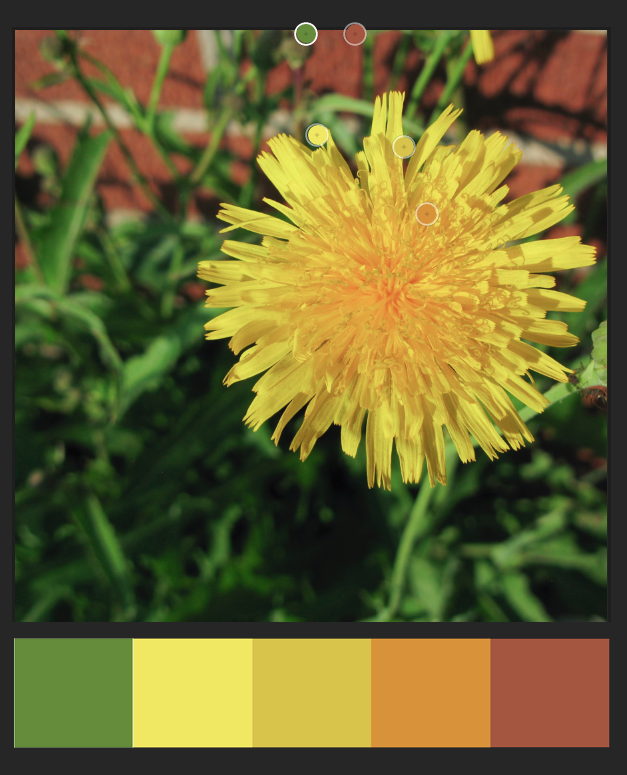
I start by pulling colors from the photo using a program called Adobe Color, which is also part of the Adobe Capture app, so you can use it in your web browser (Color) or on your phone/tablet (Capture).
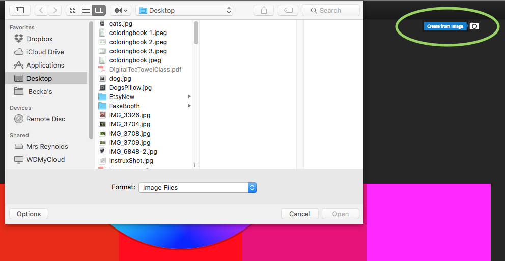
Go to Adobe Color and look for the camera icon that says Create from image (green circle) or click in the center of the screen. Choose the image you would like to use.
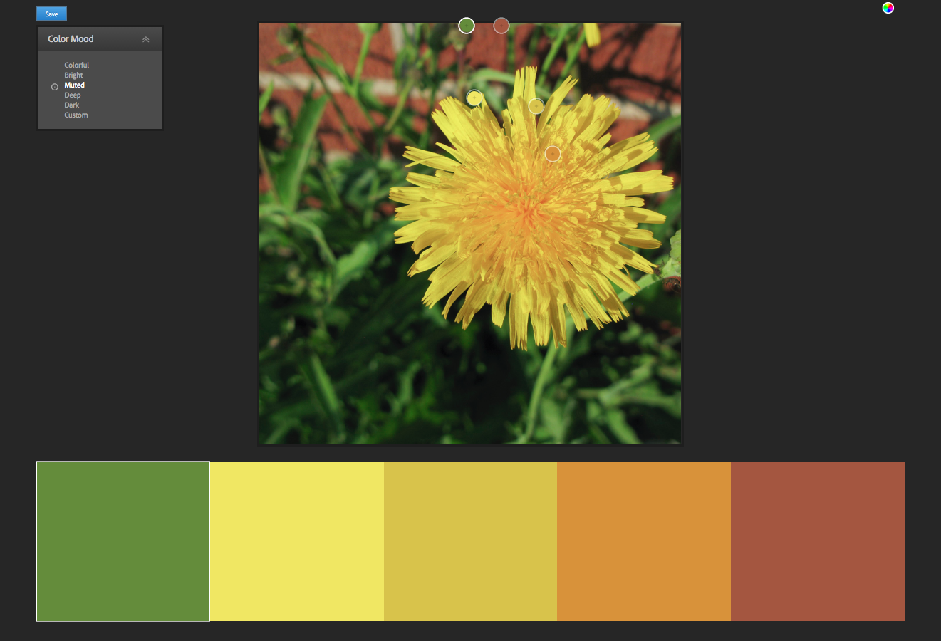
When it pops up the photo, it will automatically choose 5 colors, shown by little bubbles on the photo. You can click and move those bubbles around to adjust the colors. On the top left, there is also a palette marked Color Mood, which gives you options for “colorful”, “bright”, “muted” etc.
You’ll need to have an Adobe ID to save this color scheme. If you already have a subscription to Photoshop or any of the other Adobe software, you should use the same ID. Once you have a set of colors you are happy with, click the Save button.
A little note: No Adobe account? If you don’t want to have one more account name and password to remember, I totally get that. If that’s the case, just take a screenshot of this screen instead of saving. You can work from a screenshot almost as easily.
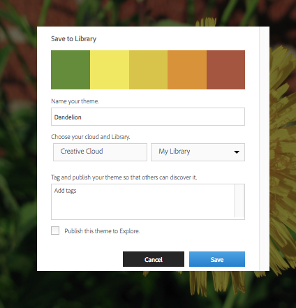 Give your color theme a name and choose where you want to save it. Creative Cloud is the subscription service that you get your Photoshop subscription from. (Because this is always a question I get asked when I talk about this in a class, it doesn’t have anything to do with “The Cloud” or saving things to “The Cloud”, Creative Cloud is your Adobe account. It’s just badly named.) By default, you have a Library named “My Library” but you can create a new one and give it a different name. You have the option of making this color scheme part of the public gallery if you choose “Publish this theme to Explore”. That’s up to you.
Why save it this way and not just on my hard drive? This is the cool part. Anything I save to My Library is available to me in any other Adobe program. So once I have captured this color scheme, I can switch over to Photoshop.
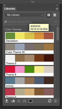
When I open the Libraries panel in Photoshop, there is my Dandelion color theme right at the top. I can click on those colors and use them just like the regular color palette. (If Libraries isn’t open look in the top menubar for Window -> Libraries and that will open it up.)
It works exactly the same way in Illustrator. If you mouse over one of those color chips, you will also get two more pieces of information. The top number (example above #D8923A) is the hex code for that color. The bottom number is the RGB values. You can type those numbers into any other graphics program and get the same color. Here’s what that looks like in PicMonkey.
If that hexcode looks familiar to you, it’s because that system is also what is used on Spoonflower’s ColorMap.
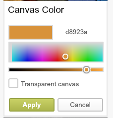
If you didn’t save to Creative Cloud and are working from a screenshot, you can open the screenshot and use the eyedropper tool to get the same hexcode and RGB information.
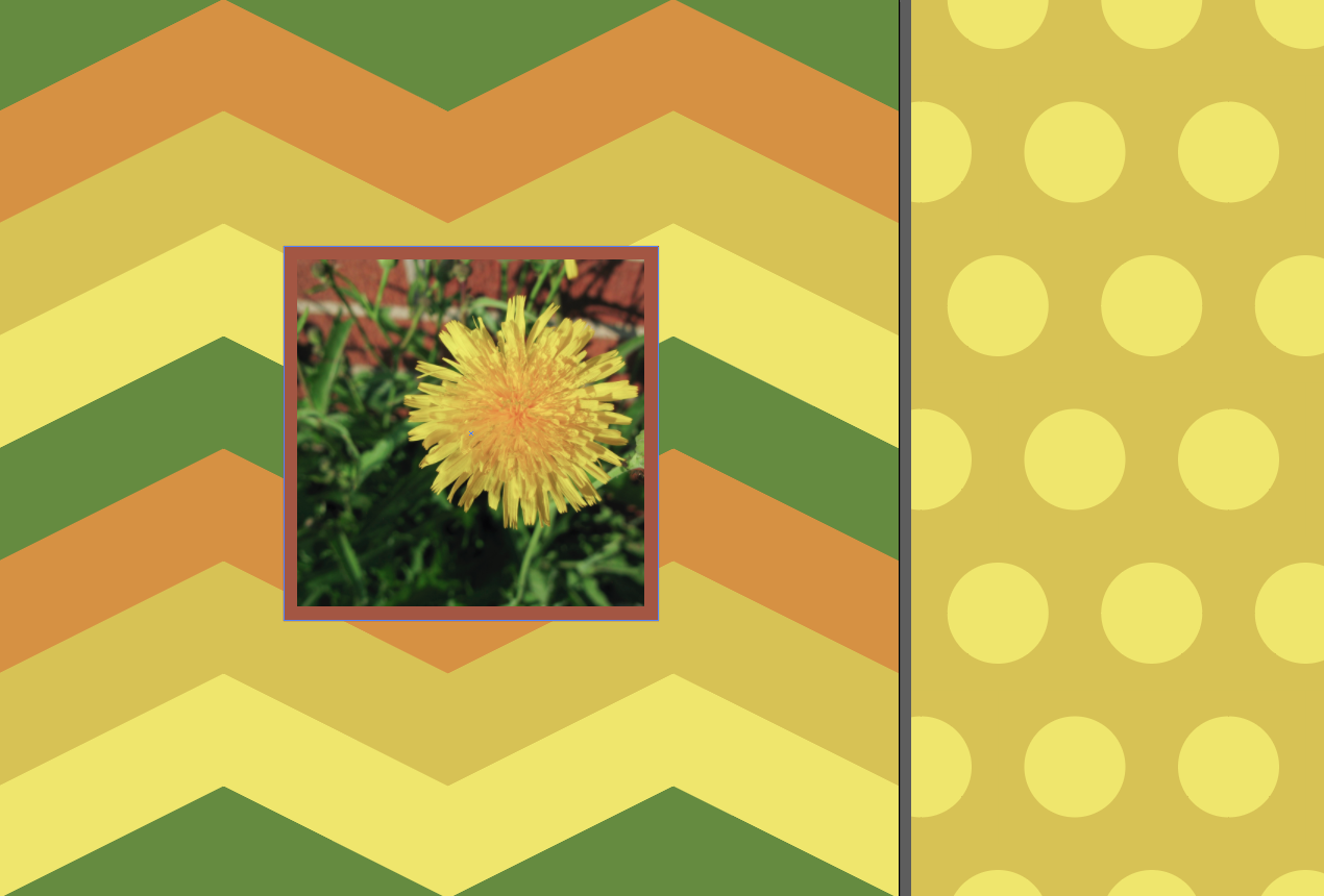
Want to see it in use? Here’s a very quick and simple example of patterns of chevrons and polkadots drawn in Illustrator, which use colors pulled from the photo. This could be the front and back of a pillow. Or the outside and lining of a totebag. Or some coordinating quilt prints.