11 August, 2017

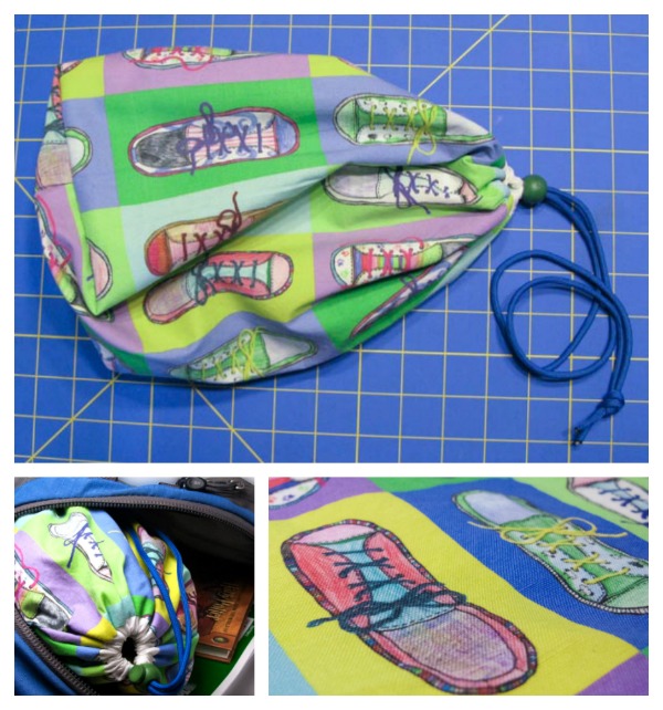
Fabric Design for Back to School: Pop Art Shoe Bag Tutorial

2017-08-11T08:17:10-05:00Everything Else, Freebies & Patterns, Spoonflower & Fabric Design, Tutorials|3 Comments

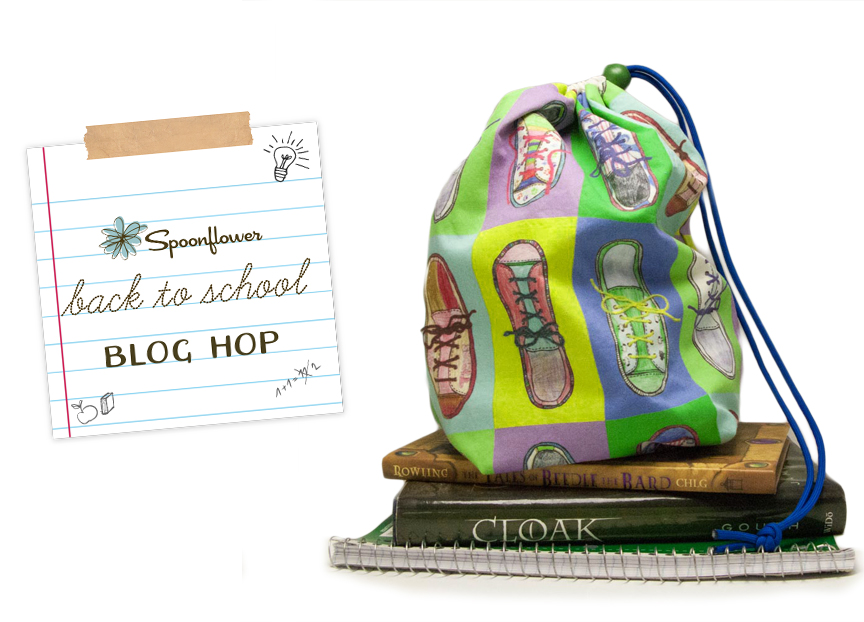
When you live in Minnesota, “Back-to-School Season” is quickly followed by “Snowboots Season”. When I asked my sister what she thought would be a great back-to-school project to share with the Spoonflower Back to School Blog Hop, she described a “stuff sack” type bag to put the kids’ shoes in their backpacks when they have to wear their snowboots to school. Something to keep the papers from getting dirty and books from getting crumpled by dirty sneakers. With each kid needing regular shoes, gym shoes and snowboots, there are a lot of shoes getting hauled back and forth on the bus every day.

Creating the fabric design.

Color & scan.

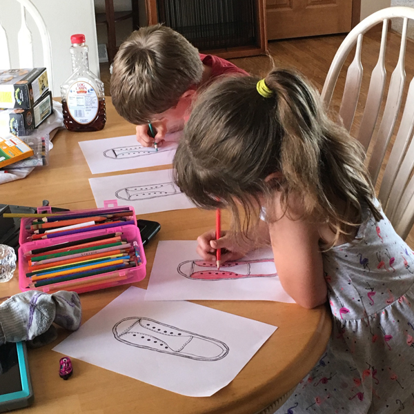
My niece and nephew are 7 & almost 9 years old and I thought the bags would be the most fun (and more likely to get used) if I could get the kids to help me with the fabric design. What better for a shoe bag than a fabric print with shoes?

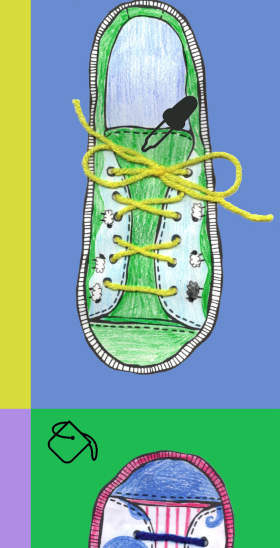
So I drew a coloring book page with a canvas sneaker. I drew it in fine tip sharpie, scanned it and emailed it to my sister. She printed copies and let the kids color the shoes any way they liked. They chose colored pencils for these, but this would also work with markers, crayons, or watercolor.

Download: If you want to make your own shoe print, you can download my shoe coloring book page here. It is yours to use any way you like.

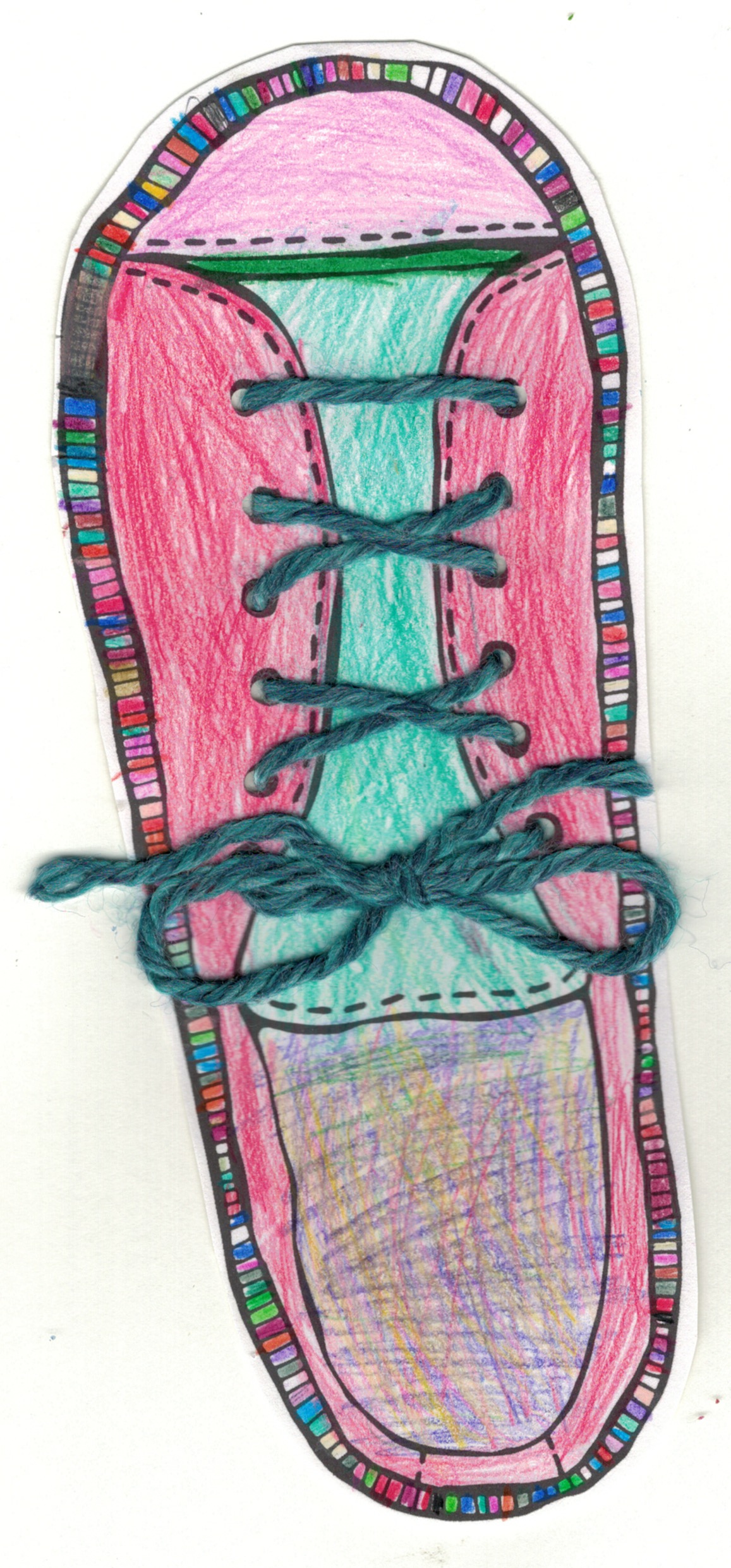
I love to add texture and dimension to my designs so when I got the colored shoes back from the kids, I used a 1/8 in paper punch to punch holes at the eyelets and I made shoelaces from colored yarn. I threaded it through like lacing the shoe and tied a bow. Then I scanned the completed shoes.

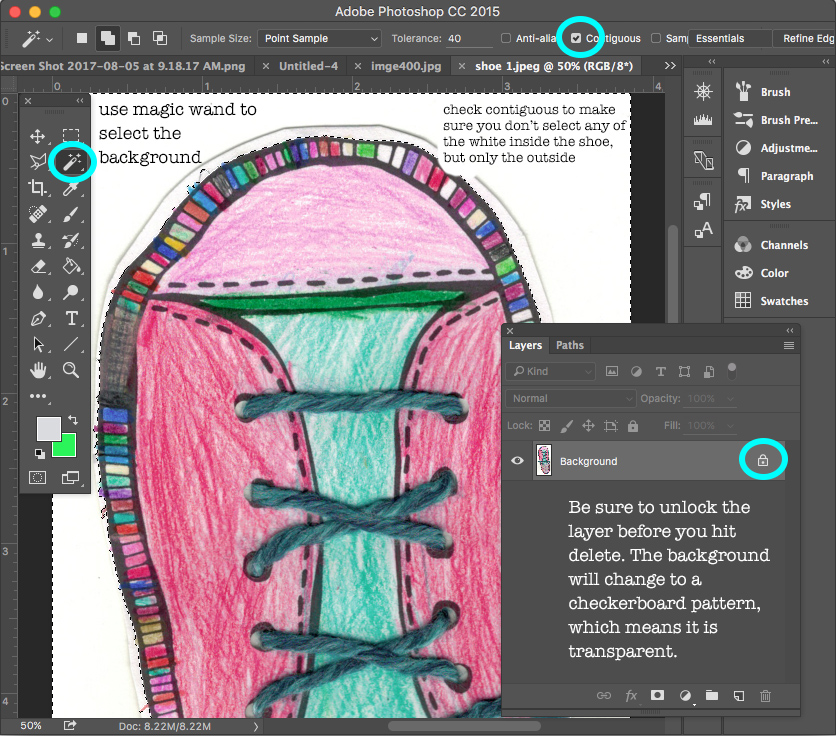
Make the background transparent.

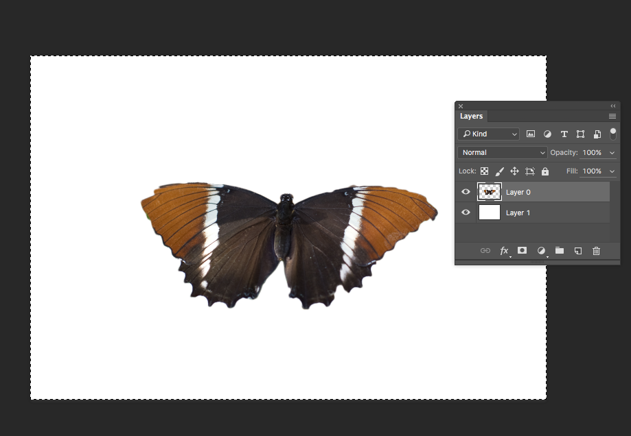
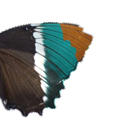
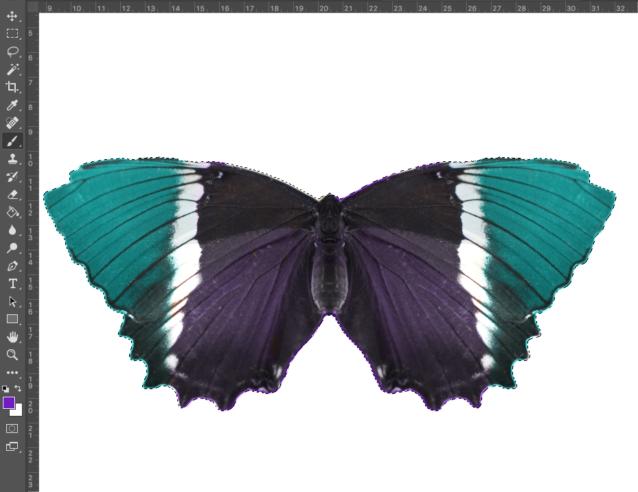
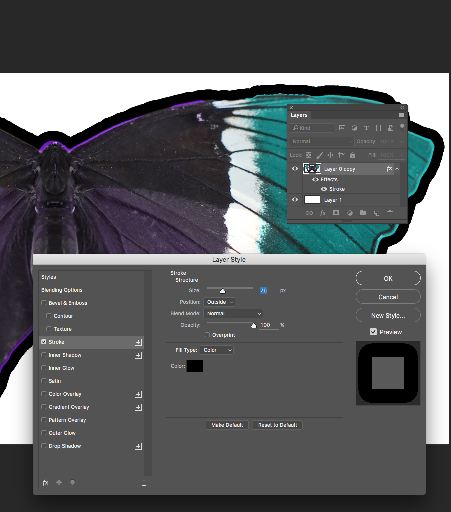
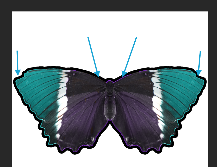
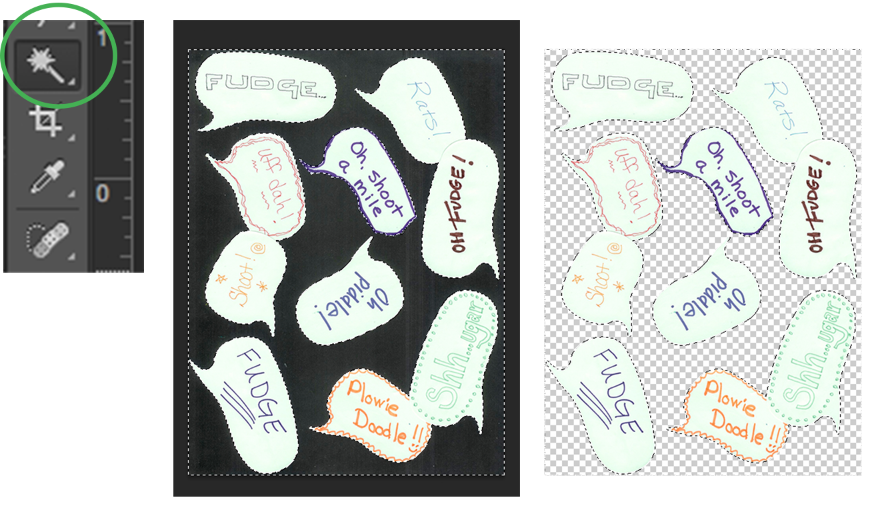
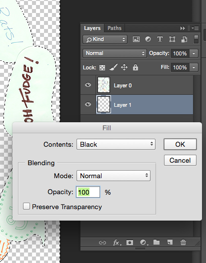
I opened each shoe in Photoshop so that I could cut out the shoe and make the background transparent. I used the Magic Wand tool to select the white background and then unlocked the layer so that I could delete that white edge and leave just the shoe.

  1. Choose the magic wand tool.
  2. Click the white area in the background of the shoe.
  3. Unlock the layer.
  4. Hit the delete key.
  5. The background should now be transparent (checkerboard).
  6. If your first click didn’t remove all of the white background, continue to select and delete the parts you don’t need.
  7. Here is a tutorial on how to adjust settings on the magic wand tool to fine tune and select more/less area.
  8. Save each shoe as a .psd file. (That’s a Photoshop file.)

Create the background canvas.

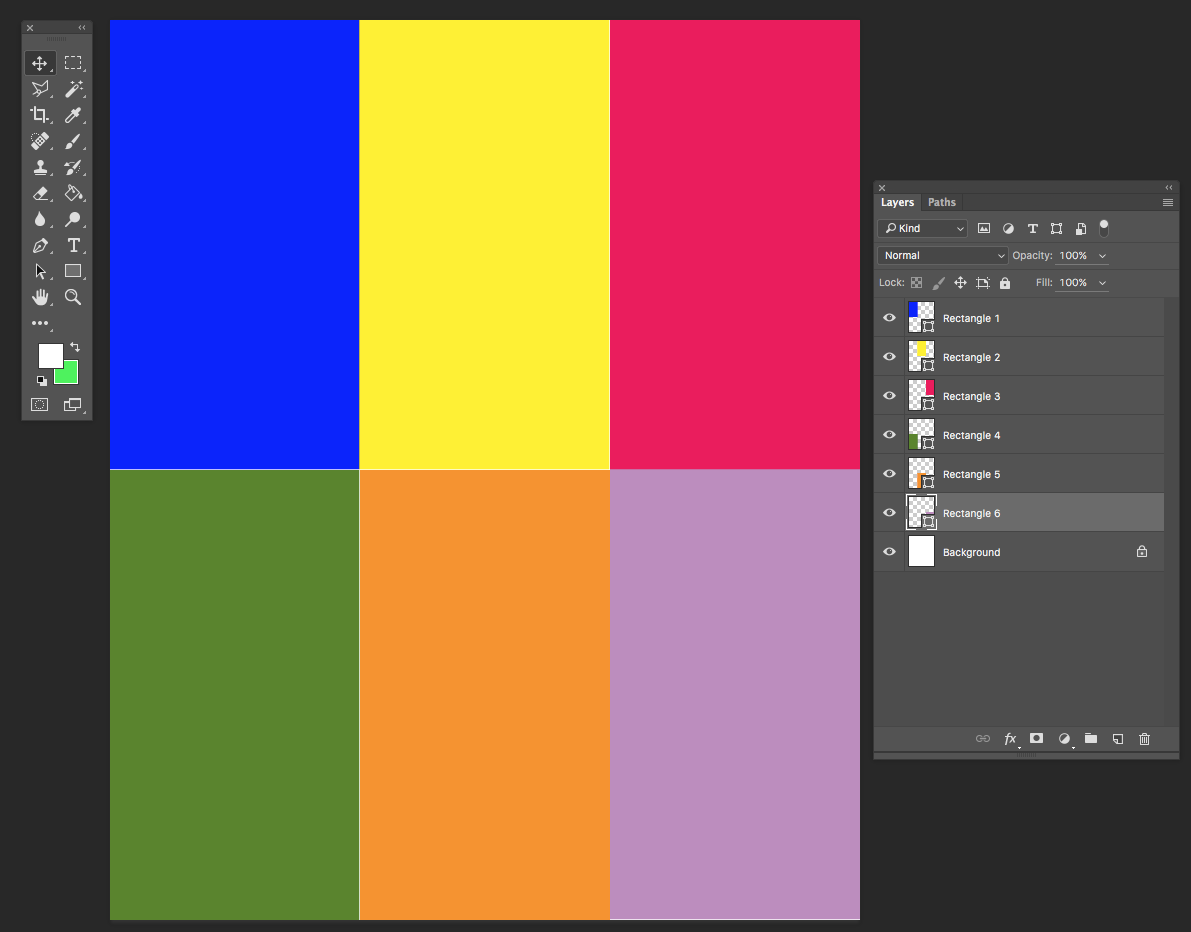
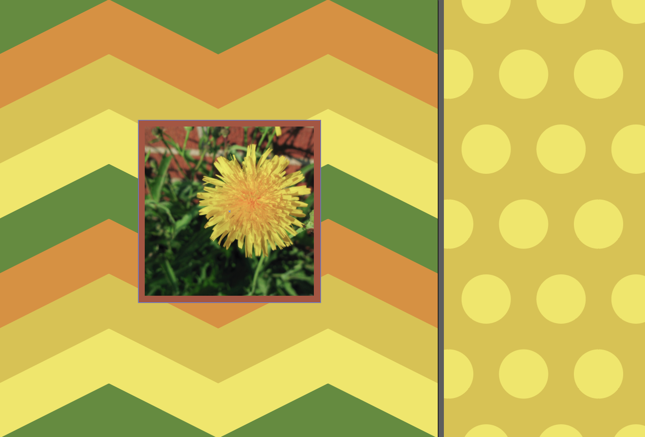
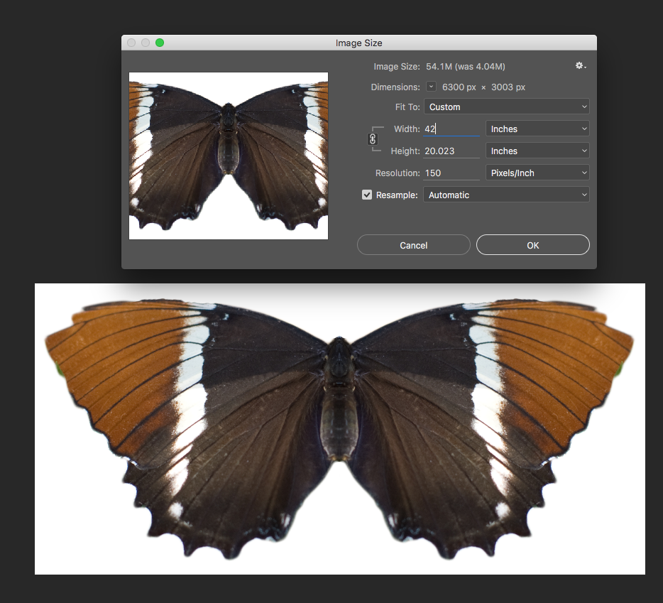
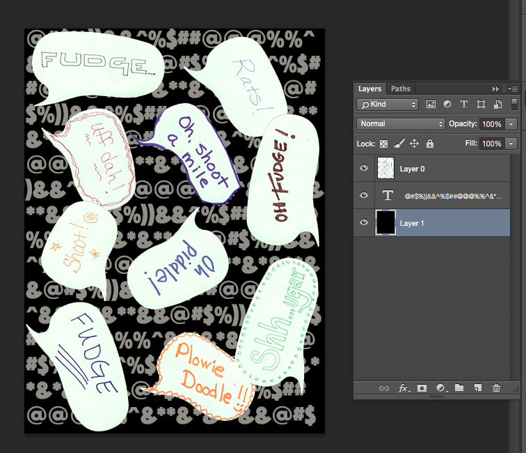
I wanted to do a repeating Warhol-inspired pop art design with the shoes by putting them each on a brightly colored background rectangle, so I set up a new canvas in Photoshop for the background. I created a new file that was 7.5 x 9 inches at 150 dpi. That’s the size I decided to make the repeat for my design.

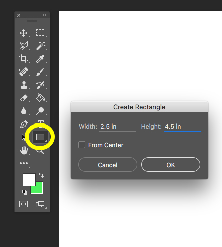
I filled this canvas with 6 rectangles, each 2.5 x 4.5 inches. I drew these using the Rectangle Tool (yellow circle below) and filled them with a random color. Hint: If you click once with the tool inside your canvas, it will bring up a dialog box and you can type in the exact size of the rectangle you would like. Just repeat that to make all six rectangles. Here’s a little more about how to use the Rectangle Tool. Use the Move Tool to move the rectangles into place and be sure that you have selected the layer that you want to move. (Each rectangle will be on its own layer.)


I am going to match the colors to the shoes a little later, so the colors don’t matter at this step, just pick ones with a lot of contrast.

Add the shoes to the design.

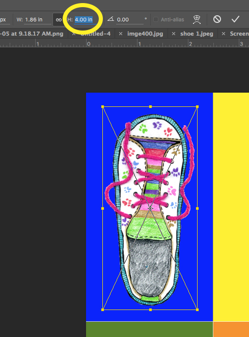
Next, I placed the shoes into the design, using File -> Place Embedded and chose the edited version with the transparent background. I resized each one as I brought it in so that each shoe would fit in a rectangle. I adjusted the height to make each one 4 inches tall and made sure to click the chain icon (to the left of the yellow circle) to make sure it was scaled proportionally and not “squished”. If you want to adjust them after you have placed them, be sure that you have the right layer selected. Each rectangle and each shoe will be on a different layer at this point.

Match the background colors to the shoes.

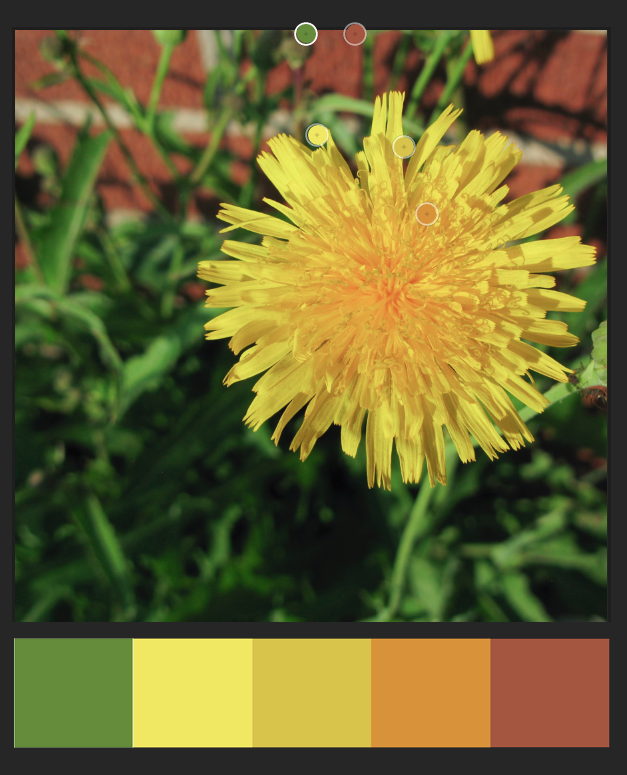
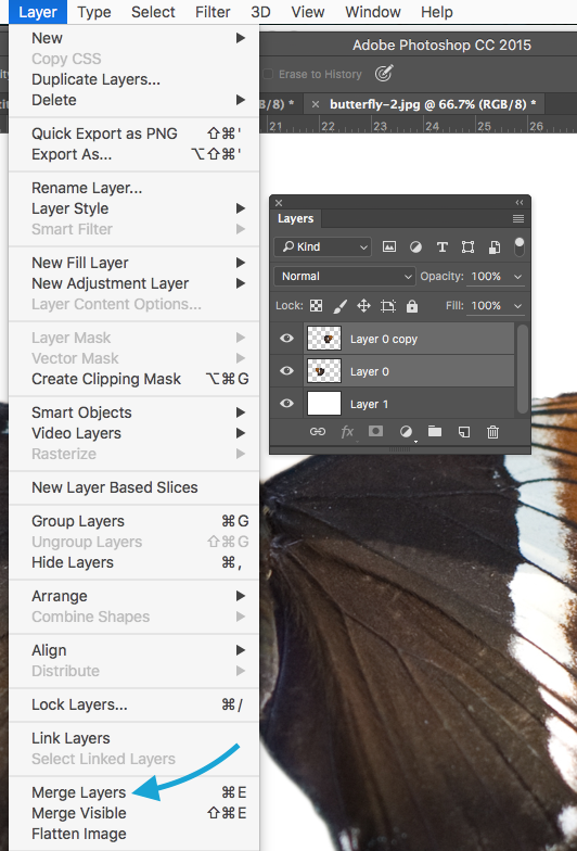
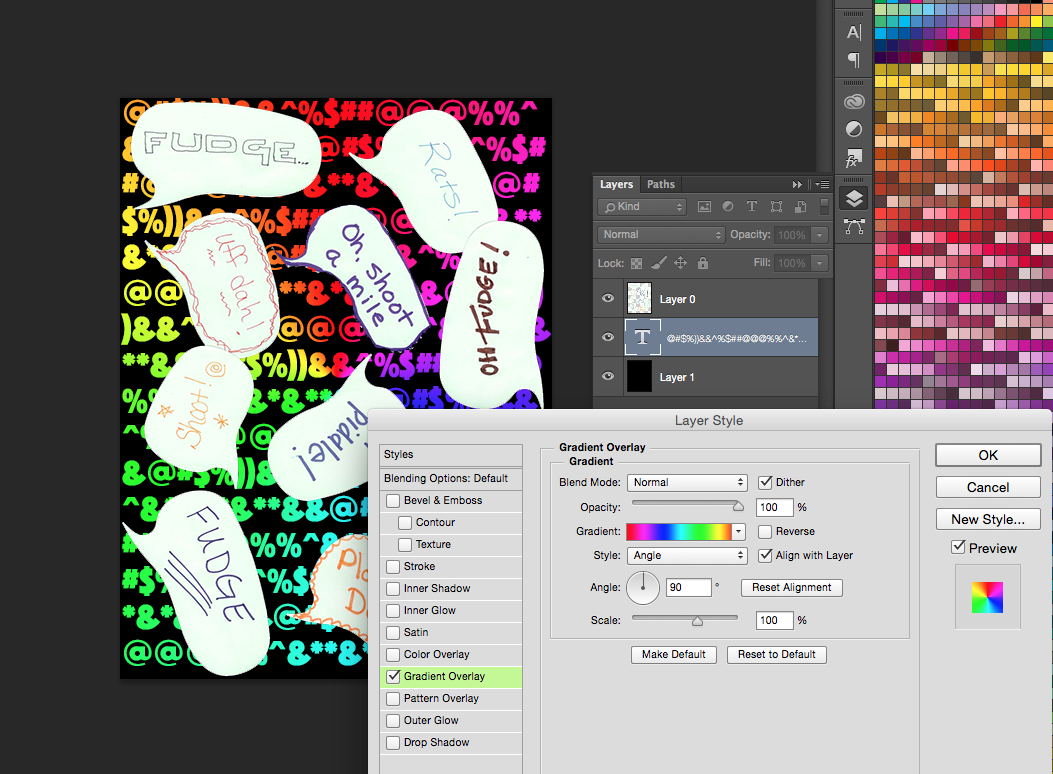
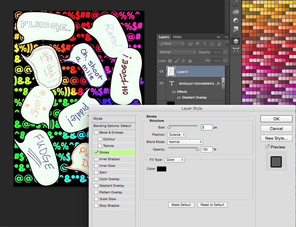
Finally, to recolor the rectangles and match them to the colors in the shoes, I used the paint bucket/eyedropper tool in combination. The annoying part of this step will be keeping track of which layer you are on, so I recommend going to Layer -> Merge Visible and making your design all one layer for this step.

I then switched to the Paintbucket Tool and hovered over a color in a shoe. When I hold down the option key with Paintbucket selected, my Paintbucket will transform to an eyedropper. I clicked with the eyedropper to choose a color from a shoe and then released the option key. Now the cursor switches back to paint bucket and I can click inside a rectangle to fill with that color. Continue to select (hold option – click) a color and paint (release option – click) until you have colors that you like.

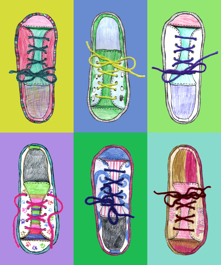
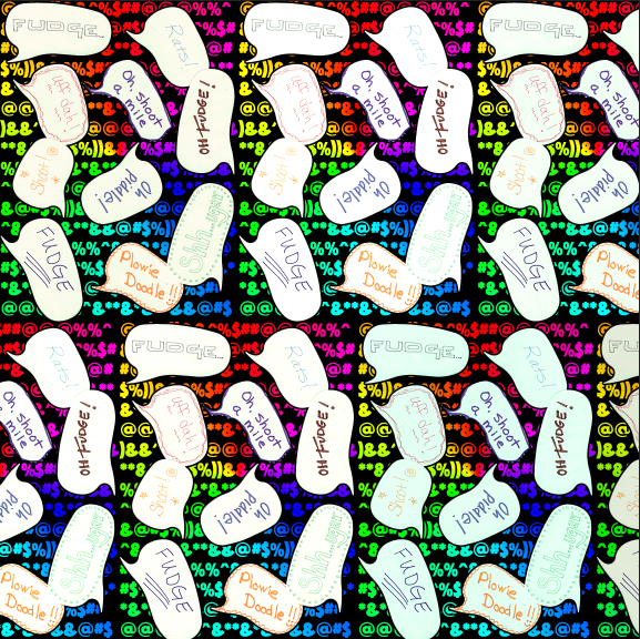
My finished repeat is below.

Save it and order a yard.

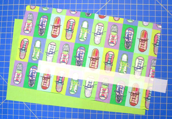
Now save this design as a .jpg and upload it to Spoonflower. I liked mine arranged as a half-drop repeat. You can get two bags out of one yard of fabric. I chose Basic Cotton Ultra for this project because I wanted the bags to be sturdy but not too bulky since they are designed to go inside another bag.

If you aren’t feeling like you want to design your own fabric or you don’t have kids around to do some coloring with you, I also curated a collection of great shoe fabrics by other Spoonflower designers. You can shop that Shoe collection here.


This is a great place to tell you that Spoonflower is giving you, my readers, a 10% discount! Use coupon code Rahn10 when you place your order. It’s valid until September 30, 2017 for orders of fabric, wallpaper and gift wrap and can not be applied with any other promotional offers.


Sewing the bag

Materials you need to make the bag.

  • 1/2 yard of shoe fabric. Basic Cotton Ultra is a great choice.
  • 1/2 yard of lining fabric.  I chose a lightweight cotton/poly broadcloth in bright green.
  • a 22 x 2 inch scrap of very lightweight fabric for the drawstring casing. I used a scrap from the selvedge of a piece of Spoonflower’s poly crepe de chine. Nylon or poly lining fabric is also a great choice. You want something that will allow the drawstring to bunch up and close the bag.
  • 1 yard of 1/4 inch paracord
  • A cord lock toggle. I got mine from this shop at Etsy.

Cut out rectangles.

You need three rectangles to make each bag.

  • 23 inches x 14 inches of your shoe fabric.
  • 23 inches x 14 inches of your lining fabric.
  • 21 inches x 2 inches of a very lightweight fabric for the drawstring casing.

Hem and fold the casing.

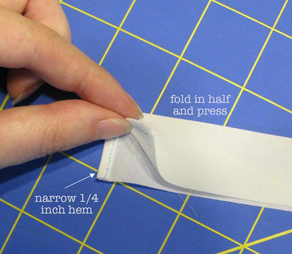
Start with the small rectangle of fabric for the drawstring casing. Make a narrow 1/4 hem at each short edge. Then fold the strip in half, matching the long edges and press.

Stitch the casing (top) edge.

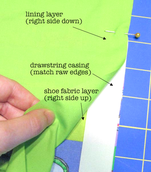
Lay the shoe fabric right side up on your table. Place the casing in the center of the long edge of the rectangle, matching the raw edges. Place the lining fabric right side down, matching the long edge. Pin through all the layers and then stitch the long edge using a 1/2 inch seam allowance.

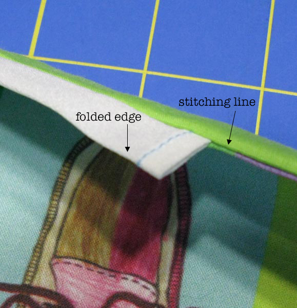
Turn the layers right side out and press so that the casing is free at the top and the shoe and lining fabrics are pressed down wrong sides together.

Stitch the side seam.

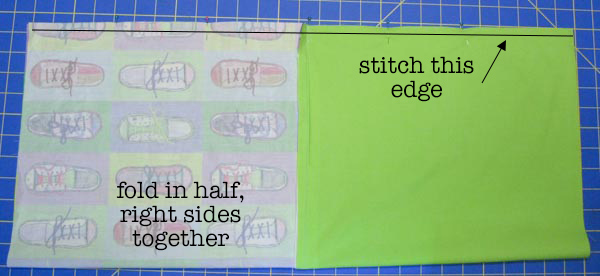
Unfold and open out your bag and refold it in half matching lining to lining and shoe fabric to shoe fabric. We are going to sew the outer and lining side seam all at once, making a tube. Match the long edges, pin and stitch with a 1/2 inch seam allowance. Press the seam open.

Mark the center, stitch the bottom.

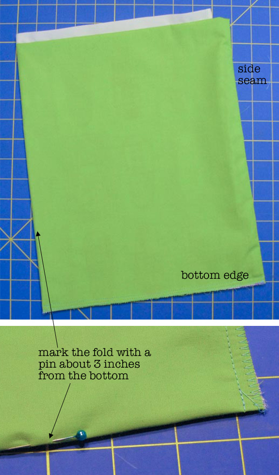
Turn the tube so that the casing is at the top, the shoe fabric is to the inside and lining is outside. It will be like a doubled over tube, open at the top and bottom.

We need to mark the side of the bag for the next step. Fold the tube in half along the stitching line at the side seam and lay it flat on a table. Then mark the opposite folded edge with a pin, about 3 inches from the bottom corner. You will use this pin to help make a corner gusset in the next step.

Stitch the bottom edge of the bag through all the layers, using a 1/4 inch seam allowance. You can serge or zig zag over this raw edge to keep it from fraying.

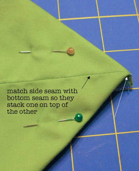
Open out the corners.

Starting with the side with the stitched seam, open out the corner of the bag and match the side seam (black arrow) to the bottom seam (white arrow). Stack them one on top of the other and fold it flat, creating a point right at the corner. Pin it to keep the seams from shifting.
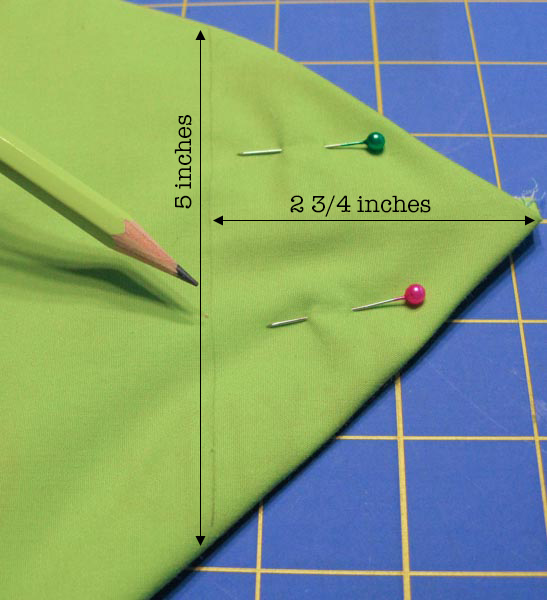
Mark the gusset.

Measure 2.75 inches from the tip of the triangle and use a ruler to draw a light pencil line. Your line should be 5 inches from folded edge to folded edge. Stitch across the corner through all layers, following this line.

Repeat for the other corner.

Since you don’t have a side seam on the opposite side, use the pin you placed to match the side to the bottom seam. Mark and stitch the same way. This will form square corners on the bottom of the bag. You can trim away the excess at the corners if you want to remove some bulk, but I like to just fold it towards the bottom and use is as an extra layer of reinforcement.

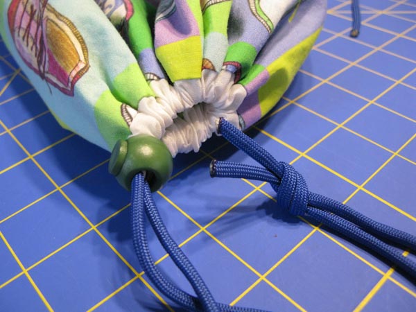
Turn it right side out & add the drawstring.

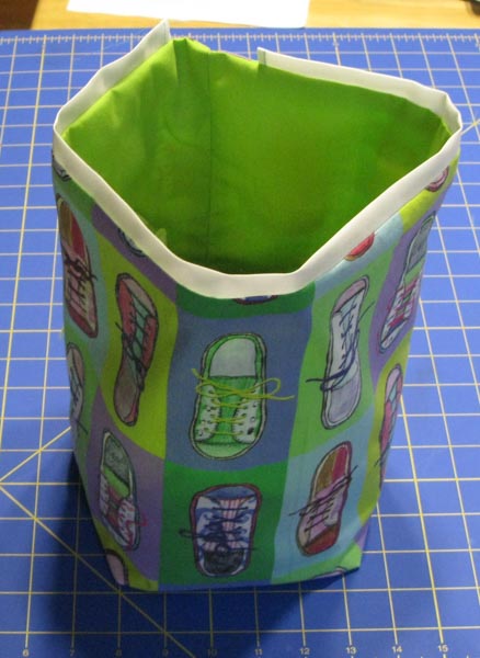
Turn the bag right side out. Cut a piece of paracord that is 36″ long. You can get one of my laser cut needles to thread the cord through the casing or use a large safety pin or elastic threader.

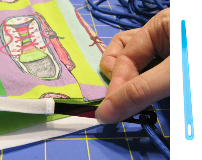
Slide the cord lock over the ends of the cord and then tie the cord ends together in a knot. Melt the ends of the cord so it doesn’t fray. (Please be careful! It gets hot and you should work in a ventilated area.)

If you want to follow along with the other blog hop posts in this series: Wednesday, August 2 – Robin Szypulski | Kritter Stitches – Bookbag on SF blog • Amy Watkins | Cozy Reverie – First / Last day of school photo pennants  • Kimberly Coffin | Sweet Red Poppy – 1st day of school outfit • Abby Glassenberg | While She Naps – Plushie key chain • Heidi Kenney | My Paper Crane – snack bags • Erin Williams | Printable Crush – book covers

31 May, 2016

Tutorial: Color schemes from photos & using Creative Cloud Libraries

2016-05-31T11:30:43-05:00Spoonflower & Fabric Design, Tutorials|Comments Off on Tutorial: Color schemes from photos & using Creative Cloud Libraries

Screen Shot 2016-05-31 at 10.10.31 AMI write a newsletter for the MN chapter of the Surface Design Association and each month I include a color scheme for inspiration. I know color is a hard thing for a lot of people. I work very intuitively with color and I personally don’t put a lot of thought into color theory or color wheels; I just go with what feels right to me. But not everyone can work that way. So I like to provide a little jumping off point by pulling a set of colors from a photograph to use as color inspiration. Maybe you can use it as a jumping off point for a new design. Maybe it makes you look deeper at a photo to see the way colors work together. Maybe it makes you think about how there are unexpected colors in shadows. I think there is something for anyone to relate to.

As a dyer or surface designer that works with paints, dyes or pigments you can look at the palette and mix up your colors to work from there. As a digital designer, I can import these colors directly in to my graphics program. It doesn’t really matter if I am working with the exact colors from the photo for a single design, but where that is handy is when I want to make a set of coordinating designs where matching colors is important.

I start by pulling colors from the photo using a program called Adobe Color, which is also part of the Adobe Capture app, so you can use it in your web browser (Color) or on your phone/tablet (Capture).

Screen Shot 2016-05-31 at 10.14.35 AM

Go to Adobe Color and look for the camera icon that says Create from image (green circle) or click in the center of the screen. Choose the image you would like to use.

Screen Shot 2016-05-31 at 10.15.00 AM

When it pops up the photo, it will automatically choose 5 colors, shown by little bubbles on the photo. You can click and move those bubbles around to adjust the colors. On the top left, there is also a palette marked Color Mood, which gives you options for “colorful”, “bright”, “muted” etc.

You’ll need to have an Adobe ID to save this color scheme. If you already have a subscription to Photoshop or any of the other Adobe software, you should use the same ID. Once you have a set of colors you are happy with, click the Save button.

A little note: No Adobe account? If you don’t want to have one more account name and password to remember, I totally get that. If that’s the case, just take a screenshot of this screen instead of saving. You can work from a screenshot almost as easily.

Screen Shot 2016-05-31 at 10.17.15 AMGive your color theme a name and choose where you want to save it. Creative Cloud is the subscription service that you get your Photoshop subscription from. (Because this is always a question I get asked when I talk about this in a class, it doesn’t have anything to do with “The Cloud” or saving things to “The Cloud”, Creative Cloud is your Adobe account. It’s just badly named.) By default, you have a Library named “My Library” but you can create a new one and give it a different name. You have the option of making this color scheme part of the public gallery if you choose “Publish this theme to Explore”. That’s up to you.

Why save it this way and not just on my hard drive? This is the cool part. Anything I save to My Library is available to me in any other Adobe program. So once I have captured this color scheme, I can switch over to Photoshop.

Screen Shot 2016-05-31 at 10.19.26 AM

When I open the Libraries panel in Photoshop, there is my Dandelion color theme right at the top. I can click on those colors and use them just like the regular color palette. (If Libraries isn’t open look in the top menubar for Window -> Libraries and that will open it up.)

It works exactly the same way in Illustrator. If you mouse over one of those color chips, you will also get two more pieces of information. The top number (example above #D8923A) is the hex code for that color. The bottom number is the RGB values. You can type those numbers into any other graphics program and get the same color. Here’s what that looks like in PicMonkey.

Screen Shot 2016-05-31 at 11.00.12 AM

If that hexcode looks familiar to you, it’s because that system is also what is used on Spoonflower’s ColorMap.

If you didn’t save to Creative Cloud and are working from a screenshot, you can open the screenshot and use the eyedropper tool to get the same hexcode and RGB information.

Want to see it in use? Here’s a very quick and simple example of patterns of chevrons and polkadots drawn in Illustrator, which use colors pulled from the photo. This could be the front and back of a pillow. Or the outside and lining of a totebag. Or some coordinating quilt prints.

Screen Shot 2016-05-31 at 11.11.41 AM

18 January, 2016

30 Second Photoshop Tutorial: Copy with Move + Option Key

2016-01-18T16:48:09-06:00Everything Else, Spoonflower & Fabric Design, Tutorials|Comments Off on 30 Second Photoshop Tutorial: Copy with Move + Option Key

miniOption
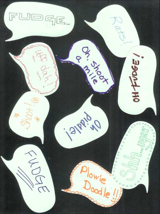
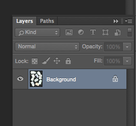
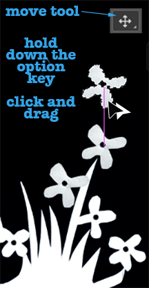
It takes some time to put together a really good tutorial for a project or design, but there are some great techniques that only take a few seconds to explain.  This is one I use all the time to copy objects in Photoshop.
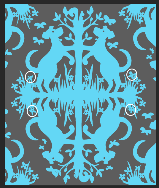
Select an object, like this little flower.

Choose the Move tool.

Hold down the option key as you click and drag that object.

Viola!  You now have a copy of that shape.  Copies made this way will be in the same layer as the original; if you use copy/paste commands, Photoshop will create a new layer for each copy you paste in.

Today I was working on a “dogs chasing squirrels” damask and I decided I wanted a few more flowers in the grass, so I used this technique to copy them.  While each was selected, I also rotated and resized a little bit to add some variety, so they would look less like copies.

Screen Shot 2016-01-18 at 4.46.00 PM


5 January, 2016

Design-your-own-Fabric Tutorial: Making Wings

2016-02-23T13:27:14-06:00Spoonflower & Fabric Design, Tutorials|5 Comments

wings

For Halloween, my niece wanted to be a butterfly fairy.  Her talented mama made the fancy princess dress, but I was asked to help with the fairy wings.  We thought it would be the most fun if the wings were not stiff wire edged things, but more like a flowy cape, so you can pretend to fly, which is absolutely necessary when you are 5 years old.  So I designed some wings and had them printed at on fabric at Spoonflower.

Here’s how you can make your own.

I started with a photograph of a butterfly.  For the wings above, I used a monarch because that matched the colors of her costume, but I did some screenshots for you using another butterfly that we photographed at the zoo, so you can see some other variations.  It helps to have a butterfly shape that goes pretty straight across at the top (not a strong V shape), but you can adjust that a little in a later step.

Screen Shot 2016-01-05 at 10.33.27 AM

First, I opened the photo in Photoshop and made a new layer, so the butterfly photo is on one layer and there is a blank background layer. I selected the butterfly using the Quick Select and Lasso tools, inverted the selection (so now the background is selected instead of the butterfly) and deleted the background. I selected the butterfly and straightened it out a little (using the Transform tool).  You can see that my butterfly is a little lop-sided here right to left, which is perfectly fine for a butterfly, but makes it harder to make a 2 sided cape.  So I am going to fix that.

Screen Shot 2016-01-05 at 10.37.48 AM

I used the Marquee Select tool to select the right half of the butterfly and delete it.  Then I copied the left half, flipped it horizontally and moved it over to the right side.

Screen Shot 2016-01-05 at 10.38.12 AM

Screen Shot 2016-01-05 at 11.33.03 AM

This is going to make it much easier to sew together later because I won’t have to worry about a front and back side; they are both the same and will match up when I put them right sides together to sew it.  I selected and merged the two layers (right and left side) to make it into a single butterfly layer again and used the Eraser tool to touch up a little bit at the head and tail and any jagged edges from my quick selecting job, so I had nice smooth lines around all the edges.

Screen Shot 2016-01-05 at 10.40.08 AM


Screen Shot 2016-01-05 at 10.40.52 AM

Next, I need to make this butterfly the right size to fit my little butterfly fairy.  We measured her wingspan, which was 41 inches from wrist to wrist.  Using the Crop Tool, I cropped the butterfly to get rid of the extra white space around it and resized it to be 42 inches across at 150 dpi.  Make sure you check the “lock” icon to the left of width/height so that it maintains the same ratio and doesn’t squash your photo.  (I made it 42 because I left a little space for a seam allowance.  You will see how that works in just a bit.)

Screen Shot 2016-01-05 at 10.57.43 AM

An aside for a just a minute about resolution.  I didn’t worry too much about what the resolution of this photo was to begin with because I don’t actually need this print to be super crisp and sharp.  For this project I was totally ok with it being a little pixellated or fuzzy because it’s going to read as a butterfly no matter what.  This won’t be the case for every project; you have to use your judgement.

Now to add some color.  For our monarch butterfly, I recolored a bit to add some yellow to the orange and black so that it matched her dress.  You can add any color you like to make a butterfly in your favorite color or you can skip this step if you love your butterfly the way it is.  Select the butterfly, choose the Paintbrush Tool and set it to “Hue” in the toolbar Mode menu.  Then choose a color in the palette and paint over your butterfly.

Screen Shot 2016-01-05 at 11.50.38 AM

Screen Shot 2016-01-05 at 10.43.08 AM

Screen Shot 2016-01-05 at 10.45.11 AM

Lastly, I don’t want to have to sew precisely around every scallop on the edge of that wing to make sure that I don’t have any white showing on my finished wings.  So I am going to add a seam allowance in black to allow give me a little wiggle room.  Double click the butterfly layer in the Layers Palette and a new Layer Style Palette will pop up (you can also choose Layer Style from the top Layer menu).

Screen Shot 2016-01-05 at 11.02.10 AM

I chose Stroke under Styles and set it to put a 75 pixel stroke on the outside of my butterfly and set the color to black.  75 px at 150 dpi = 1/2 inch.  So now I have a 1/2 inch black border around the edge.  Save this.

My butterfly wings are just barely small enough that I can put two of them (front and back) on a single yard of fabric.  I chose the Poly Crepe de Chine from Spoonflower for these wings because it is exactly the right weight and floaty-ness for wings.  So I made a new canvas 52×36 inches at 150 dpi and placed two butterfly wings on it.  If your wings are bigger, you may need 2 yards and then you can just upload as is and center the design.

Screen Shot 2016-01-05 at 12.10.42 PM

Export as a .jpg, upload to Spoonflower and wait with great anticipation while they are printed.  To finish up the wings, I cut them out and pinned them right sides together.  I cut two 20 inch pieces of black and white polkadotted ribbon and tucked them in at the top edge, about 4 inches either side of the center.  I cut two 8 inch pieces of narrow black elastic and tucked them in at the top edges of the wing tips.  Then I stitched around the whole thing with a 3/8 inch seam allowance (catching all of the ribbon/elastic as I stitched), leaving a little space to turn right side out.  Clip the seam allowance as needed, turn and press with a synthetics setting.  Slip stitch the opening.

Screen Shot 2016-01-05 at 12.13.11 PM

To wear the butterfly wings, you can either use the ribbon ties at the neck just like a cape, or we wrapped them over the front of her shoulders and tied them behind her back (my sister’s brilliant idea), so you only saw two little stripes of ribbon.  (The fairy liked not having it around her neck.)  The elastic loops slipped over her wrists.  She had a fancy fairy dress to match these, but I love them with all black too. Not in to butterflies?  Why not look for a photo of a moth, a bat, a hawk or there are even lizards with “wings” that might be perfect for pretending to be a dragon or griffin!  We also made a tiny pair of matching wings for her doll to have a matching costume.  Same method, smaller scale. 

wings2

PinterestButterfly

5 February, 2015

Design Tutorial: Creating a layered design

2015-02-05T10:46:57-06:00Classes & Teaching, Spoonflower & Fabric Design, Tutorials|2 Comments

Often when I teach an intro fabric design class, the students and I create a collaborative fabric design during class, which I have printed and mail to them after class.  This most recent class played along with me and made this design using speech bubble shaped post-it-notes and wrote their favorite “clean” swear word.  I thought it would make a funny fabric, especially given the day I had before I got to class.  So I scanned our design and got ready to put it into a repeat and it just seemed sort of blah.  We needed a much more colorful fabric to match our colorful language.  So I added some color and after I sent the swatches, I told my class I would post a tutorial about how I did it so they could check back.  My screenshots for this are in Photoshop, but many other design programs have the same tools you can use.

We started with a scanned image of post-it-notes on black paper.  I scanned this at 150 dpi because I wanted to print it at the same size and that is the resolution I need for fabric.

Screen Shot 2015-02-05 at 9.47.06 AMThe first thing I wanted to do was to move the speech bubbles to a layer all by themselves.  This way I could insert something into the background and have them float over top.  When I open the image in Photoshop, it automatically makes it a locked background layer. (See the lock icon?)  When I go to the Layers palette and double click the layer that says Background, it will unlock it and convert it to a regular layer (Layer 0), which is what we need.

Screen Shot 2015-02-05 at 9.50.26 AMNext I want to remove the black background and leave just the speech bubbles by themselves on this layer.  Choose the Magic Wand tool and click anywhere in that black background.  You can see what’s selected because Photoshop traces around it with dashed lines.  Once you have it selected, hit the delete key.  Your black background will disappear.  The checkered pattern you now see indicates that this part of the design is transparent.  (It won’t show on your finished design.)

Screen Shot 2015-02-05 at 10.15.39 AM

Next I will add a new background layer back in, by choosing the new layer icon (looks like a page with a bent corner) to make Layer 1. Then choose Edit -> Fill from the menu to fill it with black.  You will probably also have to put your layers in the right order by clicking and dragging them in the palette to make sure the bubbles are on top and the black layer on the bottom.

Screen Shot 2015-02-05 at 9.52.10 AMSo it doesn’t actually look like we have done much at this point, but what we have done is split the design into two layers so that we can now insert something in between them.  Next, I am going to add a Text layer, by clicking the text tool and dragging a text box to fill the design space.  Now I can type text into this layer.  I filled it with cartoon style swear words (*&%$!!@) to match our theme.  It doesn’t matter what color they are, we will change that next.  Drag the text layer so it is sandwiched between Layers 0 and 1.

Screen Shot 2015-02-05 at 9.53.05 AM

Now the color!  If you double click the Text layer in the Layers Palette, a window will pop up giving you options for Layer Styles.  We are going to use a Gradient Overlay to add a rainbow to this text.

Screen Shot 2015-02-05 at 9.53.47 AM

The last little tweak I made to the design was to add a black outline to our speech bubbles to help make them pop out from the background a little more.  That is easy to do with the same Layer Styles tool.  Double click Layer 0 with the speech bubbles and choose Stroke from the style options.  I added a 3 px border of black.

Screen Shot 2015-02-05 at 9.56.48 AM

And this is the finished design.

Screen Shot 2015-02-05 at 9.57.24 AMNow I understand that this is a pretty silly fabric and you aren’t probably going to run right out and order yards of it.  But by using the same steps you learned here, you can create fabrics like these:

Screen Shot 2015-02-05 at 10.32.00 AM

These sheep are drawn with a fine tip sharpie and scanned.  I cut them out from the background the same way and added a white Stroke to the layer so they have that white outline.  The background for this design instead of text, is a piece of painted paper that I scanned and added a Color Overlay (from the Layer Styles Palette) in green.

Or dancing sheep on a knitted background.

Screen Shot 2015-02-05 at 10.36.59 AM

Go to Top