22 October, 2015

Digital Fabric Design: Cheater Art Quilt

2015-10-22T17:51:46-05:00|Comments Off on Digital Fabric Design: Cheater Art Quilt

Another opportunity to go beyond The Spoonflower Handbook by creating an art quilt with digitally printed fabric. In the first class we will create a small art collage from textured and patterned paper; a hands-on way to add depth and complexity to your design with minimal computer skills needed. The second night we will scan to transform that art into a digital format and enlarge it to fit on a yard of fabric. Finish with some simple “photoshopping” to add details or adjust colors and get tips for creating coordinating prints to accompany your design. Your finished design can be printed to make a quilt or wall hanging, finishing/sewing to be completed on your own time. Materials fee $7, payable to the instructor. See supply list at registration for more details on technology and materials.

This class is 2 sessions: December 7 & 14

9 September, 2015

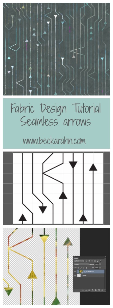
Tutorial: Seamless Arrows Pattern, Part Four

2016-03-16T10:04:02-05:00Spoonflower & Fabric Design, Tutorials|Comments Off on Tutorial: Seamless Arrows Pattern, Part Four

(This is part four of a tutorial for making a seamless arrow pattern.  Find Part One and Part Two and Part Three here.)

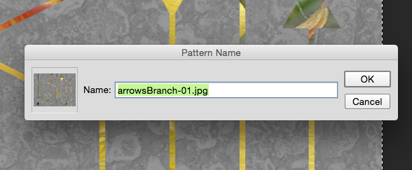
Proofing and touching up the pattern is the finishing step to create the seamless arrow design and I am going to do that with the Photoshop pattern tool.  The first thing I do is select the whole design (Edit -> Select All) and create a pattern tile by choosing Edit -> Define Pattern and click OK.

Screen Shot 2015-09-09 at 10.46.34 AMIt will look like nothing has happened.  That’s ok!  The tile that you selected has been saved in the patterns palette, which is kind of hidden.

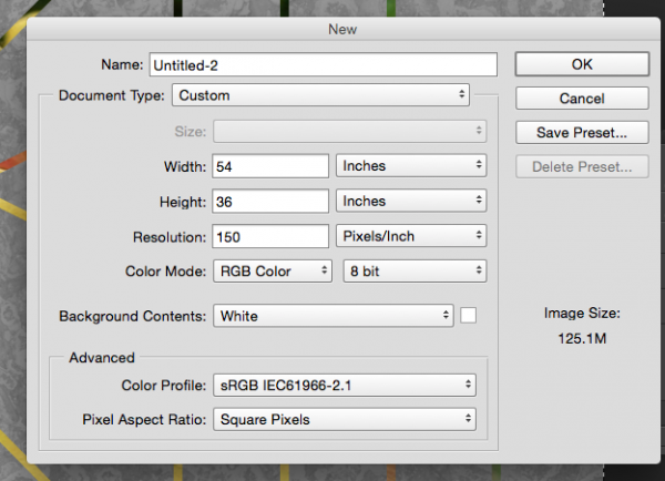
To proof the design, I create a new blank file that is the size of a yard of fabric. That’s an arbitrary size – I just think it’s nice to look at a large number of repeats.

Screen Shot 2015-09-09 at 10.46.58 AM

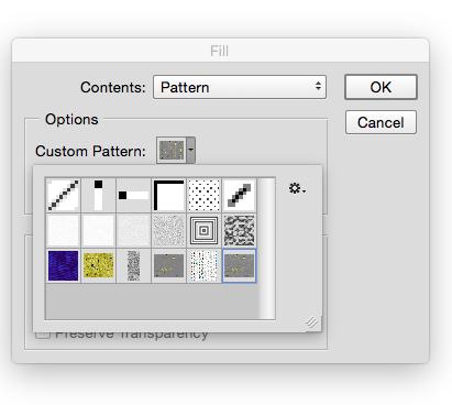
Then I choose Edit -> Fill from the menu.  From the pop-up Fill menu, choose Pattern from the contents drop down menu.  Just below that in Options there is another drop down and in it, you should find that pattern you just saved.  (See what I mean about a little hidden.)

Screen Shot 2015-09-09 at 10.47.25 AM


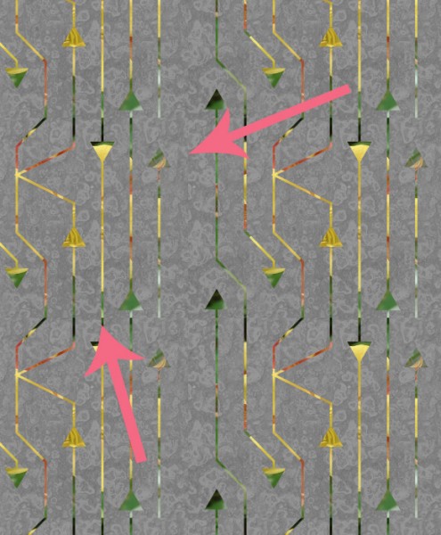
Now you can see what it looks like when the tile is repeating across a whole yard of fabric.  And right away a couple of things jump out at me.

arrow

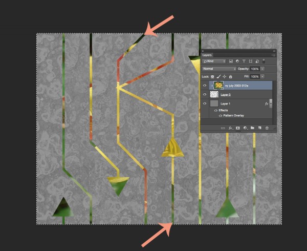
Oops.  I didn’t think about the edges and I have a blank space where there aren’t any arrows.  I can fix that by cropping out some of the blank space.  The other thing that jumps out is a seam where the color changes. The color change is kind of abrupt and it makes a dark line.  I can fix that pretty easily by going back a step to my original file.  I select the photo layer of that flower because that is where the color is coming from.  The easiest way for me to make that contrasting line to go away is to just use a paintbrush to just touch it up. I choose a green color from the bottom of the image and paint some at the top where that really deep green was, hiding that seam line and blending the two together.

arrows2

After I do those two little edits…

Screen Shot 2015-09-09 at 11.23.29 AM


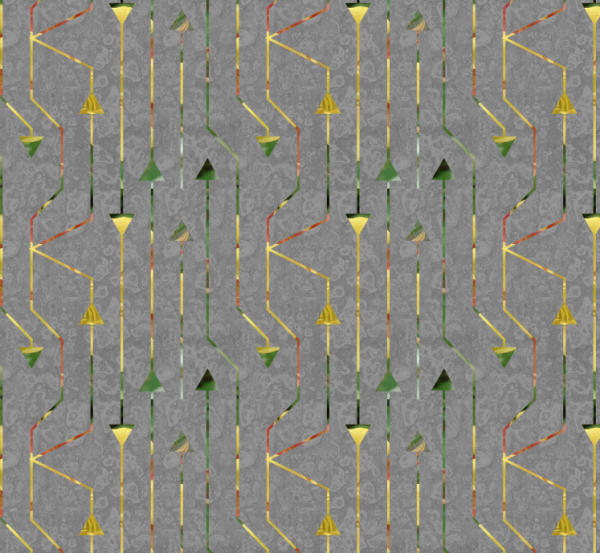
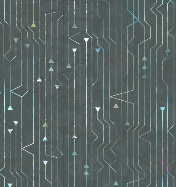
I have a pretty good finished design.  I save that tile and that is the repeat that I can upload to Spoonflower and print my fabric.  This is the version that I used for my grant project exhibition, which I will post photos of very soon.

Screen Shot 2015-08-07 at 11.26.11 AM

More in this series: Part OnePart TwoPart ThreePart Four

arrowsPin


1 September, 2015

Tutorial: Seamless Arrow Repeat Part 3

2016-03-16T10:03:14-05:00Spoonflower & Fabric Design, Tutorials|Comments Off on Tutorial: Seamless Arrow Repeat Part 3

(This is part three of a tutorial for making a seamless arrow pattern.  Find Part One and Part Two here.)

For Part Three, I am going to move over and work with the design in Photoshop now.  Why?  I could easily add color in Illustrator, but the effect I want is to cut those arrowheads out of another photo, which will give it a very organic color wash instead of a solid color.

Open the file in Photoshop.

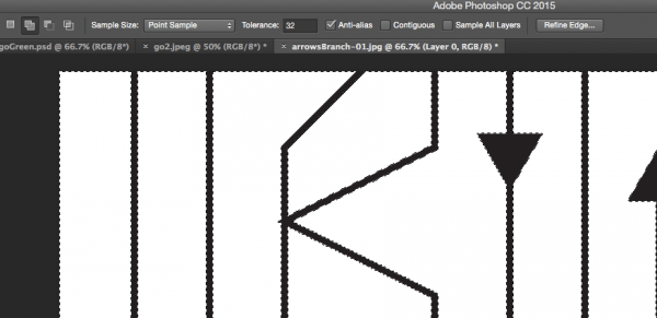
So first I open that file we just saved in Photoshop. I first double click the Layer marked Background to unlock it (making it Layer 0).  Then I use the Magic Wand tool and delete to remove the white background and just leave the pattern of black lines.  (Make sure the option marked contiguous at the top center is clicked off and you will select all of the white in the image and not just the parts touching where you click.)
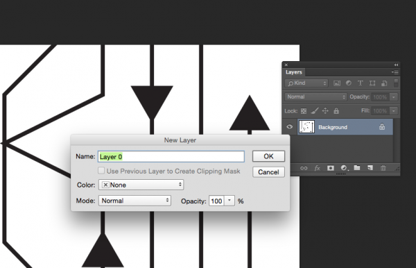
Screen Shot 2015-08-27 at 10.11.41 AM

Screen Shot 2015-08-27 at 10.15.30 AM

That will leave a checkerboard pattern in the background.  That is Photoshop’s way of telling you that is now transparent.

Add the photo layer.

Next I will add something to create that colored layer.  For my grant project design, I used one of the layers from the photo created by my design partner, so that her print and mine would coordinate.  But really anything will work, as long as it has the colors you want.  So for this example, I used a photograph of a columbine.  Choose File -> Place Embedded and pick your image.  Size/resolution is not really important.  Once you have placed it, click and drag it to resize and fill the space.  Make sure the photo layer is on top and your arrows on the bottom.

You can add filters or adjust colors or edit this layer if you want to.  For example, I might blur it to make it look more watercolored and less photo sharp.  In my grant project design, I added a few pops of magenta with a paint brush to bring out that color in the coordinating fabric.
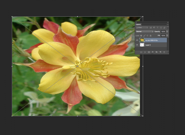
Screen Shot 2015-08-27 at 10.14.23 AM


Create a clipping mask.

Select the Layer with your image and right-click it to bring up a pop up menu or choose Layer -> Create Clipping Mask from the top menu.  This will cut from the photo in the shape of the layer underneath.
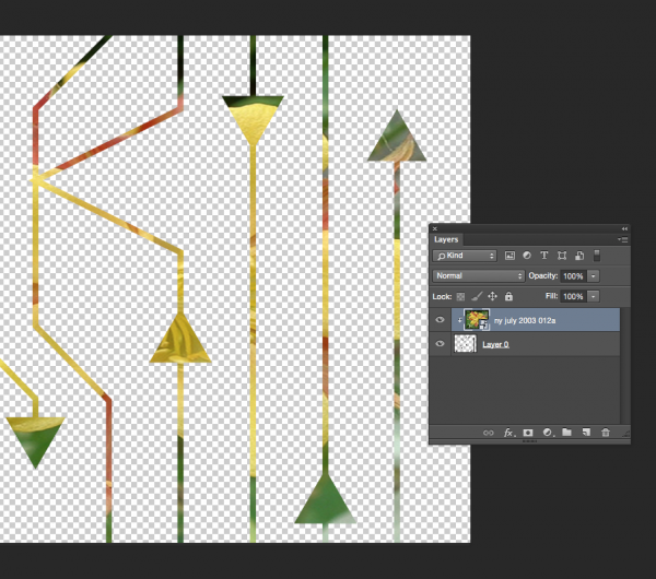
Screen Shot 2015-08-28 at 11.54.48 AM


Add a background.

I will add a new layer to give the design a background color. You can click the new layer button in the palette (looks like a page with a bent corner) or choose Layer -> New from the menu.  I can choose Edit -> Fill from the menu to fill this layer with color and then drag it in the Layers palette to be on the bottom of the stack.
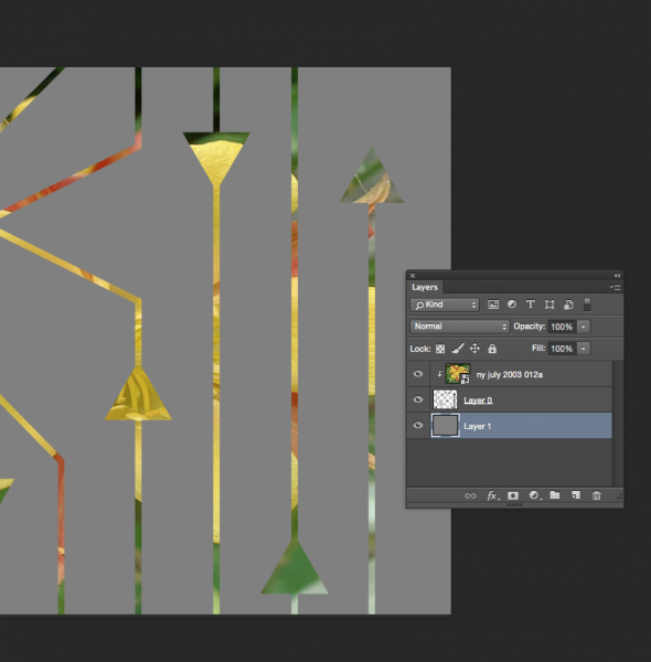
Screen Shot 2015-08-28 at 12.00.47 PM


The last thing I did was to add a little texture to that flat grey layer.  When I double click the layer in the Layer Palette, I will get a menu of Layer Style options.  I chose an asphalt texture that I had saved previously and set it to be only 19% opaque.
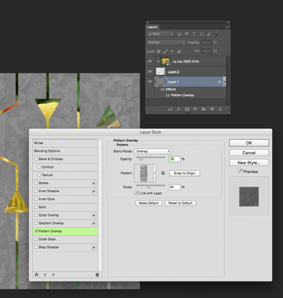
Screen Shot 2015-08-27 at 10.20.08 AM


In Part Four, I will show you how to proof your design and touch up any little flaws in the repeat and then it is finished and ready to go.

More in this series: Part OnePart TwoPart ThreePart Four
arrowsPin

31 August, 2015

Tutorial: Seamless Arrows Print – Part Two

2016-03-16T10:02:27-05:00Spoonflower & Fabric Design, Tutorials|Comments Off on Tutorial: Seamless Arrows Print – Part Two

(This is Part Two of a tutorial for creating a seamless arrows print.  See Part 1 here.)

Screen Shot 2015-08-27 at 10.06.48 AM

Part two of the tutorial is all about making the design seamless.  What does that mean?  I want these arrows to look like they are traveling all over the fabric without having a a start and stop.  Even though I only made a small section of the design, I want it to look like I designed something bigger and disguise the edges of the repeating element.

Check and adjust your lines.

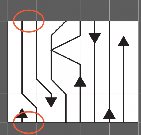
With this design, one way to make it look seamless is to make sure that any line that extends off the edge of the drawing, joins up with the design again.  In orange I circled two lines, which go off the edge at the top of the repeat, and then show up again at the bottom.  When I make this tile repeat and put two identical tiles next to each other, those lines will match up and look like they are one continuous line.  I should also say, you don’t have to always work in a repeat, in fact I don’t make repeats very often, but for this particular project I just needed some yardage and not a specific shape.  So a repeat was the easy way to go.  Make sense?

Try the Pattern Tool.

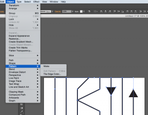
Illustrator also has a Pattern Tool which you can use to get a preview of what that repeating element will look like.  Select all of the elements in your design and then go to Object -> Pattern -> Make.

Screen Shot 2015-08-27 at 10.09.17 AM


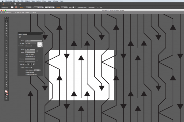
repeattoolThe pattern tool has lots of options for the kind of repeat style and the spacing, which you can play with.  I am using the tool in this screenshot to just show me what it looks like if I were to see 3×3 tiles.  And I can see when I have everything repeated that there are a couple of edits that I would make.

What do I look for?  Think about how your eye travels around the design.  My eye keeps going to and stopping at two arrowheads that are lined up side by side.  I think I need to move one of those around and break that up.  I also look for negative space – is there somewhere that is blank or has a gap that looks out of place?  Then look for things that are unique – there is only one line that stops (it’s between those 2 parallel arrowheads).  That might be a quirk that I want to leave in, or it might be distracting.

So my next step is to make all of those adjustments and then save this tile.

Screen Shot 2015-08-27 at 10.08.21 AM

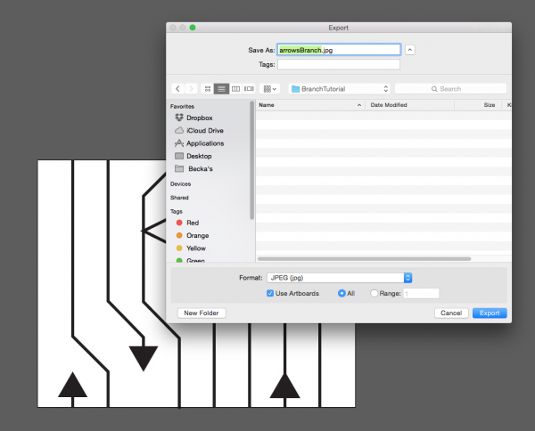
I am going to save it as a .jpg and check the box that says “Use Artboards” which will crop it to fit the tile (in case I have anything that hangs over the edge.)

In Part Three, we move to Photoshop to add color and texture to the design.

More in this series: Part OnePart TwoPart ThreePart Four

arrowsPin

26 August, 2015

Jerome Grant Projects: Duet #2

2015-08-26T16:41:27-05:00An Artist's Life, Everything Else, Gallery Exhibitions|Comments Off on Jerome Grant Projects: Duet #2

My second project for my Jerome Grant is all about the story.  My partner Dawn and I have been friends since the 7th grade.  Dawn is now a professor, teaching art at a community college.  She isn’t a digital or fabric person at all; she gravitates towards printmaking and book arts.  I thought it would be fun to go “offline” with Dawn and write a series of postcards to one another.  I bought several packages of blank cards and a bunch of stamps and we mailed our conversation back and forth with one side of the card for words and one side for a sketch of something. She block printed, I water colored with tea and we talked about art.  Why do I hate working with the color red?  Do you have a “go to” doodle that you always draw when you don’t know what to draw?

Dawn really inspired me to do something hands on and get away from the computer a little bit.  So I started a series of designs based on cut paper collages made from found paper and junk mail.  I now have about 6 designs based on that idea and I am really loving that whole set of work.  We talked a little at the beginning of the project about making a garment that told a story. Could a dress be a book?

dots 2


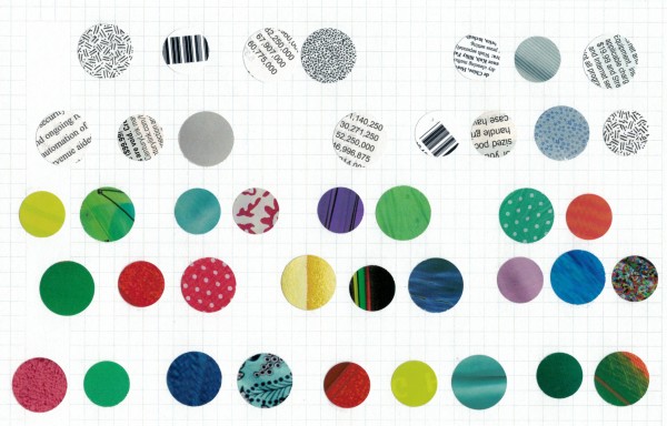
This design is the base I started from.  Two sizes of circle punches and a stack of catalogs and envelopes.  I made 4 like this that became the final fabric design.  They alternate between bright colors with no text and grey/black/white with text on them.  I wanted to incorporate text into the design to refer to that book idea, but I didn’t want it to be a literal story that you would read.  So I used text as a design element throughout.

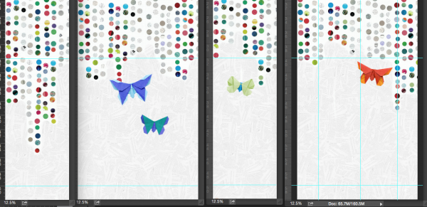
What kind of a story would a dress tell you?  It would have to be a “choose your own adventure”, where something you would do would be like turning the pages of the story.  So I created a text design from a torn up choose your own adventure book from the thrift store.  More text, but used in a textural way.  That is what makes the texture on the hem of the dress, which is shown here.  This is a screenshot of the actual dress panels as I was working on them.

Screen Shot 2015-07-15 at 12.23.23 PM


The origami butterflies came next.  I had made some fabric butterflies as a way of using up some pretty scraps for a show early in the spring.  And I loved that this design was evolving entirely from paper, so I made two kinds of butterflies.  These above were folded from origami paper and photographed to be layered into the design. And then I made 3-D fabric origami butterflies that embellish the dress.  (I have an affinity for origami butterflies.  My engagement ring was an origami butterfly folded from shiny silver paper.)

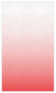
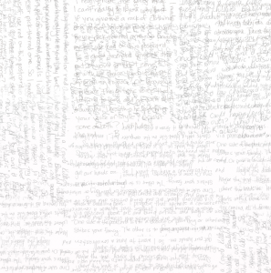
Finally I wanted to get our postcards incorporated into the design, so I scanned the text from several and created a final text design that is our handwriting with a color gradient over top.

Screen Shot 2015-08-26 at 4.31.11 PMScreen Shot 2015-08-26 at 4.31.48 PM

This design was printed on 2 yards of silk crepe to make a “scarf”.

Where does the “choose your own adventure” come in?  The dress is designed to be rearranged by the wearer.  Like a magnetic nametag, the fabric butterflies have neodymium magnets stitched to the back and another stitched to a felt backing.  The magnets let you put butterflies anywhere you like.  Up over the shoulder, all along the hem.  They also hold the scarf piece in place, so you can add a cowl back or an extra strap or a hood or a piece draped grecian style.

This one is called “Choose Your Own Adventure”.  (And I will post finished photos also after the show has opened.)

25 September, 2014

Digital Design Tutorial: Faux Batik Part Two

2016-03-16T09:45:41-05:00Everything Else|Comments Off on Digital Design Tutorial: Faux Batik Part Two

This is the second post in a series: a digital fabric design tutorial making a faux batik print.  Yesterday I painted some batik-inspired designs on paper and today I am going to show how to scan and clean up the designs.
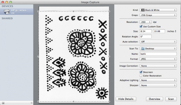
Screen Shot 2014-09-24 at 4.55.55 PM

Part Two:  Scanning and preparing your paintings

This (above) is the program I use with my scanner.  It’s called Image Capture and is built in to the Mac.  You can use whatever scanner software you have – they are really pretty much the same.  I scanned each page of my paintings.  I chose to scan them as black and white at 200 dpi.  (This scanner software has a drop down menu with defaults set, so I couldn’t scan to 150 dpi exactly as I mentioned in the previous post.)  I scanned the whole page and then saved it.

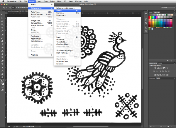
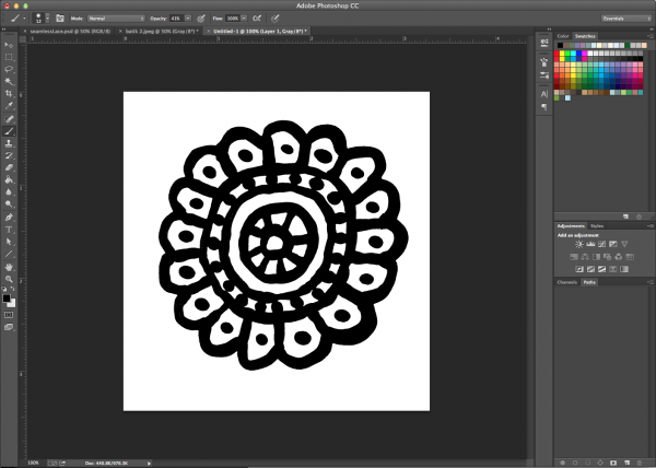
Next I opened up the scanned painting in Photoshop to do a little touchup.  I am going to adjust the Levels in my design, which basically makes the blacks blacker and the whites whiter.  It will help smooth out anywhere where the paint was uneven or lighter and get rid of a few smudges on the paper.  In Photoshop I choose the Image menu, then Adjustments, then Levels.  You don’t have to do this in Photoshop.  There are a number of really great (and somewhat more affordable) graphics programs out there that have tools that do the same things.  The tools are sometimes labeled slightly differently, but if you are willing to experiment, you can usually find a tool to do what you need.  (Photoshop is 100% worth the price, but I get that not everyone can make that work for them.)

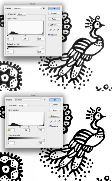
Screen Shot 2014-09-24 at 4.58.38 PMHere’s a side-by-side comparison before and after I adjusted Levels.  You can see in the tool box that I dragged the triangle sliders under Input Levels from the outside edges towards the middle until it looked right and then clicked OK. Here’s the simple techie explanation for what’s going on.  Look at the Levels tool box. The left side of the controls (black arrow) adjusts the blacks and the right side (white arrow) adjusts the whites.  All of the colors in the image fall somewhere between black and white and that’s what the spiky mountains in the diagram are showing you.  There is a lump of blacks – they are spread out because there are a lot of variations in black in our painting.  There is tall spike of all the whites, which are all very similar.  When I drag the arrows, I tell Photoshop that anything to the outside of those arrows should be all the same.  In otherwords, I tell Photoshop to make all of the blacks to the outside of the black arrow just be pure black.  That gets rid of any cloudy/grey/faded parts of the design and makes it pure black and white.  Now that you know what the tool is doing, don’t be afraid to slide the arrows around and see what happens.

levels


I wanted to work with just one element at a time instead of the whole page, so I cut out one of the elements using the Lasso Tool to draw a loop around it and select it.  Then I used Cut & Paste to paste it into a new blank document.  I saved that rosette as a .jpg all by itself.  I repeated the select, cut and paste steps for all of the design bits on this page and saved them all in a folder together.

Screen Shot 2014-09-24 at 5.00.56 PMIn the next post, I will show you how to convert these designs to vector shapes, but I wanted to talk a little first about why I am going to do that.  Just adjusting levels is enough to make these look pretty great and I could just go on cutting and pasting to make a whole design with new big canvas in Photoshop using these exactly as they are.  That is a great way to do it.  But, I want to bring everything over to use as vectors for a couple of different reasons and those are things that are really hard to do in Photoshop.  First, I want to make repeating patterns with some of these elements.  Illustrator has a killer pattern tool. Next, I want to be able to play with the colors on these a whole bunch – I don’t want to make a black and white design and I think that is going to be easier to work with in Illustrator.  Finally I want to combine a lot of these smaller elements into bigger ones, and I think copying and manipulating them will be easier in Illustrator.  Stay tuned for more.

More in this series: Part One • Part TwoPart ThreePart FourPart FivePart Six

batikPin


Go to Top