I’m a new Skillshare Teacher!
I’m super excited to announce that I have my first class available on Skillshare.
This is something I’ve been working on and thinking about for a long time. I’m absolutely going to continue teaching in all the places you love online and in the community, but I have been looking for a way to get my classes in front of more people. Social media algorithms are impossible for independent makers like me to get things seen by new people and I thought that Skillshare would be a great place to find potential students who were already looking for classes. Accessibility is an important value to me, so I didn’t like the idea of students only being able to participate via a paid subscription, which is why I’m really happy to add this as one more way to be able to offer lots of different classes in different ways. Students have asked me for years if I am on Skillshare and I can finally say YES!
Since I started working on my first class, I have watched a bunch of other Skillshare classes and I am enjoying them a lot! The way Skillshare works is that you get an annual subscription and you can participate in as many classes in as many different topics as you want to. I’ve watched classes on video editing, watercolor, sewing sock gnomes, and bookbinding. There’s a brand new teacher that’s doing one about seed saving that looks interesting and I am just waiting for that one to launch. Teachers have to audition to teach on the platform, so you know that they are pretty passionate about what they are teaching. It was totally intimidating making that intro video and hoping it would be good enough!
I also believe in transparency. Part of the way my class gets seen on Skillshare is through interaction, which means I have to tell people about it. So this is a referral link that says I sent you there, which helps Skillshare see that I am doing my part to promote my classes too. That also gets you a free 1 month trial (think of how many classes you could take in a month!) I would love it if you would interact with my class there in any way: bookmark it, register, follow me as a teacher, sign up for the trial. Everything helps show the algorithm that people are interested!
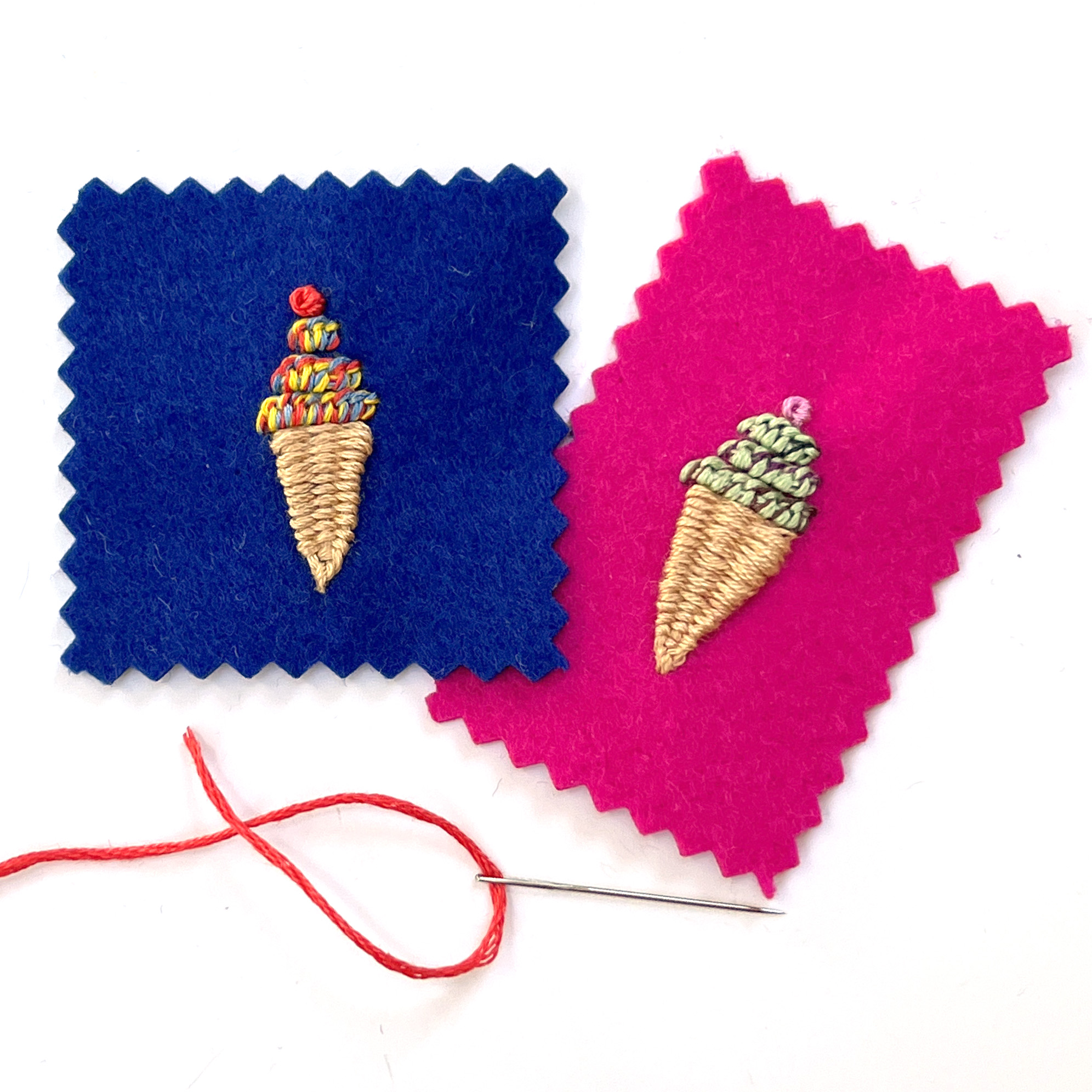
Why did I start with Embroidered Ice Cream Cones? Skillshare put out a list of their most requested classes and hand embroidery classes were on the list. These ice cream cones are a fun project that’s not just a boring beginning sampler of straight lines of stitches. I think embroidery lends itself to online classes so well. You can really see how to make the stitches close up and you can repeat the video as many times as you need to see how something works. I’m already thinking about the next class. I think it might be a pond with waterlilies and lilypads. What would you like to learn?