5 March, 2018

A whale of a design.

2018-03-05T18:32:04-06:00An Artist's Life, Spoonflower & Fabric Design|Comments Off on A whale of a design.

I think it’s fun once in a while to talk about a design and how I put it together. When I teach classes, this is an exercise that we often do: deconstructing a design so you can understand how it goes together.

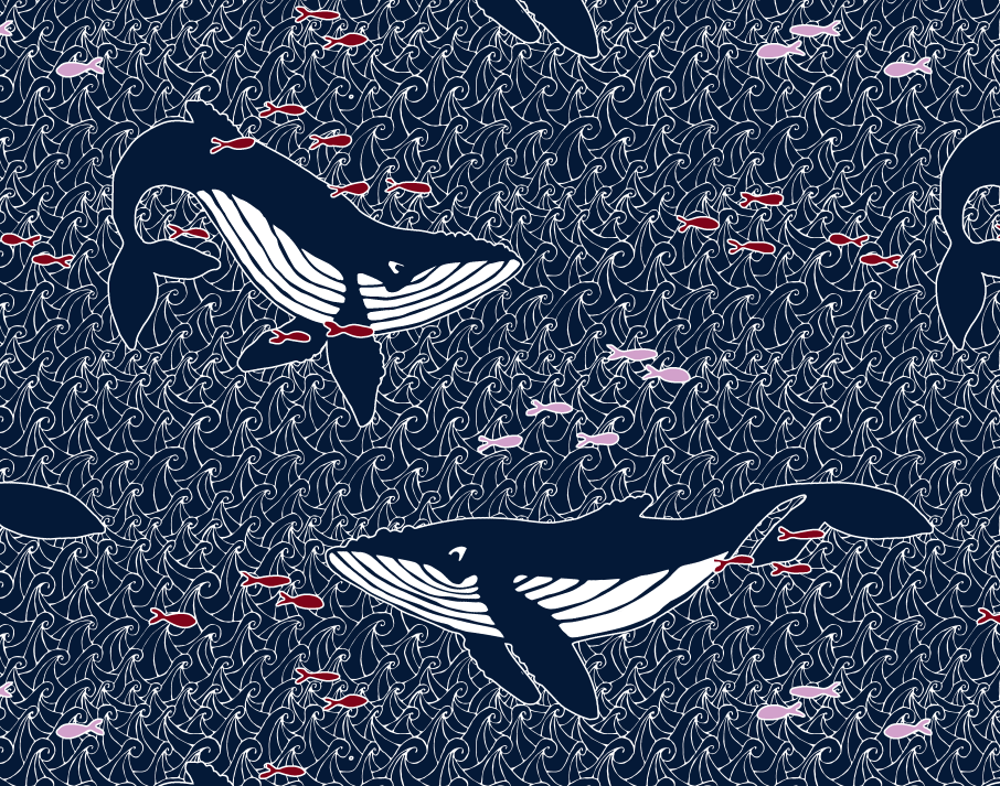
One of the recent design challenges at Spoonflower was a limited color palette design. There was no theme, just a set of colors to use in your design: navy, orchid pink, maroon and black or white. I am not sure where my humpback whales inspiration came from, but when I posted the challenge on Facebook many of you also had watery/nautical suggestions: lighthouses, coral, semaphore flags. So we were all on a similar wavelength. I didn’t actually love this color combination. I am not a real fan of red and I do not like that orchid pink at all. So I knew I had to do a design that was primarily navy.

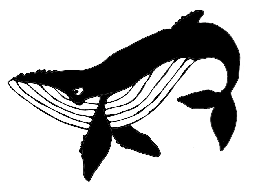
I decided to draw the whales by hand. I like to draw on plain cardstock and for this I used a black rollerball pen. I drew each of the whales on a separate sheet and didn’t worry about what the repeat was going to look like yet. I only drew the outline and filled in the solid black part of each one in Photoshop. (It was easier to do it that way than color it in with a sharpie.) For inspiration, I did a google image search of humpback whales. I like to bring up a bunch of pictures, spend some time studying them and then go draw without the photos in front of me. Details I noticed about humpbacks were the distinct stripes on their bellies, bumps on their “nose” and fins, and the fact that I think they always look like they are smiling. I scanned the whales after I drew them.

For the background I looked up a repeating “zentangle” pattern on Pinterest and sort of followed the directions. I wanted the background to also be handdrawn to match the style of the whales. I drew it originally in black on white, but realized as I put this together that I needed it to be white lines on a dark background, so I ended up using the invert filter in Photoshop once I had it all done.

The most time consuming part of this was making that background pattern seamless and matching up all of the lines so you couldn’t see breaks or gaps. If you have done any experiments with seamless patterns, you have probably seen tutorials about cutting a piece of paper and taping it back together again to make a seamless pattern. I just watched a Facebook Live post by Spoonflower doing this same technique. That’s exactly what I did with this one, but I realized after I did it that it is nowhere near as easy as those tutorials make it look. (Spoiler alert: I am planning to make that the focus of my next online class: how to finish a design done that way and why it sometimes still doesn’t look seamless.)

When I layered these elements together (waves, whales, fish) I realized that the fish and whales needed to pop out from the background just a tiny bit more, so I added a white stroke (outline) around all of them.

I didn’t worry about arranging all of the pieces until I had the colors and layers all figured out. There’s a lot of math/planning to do when you are figuring out how to make layers work together. My waves background was drawn on an 8×10 rectangle, so the rest of my design also had to fit proportionally in an 8×10 rectangle. (I wouldn’t be able to make it a square without distorting the design or cropping, which would make it no longer seamless). I did a lot of tests to check the repeat on a much larger canvas to make sure I liked the way it was repeating and about midway through I drew a few more fish because with the very large whales and very small fish it wasn’t feeling balanced.

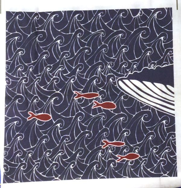
Here is the 8×8 inch swatch of fabric that I got to check out the design. You can see only a bit of a whale chin. I made this a large repeat, which seemed appropriate for whales so you can only see a bit when you only print a swatch. I think it will make really cute tote bags with just a whale or two on each side. I am planning to order some of this design on canvas later this week to try that out.

21 February, 2018

It’s never not about marketing. (More things they don’t tell you about being an artist.)

2018-05-08T09:38:17-05:00An Artist's Life|4 Comments

It’s been 3-and-a-little-bit years now that I have been doing this gig as a full-time artist instead of trying to squeeze in some art around a full-time job. There are a lot of things about it that I love and I am feeling like my system (Etsy + teaching + exhibiting/grant projects) is working for me and my little business is keeping me busy and sustaining itself. Let’s be honest, I am not making enough to retire on, but I am making enough to not need to wonder if I need to be out job hunting because I need the steady paycheck.

But one of the big surprises for me in this journey is realizing just how much of my time I spend marketing myself. (Spoiler alert: It’s way more time than I spend making art.)

The idea of going to a cocktail party and having to make small talk with people I don’t know is about the most horrible way I can think of to spend an evening. I hesitate to fall into the introvert/extrovert cliché, but I absolutely don’t enjoy social gatherings meant for networking. I would rather stay home and scrub the bathroom, seriously. But I have realized that as an independent artist, I pretty much need to spend some part of every week (probably more realistically, every day) in interacting with somebody I don’t know and telling them about me. Posting something to Instagram. Writing an engaging post on Facebook. Remembering to tweet something. Writing something thoughtful for my blog. Adding something to my Etsy shop. Planning out a newsletter. Going to a meeting. Pitching a new class. It’s like a series of tiny little cocktail parties looking for someone who’d like to chat. Every day.

Because the only way I get to DO projects/classes/sales is by connecting with someone and getting my stuff in front of them.

According to all of the marketing gurus and “10 steps to being a successful artist” posts out there, I am pretty much doing all of the right things. I have an email list. I have an up-to-date website. I post on social media as much as I can stand to. I co-wrote a book. It’s even ranked #15 on Amazon’s best seller list for Books > Crafts, Hobbies & Home > Crafts & Hobbies > Needlecrafts & Textile Crafts > Fiber Arts & Textiles. (Which sounds more impressive than it is, I think.) I do the rounds of local shows and have taught at a bunch of national fiber art conferences. I’m doing the stuff I am supposed to be doing. (I’m not always doing it great, but I am doing it.)

There is a marketing tenant that says that 80% of your social media presence should be “lifestyle”. Things that are related to the brand you want to convey but aren’t all all “me me ME!” posts. People get bored with “buy my thing” posts all the time, so you have to engage them in other ways. I totally get that. I unfollow accounts that are constant sales announcements and I bet you do too. But there is also another marketing rule that says you have to get your stuff in front of people 7 times before it makes an impact. ie. You would have to see my zipper bags on Instagram seven times before you would be motivated to do something (click through, buy one, share it or whatever) If we do the math on all of that quick, that means I need to post 28 things that are not zipper bags (and not necessarily about me but about the lifestyle) for every 7 posts that are that zipper bag. I am just exhausted typing that sentence.

Instagram and Facebook have also recently tweaked their algorithms for what posts you get to see as a follower of someone. Both are favoring posts that generate interactions. Instagram even goes so far to say “meaningful interactions”, which means a comment of more than 4 words and not just “great post!” or “love it!” You have to actually type a complete sentence. On average when I post something, only about 20% of my followers see it. I think. (It’s difficult to track down a real number and understand what all of the stats are really telling you.) And according to the new Instagram info, if the 20% of the people that see that post don’t interact with it, the algorithm won’t bother to show it to the rest of you. Don’t you love algorithms?!?

Why am I telling you all about this? Because I really think it’s important to be real as an artist. I think it’s easy to be just getting started trying to get your art out there and to get really discouraged. It is HARD to put yourself out there and have it feel like no one cares. I know so many people who enthusiastically started an Etsy shop only to get discouraged after four months and let it drift off into internet-oblivion because they couldn’t get any momentum. I get discouraged too. All. The. Time. So many feeds are so highly curated, polished, and perfected that it makes many things look easy. And those “10 step” marketing plans make it seem like if only you followed directions, you too would be an instant success.

What might not be obvious is that the perfect looking picture that you are seeing in your feed could only be making it to 10 people. You probably don’t think about it when you click, but every time you click that “like” button on one of my posts, I see every one of those clicks. I get a report of stats and percentages and engagement and so on from every one of those platforms telling me how many of you are willing to chat at the cocktail party. By liking something, you are telling the dumb algorithm that maybe it should show that post to other people who follow me too. Basically the algorithms favor the people who are already established. Instagram and YouTube even limit features available to you if you have fewer than a certain number of followers. That means if I don’t already have lots of people liking and commenting, then it won’t show it to other people who might want to like and comment. The algorithm makes it harder. It’s not just you doing it wrong.

Comments are like a gift. I read every comment. I try to respond to every one. (I don’t always catch them, but I try.) A share of a post is like winning the prize on a scratch off lottery ticket. Why? Because that part of the job is way harder than making the art. Your share just bought drinks at the cocktail party for 200 people I’ve never met before. Woohoo! I am putting together a set of new classes right now and the part I worry about isn’t the prep, the teaching, the photos or the pricing, but the marketing. How do I get the word out there to the right people that this thing is happening?

I want to know. What’s the hardest part of getting your art out there? What do you wish was just a little easier?


29 January, 2018

I think I forgot to eat breakfast this morning.

2018-01-29T18:20:05-06:00An Artist's Life, Classes & Teaching|Comments Off on I think I forgot to eat breakfast this morning.

You’d think by this point in my life that I wouldn’t miss things like this, but there it is. I was focused on a project (taking photos for some new classes) and then I had a meeting to run to and I am pretty sure I didn’t even finish my cup of tea. So then this afternoon, I was kind of scatterbrained and not very focused and suddenly I realized that all I have eaten today is a bowl of lettuce and a hard-boiled egg. That explains a lot.

Forgetting to fuel up, in the metaphorical sense, came up in a couple of conversations today. Back in the late summer, when it was time to schedule teaching gigs for this winter, I was 100% apathetic. I scheduled almost nothing. I was busy and the thought of scheduling one more thing was just completely unappealing, no matter how far away it was on the calendar or how easy it was. They were all classes I had taught before and venues where I know all of the quirks. I was so bogged down in the boring details of contracts, descriptions and logistics that it was just easier to say “no, I’m just too busy” and know that I was really just bored.

And that was kind of the conversation that we had today. Being so caught up in the “getting it done” part of your job, that you don’t have time for the reason you were there in the first place: because it is something you love.

Just a couple of weeks ago, I taught a class at a new venue to a new group that I haven’t worked with before and it was like a breath of fresh air. It was a beautiful space, the class was engaged and asked good questions, and the things that went wrong (like wonky wifi) were things I am well prepared to deal with. (I can’t tell you how many classes I have taught tethered off my phone.) I am booking some new classes at some new to me venues because I realized that I needed to get out of my rut, go to some different places and talk to some new people. I need some new fuel.

That design up above is another source of fuel I have discovered: the Spoonflower Design Challenge. I have been a huge fan of the challenges for years, but rarely took the time to participate. I decided that designing more was a goal for me this year and this has been a great motivator. I like deadlines. That’s a little detail of my design for the “origami” theme this week.

What has been bogging you down lately? Have you found some new fuel to get you going?

10 January, 2018

Out of step with the trend

2018-01-16T08:37:14-06:00An Artist's Life, Gallery Exhibitions|6 Comments

Last year I applied to a bucketload of exhibitions. It’s a thing you do when you are an artist. When you get well-known enough, you start to get invited to things, but when you are still “emerging”, you apply to juried shows so that you can get your work in front of people. I applied to a variety of things: exhibitions with themes, ones limited to specific media, ones showcasing “craft” instead of focused on fine art. I applied to two that were specifically about the crossroads of technology and art (which I think my art is a great example of). I applied to some that friends told me were “made for my work”. I never know quite where my work will fit, so I applied to a lot of different things.

I didn’t get in to a single one.

This isn’t terribly surprising. You get a lot of rejections in this business. I don’t take it too personally. But these applications take a lot of time and money. Each one has a form to fill out, a statement to write and images that always have to be edited to be a specific format (and no two are ever the same). It takes a couple of hours to apply, even if you are super prepared and have your resume and artist statement up to date. And they always have a cost. Each show has an associated fee of $25-$50 to apply. I have been on the administrative side of juried shows and I totally understand why they do this. There are costs involved to putting a show together and this is an easy way to offset it. But on the artist side, those fees add up, with no good way for me to recoup those costs. IF I get into the show, I might sell a piece and defray it somewhat, but one sale isn’t going to probably add up to $300 worth of application fees. And not every venue encourages sales.

So I decided before I applied to anything else, that maybe I would take a look at what WAS getting in to these shows and see if I could get a feel for what the trend is. So I went back and looked at some of the websites and announcements for some of the things I applied to. Several organizations that are considered to be leaders in the fiber art/craft field have also recently published posts about “10 exhibitions to not miss in 2018” and the like. So, I looked at the images that were being used to talk about these exhibitions too.

I absolutely see a trend.

I pixellated this image on purpose, so it’s not just a lousy internet connection making it blurry. I took screenshots of the images that were being used as the promo for a big variety of those “don’t miss” shows and things I had applied to. I pixellated them because I don’t want to call out or disrespect any specific artist, juror or show, because it isn’t about the specifics, but I think you can see the trend I am talking about.

There is a whole lot of neutral there.

If I were to also give you some adjectives to describe the common elements I see from this group of images, I would choose: eroded, aged, uncomfortable, sparse. At least two shows had pieces that were almost creepy with altered baby doll faces. Many objects were distressed, grungy, earthy feeling things. And I am not saying any of these adjectives are bad or negative, just that these were very common elements from show to show.

My work matches none of those adjectives. It is colorful, retro, graphic, quirky.

With one exception, I also didn’t see a single wearable garment as a featured image for any exhibition. There was a little bit of jewelry and some sculptural pieces that were garment-like. (The exception was a “don’t miss” show of Native American weavings from a museum of folk art.)

It’s actually difficult to find exhibitions that will even take wearable pieces. They are often ineligible, with no reason given. I expect it has something to do with not wanting to bother with dress forms.

So, it seems that I am out of step with the trend.

That leads me to wonder. If I took one of my garments and gave it the Cinderella-after-the-ball treatment, would it get a different response? Desaturate my colors and distress and deconstruct the piece. Would that make it more appealing to the trend? Does that make it more “art”? Do I want to do that? Is that even my work?

The answer is that I think I am not going to bother with juried shows for a while. Maybe they just think my work is terrible. Fair enough. You never get any feedback from this process, so it’s hard to tell what they are thinking. But juror after juror seem to be choosing the same kinds of other things, which are not what I do. So maybe that just means it’s time to take a break and put that time and money to different use.

I also wonder: Where exactly does my work fit? Maybe I am looking in the wrong places and I need to think about that some more too.

The “fiber art” people tell me that I am cheating because I use computers and technology in my work. (I have had other fiber artists tell me this to my face, so I know this is a real thing.). The “fine art” people don’t consider fibers a fine art form; they think I belong in craft. The “craft” people aren’t sure what to do with my focus on surface pattern; it’s too much like art. The “wearable art” people tend to favor more sculptural or conceptual. The “digital surface design” people are all about pattern and licensing and not about using your own patterns to make art. Again, I am not disrespecting or complaining about any of these groups, just looking at trends I’ve noticed and feedback I have gotten. I am not sure where I fit.

A friend of mine was recently passed over for an art-related opportunity and the feedback she got was she didn’t have enough “fine art” teaching experience, despite the fact that she is a skilled and much experienced teacher of fiber and paper arts. Let’s just say, neither of us agree with that particular piece of feedback. She’s struggling to find a fit as well.

I’m curious. What trends are you seeing in the shows you have attended, viewed, applied to or participated in? Do you love the trend? Tired of it? What do you wish you saw more of?

(Edited: also check out the comments at Facebook. some great discussion)


2 January, 2018

Goals are better than resolutions.

2018-01-02T12:39:37-06:00An Artist's Life|1 Comment

I’ve never been one for New Year’s Resolutions. It always seems like they are looking backwards: here’s what I did wrong last year and how I am going to fix it. I think New Year’s Goals are more positive and productive. Here are the things that I want to do in 2018 and why.

Design more of my fabric.

I did basically no fabric designing just for me this last year. I did a lot of projects directed by other people, as partnerships or as samples for classes. They were some awesome designs that I am really proud of, don’t get me wrong, but they were constrained or influenced by people who weren’t me. I need a little more room to explore with me as the head of the expedition.

Sales of my designs on Spoonflower picked up this year and that’s really fun. For a number of years, I was working on designs for the Spoonflower book or other projects and so 90% of my designs were private for one reason or another. If you searched me out on Spoonflower there was almost nothing there to see. I added a few new things this year, like my Screaming Hairy Armadillos collection, and I would like to do more of that. With that in mind, my goal is to release one new public design every week this year. That’s pretty crazy ambitious, but it is something I know I procrastinate really easily because it’s something without a client or a deadline. So I think if I give myself an ambitious goal and state it right here publicly, I am more likely to make it happen.

Embrace the oboe.

No, I am not suddenly taking up a musical instrument. (I played clarinet and saxophone in high school and college and took organ lessons for several years as a kid. I have already checked that off my bucket list.) I designed this oboe fabric in 2009 to make some tool bags for my husband, who does play the oboe. It was the first “collection” I designed with three coordinating prints. “OboeBlues” has consistently been one of my most popular designs and I have always meant to go back and make it in more colors and add some more coordinating prints to it. I have learned a lot since 2009. It is time to stop procrastinating that.

I actually started working on this goal this morning and I wish I could smack my past-self upside the head. I didn’t save any of the original layered versions of these or the original vector drawings I made them from. So I am re-creating them properly in layers so that I can change the colors easily and pull out elements to make coordinating prints. I am hoping to send those off to proof by the end of this week with three new colorways.

I am starting with fabric, but the goal here is to actually open an Etsy shop that is all about oboe. I already have an Etsy shop that specializes in geeky puns and mashups with fiber art, and I realize, as I have been evaluating the parts of my business that I really enjoy, that I love designing these little things celebrating the stuff that people love.

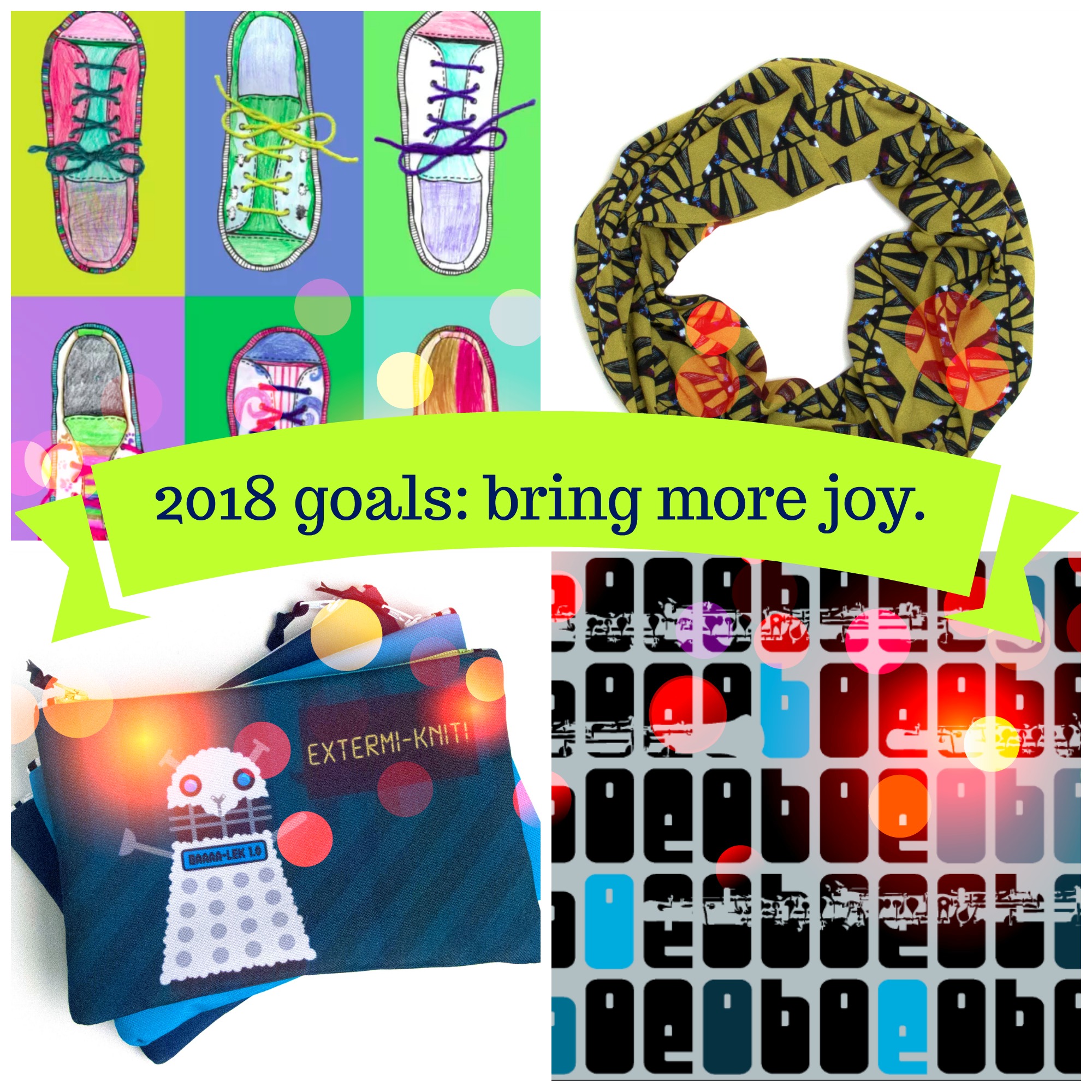
When I looked at my best sellers for 2017, it wasn’t just generic knitting bags, it was overwhelmingly knitting or crochet mashed up with sci-fi. So that’s what I am going to do with the oboe. Celebrate the oboe geeks! Having been married to an oboist for 20+ years, I am always looking for oboe themed stocking stuffers and little gifts and they just aren’t out there (or they are designed by people who think the oboe is just another kind of clarinet).

I realize that the number of you that are interested in these designs just dropped to about <8% of my readers. This is not the shop that’s going to be profiled in the “Quit your Day Job” Etsy shop articles but that is 100% not the reason I am doing it. This is why:

…our cousin (senior in HS) won our symphony’s Young Musician Award and was featured in a symphony performance. If that wasn’t enough, he also won the oboe chair in the Youth Symphony Orchestra of the USA. He will be playing this summer at the Kennedy Center and touring to London, Moscow and St. Petersburg. I’m going to make him a quilt to commemorate his achievements; using embroidery to call out his awards. You offer the ONLY oboe print online – so glad I loved it!…

That’s just one of the notes I have gotten from people who have bought that original OboeBlues print. That joy is exactly why I am doing it. So it’s not going to be just fabric, but bags and stickers and all kinds if gifts for your oboist.

Do the drudge work and like it.

I launched two new online classes this fall and I have another really big one that I am working on. The tangible goal here is to get that third class done and launched, but the more intangible goal is to keep up the momentum. I have quite a few people registered in that first class (thank you!) and I have a few registered in the second one (I LOVE YOU GUYS!). The classes were monsterous, epic amounts of work to put together: learning the new platform, writing the content, editing the video, developing the curriculum, marketing and so on.

It’s actually not drudge work at all, I really enjoy putting them together (more than I thought I would) but it takes a lot of time and it is easy to get super discouraged. I’ve been struggling with that. Logically, I know that I don’t have enough stuff ready yet. To really build momentum, I need more than 2 intro-level classes, I need a whole curriculum so that you have a reason to come back and take another class or ask a question. And I need to somehow make sure that you don’t forget about me in the meantime and forget to come back and take that next class. There is a lot of shiny out there demanding our attention. But it’s just going to take time to get there.

Embracing the theme.

As I was thinking about those three goals that I was going to publicly hold myself accountable to here, I realized that there was a bigger theme for all of the things I really wanted to do: bring more joy. 2017 was a bit overwhelming in many ways. The biggest thing I felt was dragging me down was all of the negativity I kept running into in all of my communities, both in person and online. Negativity, disrespect, apathy, competitiveness. By the end of the year, I had to pull myself away from a number of things and just focus on getting things done that mattered to me. So my goals for 2018 are going to be all about bringing more joy to my community.

Designing my fabrics brings me joy through expression and creativity. That artistic voice is really essential to who I am and I need to remember that I need to be my own director too.

Embracing the oboe is about bringing joy to others by celebrating the things they love. Those notes I get from oboe fabric fans or watching someone laugh and call a friend over to check out the “Extermi-knit” bag are moments of pure delight. We all need more of that.

Doing the drudge work is about empowering others to make their own joy. I am a teacher at heart and there is no greater reward for me than watching a student have that “ah-ha!” moment and figure something out. That’s why I teach classes, so that other people can have the joy in creating and sharing their creations. Paying it forward, one little step at a time.

The woven piece up above is a great representation of all of these things. I sent one of my small weaving looms to a friend with the “price” being that she had to weave something on it that I could show as a sample project. (I don’t love making samples, so I like to bribe friends.) She surprised me and sent me truly the most awesome sample I could ever have dreamed up: my logo woven on a loom I designed, handmade by a friend (of more than 30 years). 2018 needs to be more of that.


I want to know: Are you a resolutions person or a goals person? What are your creative goals for the coming year? Do you have a theme?

13 November, 2017

The answer is miniatures.

2017-11-13T00:26:54-06:00An Artist's Life|1 Comment

A few posts back, you probably saw our annual Halloween photo. My husband and I started doing photos about 15 years ago. We felt like it was dumb to send out photos in Christmas cards, so one year we sent out a Halloween costume photo instead. It was so much fun that it became an annual thing.

We come up with the top secret theme around late summer and figure out how to stage the photo in October sometime. They are nearly always taken in our basement photo studio with much creative reuse of furniture, sawhorses and velvet drapes. I always say that they are about 80% costume and 20% Photoshop.

This year our storyline was Newt Scamander (author of Fantastic Beasts and Where to Find Them, of the Harry Potter universe) interviewing a “fantastic beast” for his book. We hadn’t done a Harry Potter theme yet and it was fun to pick a less “main story” character. Newt has his own movie (which I like a lot) but I know that was not nearly as main stream as the HP series.

We thought about pixies or bowtruckles, but I decided that I wanted to be a mermaid. I didn’t want to make a mermaid tail that fit me, however. I thought about it and just decided that it would be 100% too much work. So we talked about it and decided that we would try to make the tail part of my costume as a miniature.

And there it is. The tail is about 10 inches tall and made from air drying paper clay, wire and some iridescent film. I googled and found a super detailed tutorial from a doll maker about how she made a mermaid tail from shrinking angelina film around a wire form and I pretty much followed her instructions. It worked pretty great and I loved the very organic texture of the slightly tattered holes in the webbing.

I didn’t want to deal with baking such a big thing in polymer clay, so I used paper clay for mine. It is an air dry clay and although I read a bunch of reviews that warned about it cracking and shrinking, I had neither problem. I let it dry slowly for about 4 days before I painted it. The texture of the scales I made with a drinking straw. I cut a snip off of the end so I had a half circle and carefully carved scales the whole length of the tail.

I painted it with acrylic paints. Golden Acrylics makes a series of interference colors that you can mix in with other opaque paint, so I blended my own mix of turquoise with interference gold and blue to make a beautiful iridescent.

We photographed the tail by itself against a piece of pale blue paper. Originally we photographed it against white, but we realized that the iridescent quality of the tail fin film was showing up very dirty gold against white paper. We spent some time being really frustrated trying to color correct that, but when we switched to blue and reshot it was so much better.

When we talked about creating a “set” for this scene, I wanted to be leaning on a sea wall with my tail flipped up and Newt could be sitting nearby to do the interview. We didn’t have a set piece, among the chairs and sawhorses that we often use, that was going to make a realistic looking wall, so we decided to make that as a miniature too. It is made from the same air dry clay and a bag of aquarium gravel. It was about 12 inches long and 2 1/2 inches high.

We built it on a cardboard base and decided to make an “L” shaped wall so we could adjust the angles to match our scene. The clay was white, so after this had dried, I gave it a wash of muddy grey paint to tint the “grout” between the stones. I tore off little bits of some sphagnum moss to glue on for some weeds and painted on some lichens with green paint.

We borrowed the wooden decking from a photo we took in St Augustine, FL. I think our ocean comes from a kayaking photo from Lake Superior.

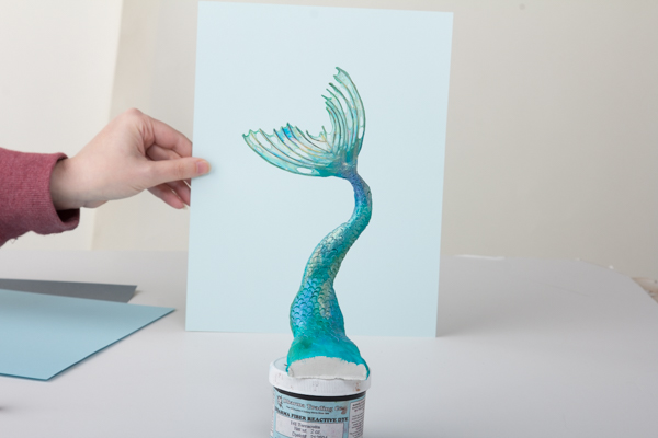
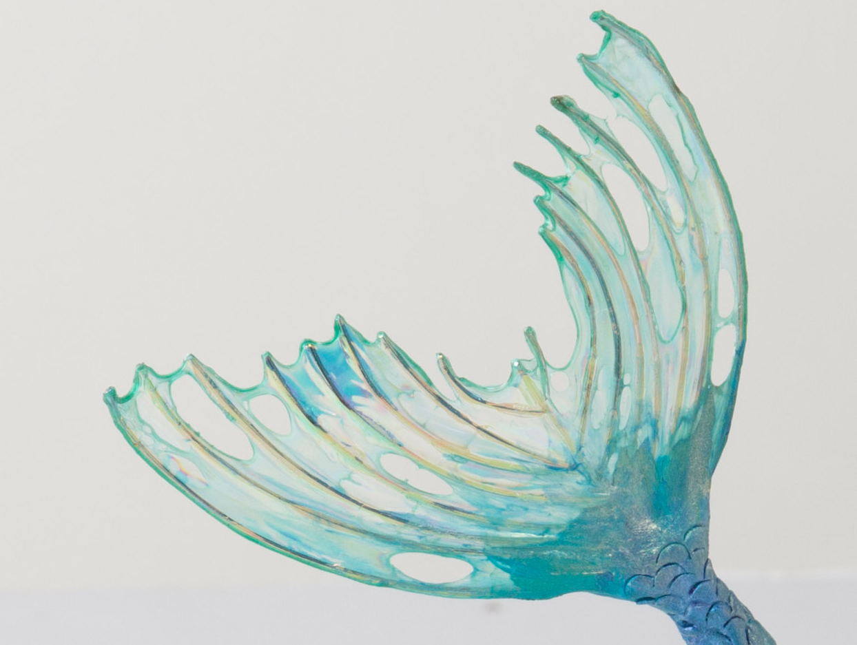
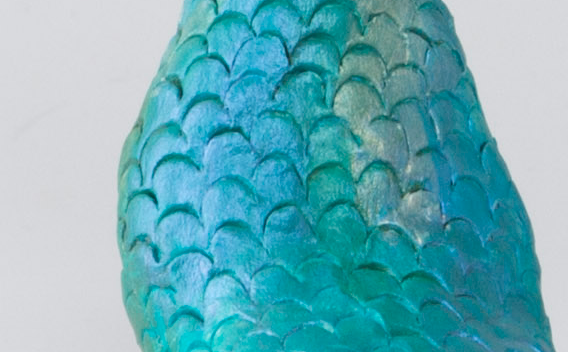
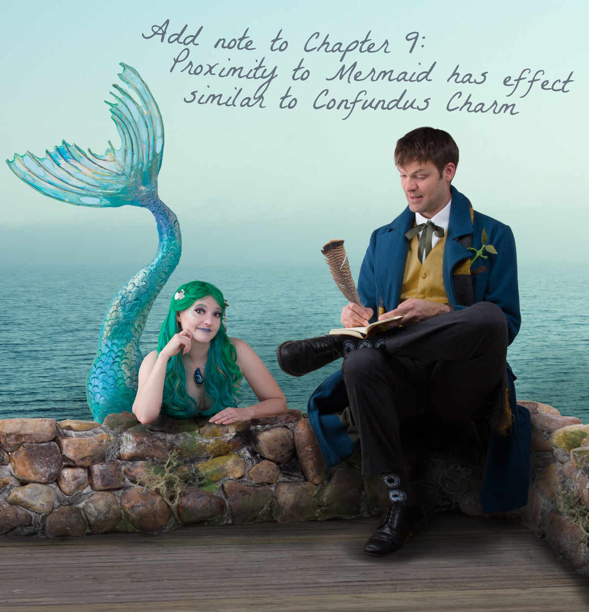
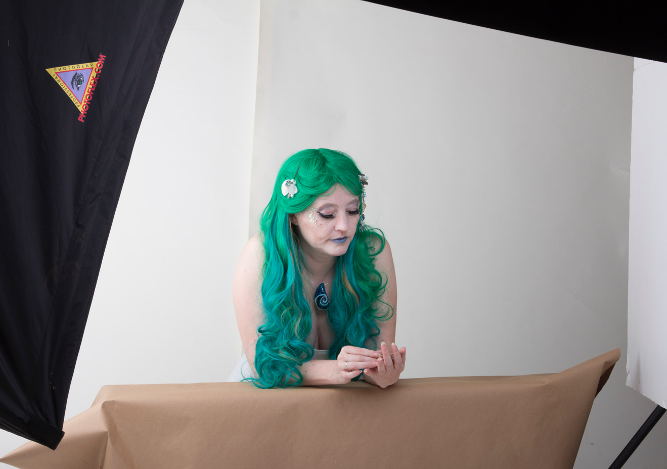
The photos of us were taken one at a time with pretty low-effort costumes. I had an awesome turquoisy-green wig, a few sequin scales glued to my face with honey, and some seashells on bobby pins in my hair. The honey sounds crazy, but latex makes me itch and many costume adhesives have latex. Honey worked perfectly for both the scales and to stick on some long false eyelashes. Andy’s costume was a lucky clearance sale find for the coat and bits and pieces of his own clothes. We recycled his vest from this year and toned down the color a little in Photoshop. I made the bowtruckle in his pocket from a piece of felt and a couple of pipecleaners. For the shots, I leaned on an apple crate and Andy sat on it, so we were at the same height and easy to assemble into one photo.

I already know what next year’s theme is going to be and it is going to have some fun bits and pieces to assemble too. It takes most of a day to shoot and assemble the photo, but it is one of my favorite annual projects.

Go to Top