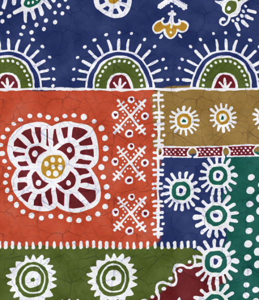
Part six of our faux batik journey takes us back to Photoshop.
I have all of the motifs for my faux batik laid out, I have my color palette chosen, so now it’s time to put the finishing touches on my design. This next bit might seem like a little bit of over-the-top, but I want to add a little bit of subtlety to this design, which is why I am going to go back into Photoshop before I add the final colors.
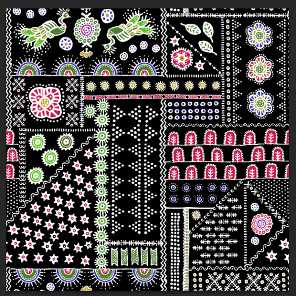
First I hide the colored background layer that I put in to help me lay out my design and I replace it with just basic black in my Illustrator file. This is going to make it really easy to do the design cleanup next. I export it, using the edges of my artboard or canvas to crop the design (getting rid of all the bits I left hanging off the edges). It looks something like this.
My first task is to make the edges of the design seamless. Since I have very organic shapes, the lines and shapes at the right side of the tile aren’t going to exactly match up with the things on the left side of the tile. But I want to make everything match up so there aren’t little flaws in the design when I repeat it. Photoshop has a tool called “Offset” that will wrap the design around and match up those outside edges so you can do the touchup work.
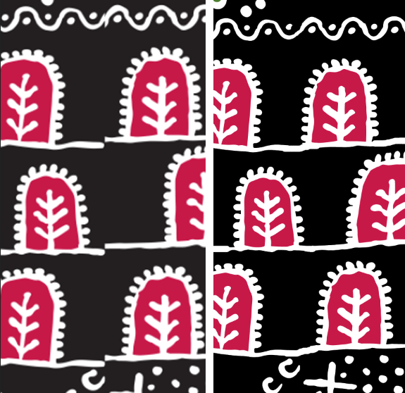
Here is one section of that matched up edge. I separated the black background from the other parts of the design and put them on two different layers. Then, I used a paintbrush and the eraser tool to carefully erase a little bit and redraw these lines to they seem to be one continuous line. I did this along the sides and top/bottom of the design and now I have a seamlessly repeating tile.
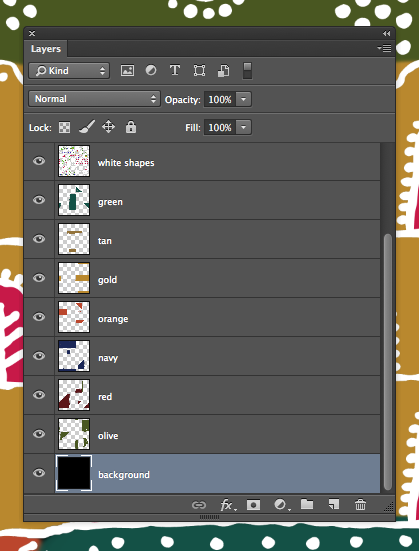
Now I want to add the background colors back in. I could have used the color blocks that I set up in Illustrator, but I wanted the edges where the colors meet to be a little less like a quilt block with straight lines and have a little more painterly quality. I also chose 7 colors for my colorway, where my mockup had only 5. Leaving my white batik shapes as the top layer and the black as the bottom, I added a layer in between for each of the colors in my colorway. I used a big paintbrush with a little bit of a soft edge to paint in the background colors where I wanted them in my design. Using a paintbrush allowed me to let things bleed a little outside the lines and to keep the more organic look to match my batik shapes. By putting each color on it’s own layer, it was easy to tweak the colors if it ended up that I didn’t like one of those colors I chose for my colorway and it will be really easy to make another colorway of this design this way (which I am planning to do!)
Finally, my white layer had some of those placeholder colors in it that I used to fill in some of the shapes (like the arch shapes above). To make those fit my colorway, I used a tool called Select Color Range which lets me click on a color and it selects that color anywhere it sees it on the screen all at once. So I could click the placeholder red and replace it with the red from my colorway.
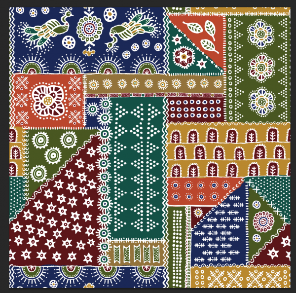
Here are the finished colors painted in.
It took a couple of tries to get everything to feel like it was balanced and to make sure that I didn’t have any colors too crowded together. The next little bit of subtlety I wanted to add was a little bit of a hand-painted or hand-dyed effect, to make the background colors look less flat and even and perfect. I tried a bunch of different techniques to achieve this: painting with different brushes, playing with opacity and flow, but they were all a little too heavy-handed. Finally I found the effect I wanted. I added a layer on top of all of this with a filter called “Clouds” in a contrasty dark and light.
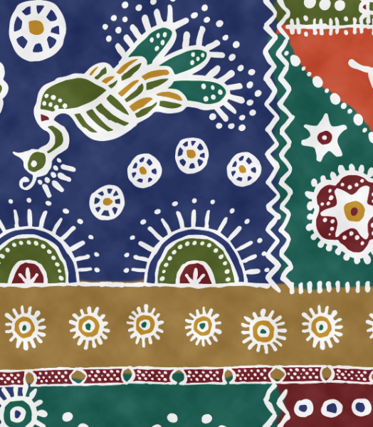
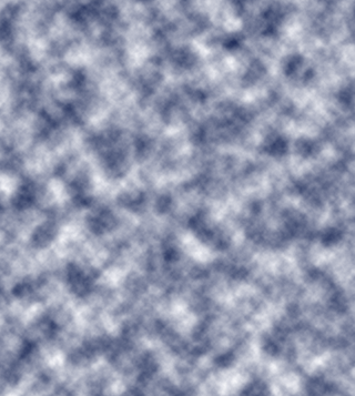 Then I made this clouds layer adjust the luminosity of the design instead of just layering on top. Luminosity is like the light shining through piece of paper, but it gave my just the effect I was going for: areas of lights and darks, without changing the colors of my design and making them muddy grey or washed out. Here you can see that effect:
One last effect and my batik is finished. For the last subtlety to really make this look like a batik, I wanted to add the distinctive crackled look that you get when working with wax. It took a lot of experimenting, but a photograph of a piece of marble gave me just the right pattern of cracks. I made this photo into a seamless repeat as well and added it as one more transparent layer on top of the design.
I have ordered a yard of this fabric to be printed and in a couple of weeks we will revisit the tutorial and see how it turned out!


