

This week Spoonflower replaced two of its standard fabrics, the Basic Cotton and Kona Cotton, with a brand new Petal Signature Cotton fabric. I am a Pro member of Spoonflower so I got a sample swatch a week or two ago and I wanted to write up some of my first impressions of the new fabric.
First, I want to talk a little about the retired fabrics. I hardly ever use Kona Cotton. It’s really a quilting fabric and I am not a quilter so I don’t have a lot of reasons to use it. I always thought it was a nice quality fabric, but I don’t have a lot more to say about it since I use it so rarely.
I have always felt that the Basic Cotton was exactly that: basic. I consider it to be something like dressmakers muslin; great for testing things but nothing special. It was relatively light weight and I always felt like the print quality was a little lackluster. The colors seemed a bit dull. All in all it was an absolutely fine craft fabric but I never felt like it was something I wanted to make a finished project out of. (Sateen was my go-to favorite cotton for that.) I have ordered a lot of Basic Cotton to test colors and print scale so I have a lot more experience with it than the Kona.
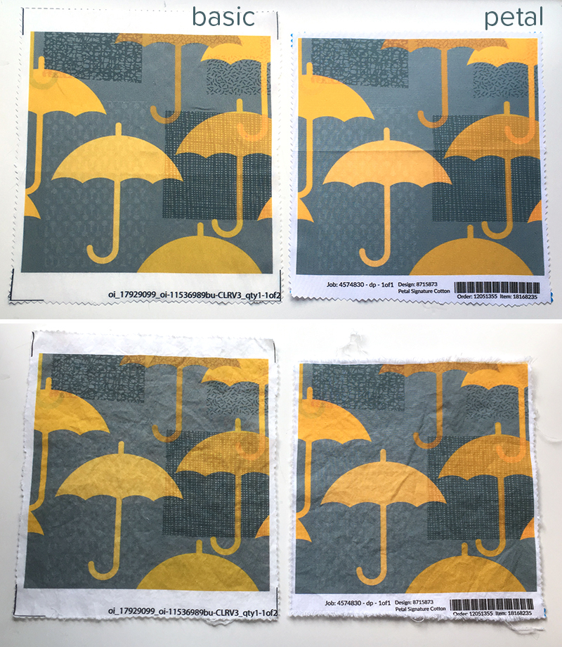
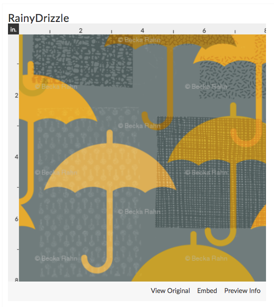 When I ordered my test swatch of Petal Cotton, I chose the same design I had just printed a few weeks before on the Basic Cotton. This Rainy Drizzle design was a design challenge entry of mine from the April Showers theme.
First Impressions
When I first pulled the swatch of Petal Cotton out of the mailing envelope, my first impression was how nice it felt. It has a very smooth texture and had a nice weight in my hand. According to Spoonflower, the new Petal is 4.3 oz per yard, where the Basic was 3.2 oz per yard. You can feel the difference. I even put the two swatches on my postal scale and it could measure a difference in the weight of the swatches. The new fabric doesn’t seem thick or heavy, but you can definitely feel a different density or something like that.
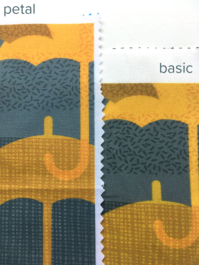
The next thing I noticed was that the new fabric is a brighter crisper white. Basic cotton never seemed not-white-enough for me, but you can see how much brighter the Petal is when they are side by side.
I think this fabric brightness effects the colors when you see the printing as well.
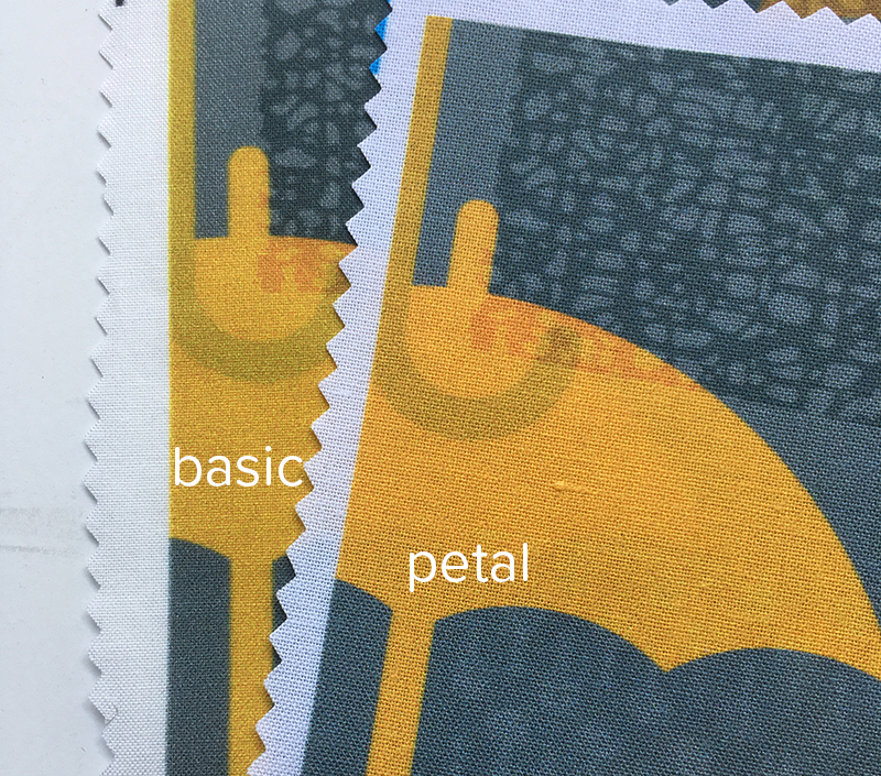
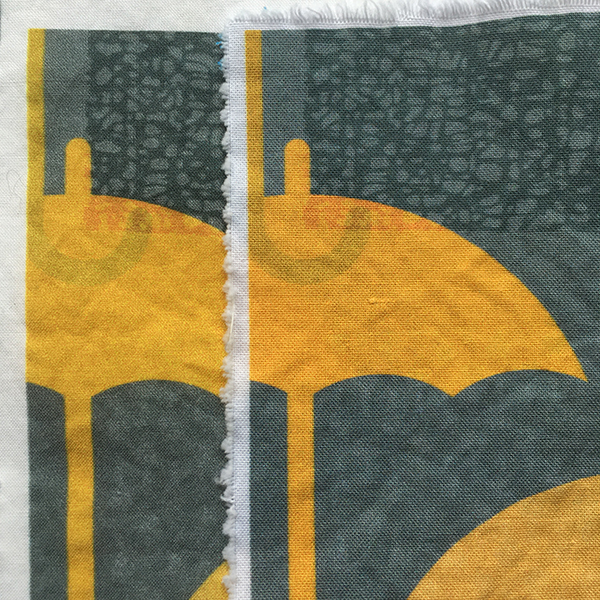
The color graininess that you can see in the yellow on the basic cotton isn’t something about the photo, it’s there on the fabric. The printing not only seems crisper and sharper on the new Petal cotton, but the colors have a little boost in vibrancy. I think you notice the sharpness especially on this design when you look at the U shaped hook of the umbrella handle above. Soft fuzzy edges on the Basic are much cleaner on the Petal cotton.
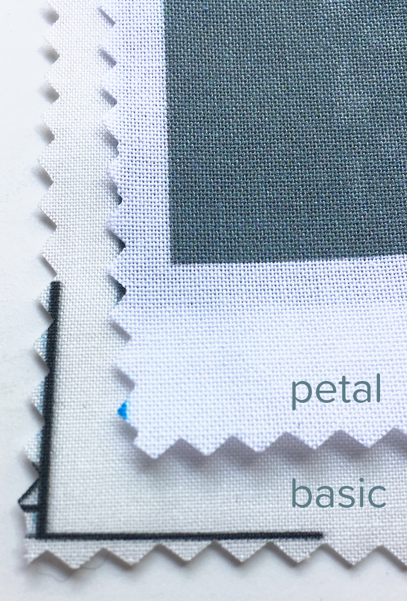
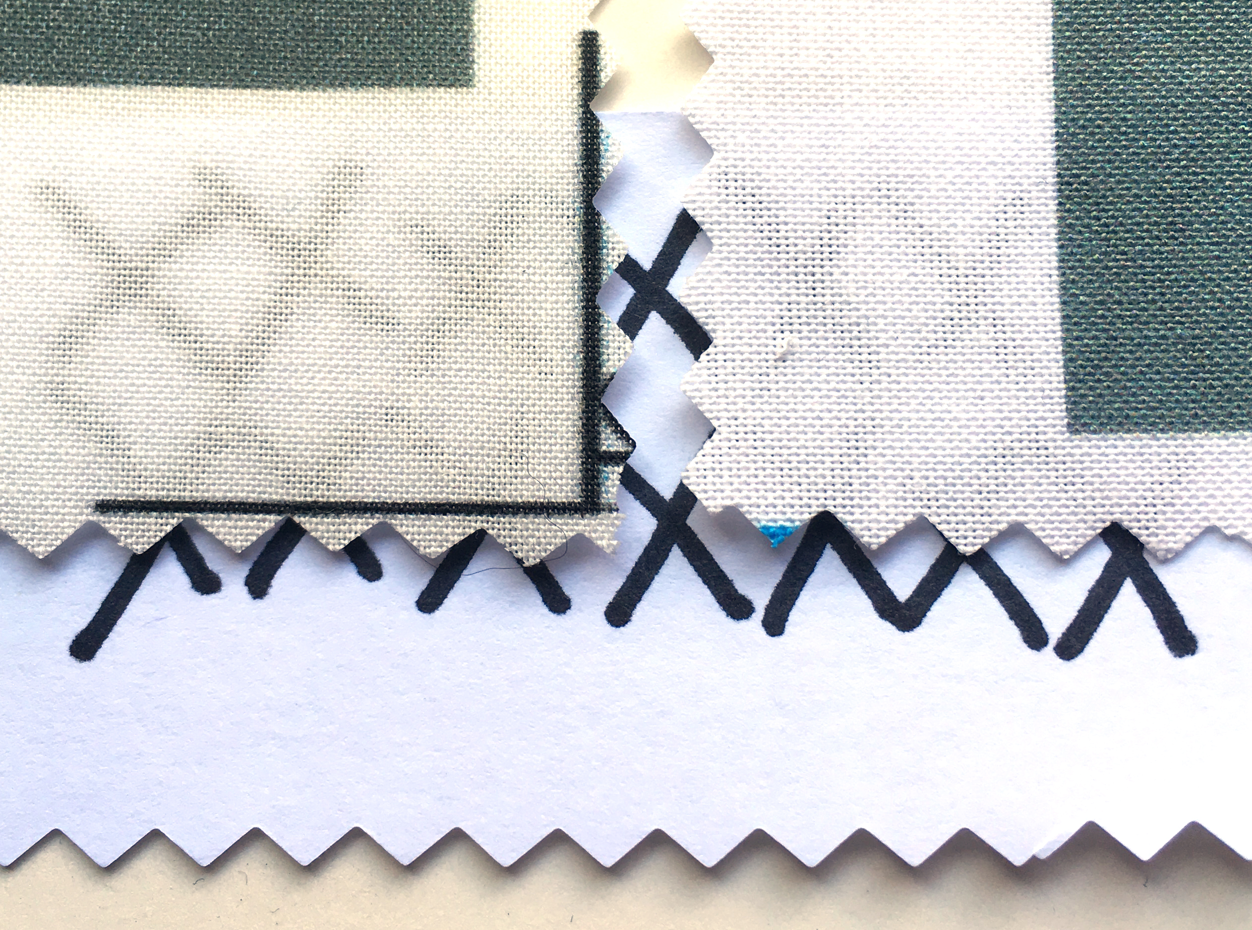
Next, I wanted to see how transparent the light colored sections of the fabric were, so I drew a bunch of Xs with a Sharpie on a piece of printer paper and slid it underneath the edges of the swatch. Both are slightly transparent, but the Petal (on the right) is possibly less so.
After Washing
I took both of these swatches and put them into the washing machine with a load of jeans. I figured that if anything would give them a real test of colorfastness, it would be tumbling around with jeans. I washed them in a regular cycle and put them into the dryer on hot. No special treatment. I didn’t iron them when I took them out of the dryer so you can see how wrinkly it is fresh out of the dryer. Neither one wrinkles significantly, which is nice.
I cut the edges with pinking shears before they went into the washer and I think the Petal Cotton frayed just slightly more than the Basic at those cut edges.
I don’t see any significant difference with the colors or saturation before and after washing. (There is a slight variation in the before & after photos above but that is due to the fact that I was using natural light and took the photos 2 hours apart.) Nothing looks to have faded and I don’t see any issues with patchiness or color abrading where the fabric got folded or anything like that.
The hand of the fabric is different for sure. Before washing, both fabrics were very stiff. After washing, the Basic cotton has less body than the Petal Cotton. It feels thinner and less substantial. Spoonflower says that both fabrics shrink about 3-5% when washed. I measured the swatches before and after washing and couldn’t see any shrinkage. I suspect you might notice that more on a larger piece of fabric.
Overall
I think the Petal Cotton is a fantastic upgrade. As a designer, I know that a LOT of my customers buy swatches and Fat Qs of Basic Cotton and I am excited for them to get the Petal Cotton instead. I think this design in particular looks significantly better and I have to assume that others will as well. The Petal Cotton is the same price as the Basic and the same width. I like that this design at least prints more vibrantly and with more sharpness. I was initially a little disappointed with the mustard color in this design because it looked muddy on my swatch and I was intending to tweak it. But I don’t think I need to do that anymore. That’s great! (If you want to try it out, Spoonflower has Petal Signature cotton on sale for 10% off this week through May 19.)
What else do you want to know about the Petal Cotton? What are your questions? Have you tried it out yet?
Edited to add
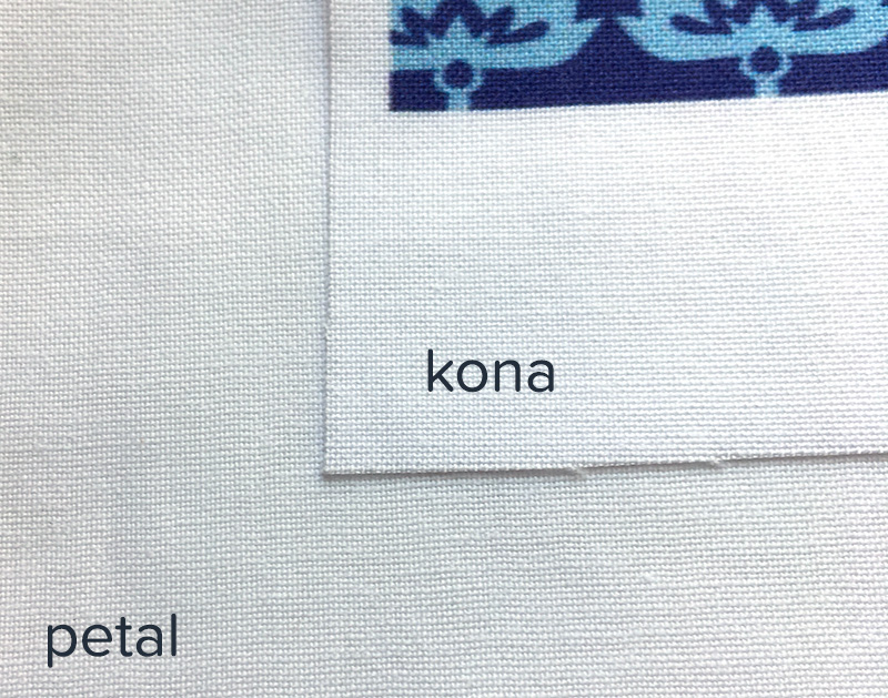
With all of the comments about the weave structure in Kona vs Petal, I was really curious and pulled out a swatch of Kona to compare. This photo is unwashed Kona, sitting on top of a piece of unwashed Petal. The two are virtually identical as far as the thread spacing and thickness of the threads. When I zoomed in (using Photoshop), I could count 16 threads per inch (horizontal) in both fabrics.
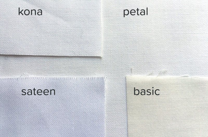
And here are petal, basic, kona and sateen all together.
I want to weigh in on the new fabric as well. As someone who uses Kona cotton almost exclusively, I had/have *HUGE* concerns about discontinuing Kona. I will say, I was surprised that the petal cotton is the same weight, but the difference I noticed immediately was the weave. Kona weave is tight, tight, tight and Petal is a more open weave. I have no idea how this will work with quilting…but I am going to order a bunch, make a mini quilt and get back to you. In general though, even though I was so sad about Kona going away, I am hopeful about the new fabric.
Thank you for your in-depth review, Becka. I have never really liked the basic cotton. I felt the quality of the fabric and the colors printed on it were not good. I used the Kona, but also didn’t love it as much as some of the other fabrics. I am hopeful about the new cotton. On another Spoonflower note, I wish they had a great tea towel fabric, and I miss the suede.
@Anne I am going to have to pull out some Kona later today and take a look. I am going to do a followup comparing the Petal to the Sateen too, so I will look at the weave structure in both. I am curious about that now. @Jerilynn I miss the suede too!
Curious to know if there is a price differential passed along to the consumer? The less dense weave typically indicates a less expensive fabric as the tighter yarn twist and denser weave are more expensive to achieve. The white is definitely brighter. That may depend on the shelf life of the basic cotton vs the time of shelf for the new petal cotton.
@datalovesinstinct The petal cotton is the same price as the basic and a little less than the kona.
Depending on the country where the new fabric is being produced vs the old, my educated guess is that Spoonflower is improving their margin with the newer fabric. Not that a business should be criticized for that as long as the consumer is satisfied with the quality of the replacement which it appears you are. I have been sewing since I was 7, been in the retail world of apparel for decades and have recently spent time in the world of quilting so I am a bundle of opinions when it comes to pricing, quality and fabrics. Thanks for getting back to me!
From your pictures, I echo Anne’s concern about the weave: it appears to be more loosely woven, which is a concern to quilters. Thanks for the thorough evaluation. If anyone’s interested, I gave up Kona some time ago for Painter’s Palette Solids from Paintbrush Studios. I wish Spoonflower could get something like that substrate for their printing!
I’m concerned that the Petal fabric, being an upgrade to basic, which I NEVER use, may also be a downgrade to Kona, which I really like. I will try it, but if it is inferior to Kona, I will simply buy from a different manufacturer. To me, it sounds like a one size fits all solution, and we all know how well THAT works!!
I compared a swatch of the Petal with a swatch of Sateen, with the same design. I felt that the Sateen had a slightly clearer, sharper image. The colors were very close. The Sateen has a nicer hand, of course, and the weave seems less apparent.