I am so excited to finally be able to talk about my collaboration with the Guthrie Theater Store. In February, I was approached by the manager of the gift shop for the Guthrie Theater. Their summer musical was Sunday in the Park with George and she wondered if I would like to work with them to make some exclusive pieces for the shop that were inspired by the show.
Sunday in the Park with George is loosely based on the life of Georges Seurat and his painting Sunday on the Isle of la Grande Jatte. I first saw the show about 15 years ago and soon after that we visited the Art Institute in Chicago and were able to see the painting. It was the first time that I can remember seeing a painting and literally gasping. I came around a corner and there it was. Part of the beautiful visual story of the show is that the actors recreate the painting on stage and the characters move in and out of that scene.

Image courtesy of Art Institute of Chicago
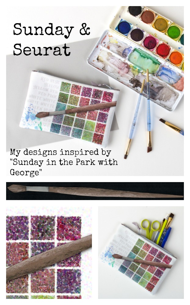
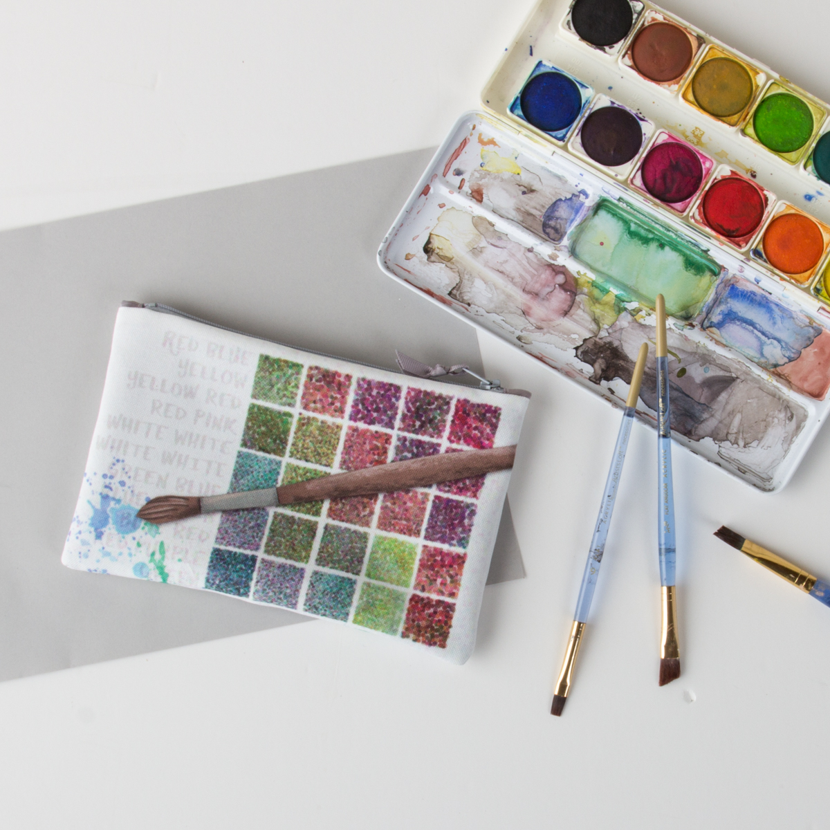
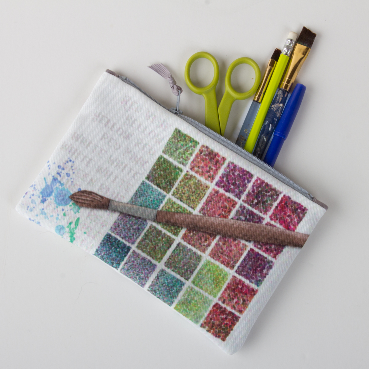
The show is a love note to artists. Seurat struggles with getting the image that he sees in his head on to the page and the struggle filling up the blank canvas. He is famous for the pointillist style, where the image is made up of dots of colors that your eye blends together. When I thought about what to design, I thought of the song “Color and Light” from the show, where Georges repeats the names of colors in a rhythmic pattern like his dots on the page. So that was one of the first designs I created.
Red Yellow Blue
Making the design Red Yellow Blue
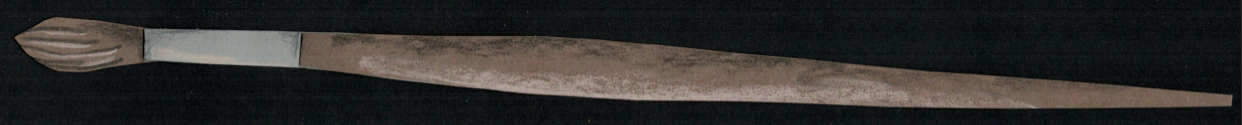
I started many of the designs in this collection from paper. The grid (representing a paint palette) and the paint brush are both illustrations made from cut paper; the paint splatters were watercolor. The paintbrush was shaded with colored pencils to add some texture. I scanned all of those pieces so that I could manipulate them digitally but preserve the texture and hand-cut or hand-painted quality of them.
There is a filter in Photoshop called “pointillism”, which seemed like a logical choice to make the design look Seurat-like, but it didn’t give me the effect I wanted at all. So I read a little more about Seurat’s painting and that gave me some ideas.
The artist worked on the painting in several campaigns, beginning in 1884 with a layer of small horizontal brushstrokes of complementary colors. He later added small dots, also in complementary colors, that appear as solid and luminous forms when seen from a distance.
I built up my design the same way with transparent and opaque layers, some with dots and some without and I digitally played with the luminosity in different ways. It took a lot of experimenting to get something that felt just right. It ended up being about four or five layers in total.
This design was intended to be a zipper bag, so I created the design to scale and not as a repeating pattern, which is more typical for fabric designs. It is printed on eco-canvas, which is made from 45% recycled polyester. The finished bag is about 5×8″, which is just the right size for your favorite pencils and art supplies.
Red Yellow Blue.
This is the first in a series of posts about the making of these Sunday & Seurat designs. I wanted to have the chance to talk a little more about the inspiration and process of making each one. They can be found for sale at the Guthrie Theater Store and you can see the whole collection in this virtual gallery.