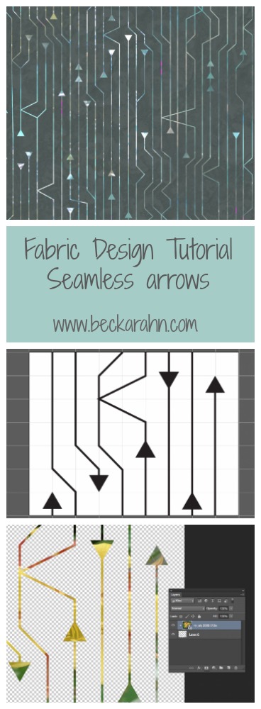
Tutorial: Seamless Arrow Repeat Part 3
(This is part three of a tutorial for making a seamless arrow pattern. Find Part One and Part Two here.)
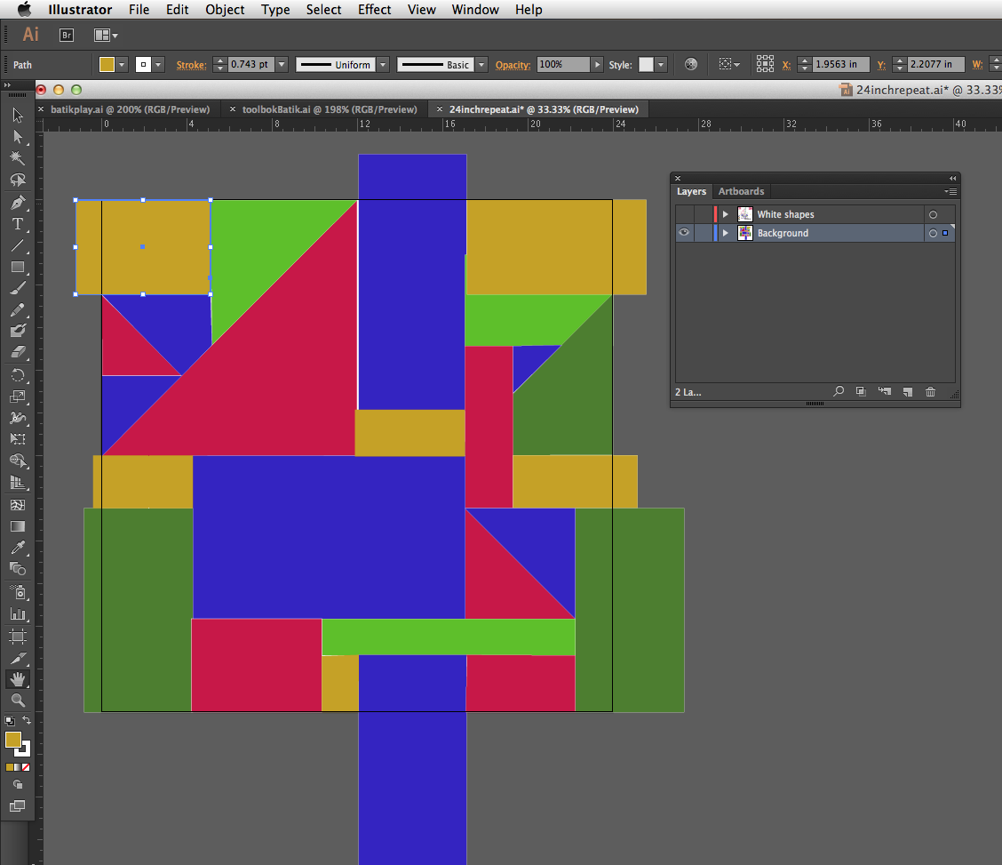
For Part Three, I am going to move over and work with the design in Photoshop now. Why? I could easily add color in Illustrator, but the effect I want is to cut those arrowheads out of another photo, which will give it a very organic color wash instead of a solid color.
Open the file in Photoshop.
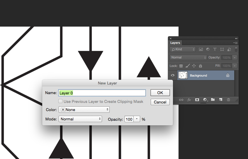
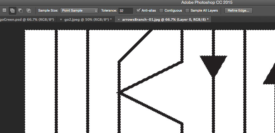
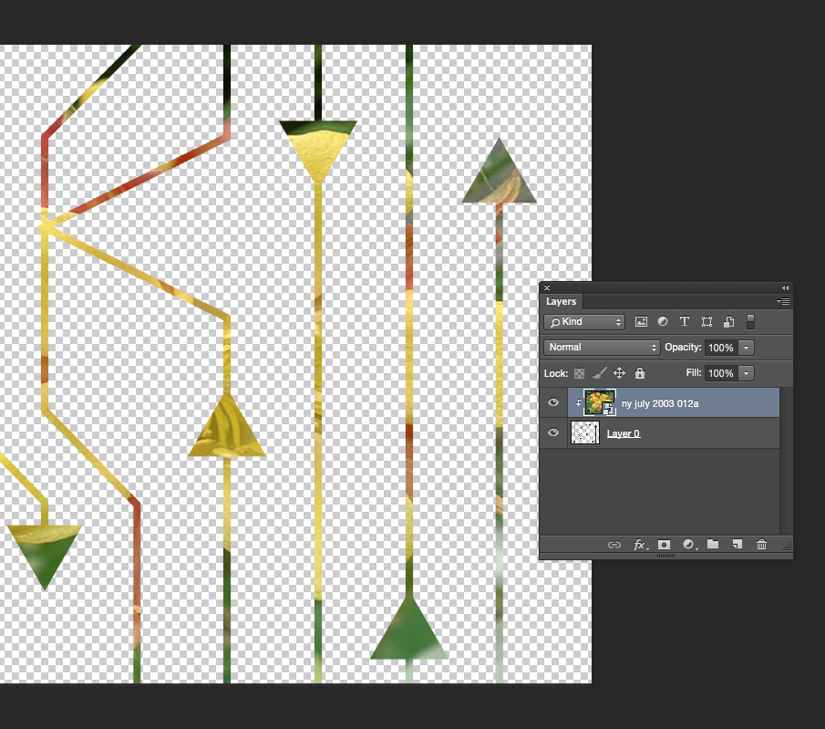
So first I open that file we just saved in Photoshop. I first double click the Layer marked Background to unlock it (making it Layer 0). Then I use the Magic Wand tool and delete to remove the white background and just leave the pattern of black lines. (Make sure the option marked contiguous at the top center is clicked off and you will select all of the white in the image and not just the parts touching where you click.)
That will leave a checkerboard pattern in the background. That is Photoshop’s way of telling you that is now transparent.
Add the photo layer.
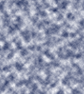
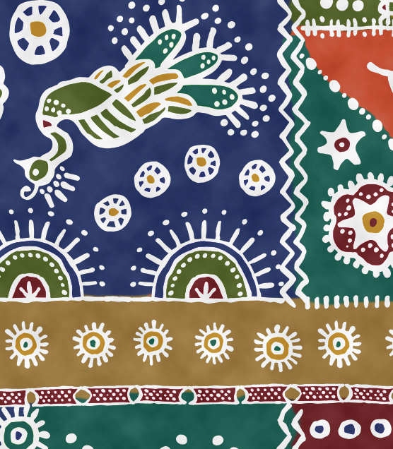
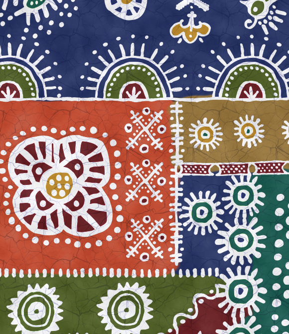
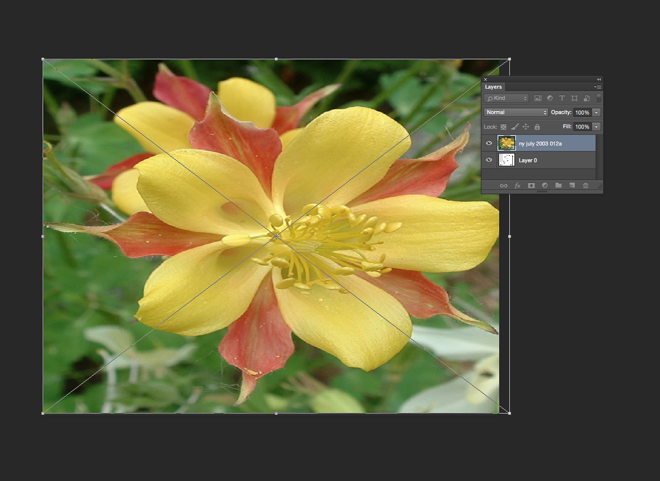
Next I will add something to create that colored layer. For my grant project design, I used one of the layers from the photo created by my design partner, so that her print and mine would coordinate. But really anything will work, as long as it has the colors you want. So for this example, I used a photograph of a columbine. Choose File -> Place Embedded and pick your image. Size/resolution is not really important. Once you have placed it, click and drag it to resize and fill the space. Make sure the photo layer is on top and your arrows on the bottom.
You can add filters or adjust colors or edit this layer if you want to. For example, I might blur it to make it look more watercolored and less photo sharp. In my grant project design, I added a few pops of magenta with a paint brush to bring out that color in the coordinating fabric.
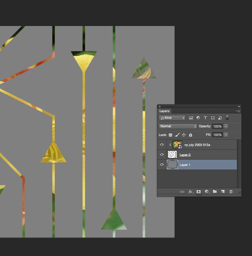
Create a clipping mask.
Select the Layer with your image and right-click it to bring up a pop up menu or choose Layer -> Create Clipping Mask from the top menu. This will cut from the photo in the shape of the layer underneath.
Add a background.
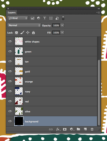
I will add a new layer to give the design a background color. You can click the new layer button in the palette (looks like a page with a bent corner) or choose Layer -> New from the menu. I can choose Edit -> Fill from the menu to fill this layer with color and then drag it in the Layers palette to be on the bottom of the stack.
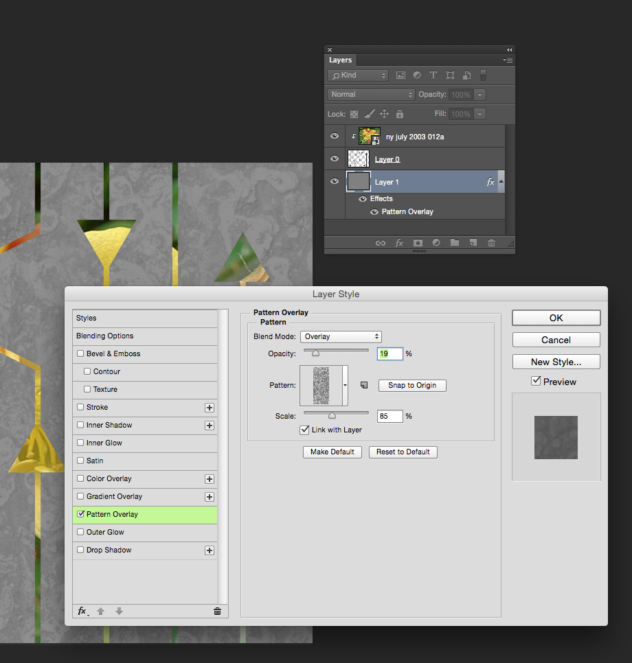
The last thing I did was to add a little texture to that flat grey layer. When I double click the layer in the Layer Palette, I will get a menu of Layer Style options. I chose an asphalt texture that I had saved previously and set it to be only 19% opaque.
In Part Four, I will show you how to proof your design and touch up any little flaws in the repeat and then it is finished and ready to go.
More in this series: Part One • Part Two • Part Three • Part Four