25 May, 2018

Making Paper Mosaics: A video demo

2018-05-25T10:14:07-05:00Everything Else, Gallery Exhibitions, Spoonflower & Fabric Design, Tutorials|2 Comments

At my last fabric design class, I chatted with my students about how I make paper mosaic designs. I like to design fabrics using original art like paper collage or drawings or paintings. They were very curious to see the originals that my fabrics had started out as, so I thought it would be fun to make a video demo to show the process from paper to fabric.


Here are a few other mosaic designs I have done. All are made from recycled magazines or other patterned papers.


5 March, 2018

A whale of a design.

2018-03-05T18:32:04-06:00An Artist's Life, Spoonflower & Fabric Design|Comments Off on A whale of a design.

I think it’s fun once in a while to talk about a design and how I put it together. When I teach classes, this is an exercise that we often do: deconstructing a design so you can understand how it goes together.

One of the recent design challenges at Spoonflower was a limited color palette design. There was no theme, just a set of colors to use in your design: navy, orchid pink, maroon and black or white. I am not sure where my humpback whales inspiration came from, but when I posted the challenge on Facebook many of you also had watery/nautical suggestions: lighthouses, coral, semaphore flags. So we were all on a similar wavelength. I didn’t actually love this color combination. I am not a real fan of red and I do not like that orchid pink at all. So I knew I had to do a design that was primarily navy.

I decided to draw the whales by hand. I like to draw on plain cardstock and for this I used a black rollerball pen. I drew each of the whales on a separate sheet and didn’t worry about what the repeat was going to look like yet. I only drew the outline and filled in the solid black part of each one in Photoshop. (It was easier to do it that way than color it in with a sharpie.) For inspiration, I did a google image search of humpback whales. I like to bring up a bunch of pictures, spend some time studying them and then go draw without the photos in front of me. Details I noticed about humpbacks were the distinct stripes on their bellies, bumps on their “nose” and fins, and the fact that I think they always look like they are smiling. I scanned the whales after I drew them.

For the background I looked up a repeating “zentangle” pattern on Pinterest and sort of followed the directions. I wanted the background to also be handdrawn to match the style of the whales. I drew it originally in black on white, but realized as I put this together that I needed it to be white lines on a dark background, so I ended up using the invert filter in Photoshop once I had it all done.

The most time consuming part of this was making that background pattern seamless and matching up all of the lines so you couldn’t see breaks or gaps. If you have done any experiments with seamless patterns, you have probably seen tutorials about cutting a piece of paper and taping it back together again to make a seamless pattern. I just watched a Facebook Live post by Spoonflower doing this same technique. That’s exactly what I did with this one, but I realized after I did it that it is nowhere near as easy as those tutorials make it look. (Spoiler alert: I am planning to make that the focus of my next online class: how to finish a design done that way and why it sometimes still doesn’t look seamless.)

When I layered these elements together (waves, whales, fish) I realized that the fish and whales needed to pop out from the background just a tiny bit more, so I added a white stroke (outline) around all of them.

I didn’t worry about arranging all of the pieces until I had the colors and layers all figured out. There’s a lot of math/planning to do when you are figuring out how to make layers work together. My waves background was drawn on an 8×10 rectangle, so the rest of my design also had to fit proportionally in an 8×10 rectangle. (I wouldn’t be able to make it a square without distorting the design or cropping, which would make it no longer seamless). I did a lot of tests to check the repeat on a much larger canvas to make sure I liked the way it was repeating and about midway through I drew a few more fish because with the very large whales and very small fish it wasn’t feeling balanced.

Here is the 8×8 inch swatch of fabric that I got to check out the design. You can see only a bit of a whale chin. I made this a large repeat, which seemed appropriate for whales so you can only see a bit when you only print a swatch. I think it will make really cute tote bags with just a whale or two on each side. I am planning to order some of this design on canvas later this week to try that out.

11 July, 2017

Sunday & Seurat: Sailing the Seine

2017-07-11T21:42:22-05:00Gallery Exhibitions|4 Comments

This is part of a series of “behind the scenes” posts about my Sunday & Seurat designs for the Guthrie Store. Click here to see all of the posts in this series or see a gallery of the collection.


Another detail I noticed in the Sunday on the Isle painting was the sailboats in the distance. Since Minnesota is nicknamed the “Land of 10,000 Lakes”, I knew that a print with boats would probably be something people here would love.

I started this print by creating the water. I collected about 15 different patterned and colored papers, everything from newsprint to sheet music to scrapbooking paper. I laid them all out on my table and gave them all a wash of blue paint. I wanted to obscure some of the patterns a little bit, but I also wanted to give it a cohesive color palette. By giving everything a wash of the same blue, they suddenly all become variations on a theme, rather than 15 separate colors.

I tore the papers into long strips and started layering them together to look like waves. I deliberately tore them a little unevenly to get the “foam” of white paper showing on the tops of some. I glued this all together as a paper collage. My scanner can only scan a piece 9×12, so I needed to carefully adjust and mask the edges of that rectangle so that I could make a seamlessly repeating pattern that could fill any amount of fabric. There is no magic formula to making something like this appear seamless, just lots of time zoomed in and manipulating pixels one by one to disguise the edges of the tile. Totally tedious; totally worth it. Many hours later, I had made a seamless water pattern out of it, which I saved as is, because I reuse patterns like this all the time once I have the hard work done.

Next I created a cut paper illustration of the sailboats and scanned it. One of the things I loved about the sailboats in the painting was the reflection in the water. I thought that was such a lovely detail. So my illustration had a reflection as well.

I made several different sailboats and added those in a layer on top of the water. I was careful to place them on the waves so they looked like they were sailing along and not just plopped down. Finally, I added a flock of birds. I originally had made a set of water lilies as well (my favorite flower) to go in among the boats, but the scale just didn’t work out. If they were small enough to make sense with the sailboats, you couldn’t tell what they were. So those got scrapped.

You’ll notice that the color of my water and the color that it is on the finished fabric aren’t the same thing. When I looked at my finished design, I realized that it looked a little somber. Although the colors matched the painting pretty well, it didn’t have that summer sailing kind of feeling that I wanted. So I went back in and brightened up the water and shifted it to look a little more turquoise, a color that made me think more of sunshine on the water. I also tweaked the tiny flag at the top of the mast so there were pink and yellow flags just for a little sparkle of color.

The final layer, of course, was my Seurat-inspired pointillism texture added in layers. You can still see a tiny bit of the polkadots in some of the patterned papers, but I love the complexity that gives to the design. I love this one and I hope lots of you love it too.

2 February, 2017

Screaming Hairy Armadillos (or armadillos as the road to inspiration)

2017-02-02T17:55:37-06:00An Artist's Life, Spoonflower & Fabric Design|2 Comments

There is a lot going on in the world right now that makes some of us want to scream. I get it. But I think we need a little break from that to talk about a different kind of screaming.

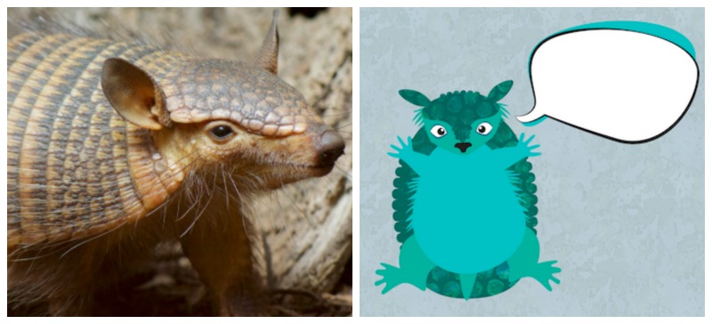
Let me introduce you to Amber.

She’s a screaming hairy armadillo from the Smithsonian National Zoo. They tweeted about her last week. And my mom and I both saw it and were curious. Why was she called a “screaming” hairy armadillo? I get the parts about hairy and armadillo, but screaming?

So we Googled it.

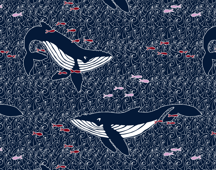
And then we got the giggles. My dogs are now in love with Amber’s cousin-in-the-video and come running in the room when I play the sound. I told my mom “I think I need to design something with screaming hairy armadillos on it”. This might be the first fabric I have ever designed inspired by a sound. :)

So I thought about that for a couple of days. I have been working non-stop on grant/exhibition projects and I needed a day to goof off and design something fun. And I thought it would also be fun to talk a little about that process.

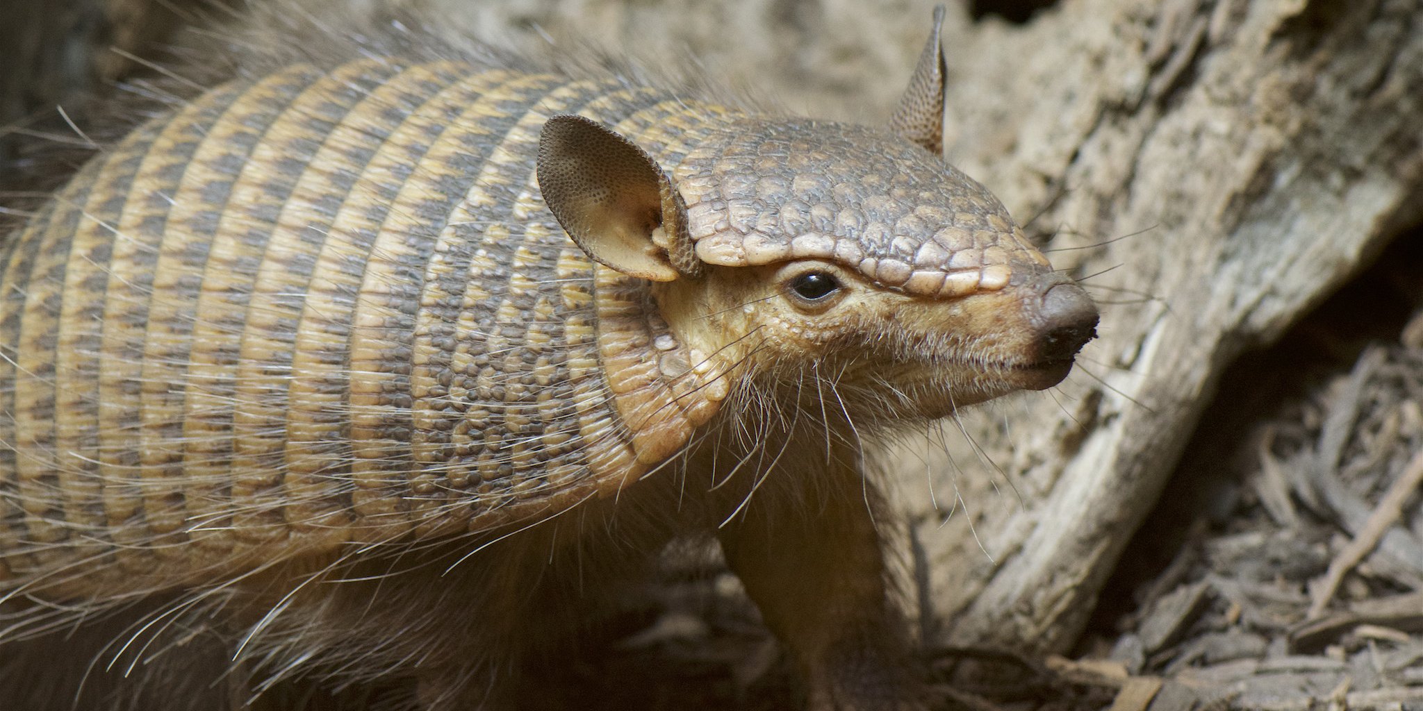
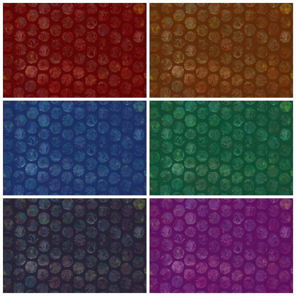
First I studied a bunch of armadillo photos and thought about how to make that great armor texture they have. Cut paper bits? Something photographic? Lace? Then I saw something pop up in my Facebook feed about making a paint texture with bubble wrap.

Screen Shot 2017-02-02 at 4.48.30 PM

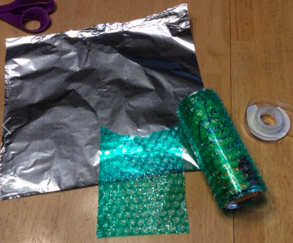
So I grabbed a piece of bubble wrap and some double-sided tape and made myself a roller around an empty soda can. I squirted out some paint on the tin foil, rolled some on the roller and painted some sheets of black card stock.

Screen Shot 2017-02-02 at 4.50.27 PM

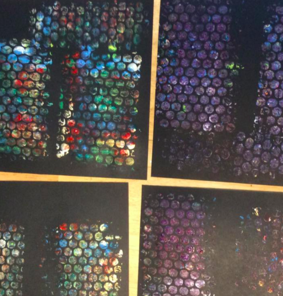
Messy, but perfect! Then I started drawing some armadillos. I did a quick pencil sketch and then drew over them with a fine sharpie pen.

Screen Shot 2017-02-02 at 4.52.40 PM

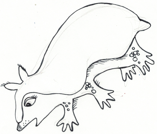
I thought I would just fill in their backs with the paint texture and have them be hand drawn. Turns out that they are perfectly cute little guys, but not very successful as fabric. I played with colors and fills and I just couldn’t get them to balance. The bubble wrap texture was so bold and dark and the lines here too delicate. Bleh. So I walked away for a bit.

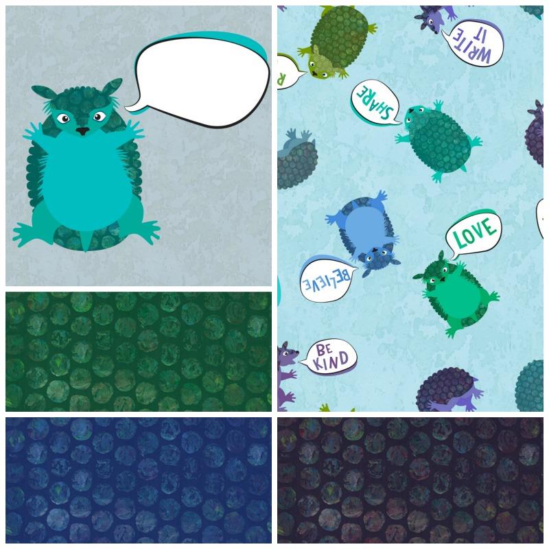
Then I tried re-drawing them using layered shapes in Illustrator. That worked a lot better. The big blocks of solid color were much more balanced with the bubble wrap texture. I am kind of in love with them.

Screen Shot 2017-02-02 at 5.03.04 PM

The bubble wrap also got a little tweaking. I changed the transparency of that layer to be about 45% and put it over the same base color of the armadillo (turquoise in this example). The black in the bubble wrap print darkened the color up so that I got a nice related shade and you can still see some of the rainbow colors in the paint.

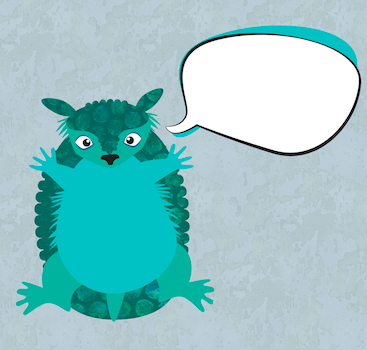
Then, we all know they are screaming armadillos, so they needed to say something. Only I couldn’t make up my mind what they needed to say, so I actually did two versions of the design: one with blank speech bubbles and one with “just do it” sort of positive messages: read it, think, love, believe, speak up, try, make good art.

I thought it would be fun to have options. Want your armadillos to scream Happy Birthday? or Congrats? Or Happy Retirement? Then you can fill it in with fabric markers, paint, embroidery, or sharpies. A friend sent me a list of “g-rated” swear words yesterday. She remembered that I talked about a collaborative print I did in a class with phrases like “oh piddle” and “son of a biscuit” and I now think it would be super funny to do a version with the armadillos politely swearing up a blue streak. But that’s another day.

bluearmadillos

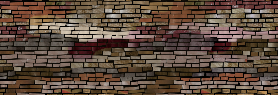
So I started with a blue and green colorway and did two color variations, one with bright earthy colors and another with pinks and purples. The background of the armadillos is a photo of peeling paint from a utility box. Sometimes amazing textures come from weird places. But it goes nicely with the other paint textures. I took the same bubble wrap scan and made a seamless texture out of it too. So you can also get coordinating “polkadots” that match the armadillo armor.

versions

bubbles

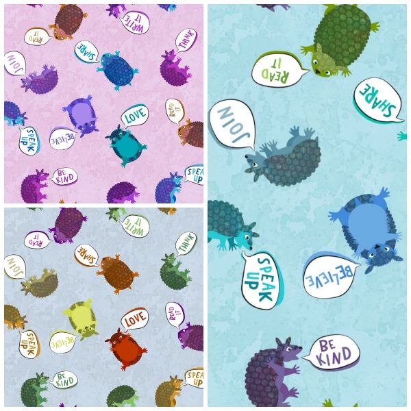
I named them “Activist Armadillos” and I have uploaded all 16 designs to Spoonflower as fabric or wrapping paper designs. I have ordered swatches of all of the versions and I will post an update when I get them and decide if I need to make any tweaks to the design. I can’t wait to see them.

I think the screaming armadillos would make an awesome tote bag with a lining of armor polkadots. I might have to make that for me.
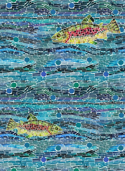
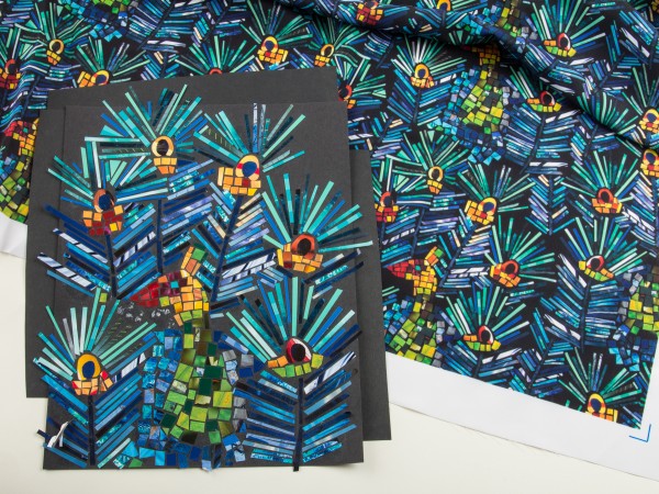
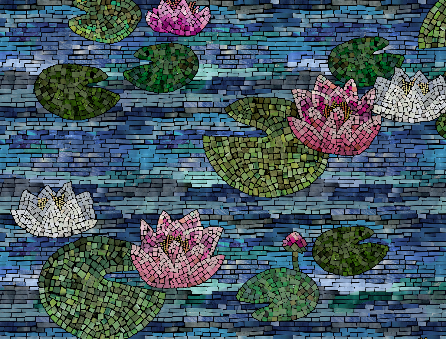
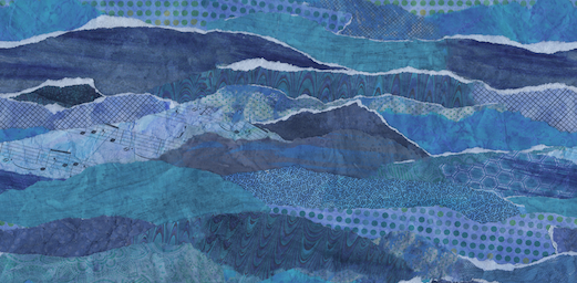
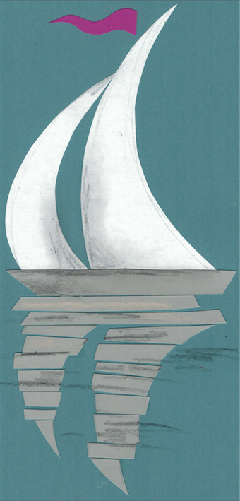
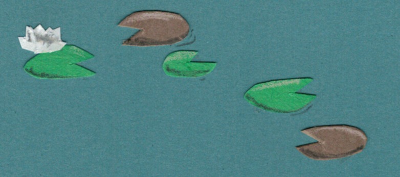
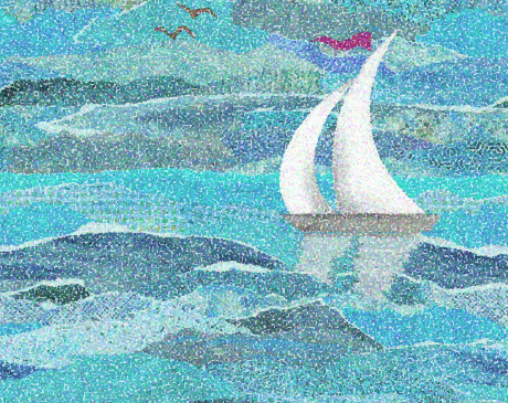
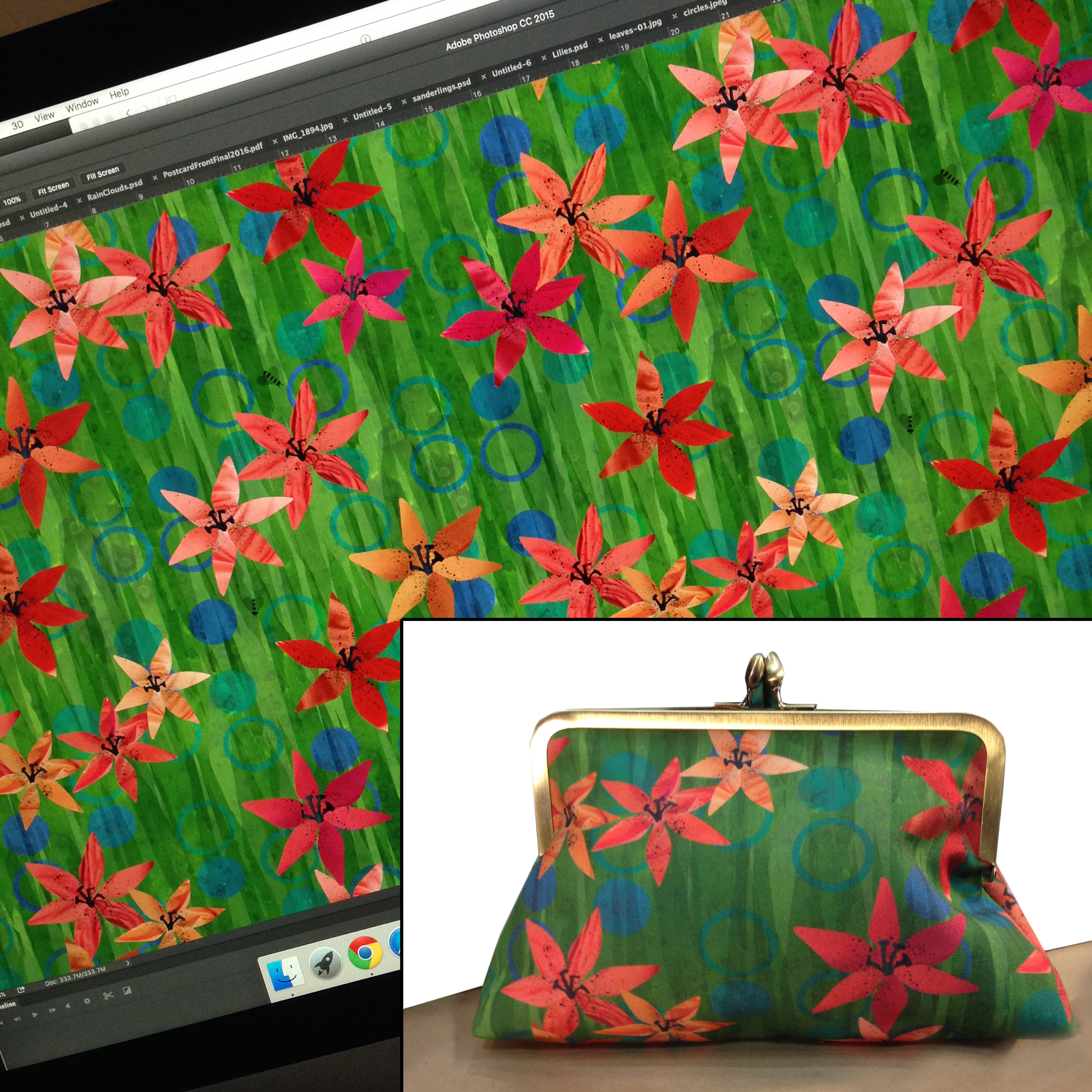
28 September, 2016

A Taste of Digital Fabric Design

2016-09-28T10:15:59-05:00, |Comments Off on A Taste of Digital Fabric Design

Have you ever dreamed of being a fabric designer? Online services like Spoonflower.com allow you to digitally print fabric with your own designs, from just a swatch to yards of fabric. Led by co-author of The Spoonflower Handbook, this seminar will give you the basics to get started designing your own fabrics, from how to deal with colors to resolution and file set up. See lots of samples and create a collaborative fabric design in class. No laptops needed, just paper and pencil for notes.

Go to Top