28 August, 2015

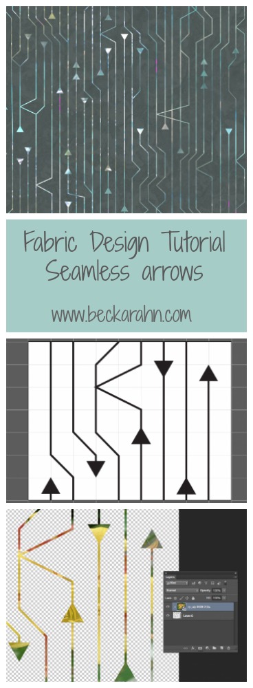
Tutorial: Seamless Arrows Print – Part One

2016-03-16T10:01:48-05:00Spoonflower & Fabric Design, Tutorials|2 Comments

It’s a busy week for me with The Spoonflower Handbook coming out on Tuesday and the opening reception for my grant project on Thursday, so I thought I would combine the two and give you something fun:  a fabric design tutorial based on one of the prints from my grant project.

The third project for my grant was a dress also created in duet with another artist.  For that design, she created a layered photo image and sent it to me.  I created a coordinating print and the two were combined in the final piece.  The photo she created had lots of organic shapes, transparent layers and abstract imagery, so I decided to create some contrast by making a print that was the opposite of that: geometric & somewhat representational.

Screen Shot 2015-08-07 at 11.26.11 AM

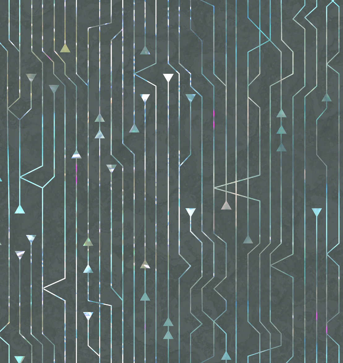
The inspiration for this design is actually a software engineering tool that helps designers collaborate by tracking the different versions of the code and where things merge and branch off.  I saw this graphic representation of that over my husband’s shoulder while he was working and I loved both the look and the metaphor.

Screen Shot 2015-08-27 at 10.45.42 AM

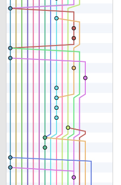
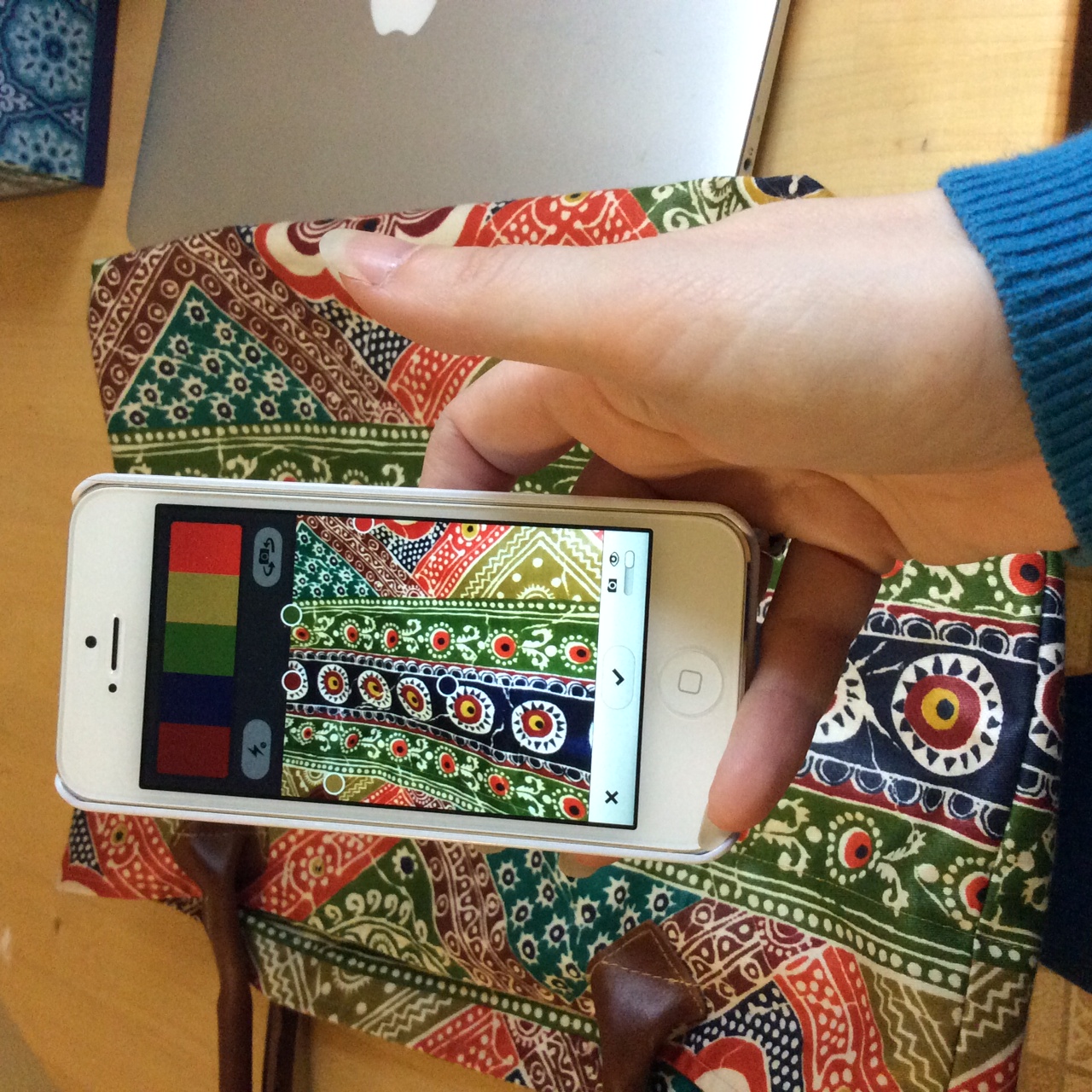
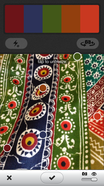
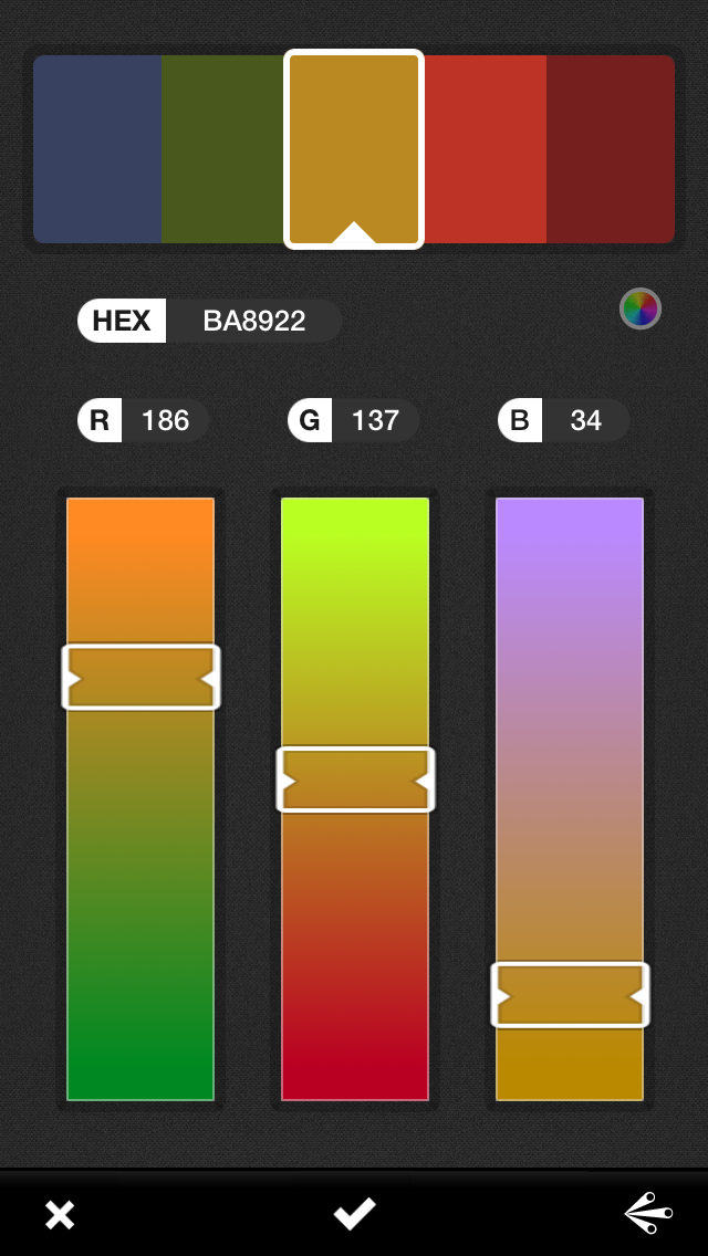
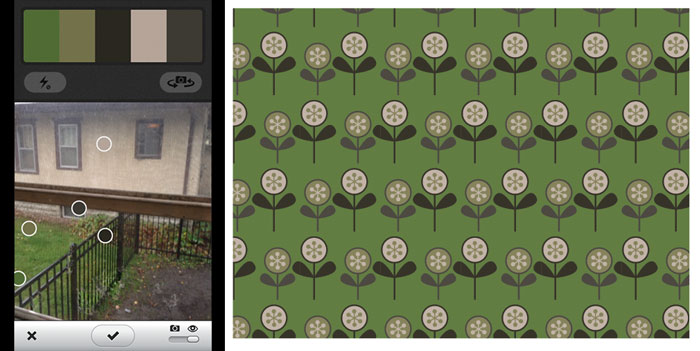
I decided to make arrowheads instead of dots and to use a layer from the photo to choose the colors in my design (which I will show you more about later.)

Creating the Arrowhead Design

Open a new file in Adobe Illustrator.

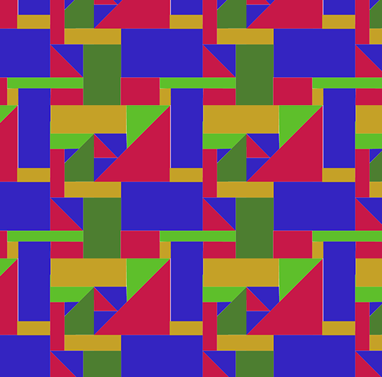
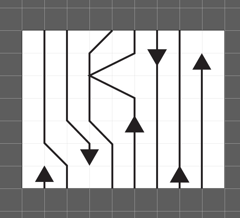
For this tutorial I did just a small repeat so it was easy for you to follow along.  (My finished design was about 18 inches square.)

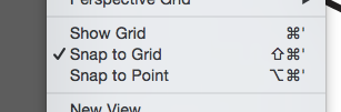
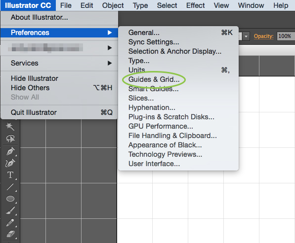
I turned on two options in Illustrator that really make this design easy to do: Show Grid and Snap to Grid.  You can find both of those in the View menu.  You can adjust the spacing of your grid lines under Illustrator -> Preferences -> Guides & Grid.

Screen Shot 2015-08-27 at 10.52.02 AM


Screen Shot 2015-08-27 at 10.53.39 AM


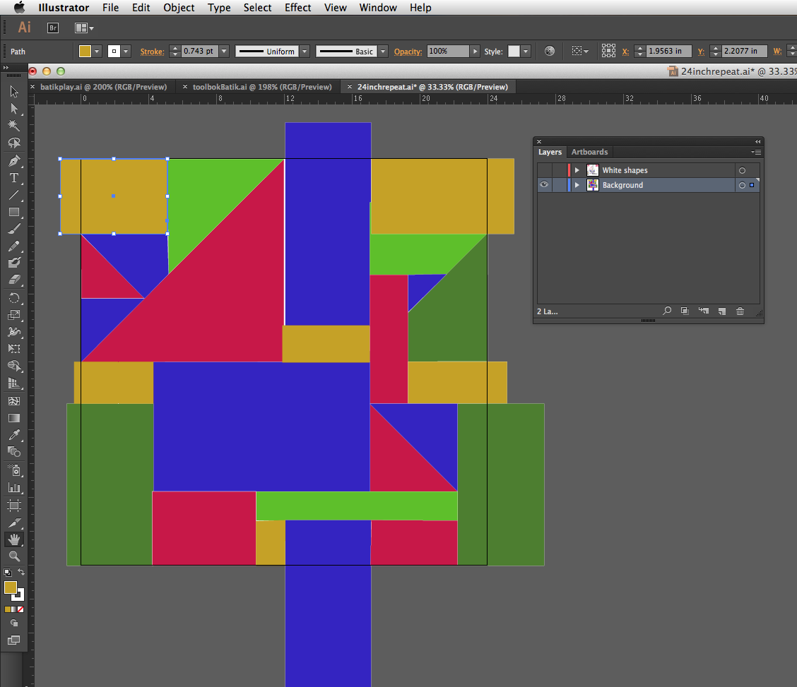
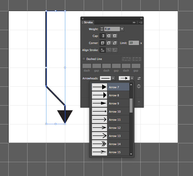
Draw with the Pen Tool & adjust lines.

I drew all of the lines in the design using the Pen Tool.  (If you need help, there’s a great tutorial here for drawing straight lines with the Pen Tool.)  The grid will help you see where to place lines and the Snap to Grid option will make them stick to the intersections of the grid – making it really easy to make straight lines that are very precisely spaced based on your grid spacing.

Once I had a line in place, I selected it and went to the Stroke Palette to adjust the look of the line.  I made the line weight heavier at 6 pt and added an arrowhead at the end by choosing one from the dropdown.

Screen Shot 2015-08-27 at 9.59.28 AM

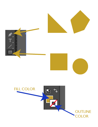
Add extra arrowheads with the Polygon Tool.

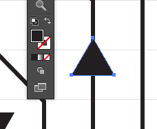
I did all of my drawing in black and white because I am going to add the color in a later step. Once I had all of the lines in place, I wanted to add some extra arrowheads, not just at the end of the lines.  To do that, I used the Polygon Tool (which is one of the options under the Rectangle Tool).  I chose a 3 sided shape with a .5 inch radius, which matched the arrowheads pretty perfectly.  I adjusted the fill to be black and the outline transparent.

ss2

Screen Shot 2015-08-27 at 10.04.02 AM

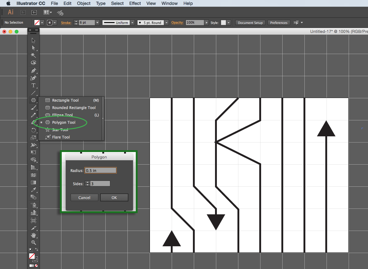
Adjust the fill and outline in the bottom of the tools palette. It’s the two overlapping squares.

Screen Shot 2015-08-27 at 10.05.26 AM


In part two of this tutorial, I will talk about how to make sure that this design is seamless and check for a balanced repeat.

More in this series: Part OnePart TwoPart ThreePart Four

arrowsPin

24 August, 2015

Jerome Grant: Duets Part One

2015-08-24T10:34:01-05:00An Artist's Life, Gallery Exhibitions, Spoonflower & Fabric Design|Comments Off on Jerome Grant: Duets Part One

The three projects for my Jerome Grant exhibition are all duets with other artists.  I chose three people as partners who I thought had something to teach me about art and design.  The original idea was to work on things digitally and have the focus be about the ways we all use digital design tools, but as we started to talk, each duet turned into something a little different.  The first partner I worked with was my dear friend Donna Kallner.  Donna is the fiber artist of the three and although her particular passions are ancient art forms, she is one of the most self-taught “techhie” artists I know.

Donna was featured in the Spring 2015 of the publication from the National Basketry Organization.

Donna was featured in the Spring 2015 of the publication from the National Basketry Organization.

Donna and I decided to play a game called “Photoshop Tennis”.  The idea is that you pass a digital image back and forth and each make an edit.  I do something and lob it back to her and vice versa.  We gave ourselves a pool of images to work from with a shared DropBox folder.  We set down some ground rules (choose at least 2 photos to combine) and a general aesthetic (organic, earth tones.)  We had wet dogs, fungus, brick, bittersweet, weathered tables and agates among the images in that folder.

originalsq


We had several versions of designs going, but this set of photos ended up being the final fabrics.  A brick wall, a snowy cornfield, frost on a window and a line drawing that I scanned.  These were layered with different opacity, repeated, mirrored, inverted.  We did a lot to them, but I think they still read in the final fabrics amazingly well.

finishedsq

I love that we created a geometric print from an organic shape.  That is one of my favorite parts of this design. I can’t tell you who did what because it evolved very organically. I was completely skeptical at first because I had never created a design from a large landscape image.  My photo choices tend towards close up macro shots, at the other end of the spectrum.  One of the “new” ideas I think I learned was the use of repeating layers.  The brick pattern was layered several times by itself and rotated – transforming the brick into a more irregular cross-hatch pattern, which is a fantastic texture. We left our files “in progress” when we passed them back and forth, so I could dig right into the layers and see how everything fit together. I think we get into habits as designers of going to your “go to” tools and this was a really interesting exploration for me to dig into Donna’s work and say “what did she do there”.  It was a way for me to watch her work and see a new process.

The ensemble that these fabrics go in to is two major pieces: a sheath dress made from the blue brick print and a coat made from the geometrics.  Both pieces have the frost image layered on top in very specific places.  It makes a “collar” on the dress and is layered at the hem and cuffs of the coat at very large scale.  The hand-drawn print is the coat lining.  The dress and coat are made from cotton sateen, the coat lining is satin.  (The coat is interlined with a heavy cotton twill to give it some weight and structure.)  Both pieces are based on 1950’s vintage patterns.

I have titled it “You Can Take the Girl Out of the Country”.  I do know that I am taunting you, but I won’t show the finished pieces until after the show has opened.  Hopefully you can use your imagination a little bit until then.

6 March, 2015

Inspiration from anywhere

2015-03-06T14:15:20-06:00Sewing & Design, Spoonflower & Fabric Design|Comments Off on Inspiration from anywhere

Screen Shot 2015-03-06 at 1.37.46 PM

My niece drew this picture of a sewing machine for me.  Her message “Don’t miss the sniff” is to let me know that not only is there a scratch and sniff sticker there, but she drew it using smelly markers.  Important stuff when you are 4.  I am in love with this picture.

“Kid art” is a really hard thing to translate into fabric design.  And honestly, I look at pretty much everything anymore and think “How can I make fabric out of this?”  So I wanted to capture this fabulous drawing in fabric.

via gofugyourself.celebuzz.com

via gofugyourself.com

The new fall line for Dolce & Gabbana offers this.  Which I honestly think is hideous.  If you click that photo it will take you to a whole slide show of their runway show, which has a whole collection of “kid art” prints.  They all look like they are printed on shiny satin besides, which also doesn’t make any sense.  Formal crayon wear? Ugh.

So instead of trying to go with a literal interpretation, I decided to use Mia’s drawing as inspiration instead.

Screen Shot 2015-03-06 at 1.55.51 PM

So, I drew the sewing machine and all of the other doo-dads and shapes in Illustrator, making it into a vector design so I could rearrange, resize and so on to make a repeat.  This one is about 18″ because I wanted it to be big and bold.  I wanted some textures to overlay on designs like this, so a few weeks ago, I spent an afternoon making fibery textures.  This one is perfect for this design.  I also used Mia’s drawing for the color inspiration.  I think my version has enough pink in it for her to approve.

I don’t see this is a clothing fabric (although she would probably wear it) so I decided to think of it like a craft/quilting fabric instead, which meant I wanted to have a collection of coordinating prints to go along with it.  Solids with the same fibery texture, “cheerios” and little banner flags so far.  I think I need one more.  Any ideas?

coordinates


I know it is sewing machines (and you do now too), but I think this also could look like tribal/tiki/monster as I can see a few faces in there.  And that also works for me.


6 October, 2014

Digital Design Tutorial: Part Six

2014-10-06T19:07:43-05:00Spoonflower & Fabric Design, Tutorials|Comments Off on Digital Design Tutorial: Part Six

Part six of our faux batik journey takes us back to Photoshop.

I have all of the motifs for my faux batik laid out, I have my color palette chosen, so now it’s time to put the finishing touches on my design.  This next bit might seem like a little bit of over-the-top, but I want to add a little bit of subtlety to this design, which is why I am going to go back into Photoshop before I add the final colors.

First I hide the colored background layer that I put in to help me lay out my design and I replace it with just basic black in my Illustrator file.  This is going to make it really easy to do the design cleanup next.  I export it, using the edges of my artboard or canvas to crop the design (getting rid of all the bits I left hanging off the edges).  It looks something like this.

Screen Shot 2014-10-06 at 5.58.44 PM

My first task is to make the edges of the design seamless.  Since I have very organic shapes, the lines and shapes at the right side of the tile aren’t going to exactly match up with the things on the left side of the tile.  But I want to make everything match up so there aren’t little flaws in the design when I repeat it.  Photoshop has a tool called “Offset” that will wrap the design around and match up those outside edges so you can do the touchup work.

Screen Shot 2014-10-06 at 6.08.32 PM
Here is one section of that matched up edge. I separated the black background from the other parts of the design and put them on two different layers.  Then, I used a paintbrush and the eraser tool to carefully erase a little bit and redraw these lines to they seem to be one continuous line.  I did this along the sides and top/bottom of the design and now I have a seamlessly repeating tile.

Now I want to add the background colors back in.  I could have used the color blocks that I set up in Illustrator, but I wanted the edges where the colors meet to be a little less like a quilt block with straight lines and have a little more painterly quality.  I also chose 7 colors for my colorway, where my mockup had only 5.  Leaving my white batik shapes as the top layer and the black as the bottom, I added a layer in between for each of the colors in my colorway.  I used a big paintbrush with a little bit of a soft edge to paint in the background colors where I wanted them in my design.  Using a paintbrush allowed me to let things bleed a little outside the lines and to keep the more organic look to match my batik shapes.  By putting each color on it’s own layer, it was easy to tweak the colors if it ended up that I didn’t like one of those colors I chose for my colorway and it will be really easy to make another colorway of this design this way (which I am planning to do!)

Screen Shot 2014-10-06 at 6.12.55 PM

Finally, my white layer had some of those placeholder colors in it that I used to fill in some of the shapes (like the arch shapes above).  To make those fit my colorway, I used a tool called Select Color Range which lets me click on a color and it selects that color anywhere it sees it on the screen all at once.  So I could click the placeholder red and replace it with the red from my colorway.

Here are the finished colors painted in.

Screen Shot 2014-10-06 at 6.19.47 PM

It took a couple of tries to get everything to feel like it was balanced and to make sure that I didn’t have any colors too crowded together.  The next little bit of subtlety I wanted to add was a little bit of a hand-painted or hand-dyed effect, to make the background colors look less flat and even and perfect.  I tried a bunch of different techniques to achieve this: painting with different brushes, playing with opacity and flow, but they were all a little too heavy-handed.  Finally I found the effect I wanted.  I added a layer on top of all of this with a filter called “Clouds” in a contrasty dark and light.

Screen Shot 2014-10-06 at 6.23.36 PMThen I made this clouds layer adjust the luminosity of the design instead of just layering on top. Luminosity is like the light shining through piece of paper, but it gave my just the effect I was going for: areas of lights and darks, without changing the colors of my design and making them muddy grey or washed out.  Here you can see that effect:

Screen Shot 2014-10-06 at 6.27.19 PM


One last effect and my batik is finished.  For the last subtlety to really make this look like a batik, I wanted to add the distinctive crackled look that you get when working with wax.  It took a lot of experimenting, but a photograph of a piece of marble gave me just the right pattern of cracks.  I made this photo into a seamless repeat as well and added it as one more transparent layer on top of the design.

Screen Shot 2014-10-06 at 6.37.11 PM


I have ordered a yard of this fabric to be printed and in a couple of weeks we will revisit the tutorial and see how it turned out!


1 October, 2014

Digital Design Tutorial: Faux Batik Part Five

2016-03-16T09:48:00-05:00Spoonflower & Fabric Design, Tutorials|Comments Off on Digital Design Tutorial: Faux Batik Part Five

Today is all about color!  Now that I have most of my design laid out, I want to start to think about the colorway for this fabric.  The colorway is the set of colors I am going to use.  I really love the colors that were in my original inspiration fabric.  I could pick these colors out on my own in the color palette in Photoshop, but I want to show you a really fun tool that you can use for creating colorways.  It’s called Adobe Kuler and it is a free app for your iPhone or iPad. Edit: You would know it. In the week since I posted this tutorial, Adobe did an update. The app is now called Adobe Color and the screens are slightly different but still work essentially the same.

photo(3)It uses the camera to look at whatever you want to capture a colorway from and it picks out a set of colors from what it sees.  As you move around 5 little circles pop around the scene and identify colors.  You can tap the screen anytime to freeze it and then click the check box to save the colors.

photo 2Once I have saved it, I can open up the colorway by tapping a little icon that looks like a panel of sliders and here is the best part…

photo 1For each color, it shows me the HEX code and the RGB values, which are codes I can type right in to Photoshop or Illustrator.

Now remember that it is using a camera to capture the colors.  Your colors will be influenced by the light the camera sees, shadows and so forth.  So it might not be the final colors you use for your design, but it’s a great place to get started or even to just get inspired.

Here’s a colorway out my kitchen window on this rainy Wednesday and a little vector pattern to go with it.

rainy

And here’s a version in a Chester colorway.

Screen Shot 2014-10-01 at 12.03.15 PM

I did a couple more shots with Kuler of my bag and I have come up with this colorway for my faux batik fabric.  I may tweak these a little bit later when I see what they all look like together, but this will be my starting point.

Screen Shot 2014-10-01 at 11.48.07 AM

More in this series: Part One • Part TwoPart ThreePart FourPart FivePart Six

batikPin

29 September, 2014

Digital Design Tutorial: Faux Batik Part Four

2016-03-16T09:47:16-05:00Spoonflower & Fabric Design, Tutorials|Comments Off on Digital Design Tutorial: Faux Batik Part Four

Part Four of my batik-behind-the-scenes series takes us to the fun part: starting to put it all together.

It’s time to start laying out my canvas for putting together all of the elements into a whole design.  I decided to think about this as two layers: the background colors and the batik designs.  I wanted a large repeat area so I made a new canvas 24 x 24 inches.  The original faux batik design I was inspired by worked almost like a stripe pattern with bands of designs that went across the width of the fabric.  I decided I would like something a little less directional and more versatile than a stripe, so I decided to lay out a “crazy quilt” kind of background made up of squares and triangles.  I made this background as a layer all by itself to act as a guide for where to place my designs.

Screen Shot 2014-09-29 at 11.55.21 AM

The shapes that extend off the edges of the 24 inch square “tile” are my reminder to myself that those blocks are going to help make this design more seamless.  If you look at the large green rectangles on the bottom corners, I want that color to continue across the edges of the design, so when you repeat and put these tiles next to each other, those two green blocks will connect up and look like one larger green block.  Make sense?  This makes it harder to see the edges of my tile.

Screen Shot 2014-09-29 at 12.45.06 PM

Here’s what it looks like when I tile it.  I see that I still have a pretty obvious line going along the right edges of the blue shapes.  I think I can fix that later with some color work, so I am going to leave it alone for now.

How did I make the shapes for the background?  There are two main tools in Illustrator for making these kinds of shapes:  the pen and the “pre-defined shape” tool.  You can draw more free-form shapes with the pen and the shape tool lets you just click and drag to make rectangles and circles.

Screen Shot 2014-09-29 at 12.02.13 PM

The colors I chose to lay out this design in are just placeholders.  I picked 5 contrasting colors so that I could see my shapes easily and to work out a rough color balance, but these aren’t the colors I am going to use for my final design.  I am going to talk about how to pick those colors in Part Five. You can see the color you have currently selected by looking at the palette.  The solid square shows the fill color and the open box is the outline.  My shapes don’t have an outline, so I have the “not” red line showing in that section above.

The easiest way to pick and choose colors is to use the eyedropper tool.  This tool has two “modes” that I am going to call “Pick” and “Push”.  Pick chooses a color from anywhere that you click.  So I can click the blue anywhere on the page and that will be the color that shows up in the palette.  Push you get to by holding down the option key while you are using the eyedropper.  The icon will flip around and now anytime you click it will push that color you have selected to the shape you click on.

Screen Shot 2014-09-29 at 12.27.18 PM

I made a little animated graphic to show you how this works.  First I pick it with the regular eyedropper and then hold down option and push it to the next shape.

eyedropperOnce I have my background all laid out, I lock the layer so that I can’t accidentally select or change something (I can unlock it later).  Now I can go on to placing my batik shapes into a new layer on top.  I already converted all of my shapes into vectors and I have them all in a “toolbox” document.  I use this to copy and paste into my design document.  This way I always have a copy of the original shape that I can go back to and I can pop back and forth between the two documents.  I decide which shape I want to fill, then I choose something from my toolbox, copy and paste it over.

Screen Shot 2014-09-29 at 1.02.50 PM

I rotate and resize it.  Sometimes I need to select and make more copies of a motif or I delete a bit that’s not working.  Once I have them placed and filling the area I want them to be in, then I use the same eyedropper trick to color them.  Choose the color I want and then push it into each section of the design.

colorit5


Here’s as much as I have finished so far.  Just so you don’t think this is a fast process, this much has probably taken me about 6 hours.

Screen Shot 2014-09-29 at 12.59.44 PM


More in this series: Part One • Part TwoPart ThreePart FourPart FivePart Six

batikPin

Go to Top