15 July, 2021

Sewing with Spoonflower’s Cotton Lawn

2021-07-15T16:12:37-05:00Everything Else|2 Comments

I was really excited to get a yard of Spoonflower’s new Cotton Lawn to try out. This new fabric is a very finely woven lightweight cotton. It’s very smooth and has a crispness that makes it feel really nice in your hand. I got just a yard of fabric printed in one of my designs and decided to make my favorite tank, which is the Gemma by Made By Rae. I have probably made a dozen of these tanks over the years and if you have ever taken an in-person class from me, you probably have probably seen me wearing one. It’s my go-to teaching outfit.

Usually I make this tank in the poly crepe de chine because it has always been the lightest weight and most drapey of Spoonflower’s fabric options (I am not counting chiffon, which is very transparent and not so appropriate for this kind of garment.) So I thought that lawn would also be a great option, but I have to say that I have mixed feelings about this version in lawn.

Print Quality

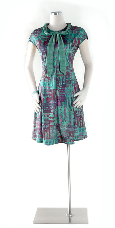
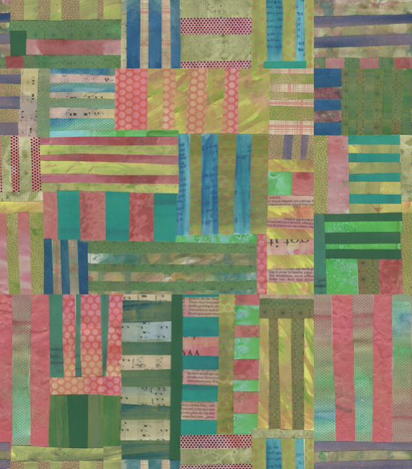
The sharpness and color of the printing on the cotton lawn is just outstanding. As I talked about in my earlier review of Spoonflower’s Signature/Poplin/Sateen, some of the finer details can get lost on the more textured fabrics. The lawn has such fine threads that it really captures all of the texture. This is a design that I made with cut paper mosaic tiles made from handpainted deli paper. You can see all of the brush strokes and color depth really well. This might be a new favorite for me when we are talking strictly the look of the printing.

Sewing with the Cotton Lawn

Since this is a pattern I have made many times before, I just got out my pattern pieces and set right to work. I made the size I usually make. Because I noticed when I washed this fabric that it really didn’t fray at all going through the washer and dryer, I chose to just leave the seam allowances unfinished. I usually serge them when I am working with the poly crepe de chine.

Where I started to have issues was when I started sewing. The first seam totally shredded the thread about half way through the side seam. I thought that was a little weird, but I figured I probably just needed a new needle, so I ripped out the stitches and traded needles on my machine. For the kind of sewing I do most often, I use a standard Schmetz Universal 80/20 needle, so that was what was in the machine and also the new needle I put in, but after the second seam I was still having issues with the thread. So I unthreaded and rethreaded my machine and tried again. I was starting to get a little frustrated.

Then I decided that maybe lawn needed a finer needle than what I normally use. Trading out needles project by project isn’t something I do often but I decided that was worth a try. I dug through the drawer where I keep my needles and came up with a 70/10 Universal needle, which is just slightly smaller. The 70/10 was somewhat better, but let’s just say that I wouldn’t show anyone the stitches on the inside of this top. The trick I discovered was to stitch really slowly and steadily with this smaller needle and it seemed to do just fine. If I went too fast, the thread would start to shred again.

Probably a microtex/sharp needle would be even better, but I didn’t have any of those in my stash and I didn’t feel like a special trip to the store made a lot of sense for this one project. I will for sure get some if I decide to sew another project with lawn.

Do I love my finished project?

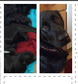
The thing that surprised me the most about my finished tank was that I totally don’t like the way it drapes in the lawn fabric. Like I mentioned earlier, this lawn has a crispness to it which means although it is soft and lightweight, it is not very fluid. When I put on the tank top, it feels like it stands away from my body a little bit too much and the same size that I always make felt like it was too big. It feels frumpy and a little like I am wearing a maternity top, to be honest.

Here’s a photo of the exact same tank in cotton lawn and poly crepe de chine, side by side. You can see how differently the two fabrics hang in this finished garment. I knew the crepe de chine was a much more fluid/flowy fabric, but I didn’t think it would make as much difference as it does. After I looked at the version in lawn I decided that I am going to add some darts to reshape the underbust/waist a little so it hangs a little better, but I wanted to get this photo in its original version first. I think that will help take out some of the extra fabric that is letting it bell out away from my body and it will feel more like it fits. The fabric feels really nice to wear, but I think if I was choosing a pattern for cotton lawn next time, I would pick something slightly more fitted or structured to take advantage of that fabric crispness.

Other things to note

A few other details I noticed. The lawn irons beautifully. It came out of the washer and dryer with very few wrinkles and even after I made this and had it sitting folded on my studio table for a few weeks, the creases were minor. One of my big issues with a previous cotton lawn that Spoonflower had years ago was that it wrinkled like crazy and it held on to creases and wrinkles. This one is a great improvement over that.

I occasionally need to print labels for garments or projects and I think that cotton lawn may be my new favorite fabric for that. Because of the fine smooth surface I think text will be more easily readable and the relative lack of fraying means it may be able to hold up to leaving raw edges exposed.

Overall impressions

I think it’s a lovely fabric and a nice addition to the Spoonflower line-up, but I think it might require a little more patience or careful choice of sewing tools/threads to sew it well. I will plan ahead a little more before I tackle my next project.

The fabric design for this top is my Storm Clouds Mosaic and it is available in my Spoonflower shop. The crepe de chine fabric pictured is a personal design, made as a gift for a friend.

16 August, 2019

Design Your Own Fabric Inspired by Textile Traditions

2019-08-16T14:28:44-05:00|Comments Off on Design Your Own Fabric Inspired by Textile Traditions

The Museum of Russian Art is pleased to invite you to a hands-on workshop with Becka Rahn in conjunction with the exhibition Village Wardrobes: Traditional Dress from Western and Central Ukraine

Be inspired by the shapes and colors of the costumes in Village Wardrobes: Traditional Dress from Western and Central Ukraine and create your own digitally printed fabric design.  Artist Becka Rahn will help you to create your own pattern inspired by the exhibition, then show you how to manipulate it using simple software to help you make repeating shapes and textures that can be printed onto fabric or paper. You don’t have to know anything about sewing or computers to be able to create your own surface designs; beginners are welcome!  Each participant will get a swatch of their fabric design to keep and have the opportunity to contribute to a collaborative project that will be on display at the Museum.

This workshop will be available on both October 1 and October 2 at The Museum of Russian Art  |  6:30-8:30 pm

CLASS REGISTRATION:  TMORA Members  $20  |  General Admission  $25

Each workshop is limited to 12 participants.  Advance registration is encouraged.  The Museum of Russian Art features free parking directly across the street (Diamond Lake Road) in the Mayflower Church parking lot.

22 October, 2018

Designing stuffed toys with muslin mockups

2018-10-22T10:53:17-05:00Sewing & Design, Spoonflower & Fabric Design|1 Comment

The Spoonflower design challenge this week was a cut-and-sew project that fit on a fat quarter. I love designing these kind of things. Some of my very first Spoonflower designs were sets of stuffed toys (Goldilocks and the 3 Bears, Red Riding Hood) where you could make all of the little characters as dolls or finger puppets and then they had their house which was a bag to store them all in. All of the pieces fit on a fat quarter and you just cut them out and sewed them together. The way this design challenge was set up you could make a cut-and-sew anything. Many people made stuffed animal toys, but you could do things bags, headbands or bibs as long as they fit on that 21×18 inch rectangle.

I struggled with this one a little bit. I was going to re-do a sheep stuffed toy pattern that I had in my Etsy shop years and years ago. I thought it would be easy to convert since I had already pattern tested it. But I just wasn’t excited about it and it’s a little fiddly to sew together.

Then I thought about a conversation I had with my friend Megan, who owns a local yarn and fabric store called Knit & Bolt. For a class I was teaching, I interviewed Megan about trends she saw in fabrics – what sells, what doesn’t sell, what do people come in looking for. One of the things that came up was cut-and-sew panels like these. They are popular at her shop, but one of the things she noticed about them is that although they seem like a really great beginner project for new stitchers, often the actual sewing parts are really difficult. She had an example of a cute cowboy doll, but the neck and arms were very skinny, which made it hard to turn right side out and stuff. The way that other parts attached to the body was complex. The shapes that you needed to sew were tight curves, which can be challenging for a beginner.

So I decided that I wanted to design something that was actually a beginner sewing project. Of course I came up with this pretty close to the deadline for the challenge (because don’t you always do your best work on a deadline?) So I thought about it and decided to rework some artwork I had already drawn.

I drew these labradors for another design challenge entry for tea towels. They were inspired by a photo of a pair of mid-century ceramic statues of little black and white dogs. I thought they were really cute and it would be fun to rework them for a different kind of cut-and-sew design.

The best part is that they are really simple shapes, so they would be easy to stitch. I removed their tails and redrew them so that they were part of the artwork on the back of the dog. No skinny bits to stuff and sew. I added a wide seam allowance around each piece. The instructions say to sew with a 1/4 inch seam allowance, but I made my border a bit wider than that so there was a little room for wobbles in the sewing line. By making the seam allowance in the same color as all of the outlines in the art, you won’t see a white “gap” at the edges if your sewing isn’t quite perfect – the color will go all the way into the seam. There are still a few curves around the ears but they should be accomplishable for a novice stitcher. Then because I think that it’s always fun for your stuffed toys to be able to do something, I used the rest of the fat quarter to make reversible bandanas for the dogs, which you just fold in half, stitch the edge and then fray it out to make a fringe.

I didn’t have time to actually get these guys printed and tested before I had to turn in my design challenge entry, but I didn’t want to post something that was completely untested. So I made a muslin mockup. Because I drew this original design in Illustrator, I just converted my shapes into a line drawing and printed it out.

I taped the line drawing up to a bright window and traced my lines on to a piece of muslin with a sharpie. Then I could cut and sew a sample to scale and make sure everything worked out just right. Super fast prototyping! I can’t wait to get the finished printed sample so I can make up some with the final design, but this was enough for me to make sure everything worked and fit together.

14 July, 2016

Fabric Design Tutorial: Create a “Mini Photo Scrapbook” Fabric Design

2016-07-19T09:53:53-05:00Everything Else, Spoonflower & Fabric Design, Tutorials|Comments Off on Fabric Design Tutorial: Create a “Mini Photo Scrapbook” Fabric Design

Screen Shot 2016-07-13 at 11.48.36 AMI am going to call this tutorial the first in what I hope will be a series of “Suggestion Box Tutorials“.

I got an email from a woman this morning asking for help designing a fabric to make a keepsake zipper bag. She and a collection of friends are meeting up this summer and she wanted a little something to give each of them to commemorate the occasion. She had a great idea for what she wanted the fabric to look like: a collection of photos and little graphics that were all significant to this group of friends. The photos should be scattered like postage stamps on a white background. She even sent me a sketch.

Her question was: did I know of anywhere there was a tutorial that could show her how to do this and how could she make sure that it was just the scale and size she wanted?

Could I think of anything? No. So, this seemed like the perfect tutorial for me to write.

What does your intention tell you about your design?

If you have had the chance to take a class from me, you know that one of my tips for creating really successful fabric designs is to design with intention. The intended use for your fabric can give you so many hints about how you need to set up your design files.

This fabric is intended to be a lining for a small zipper bag. So we know that will use pieces of fabric that are maybe 10-12″ square. If I create a repeating tile that is larger than 12″, I won’t see all of the photos that will be in the design because I will be just cutting out a piece. Maybe that’s ok. Or maybe you want to make sure that each bag has every photo visible. That’s a choice for you to make.

I also know that if my zipper bag is 10-12 inches, I probably need the photos to be pretty small in relation to that so that the scale makes sense. If the photos are each 6 inches, I will only be able to see a couple of them once I cut it out.

Screen Shot 2016-07-13 at 12.12.30 PM

Do the math.

So for this project, I am going to use that information to set up my design file (aka do the math). Why do I need to do that now? Can’t I just do the fun part (designing it) and worry about that math stuff later?

The number one thing I hear from new fabric designers is:

I uploaded my thing to Spoonflower and it was so awesome, but it was totally the wrong size! I thought it would be small but when I uploaded it, it was huge! I don’t know what happened. I was so surprised.

This is the step where you can make it turn out exactly the size you want it to be. It just involves a tiny bit of math.

  1. Decide what size you want your repeat to be. By “repeat” I mean the file that you will upload to Spoonflower. Spoonflower computers will repeat that file it to fill as much fabric as you want to print. Yes, you repeat your repeat. English is weird.

Screen Shot 2016-07-13 at 12.25.24 PM

I decided that for this zipper bag lining, I want my repeat to be 12″ because I want to be able to see the whole thing with all of the little photos when I cut out my lining piece. That’s my design choice. You make your choice.

2. The magic number is 150.

The only thing you need to remember about resolution for this project is 150. Resolution is the number of dots (or pixels) per inch that the file needs in order to print at the size you want. Dots per inch = DPI.

Spoonflower’s printers use a resolution of 150 DPI. That’s why 150 is our magic number. That means if you set your file to 150 DPI, you will get exactly what you expect to get. That’s a rule. 150 uploaded = 150 printed. In otherwords, if I make a file that is 12 inches at 150DPI, I will get a printed design that is 12 inches. No more, no less. So how do I set up the file?

3. Figure out how many pixels that is.

Resolution is the number of pixels per inch. Since we know how many inches we need (12″) and we know how many pixels per inch (150 DPI) we can figure out how many total pixels that is. And we need to know the total number of pixels because that’s the number our graphics program will ask for.

inches x resolution = pixels

12 inches x 150 pixels per inch = 1800 pixels

That means if I want a file that will print exactly 12 inches wide, I need to make a file in my graphics program that is 1800 pixels wide.

Remember that number. 1800 pixels. Write it down on a scrap of paper.

Create a new blank file.

For this design, I am going to use a program called PicMonkey because I think it is the ideal tool for this design. It’s going to make it easy. You can use any program you want to to make your designs, but PicMonkey has some built in tools that I know will work really well for this. That’s why I picked it. It’s a free online graphics software that works right in your web browser. You don’t need to download anything.

Go to PicMonkey.com. At the top of the screen you will see a menu bar.

Screen Shot 2016-07-13 at 12.44.02 PM

Click on the option on the right that says Collage.

Set up the Layout.

Screen Shot 2016-07-13 at 1.22.09 PMThe reason that PicMonkey is such a great tool for this project is because of this collage tool. Look at the left sidebar on your screen for the icon that looks like a grid. If you hover your mouse over it, it will say “Layouts”. Click the Layouts button.

Feel free to explore the options in this panel! These are all of the different ways that PicMonkey can layout a collage for you.

(There are some options that are marked with a crown – those are part of the upgraded “Royale” package that PicMonkey offers, which is an annual fee of $40/year. We will use a free layout option for this project but that $40 per year membership is totally worth it. Note: I don’t get anything from PicMonkey for telling you that; it’s just my personal opinion. I just love PicMonkey.)

Screen Shot 2016-07-13 at 1.24.22 PMClick on the option called “Square Deal” out of that list and then pick the little icon at the very far right (a grid of 25 squares.)


Remember when I told you to write down “1800 pixels”. The very next thing you want to do is set this file to be 1800 pixels. Look at the bottom center of the screen and you will see where to type that in. I put in 1800 for both the width and the height, so I will have a 12 x 12 inch square as my file size. (See how easy that was!) Hint, if you click the Lock Icon after you do this, it will keep it at this size while you are doing the next steps and rearranging things.

Screen Shot 2016-07-13 at 1.32.25 PM

Add your photos.

The dotted lines in this layout represent the places I can drop in my photos and graphics to make up this design. But first I need to load them into Picmonkey.

Screen Shot 2016-07-13 at 1.35.43 PMLook back again at the left sidebar. Choose the top icon that looks like a picture of mountains and is labeled “Images”. The very first thing in the panel of thumbnails will be a button (top left) that says “Open Photos”. Click that and it will pop up a window for you to find the files on your hard drive.Screen Shot 2016-07-13 at 1.36.58 PM

A hint: It’s super helpful if you collect everything you want to use for this design and put it all together in a folder on your Desktop (or somewhere else handy). Then you can select and upload them all at once instead of needing to hunt and peck all over your computer to find what you need. Load all of the photos you want to use right now. You can click that “Open Photos” button more than once to keep adding photos.

Screen Shot 2016-07-13 at 1.44.14 PMYou will see all of your photos pop up in the thumbnails along the left side of the screen. They don’t have to be photos. Anything in a .jpg format will work, like little graphics or screenshots. Just make sure you have permission to use them.

Now the photos are ready to use. I chose a bunch of photos of my dogs for this example.


Fill in the blanks.

You can now click and drag the photos from the left sidebar and drop them in the boxes in the template on the right. If I look back to the sketch my friend made, she has photos scattered all around the design, so I am not going to fill in every box in the template, but I will leave some spaces.

Screen Shot 2016-07-13 at 3.05.41 PMWant to vary the sizes of the boxes a little? You can click and drag to change the size and shape of the rows and columns. Hover with your mouse between a couple of boxes and you will see a double arrow pop up. You can drag with that double arrow to make the columns and rows bigger and smaller.

Screen Shot 2016-07-13 at 3.07.20 PM


Recenter a photos? Hover over a picture and wait for your cursor to change to a 4-pointed arrow. Now you can move the photo around within the box (to recenter it).

Want to add another photo and insert an extra box into the template? Grab a photo from the thumbnails, drag it over to where you want to add it and wait for a blue outlined box to pop up. When you drop the photo it will add a new box where that blue outline was. Now there are two photos in that space.

Screen Shot 2016-07-13 at 3.11.02 PMScreen Shot 2016-07-13 at 3.11.10 PM


Zoom? Click any photo in the collage to see an Edit button (top left) or an “X” (top right). Click the “Edit” button and a menu will pop up that will let you zoom and rotate that photo you have selected. Click the “X” to remove the photo.

Screen Shot 2016-07-13 at 4.08.10 PM

How do you know if the photos you are using are going to work and not look pixellated? Pretty much it is what-you-see-is-what-you-get. I could help you do the math to check that you have enough pixels in each of these photos and so on, but honestly, if it looks blurry, or pixellated, or in any way yucky when you look at it in this step, it’s going to look that way when you print it. It’s pretty simple. Your best bet is: if it looks yucky, choose a different picture. You can’t fix blurry or pixellated.

(more…)

9 May, 2016

New Work: Shadows, Spoonflower & Davie

2016-05-09T19:29:07-05:00Everything Else, Gallery Exhibitions, Spoonflower & Fabric Design|1 Comment

shadows

Shadows

2016

Digitally printed polyester pique.

I had the photo studio set up for another big project shoot, and I realized that I hadn’t had a chance to talk about this dress that I made this spring. The pattern is a modified version of the Davie dress by Sewaholic. I love the way this one fits and I have made several versions of it. The fabric is Spoonflower’s performance pique.

The design is a combination of cut painted paper and text. The paper design started out like this and I actually used it in a fabric collection of “Fish Market” designs that I have up at Spoonflower.

Screen Shot 2016-05-09 at 10.37.35 AM

I layered two copies of that cut paper together and then cut text from one layer. The text is the closing speech delivered by Puck from A Midsummer Night’s Dream:

“If we shadows have offended,
Think but this, and all is mended,
That you have but slumber’d here
While these visions did appear…”

Why that text? Because I like it. And Midsummer is my favorite Shakespeare play. I wanted to do a text based design, where it wasn’t something necessarily readable, but text was a design element.

I manipulated the colors, but you can still see all of the texture of the painted papers in the design. The tie is made from a small repeated section of that aqua with black polkadots pattern you see below.

Screen Shot 2016-05-09 at 11.01.47 AM

A little note about the fabric. It’s polyester, and I feel like I spend a lot of time defending things for being polyester. This is awesome polyester. Seriously. Comfy, soft, breathable, unwrinkleable, machine wash, amazing print quality. There’s nothing negative on that list. I understand that there are yucky polyesters. There are also horrific wools, nasty nylons and even some unwearable cottons. So this is a little bit of a soap box and a little bit encouragement to not judge a fabric by its label.

Go to Top