

I decided it was time to give the blog a little makeover and it was a great excuse to do a little work on my own logo as well. The template I was using for my blog didn’t have a really great mobile version, but they did have an upgrade to the template which has some really cool new features. I have some tweaks to make to this one still (like none of my links are showing up in color), but it is getting closer and the mobile readability is much improved. Which is good, because I read that Google is going to start penalizing sites in search results that are not mobile friendly and being searchable is pretty darn important. Want to check your site for mobile friendliness? Google has a tool.
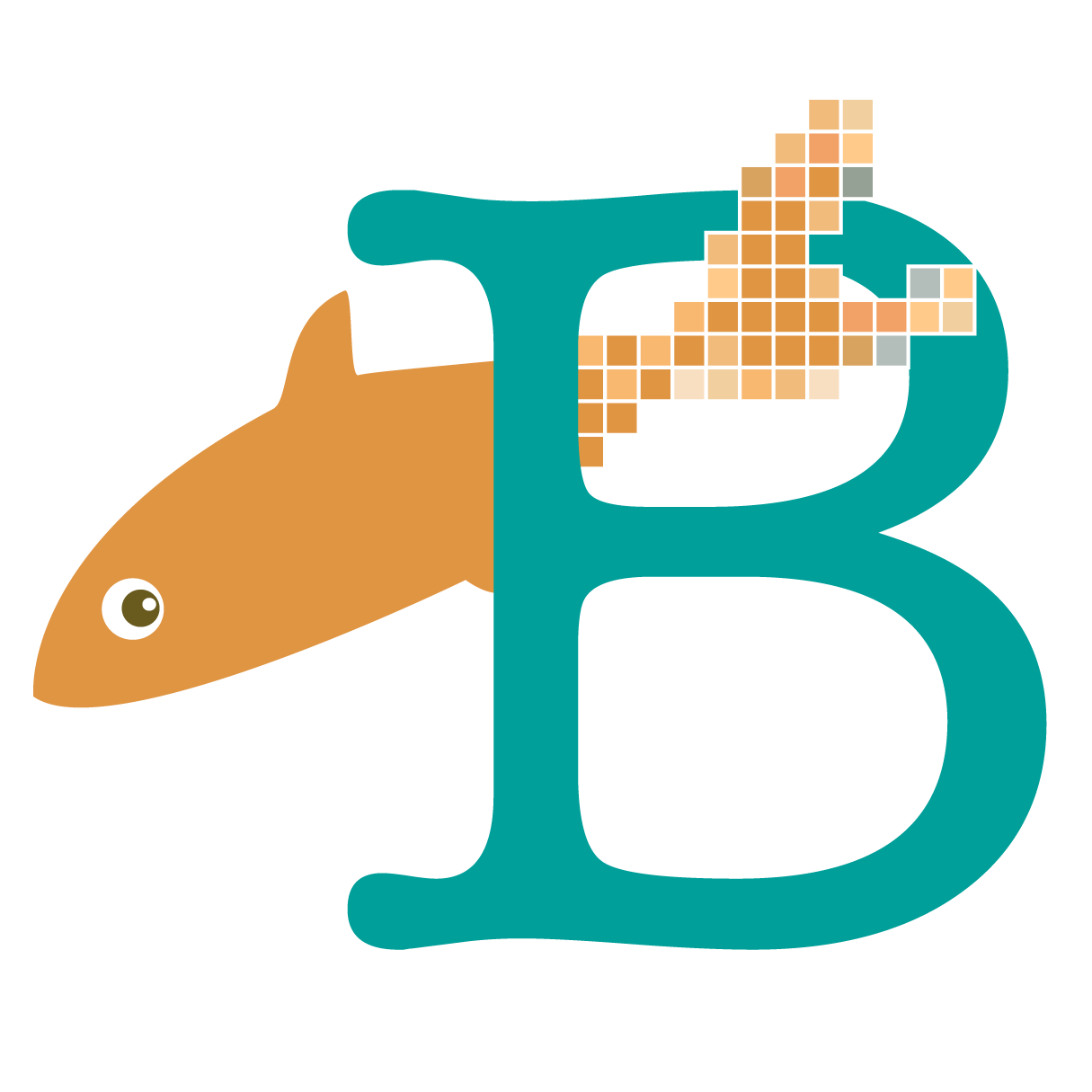
Since I was in the mode of giving everything a refresh, I thought it was time to look at my logo as well. I designed this little goldfish in 2008 and I have used it on all of my accounts, business cards and tags and so forth for all this time. His name is Smee. He is a simple recognizable graphic and didn’t tie me to any particular art form or technique. I didn’t want a logo with sewing machines or knitting needles because I really wanted the logo to work with whatever I was choosing to do and it has served me well.
Why a goldfish? I have had a pet goldfish or two pretty much continuously since I was in highschool. Dmitri and Gustaf lived with my younger sister when they outgrew my dorm room fish bowl. Tigerlily and Smee were also dorm fish. Andy and I had the retirement home for fish from the Biology 101 lab at USD. Toby, Josh, W, T, F (what the fish), Harold and Henry have all lived in the living room aquarium and summers in the waterlily pond outside the kitchen window. Does a goldfish represent my work? Probably not, but it does represent me in a personal way.
But recently, I have started to develop more of a focus for my work that I have ever had before. Everything I do now involves something digital, although still diverse – photos, digital printing, laser cutting, website design. I wanted my logo to be able to communicate that in a little way and maybe remind someone “oh this is that girl with the digital stuff” but I didn’t want to totally move away from my little fish.
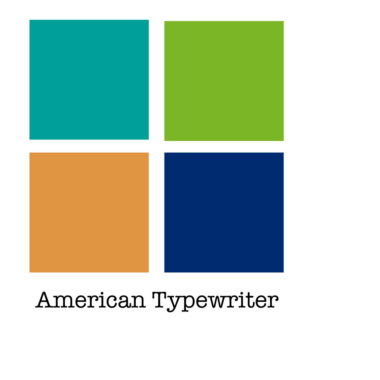
If you have ever taken a class from me in almost any subject, you will know that I talk about pixels a lot. For me they are a really fundamental concept for understanding how all of this digital image stuff works. So I thought “visible pixels” were a great representation of that digital concept in my work. The fish swimming through the B in the logo shows it transforming from pixels into something “real”, which is exactly the process that I do, transforming digital into tangible. Is it nuts to have all of this metaphor and backstory? Maybe. But I remember reading a story about the FedEx logo and the “hidden arrow” and I think there are probably more subtle stories happening than most people realize. The font for the B is American Typewriter, which I have license to use in this way through my Adobe software licenses. (I didn’t know this about the font when I chose it, but it was designed in 1974 (the year I was born) and it is the font used for the I heart NY campaign.) I always just use my name as my business name, so B for Becka works for me. Finally, colors. It seems very corporate to think of myself like a “brand” with brand standards but I many years ago picked a set of colors that I used for everything so that it was all consistent, my brand colors. My business cards matched my blog matched my Etsy shop. I had 6 colors, now I have simplified to 4. I dropped the purply-blue which was feeling pretty dated and picked up an almost navy.
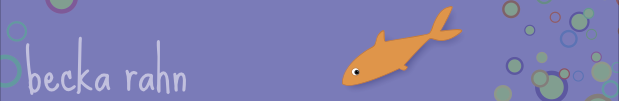
 If you are curious, here are some of the old old versions of the logo/colors I have used. They feel really heavy and dark to me now.
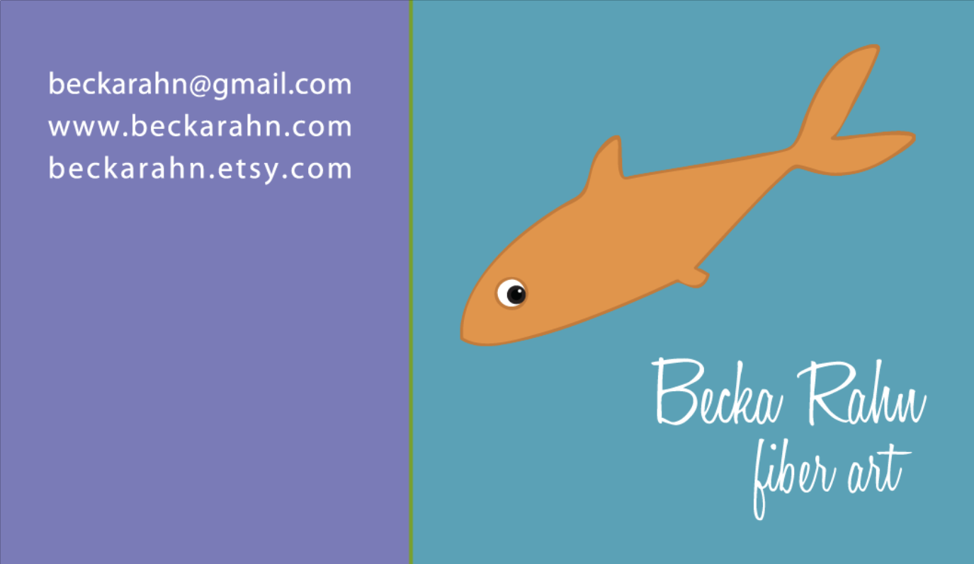
I am just starting to switch everything over to this new logo and look. Time for new business cards and the Etsy shop needs an update too, but it feels really good to do some spring cleaning and give everything a fresh new look.
I like it a lot! Glad little Smee is still part of it. Back story is perfect way to introduce. BTW, Smee has a Daddy connection, seeing as he starred as the Crocodile in Peter Pan a gabillion years ago to help out a friend. Said croc oversees the computer as I type. Nicely done.
Also, like that you kept the photo of you the same, echoes colors, nice tie together.
I like the lighter version of the website too… feels fresh for lack of a better word.
I really just lightened up the background. Pale green instead of pale grey. But I like it too.
The whole site is beautiful and fresh – and inspiring.