Responding to the Baldishol Tapestry: The making of my piece, Pica pica
I was invited to create a piece for “The Baldishol: A Medieval Norwegian tapestry inspires contemporary textiles“, an exhibition at Norway House in June 2020.
For my piece I am creating a cut paper design which will be digitally printed on to velvet. To start the process, I am hand-carving stamps to print the paper with textures and patterns from the tapestry. I talk about this and show some of the carving in the video above.
The next step was to print my stamps onto paper. I spent most of a day trying to make this work and I was really frustrated with the results. My goal was to get paper with bold patterns but that were a color-on-color effect. I wanted them to read as once color from a distance and not look like brown-on-yellow like this one I tried printing with block printing paint. I didn’t realize that block printing paints come in a very limited color palette, complicated by the epidemic and the ability for stores to restock or sell online. I have a lot of experience color mixing with dyes, but these paints behaved very differently and I could not get the colors I wanted.
So I started to brainstorm other materials that might work. Dye ink pads came the closest, until I had a brainstorm with a little help of my sister. I was telling her about my frustration and what I was trying to do while she was baking something in her kitchen. She made a comment about a drop of oil on the page of her cookbook and how it discolored the page. I had thought about oil as a printing material, but I had convinced myself it wouldn’t work and the oil would bleed too much. But then when she said out loud what I had been thinking, I had to try it. So I poured a little olive oil in a bowl and grabbed a scrap of cotton fabric. I lightly oiled each carved block and laid a sheet of paper on top.
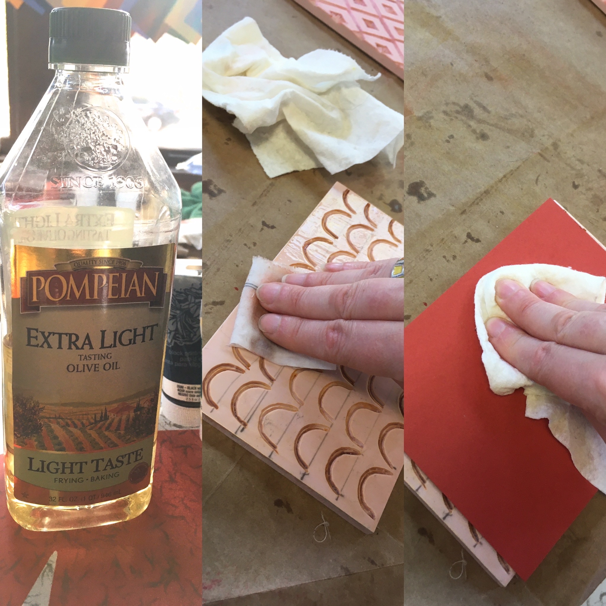
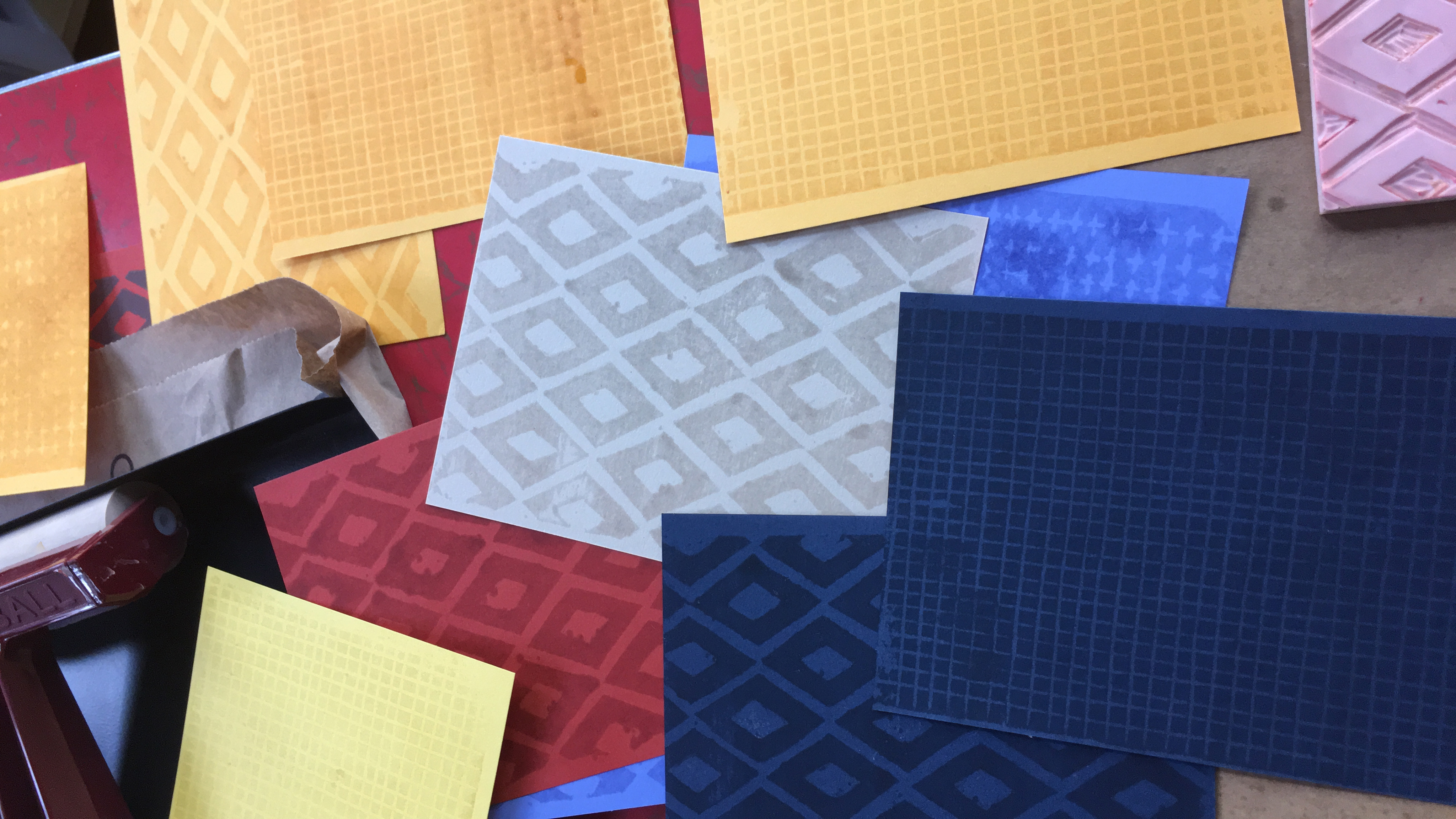
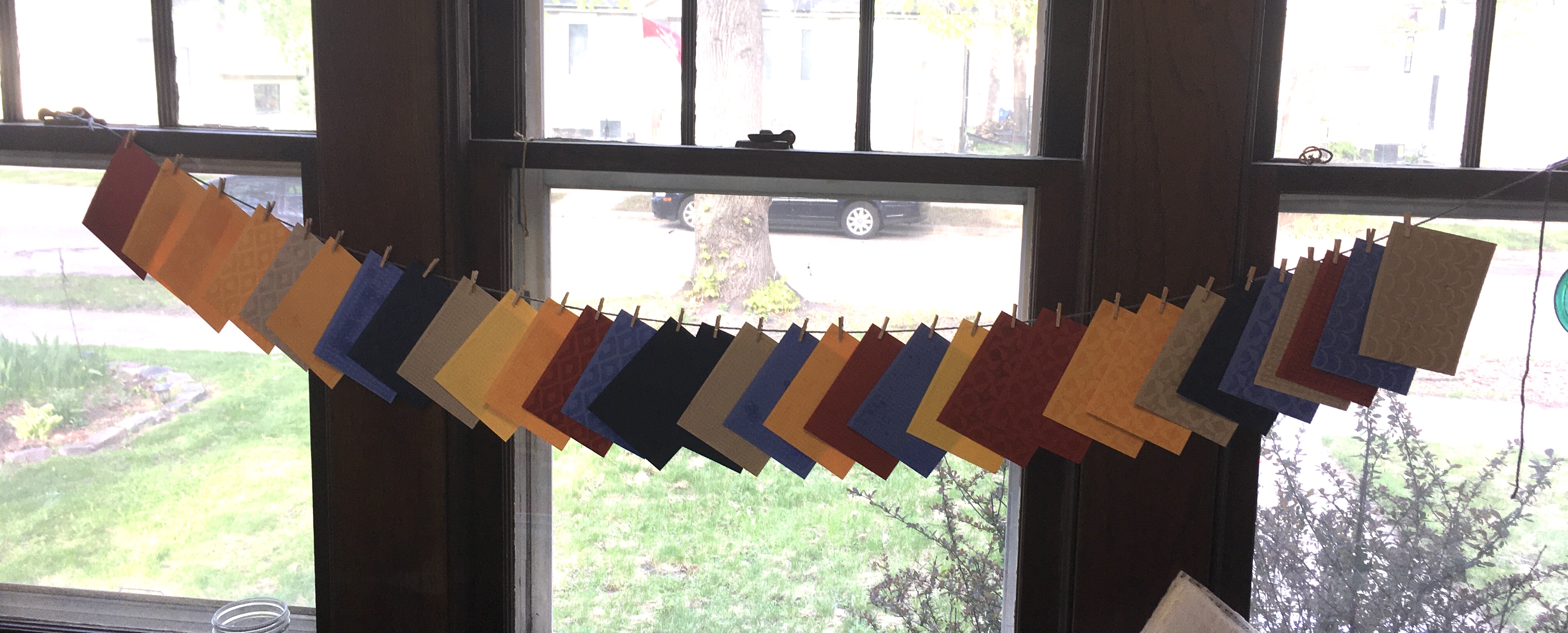
The result was exactly what I was going for! The oil darkened the paper so that I had a twotone effect but the papers were all still a single color. I will admit that I did a little dance around my studio at this point. I spent a couple of hours printing the six stamps I carved onto six different colors of paper and I hung them in my studio windows to finish soaking in (since oil doesn’t really “dry”).

The Baldishol Tapestry (shown above, image from Norway House) was the inspiration for the exhibition that this piece is a part of. For my design, I wanted to take elements from the tapestry but not copy the art directly. I liked the birds in the design, so I decided to make my design feature the birds. This was part of my original design for the piece, but the process of making it took a few turns I didn’t expect.
I wrote this statement to accompany the piece at the exhibition:
This design is named Pica pica, which is the genus and species name of the magpie. Magpies are often the unwitting target of the cuckoo, a bird who lays its eggs in another bird’s nest. Although I had sketched and planned this design during the previous fall, I didn’t start the hands-on part of making it until early spring of 2020, just a few weeks before the COVID-virus sent most of the world into quarantine. As the weeks went by, I realized that my plan was going to have to take a detour. I couldn’t work in the studio I had intended to, the materials I thought I was going to use were unavailable, and I was stuck in my “nest” with a proverbial cuckoo’s egg; artwork that was going to need to be totally different than what I thought it would be. So I started to re-think the way that this design was going to take shape. Inspired by elements and colors from the Baldishol Tapestry, I created this fabric design from cut paper illustrations, made from paper pulled from my stash. I wanted to echo some of the woven textures and shapes from the tapestry that inspired the design, so I hand-carved stamps to create subtle textures on the paper. After some trial and error, I printed the stamp designs not with paint, but with olive oil from my kitchen cabinet. I scanned the paper art and digitally assembled it into a repeating pattern which was then printed on to velvet fabric.
Instead of flocking around the figures like they are in the Tapestry, my birds are settled in nests that are shaped like the curved ribbons in the border of the Tapestry design. I sketched out the design and then created four copies using pieces of the paper that I printed with oil. Each one has small differences in the patterns, colors and layout of the elements. I scanned each piece individually and then assembled a repeating pattern digitally. A cool thing about printing digitally is that I can change the scale of the pattern easily.

So after I had put together a repeating pattern, then I chose the scale to print it at so it would fit the bench I wanted to upholster with the fabric. The design repeat ended up being about 20×32 inches and I rotated it so I could print it without having to worry about the width of the fabric. For my final piece I printed the design both on velvet and a lightweight twill. Because of all of the virus related delays, I wasn’t sure which fabric would end up working better and I knew I wouldn’t have time to reprint.

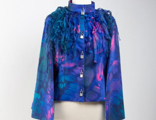
Ultimately, I chose to use the velvet for my upholstered bench and matching pillow. The pieces were exhibited at Norway House from June – September 2020.