

I did an artist talk a few weeks ago and there was a question that someone asked that has stuck with me. That person said basically: I am a little scared and unsure how to get started and I don’t know what to design. What would you recommend?
I answered something about really designing what you love. Start there. Which I believe 100%. That’s one of my very favorite things about designing your own fabric is that you can make the fabrics that you love and there is nothing more motivating that to be working on something you are excited about.
But then I got curious about what designs of mine were really resonating with other people. On the weeks when I enter the design challenges, I do get a sense from votes and favorites what designs that the “design challenge voters” group of people really respond to and which ones they don’t. Sometimes that’s really surprising. But the contest voters aren’t necessarily the same audience as the people who are buying fabric.
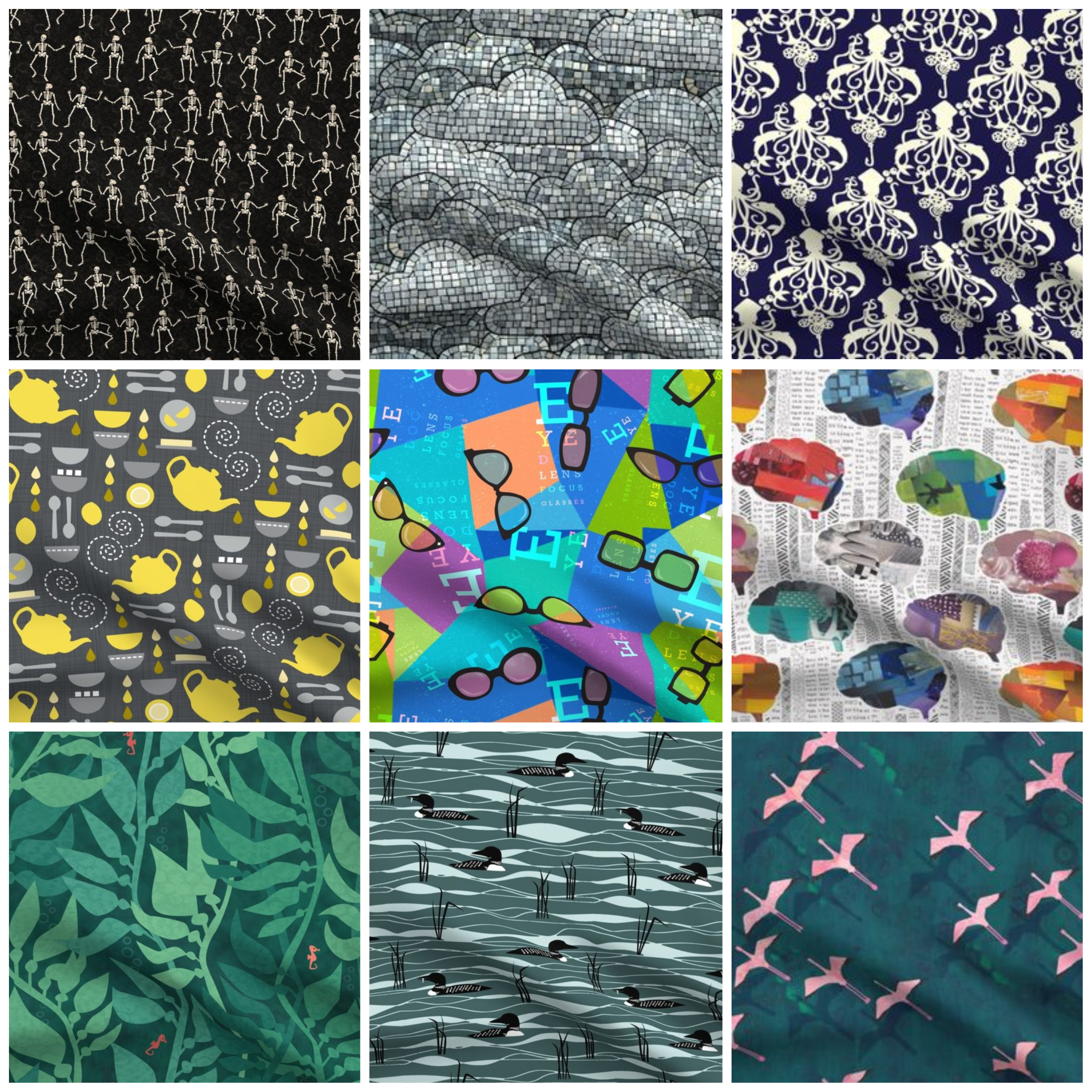
My bestsellers from 2021
So I decided to dig in to my sales from last year and see what’s selling. Spoonflower doesn’t really give you stats of any kind. I just downloaded a spreadsheet and did some tally marks of yards sold on a scrap of paper. This is low tech analysis here. The image you see above is my top nine selling designs from 2021. There were some of these that surprised me. When I see a sale email come in, I am always super excited to see it but I don’t really tally up in my head “Oh, that’s a sale of that design”.
The Loons on the Lake was my bestseller, which is cool since that feels like a very Minnesota kind of design and I know I have an enthusiastic local group of supporters. That design was created for a “Pine and Mint” limited color palette design challenge from 2020 and came in 159/858.
Interestingly, at least to me, was that my second place bestseller was the “Tea With Lemons” design, which was from 2021 and is also from a color limited palette design challenge which was the yellow and grey Pantone colors of the year. It ranked 66/1456 designs.
I do keep track of my stats from design challenges, which is a little geeky I realize. But I set myself a goal of entering every design challenge from 2018-2021. (I took a break the second half of 2021 because I was swamped with puppy things.) I was curious if I was “getting better” or if I could learn anything from keeping track of the results and where I finished in the pool. The answer is not really. In 2019 I had 11 designs that hit the top 100, in 2020 it was 2 and 3 in the part of 2021 when I participated. Only five of those designs that were in the top 100 are in my personal bestsellers.
The rest of my top nine from 2021 fell into more or less equal sales numbers.
- The mosaic clouds design was my top finisher in a design challenge in 2021 (it came in number 25.) I entered it in a design challenge, but it’s a mosaic style which is kind of a signature for me so it wasn’t something I did specifically for the challenge.
- The Flamingos Flying design was a 2019 design challenge theme of “aerial views”.
- The Dancing Skeletons was for a “gothic halloween” challenge. This one was a surprise for me. I love the design, but I didn’t realize it has been as popular as it was.
- Eye Doc, especially the small scale version, was really popular in 2020 and continued to be in 2021. I think it was used a lot for masks. This was a “medical professionals” design challenge entry.
- “Your Brain’s not Broken” is also a personal favorite from a design challenge of “causes that are important to you”.
- The Kelp Forest design was no surprise. I have this as the backdrop for all of my Zoom calls and it’s probably the design of mine that gets the most eyes on it because of that. I wallpapered my bathroom in a different colorway of this same design.
- The steampunk squid continues to be a perennial favorite. I designed this one in 2015 for the Spoonflower Handbook, although it’s the navy and white version that sells better than the pale blue we used in the book.
What did I learn?
With the exception of the squid design, every one of these is something I entered in a design challenge. To be fair, I don’t design a lot of things that don’t go into a design challenge. Creating one new design a week is doable for me, designing more than that doesn’t happen nearly as often.
I tend to do well in the color limited palette design challenges; those are consistently some of my highest design challenge rankings. I’m not sure why, but I think it does go back to that idea of designing what you love. The thing about the color limited palette challenges is that you can design *anything* as long as you stick to the specified colors. So I get to really bring my quirkiness into the design more than some of the others. At least I think so.
Some of my top 25 finishers in the design challenge have had zero sales. They were popular among challenge voters, but that doesn’t necessarily translate into customers.

I also think it’s super interesting that these two designs are both available on Etsy/Amazon/eBay through Spoonflower’s shops on those venues. Even though they were selected to be on those platforms (along with several other of my designs) they aren’t popping up with more sales through those venues.
Here are the top 18 overall Spoonflower bestsellers according to Spoonflower’s site. I have no insight into how they determine this and I know that some of those designs (like the elephants and fireflies) have been on this list for at least 5 years. It doesn’t change often. It makes me curious to know about things like the blue lemons design. Are there really that many people shopping for lemon fabric or does this mean that this one design sold oodles of yardage to one customer? We just don’t know.

What I do love about these bestsellers is that they do reflect some of my personal style and that idea I shared about designing what you love. The flamingos, skeletons, squid, brains, and clouds are all made from cut paper illustrations. The tea and kelp designs are drawn in illustrator primarily but are overlaid with handdrawn/painted textures. These are all really textural design elements that I love. Even though many of these were the response to a design challenge prompt, they do have a lot of that quirkiness that I think is important. Where else would you find brain fabric or an eye doctor print?
Although one single print didn’t make my own bestsellers list, my oboe fabrics are an overall bestseller. I have about a dozen oboe designs, so even though each one of them might not sell more than a couple of yards, as a group the oboe fabrics probably were right up there at the top.
Sales isn’t really a factor that drives what I design, so I know I’m never going to hit that bestseller page on the Spoonflower site. My art practice has a different focus than that. I design far more fabrics that I use to make things; these are designs that are not available for other people to use. I also feel a little more free to design what I want to design and not follow the color or aesthetic trends. That works for me. But I think it’s always interesting to step back and look with a wider lens and see what you can learn from what you are doing.