6 January, 2020

2019: The year that faded away

2020-01-06T16:42:55-06:00Everything Else|3 Comments

Just before Christmas, we lost our beautiful Chester. We adopted him and his brother Leo when they were 6 months old and we got a message from a friend that there were these puppies in need of a rescue. We thought we might be nuts getting two puppies at once, but it turned out to be messy, chaotic and ridiculously affectionate fun. Chester had a cancer of the blood vessels that had spread from his abdomen to his lungs. We had no idea that anything was wrong until very early one morning when he woke us up whimpering. The emergency vet was the kindest and most gentle person who had to break the news that the tumor had ruptured, he was bleeding internally and there was nothing that we could do but say goodbye. The cancer had taken over. It was a shock and it took us a few days to be able to talk about it without sobbing. He was much loved and he will be missed. My sincere thanks to everyone who heard and reached out to us with love. The photo above is one of my favorite pictures of him ever, blissed out and panting after fetching the ball a million times.

The rest of 2019 has just faded away into a blur. I had a couple of blog posts planned out; I often write a recap post of my year and a goal for the year ahead. But instead, I just took a social media hiatus. I stepped away and de-scheduled the posts and put my Etsy shops on vacation and I just took a break. In all honesty, the idea of having to deal with a panicked last minute online customer, a shipping issue or a negative comment on something was more than I could deal with. So I took a lot of walks with my husband and my newly-solo-labrador instead. And we ordered calzones and snuggled under blankets and watched Star Wars movies. We didn’t do fancy cookie baking, or put up a tree, or go to the holiday party, or cook a big meal or any of that stuff that many of us feel obligated to do at this time of year. And do you know what? I don’t think we missed it.

It feels good to start the year fresh. January rolled around and I turned back on the shops, dealt with the backlog of emails and Leo and I are figuring out a new routine. I work from a studio at home, so the dogs have always been my “coworkers”. It’s been bittersweet. Leo has started walking to the post office with me every day to drop off Etsy packages. Juggling a bag of mail and two large and enthusiastic dogs crossing traffic was always a little too much for me before, but Leo and I have it figured out. (He loves to hunt mice and stuff his face into the snow all the way up to his ears.) My husband works at a dog-friendly co-working space, so Leo went to work with him one day and then I picked him up and we made a trip through the bank drive through where he got a milkbone. I don’t usually take the dogs along on errands but I’m trying to do some things to keep him from just snoring on the couch all day now that there’s not someone always around to play chew-on-your-brother or chase-the-squirrel.

This feels like it could turn into one of those inspirational posts about new years and new beginnings but that’s really just not me. We are figuring things out a day at a time. Some days we try something new and some days we just need to let something go. And so far it’s turning out pretty ok.

18 December, 2019

A year of Design Challenges

2019-12-18T11:55:05-06:00Everything Else|1 Comment

Every week, Spoonflower posts a design challenge theme and asks designers to create something that is their interpretation of that theme. Themes this year have included pollinators, fitness, color-blocking, pirates and dinosaurs. In 2018, I made a goal for myself of designing something every week of the challenge. I decided to continue that in 2019, so this week was my 97th consecutive design. If you follow me on Instagram or Facebook, I post them there every week and often talk about how the design is made and what inspired my interpretation.

I was really happy this year that I had 6 designs that placed in the top 50 in the challenge at Spoonflower! My Color Blocked Elephants was my top finisher. It came in at #17. I also had one design – Eucalyptus Blossoms – featured in the Spoonflower holiday magazine. Most of the designs are also available in my Spoonflower shop in my 2019 Design Challenges collection.

I put together this slide show so you can see all 48 designs from this year and I marked my personal top 10 for the year and the six that placed in the Spoonflower Top 50. Some of these designs I love a lot – Striped Stegosaurus, Elizabeth, Moon Landing – and there are some that I am not so happy with. But I am super proud that I finished something every week. Practice! I am hoping in 2020 that I will break into the top 10.

Which was your favorite design from 2019? I’d love to know!

28 August, 2019

Pattern Review: Sydney Bag by Swoon Sewing Patterns

2019-08-28T16:54:09-05:00Everything Else|2 Comments

This spring I flew to DC and taught a weekend of classes for two different fiber art guilds there. I had time before my talk to chat with some of the members and they showed me a project they had been working on. A group of about 8 of them had gotten together one weekend and made Sydney Bags by Swoon Patterns. It’s a pretty cool crossbody bag with lots of practical pockets, nice details and ways to use combinations of different fabrics. We talked about how it would be fun to sew in some Spoonflower fabrics since that was what I was there to talk about. When I came home, I bought and downloaded the pattern but I didn’t get a chance to sew one until now.

I decided to make mine on a whim, so I used scraps and things from my stash. The print is one of my designs called Sara. I had some scraps of eco canvas left over from another project. (That design is available in my Spoonflower shop.) The contrast is a remnant of orange velveteen I bought because I liked the color. I had some metal zippers in my stash and I lined it in a deep blue dotty cotton print. It’s bold. I will admit that. But I love it.

The pattern was superb. The ladies that I talked to from the quilt guild said it was the hardest thing that they had ever made. I don’t think it was hard in the “I don’t have the skills to do this” sense, I think it was hard in the “wow this is complex and I have to pay attention” sense. It was hard, but the fun kind of hard.

The bag has tons of details. The front pockets have an inverted pleat and side gussets, plus two magnetic snaps under the flap. The way they went together was clever and even though there were a lot of steps, the instructions were excellent. Every step was there and clearly explained with diagrams. Assembling the front panel with 3 pockets in it was intense, but any time I got confused, I just had to read the instructions and do exactly what it said and it just worked. Lots of things about the way it went together were clever and very thoughtfully designed. It has a zip top, a pocket inside, a pocket on the back, and the three on the front. My keys and my phone go in those front pockets and I keep a notebook in the back one so it doesn’t get crumpled in the rest of the jumble of things in my bag.

I ended up at the fabric store twice because I didn’t read carefully and forgot to get D rings. I didn’t have the right size in my stash already. The strap was really long so it’s nearly doubled up on my bag, but it was easily adjustable with the slider. If I made it again I would cut that shorter. I’m only 5’4″, so I don’t need a long strap. I only made one tweak to the pattern. Instead of stitching a stay on the top of the back pocket, I just added another magnetic snap to hold it closed.

The finished bag is a good size for all of my stuff (and then some), but just a tiny bit too small for my laptop. I am really tempted to make another and just increase the width by a couple of inches so my laptop would fit inside. Or maybe I will see if they have a laptop bag design because this one was really fun. Five stars from me.

16 July, 2019

Artist vs Big Giant Company (with a happy ending)

2019-07-16T17:03:48-05:00Everything Else|1 Comment

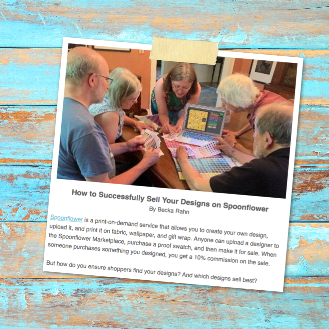
If you follow a bunch of other artists and crafters on social media like I do, you will have seen stories about big giant companies (like Target and Anthropologie) using artists’ work without their permission. I have a friend who this happened to and it’s rotten. (I think hers had an ok resolution, but she isn’t allowed to talk about it.) My story is a little different and it starts with a video game.

You may or may not be a fan of video games. For the most part, I am not, although I love board games. Recently, a company called Niantic came out with a phone based game inspired by the Harry Potter Universe. It’s called Wizards Unite. In the game, you are a wizard helping to capture some magical creatures set loose in the real world and you find them by walking around and looking for them with your phone. If this sounds familiar, this game is based on the same platform as PokemonGo, which was all the rage just a few years ago. Like I said, I am not in to video games, but I am on board with anything Harry Potter inspired so I had to check it out. My husband and I have a fun time walking the dogs after dinner and exploring our local park for signs of magical beasts. There are lots of fire breathing chickens and baby hippogryphs there, in case you were wondering.

In the game there are “Greenhouses”, which are tied to geographic elements in the real world like a piece of public art, a neighborhood sign “Welcome to Northeast Park” or a sculpture or statue. They are spots to get a little spell energy or harvest potion ingredients.

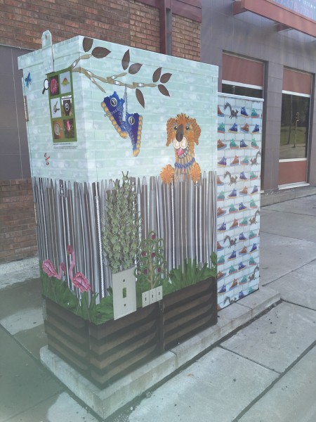
On site installation of utility box wrap art.

In 2016, I proposed and got a grant to design three public art pieces for a neighborhood in Minneapolis. I collected photos from the neighborhood, assembled collages of those photos and covered three large utility boxes. Each one was everyday scenes made up of photos of everyday objects. You can read more about the whole project and see more photos here.  Dandy the dog is made from photos of dandelions, coffee cup lids, pennies and has a rosebud for a tongue. I even made a kids book to accompany the public art pieces.

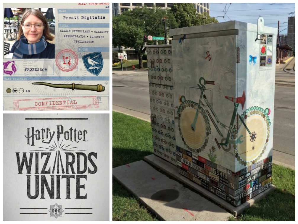
On my way walking to a meeting in that neighborhood, I pulled out my phone to see what was around and to my complete delight, one of my utility box art installations was a Greenhouse! That’s a picture of it in that little pentagon shape. My art was in the Harry Potter game!

This might seem like a silly thing to be excited about. But for an artist, getting people to notice your stuff is a monumental task. It’s hard. A game that encourages people to walk over and look at this piece is brilliant. And it’s been there for almost 3 years now; I was afraid it was going to just start becoming part of the background noise and no one would notice it anymore. So I am thrilled.

The name of the Greenhouse is the title of the piece, Look Both Ways. This set of boxes has a bike on one side and a cat and a traffic light on the other. Next to the title, you can see an “i” in the circle next to the title, and you can tap on that to see more about the piece.

There it is! A nice photo of my piece and my name….. um… sort of. Yes, that says “Becks ran 2016“. I was heartbroken.

How did this happen? Niantic has a whole process that lets anyone submit a location to be added to the game. I have to guess that some enthusiastic Pokemon player thought this would be a great spot and submitted it. It’s right near a light rail station. It’s a great spot. They just couldn’t remember how to spell my name.

My first reaction was to think: huge company will not care if my name is on it or not. I will have to just live with it and there goes the blog post I was going to write, because it’s just too sad.

But then I snapped out of the pity party and thought if I don’t ask, no one else is going to. So I started by sending them a tweet. Nobody answered. So after a few days I got on the website and looked for a way to submit a correction. I found a form but it was about deleting a location completely, which isn’t what I wanted to do. So I sent an email through a contact form.

They auto-responded with a link to that same “delete a location” link. I was a little worried that they would just delete it if I reported anything, but I filled out the form. I looked up the latitude and longitude (thanks Google Maps). I tried to explain that I didn’t want it deleted, just to fix a typo. I sent a photo so they could see the piece in the game and my name printed right on it. I submitted a business card as requested. I crossed my fingers.

They auto-responded again:

Thanks for taking the time to write in. In order to proceed with your request, you must be the Mayor, a senior level city official, or the Director of this site. If you haven’t already, please send one of the following items to ensure that we can process your request without any delays:

– Attach a scanned copy of your business card.
– Attach a letter written on official letterhead of the organization.
– Submit the request using an email address from the organization’s domain.

We take extra verification steps to ensure that this request is on behalf of the Parks Department and appreciate you taking the time to provide us with these materials. If you are not the Mayor, a senior level city official, or the Director of this site, please have them submit a request.

At this point, I figured I was doomed. This piece doesn’t have anything to do with the Parks Department and I am pretty much 100% certain that the Mayor of Minneapolis wasn’t going to write a letter on my behalf.

So I tried again. I wrote back and explained that I was just an artist trying to get appropriate credit for my work. I offered to have the neighborhood association who commissioned me to do the piece write a letter to them. I asked if there was anything else I could do.

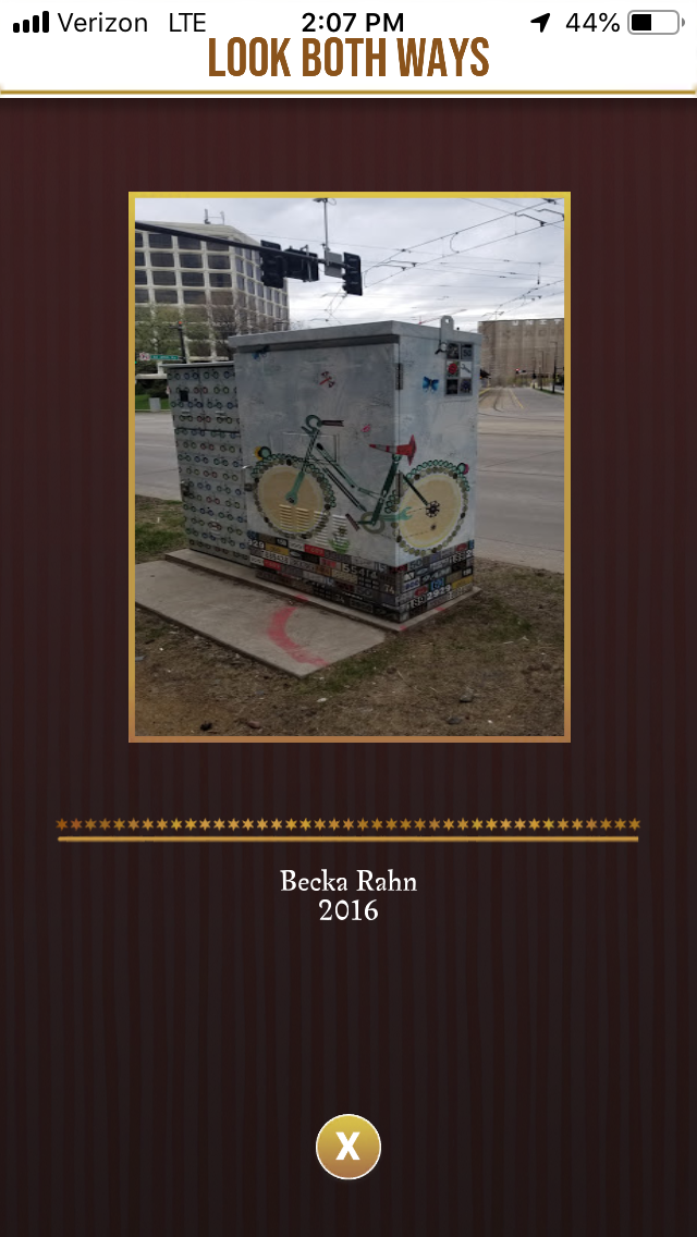
And then I met Steve. An actual human emailed me back this time. He said he had reviewed my request and made the necessary adjustments. Wait, really?

Yes, really. It took a couple of weeks for the update to work its way through, but I was in the neighborhood again today, my wizard stopped in her favorite Greenhouse and look what she saw:

I’m delighted. Probably only 1% of people actually tap on that little “i” icon and see that name, but I know that it’s there. (and now you do too.)

Persistence and patience paid off. And once I got to speak to a human, he understood the situation and he helped make it right. Thanks Steve.

So I am going to throw some muggle money at the app later tonight and get myself some Ravenclaw swag. It’s a free app to play, but it didn’t get made for free. (I’m married to a software developer and I know they work hard.) I enjoyed the game before and I enjoy it even more now that I know they aren’t a big company ignoring an artist. They didn’t have to have that little info box in the game, but they do and that means something to me. So this one has a happy ending.

My wizard in the game is named Prestidigitatia; email/DM me and I will send you my friend code if you want to be game friends. Maybe we can fight off a Dementor together someday.

9 July, 2019

Selling your Designs on Spoonflower at Craft Industry Alliance Journal

2019-07-09T10:25:24-05:00Everything Else|Comments Off on Selling your Designs on Spoonflower at Craft Industry Alliance Journal

I wrote an article for the Craft Industry Alliance Journal about selling your designs on Spoonflower. The Journal is usually available only to members, but they decided to make this story available to the public. Yay! Read here about how you should think about TACOS when you are creating your designs, and let me know if you have questions! I’ll do a follow up post here on the blog to answer them.

8 July, 2019

Wiksten Shift: I thought it would be cute…

2019-07-08T19:10:33-05:00Everything Else|3 Comments

I don’t have a lot of time to sew purely for myself. A lot of my business is sewing for other reasons: making items to sell or creating pieces for exhibitions. A few weekends ago, I ended up with some free time and nothing pressing on my agenda. I wandered up to Knit & Bolt, my neighborhood fabric store, and I bought a copy of the Wiksten Shift Dress pattern.

I’d been seeing this one all over Instagram and the craft blogs. It’s a super simple shape and I could have probably drafted the pattern myself, but I like to support indie pattern designers and I honestly didn’t want to think that hard. I just wanted to spend an afternoon making a simple dress.

I had a perfect piece of fabric: a blue/green woven that I had bought to make a dress for my sister’s wedding. I ended up not having enough fabric for the dress I wanted to make for that event, so I used something else and this green went in the stash. It’s a cool weave that has blue threads in the warp and green threads in the weft so it changes color a little as it moves and it is super soft.

The pattern has a yoke on the back and I thought it would be fun to use a contrasting fabric for that and I found a scrap of this print that I designed and printed at Spoonflower on some cotton sateen. The colors were perfect together.

Since this was a new-to-me pattern designer, I remeasured myself and checked their size chart and decided based on my measurements that I should make a size 10. So I got it all sewn together and I thought to myself that it was looking a little roomy, but it’s supposed to be a relaxed kind of boxy silhouette (something I don’t sew for myself often) so I just kept working.

And then, my dear readers, I tried it on.

It looks like I am wearing a green trash bag. In the third photo I grabbed the extra fabric and pulled it back so you can see just how much extra there is. Now I realize that I am neither 5’11” or a size 0 like the model is in the picture, but seriously. This looks nothing like the pattern envelope.

I thought I was losing my marbles. How could it be this wrong? I googled and looked at some other versions people had made and I noticed a comment on someone’s post about sizing down according to the pattern instructions. Huh? Then I glanced back at the pattern booklet and saw this note: Sizes: US Women’s sizes 0-22.  Model is 5’11” tall and a size 4 and is wearing a 4 in the top and a 0 in the dress (dress has more ease than top).  The oversized fit makes it possible to size down, but the bicep needs at least 3″ ease for comfort. 

I’ve never seen this in a pattern before, but basically this is saying if you want yours to fit like the one on the model, you need to go at least two sizes down from your measurements, otherwise you will look like you are wearing a trash bag. I completely missed that when I was reading the instructions the first time and it’s not mentioned anywhere else. So if you don’t see it and make it in your size like you would normally do, you might be in for a surprise.

So there is no way I was going to wear this thing.

I put it in a time-out for a few days so I could think how to rescue it. My first brainstorm was to use elastic thread to ruche or shirr the underbust/waist area to give it a defined waistline. Made by Rae has a great tutorial about how to do that. I didn’t take a photo. Let’s just say it wasn’t successful. I had trouble with bobbin tension and the thread breaking and I lost patience with that. I have used this technique in the past with great success, but that was on my older sewing machine and I wasn’t patient enough to figure out the tension on this newer machine. Rae says that it is totally worth buying a better quality elastic thread than you get at the Joann’s and I think that was part of my issue. The elastic thread I had was not great. I didn’t want to bother to track down better stuff.

After chatting with someone else online with the same fit problem, I decided that the only thing to do was to try recutting it. So I left the neckline and shoulder seams, ripped out the side seams and pinned and recut the pieces down to a size 0. That might seem dramatic, but when I measured how much ease that I had, I realized that I could go down 5 sizes and still have plenty of room.

You will notice there is no picture here. It was definitely better with all of that fabric taken out. Waaaaay closer to the fit you see on the model in the photo. But unfortunately still just mediocre. I cut the short length on mine because I am 5’4″ and the pattern piece for the long version was all the way to my ankles. I don’t think the longer length would have been good either.

So why am I posting this? Nobody ever posts photos of their flops. If I had made this as a beginning seamstress, I would have blamed it all on myself and figured the reason that it didn’t look like the one in the picture was because I didn’t know what I was doing. And that’s totally not true. I am not saying this is a bad pattern, but I am going to say that this is a bad beginner pattern. Although it’s super simple to sew, it is deceptive. It’s only going to look cool like the pattern envelope in a very special set of circumstances. I was excited to sew something, I jumped in and I didn’t listen to my wiser self.

  • You have to realize that the pattern is telling you to ignore what you know about picking a size and size down 2-5 sizes. I am really not sure why they didn’t just re-size the pattern if the way they were going to represent the pattern in photos was to show someone wearing the “wrong” size.
  • It needs the right fabric. Mine was a mid-weight woven. I think something lighter/gauzier/drapier might have made mine look less trash-bag-like.
  • Boxy is just not a silhouette I like. I knew this dress was that shape and I made it anyway.
  • When you are 5’4″, the dress length is not designed for you. I think most commercial patterns are designed for someone 5’6″, I couldn’t find that info about Wiksten, but I suspect it might be slightly taller. I think a slightly longer length in this one might have been better proportioned for me.

Have you made a Wiksten Shift? What was your experience?

Go to Top