18 June, 2019

Intention and Expectation: Attending the Americans for the Arts Conference

2019-06-18T09:21:25-05:00An Artist's Life, Everything Else|Comments Off on Intention and Expectation: Attending the Americans for the Arts Conference

The Americans for the Arts (AFTA) conference was held in Minneapolis this weekend. It is a national conference for art administrators primarily to get together and talk about funding, sustainability, data, evaluation, and innovation and do it in a room with other people who get it. I love being an artist, but I was really good at being an arts administrator. Art is something I have to do because it is part of who I am and I can’t not do it; being an arts admin was something I was called to do by whatever little voice in your head it is that tells you that you need to do this because you can make a difference.

I left my arts admin job about 5 years ago. It was an organization that I deeply loved, a mission I believed in and a community with a lot of untapped potential. I worked way too many hours and there were some parts of the approximately 1 million cobbled together parts of my job that I was less than wonderful at, but by and large it was a good fit. I did good work and proud of the projects and connections I got to be a part of.

But something changed. There was a transition in leadership. The board of directors decided to shift the values and culture of the organization to follow a different path. It wasn’t just “things change because of new leadership and people hate change” but a bigger organizational shift that included altering the mission statement. I’ve been on enough boards of directors to know that I don’t know the whole story about why and how that came to be, but I do know that suddenly I was part of an organization that wasn’t a good fit anymore and was moving in a direction that I wasn’t really excited about. And I didn’t have a voice in that change. So I needed to leave.

I don’t talk about this much. Mostly because it has taken me a long time to process it. On my last day, I turned in my keys, walked out to my car and sobbed in the parking lot. It was emotional and complicated and I couldn’t really articulate anything except the gut feeling that I needed to move on. I still think it was the right choice. It doesn’t make it less hard.

So what does this have to do with the AFTA conference?

This conference was really designed for arts admins. Everyone asked me “who are you with?” and looked quizzically at the big blank space on my nametag where my org name would be. It made me a little nostalgic. It’s hard to be an independent artist. This conference, like many others, had a couple of afternoons of concurrent sessions. You get the agenda and read two or three sentences and try to pick which of the five different topics to go to. This is always hit-or-miss. I’m not an arts admin anymore, so I felt a little like an odd duckling. I got a scholarship to attend this conference because I wrote an essay about making more connections as an independent artist and how I thought these sessions would be valuable to me as a board member of the orgs I serve. (Thanks McKnight Foundation!) So I picked topics that I thought were a good match for those goals.

After about 5 minutes in the first session I chose, I was sure I had made a big mistake. The presenter was charismatic, but instead of diving in to her topic, she told stories about her family and she had someone from the audience sing for us. It was a presentation outside of the box and I was a little restless. I wanted things I could write down in notes. I fiddled with my tea cup. I felt irritated when the conversation veered off into something spiritual. It wasn’t what I expected.

And then I had to shake myself. I was an an arts conference. Learning about art. Which by definition is outside the box. And should make you a little uncomfortable maybe. I was so caught up in taking notes to help me write the final report for the scholarship, that I sort of forgot that I was there to talk and think about art. This session was more like a collaborative performance with the audience than a lecture and I was totally missing it.

So I took a deep breath.

And I listened.

I couldn’t write a summary of the session for you if I tried. And I only wrote down one sentence in my notes but I ended up coming away with things I am thinking about a couple of days later.

“When you come in, leave the gate open.” That’s the quote I wrote down. Her story with this quote had a different intention perhaps, but my take was this: When you start to explore something new, invite people to come along. Leave the gate open so they can follow and explore too. It’s a way to think about inclusivity in what I do. How do I leave the gate open for the next person to come in?

The second story that she shared that stuck with me was about a gallery opening where the attendees were more focused on taking selfies with the art than being with the art. She realized that the way she was talking about the work (promoting/press releases etc) was attracting a specific kind of audience with an expectation of how both the art and the viewer should interact. And that wasn’t the community or culture she was trying to build. So she stopped sending press releases. She didn’t dig in to this idea much deeper but it got me to think about the idea of not only curating your work, but curating your audience as well. Creating the culture and community that you want to be a part of. That’s something I want to think about more.

At another session, with another captivating presenter, I was 100% in the moment until he had everyone stand up and hug three other people. I understand the message he was trying to demonstrate about connections and community but there was no way I wanted to hug a bunch of complete strangers sitting around my table. (Haven’t we learned anything about touching people without their permission?) There was no way to gracefully opt out of that assignment, it was awkward and super uncomfortable, and it certainly made me feel differently about that session.

Finally, at the closing session another presenter had us write on a piece of paper and then take it and construct a paper airplane. I don’t remember what we were supposed to write or what the message of the activity was (apologies to the presenter) because I got caught up watching the other people at my table. I folded my very favorite paper airplane right away without hesitation. I do a lot of paper art, so it was easy and I didn’t even think about it. The person to my right teased me about being too eager to throw the plane. “You did that too fast,” he said. Next person around the table made a functional plane, but he had a lot of extra creases in the paper from overthinking and re-doing. The woman across from me taught a lesson to several others so they would do it the “right” way. One or two people looked puzzled like they’d never folded a plane before. One argued about the merits of folding the wings diagonally vs horizontally. One woman folded hers quickly and quietly but looked a little like she was embarrassed to admit she knew how. I was completely fascinated to see how many ways that this random group accomplished the same basic task and their reactions to it.

What do all of these experiences have in common? I think it was all about intention and expectation. 

First was a mismatch between the presenter’s intention for her session and my expectation about what it was going to be. I could have left the session being irritated and grumpy that it wasn’t what I wanted it to be, but I chose to change my expectation.

Next was about realizing that when you do things in an expected way (traditional press release) you will probably get an expected outcome (traditional attendees). If your intention is to change the way something works, you have to change the way you talk about it.

Third was an intention by the presenter to break down a barrier and make people feel included. However, the intention completely backfired by making me  (and others) feel uncomfortable and dreading the expectation of more unwelcome interaction. (spoiler alert, he had us tell each other “I love you”.)

Finally, the intended message of the closing exercise ended up having a completely different meaning for me based on my own take on the process involved.

As an artist, these are awesome things to think about:

  • Will the participant/viewer understand what I am intending with this piece or process? How can I help them know what to expect ahead of time?
  • Am I communicating the outcome I want to have happen after they’ve seen/interacted with this piece?
  • Are the ways that I am creating or teaching putting up barriers for someone to interact with the work?
  • Am I open to the other ways that my work can be interpreted and what can I learn from that?

Although this was an arts conference, we didn’t talk very much about art. We talked about strategic planning and troublesome board members, HR issues and theories of change, data and consulting firms. But my takeaways from the sessions and the things I am thinking about the next week don’t have anything to do with the topics of those sessions.

It did what great art does: It made me think. I had a reaction. A mismatch of both expectation and intention, maybe, but an experience I took something away from nonetheless.

7 June, 2019

Fabric Review Part 2: Spoonflower’s Petal Cotton vs Sateen

2020-05-22T12:55:40-05:00Everything Else, Fabric Reviews, Spoonflower & Fabric Design|4 Comments

After I posted my initial comparison with Petal Cotton, Basic Cotton and Kona Cotton from Spoonflower, I had several people ask me about Cotton Sateen. Sateen is my favorite of the lightweight cotton fabrics and has been for a long time. Sateen has a different kind of weave structure. Instead of the warp and the weft threads being evenly distributed, a sateen weave lets the warp threads “float” across the surface of the fabric. I’ve always found Spoonflower’s sateen to be the best for printing fine details; designs always print very crisply. (It’s also 56″ inches wide, which means you get a lot more fabric when you order a yard of sateen.)

Holding the Sateen and the Petal cotton swatches in my hand, the Petal feels a little heavier/thicker, but when I weigh them on my postal scale, they show the same weight, so the difference is subtle.

As far as printing, Sateen still is the best for crisp sharp details. Petal is great (and a big step up), but Sateen is just a little sharper yet. On this design you can see it best in the grey-on-grey sections. The edges of the shapes are just a little more precise and sharp. The colors/saturation between the Petal Cotton and Sateen are very very similar. I can see a little difference in contrast. In this design, the greys have a little more contrast on the sateen – the darker shade is darker on the Sateen vs Petal and the yellows are a tiny bit brighter.

Overall, I think the Sateen and Petal are very similar print wise; the biggest difference is the fabric itself. I have used the Sateen to make a number of dresses and I think it is lovely to sew with. It presses nicely and it has a nice drape. I have ordered some Petal to make a couple of summer tank tops and I am curious to see if the thicker-feeling fabric feels too bulky as a clothing fabric.

14 May, 2019

Fabric Review: First Impressions of Spoonflower’s new Petal Cotton

2020-05-22T12:55:51-05:00Everything Else, Fabric Reviews, Spoonflower & Fabric Design|9 Comments

This week Spoonflower replaced two of its standard fabrics, the Basic Cotton and Kona Cotton, with a brand new Petal Signature Cotton fabric. I am a Pro member of Spoonflower so I got a sample swatch a week or two ago and I wanted to write up some of my first impressions of the new fabric.

First, I want to talk a little about the retired fabrics. I hardly ever use Kona Cotton. It’s really a quilting fabric and I am not a quilter so I don’t have a lot of reasons to use it. I always thought it was a nice quality fabric, but I don’t have a lot more to say about it since I use it so rarely.

I have always felt that the Basic Cotton was exactly that: basic. I consider it to be something like dressmakers muslin; great for testing things but nothing special. It was relatively light weight and I always felt like the print quality was a little lackluster. The colors seemed a bit dull. All in all it was an absolutely fine craft fabric but I never felt like it was something I wanted to make a finished project out of. (Sateen was my go-to favorite cotton for that.) I have ordered a lot of Basic Cotton to test colors and print scale so I have a lot more experience with it than the Kona.

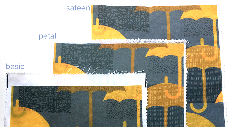
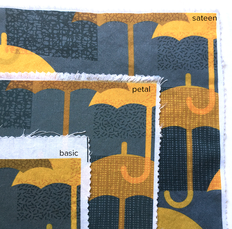
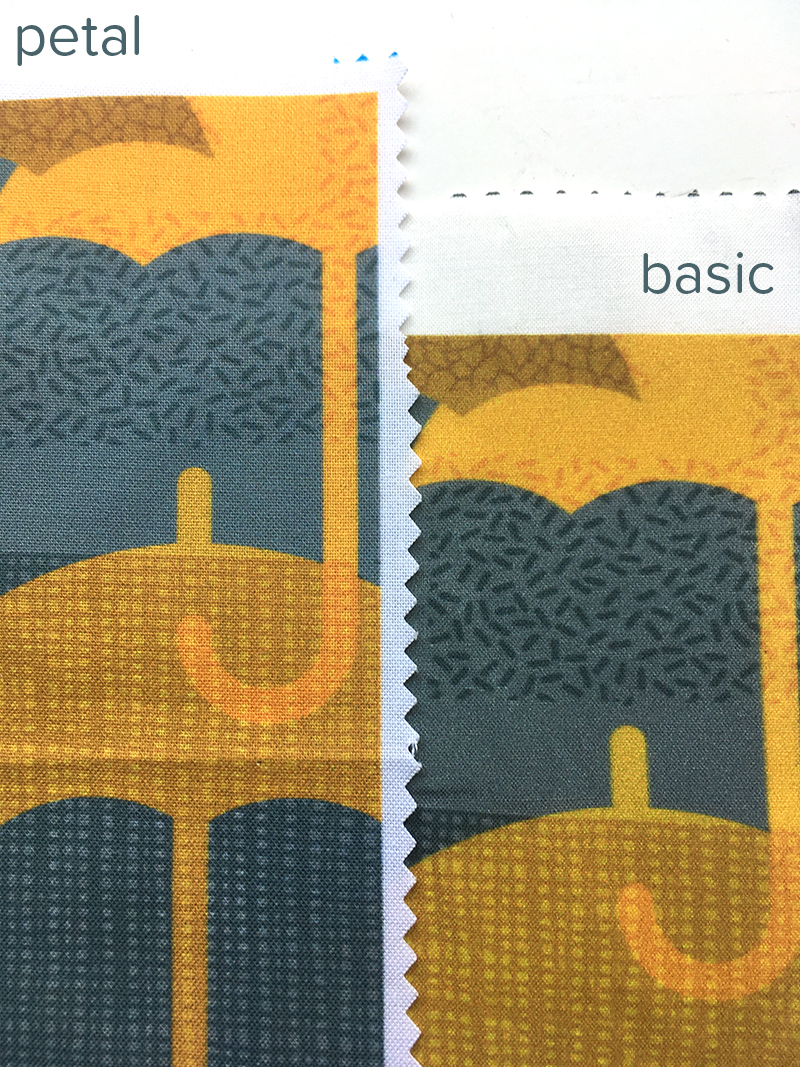
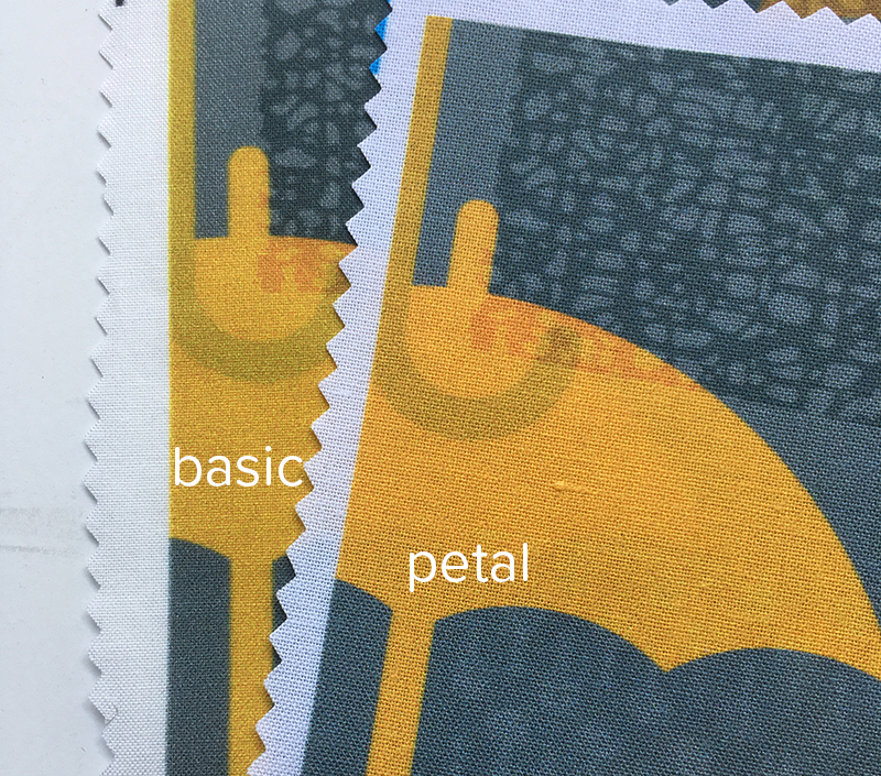
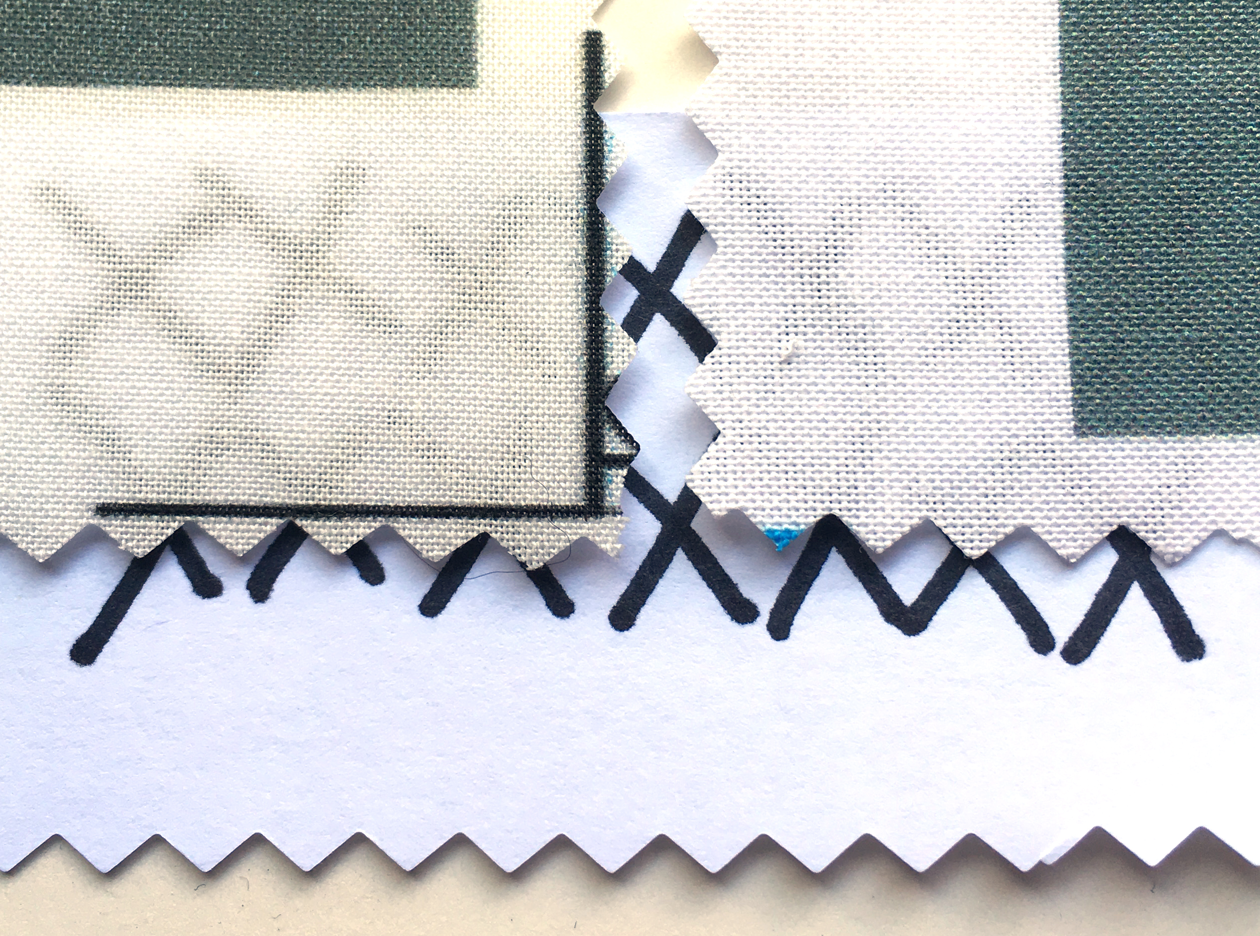
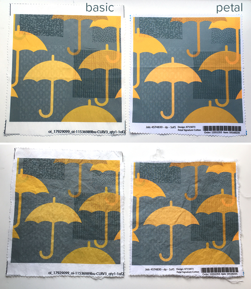
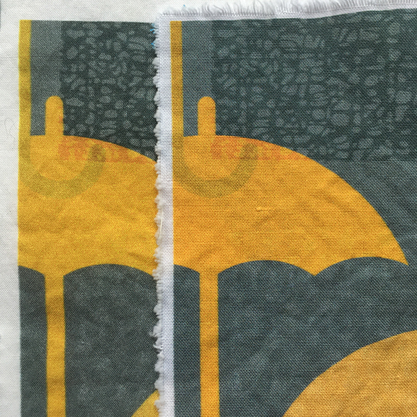
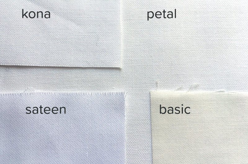
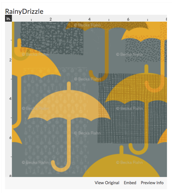
When I ordered my test swatch of Petal Cotton, I chose the same design I had just printed a few weeks before on the Basic Cotton. This Rainy Drizzle design was a design challenge entry of mine from the April Showers theme.

First Impressions

When I first pulled the swatch of Petal Cotton out of the mailing envelope, my first impression was how nice it felt. It has a very smooth texture and had a nice weight in my hand. According to Spoonflower, the new Petal is 4.3 oz per yard, where the Basic was 3.2 oz per yard. You can feel the difference. I even put the two swatches on my postal scale and it could measure a difference in the weight of the swatches. The new fabric doesn’t seem thick or heavy, but you can definitely feel a different density or something like that.

The next thing I noticed was that the new fabric is a brighter crisper white. Basic cotton never seemed not-white-enough for me, but you can see how much brighter the Petal is when they are side by side.

I think this fabric brightness effects the colors when you see the printing as well.

The color graininess that you can see in the yellow on the basic cotton isn’t something about the photo, it’s there on the fabric. The printing not only seems crisper and sharper on the new Petal cotton, but the colors have a little boost in vibrancy. I think you notice the sharpness especially on this design when you look at the U shaped hook of the umbrella handle above. Soft fuzzy edges on the Basic are much cleaner on the Petal cotton.

Next, I wanted to see how transparent the light colored sections of the fabric were, so I drew a bunch of Xs with a Sharpie on a piece of printer paper and slid it underneath the edges of the swatch. Both are slightly transparent, but the Petal (on the right) is possibly less so.

After Washing

I took both of these swatches and put them into the washing machine with a load of jeans. I figured that if anything would give them a real test of colorfastness, it would be tumbling around with jeans. I washed them in a regular cycle and put them into the dryer on hot. No special treatment. I didn’t iron them when I took them out of the dryer so you can see how wrinkly it is fresh out of the dryer. Neither one wrinkles significantly, which is nice.

I cut the edges with pinking shears before they went into the washer and I think the Petal Cotton frayed just slightly more than the Basic at those cut edges.

I don’t see any significant difference with the colors or saturation before and after washing. (There is a slight variation in the before & after photos above but that is due to the fact that I was using natural light and took the photos 2 hours apart.) Nothing looks to have faded and I don’t see any issues with patchiness or color abrading where the fabric got folded or anything like that.

The hand of the fabric is different for sure. Before washing, both fabrics were very stiff. After washing, the Basic cotton has less body than the Petal Cotton. It feels thinner and less substantial. Spoonflower says that both fabrics shrink about 3-5% when washed. I measured the swatches before and after washing and couldn’t see any shrinkage. I suspect you might notice that more on a larger piece of fabric.

Overall

I think the Petal Cotton is a fantastic upgrade. As a designer, I know that a LOT of my customers buy swatches and Fat Qs of Basic Cotton and I am excited for them to get the Petal Cotton instead. I think this design in particular looks significantly better and I have to assume that others will as well. The Petal Cotton is the same price as the Basic and the same width. I like that this design at least prints more vibrantly and with more sharpness. I was initially a little disappointed with the mustard color in this design because it looked muddy on my swatch and I was intending to tweak it. But I don’t think I need to do that anymore. That’s great! (If you want to try it out, Spoonflower has Petal Signature cotton on sale for 10% off this week through May 19.)

What else do you want to know about the Petal Cotton? What are your questions? Have you tried it out yet?

Edited to add

With all of the comments about the weave structure in Kona vs Petal, I was really curious and pulled out a swatch of Kona to compare. This photo is unwashed Kona, sitting on top of a piece of unwashed Petal. The two are virtually identical as far as the thread spacing and thickness of the threads. When I zoomed in (using Photoshop), I could count 16 threads per inch (horizontal) in both fabrics.

And here are petal, basic, kona and sateen all together.

10 April, 2019

Five years at the American Craft Council show

2019-04-09T23:04:19-05:00An Artist's Life, Everything Else|2 Comments

This year was my fifth year exhibiting at the American Craft Council Show. If you don’t know about their shows, here’s a little nutshell. The American Craft Council is located in Minneapolis (formerly in NYC) and they are an organization that promotes fine craft. They put on a conference, host lots of talks and small events, and publish two magazines that “champion handmade”. Each year (for the past 30+ years) they put together a large craft show in four different locations: Atlanta, Baltimore, St Paul and San Francisco. Each is a juried show with 200+ artists working in fiber, metal, jewelry, wood, or glass.

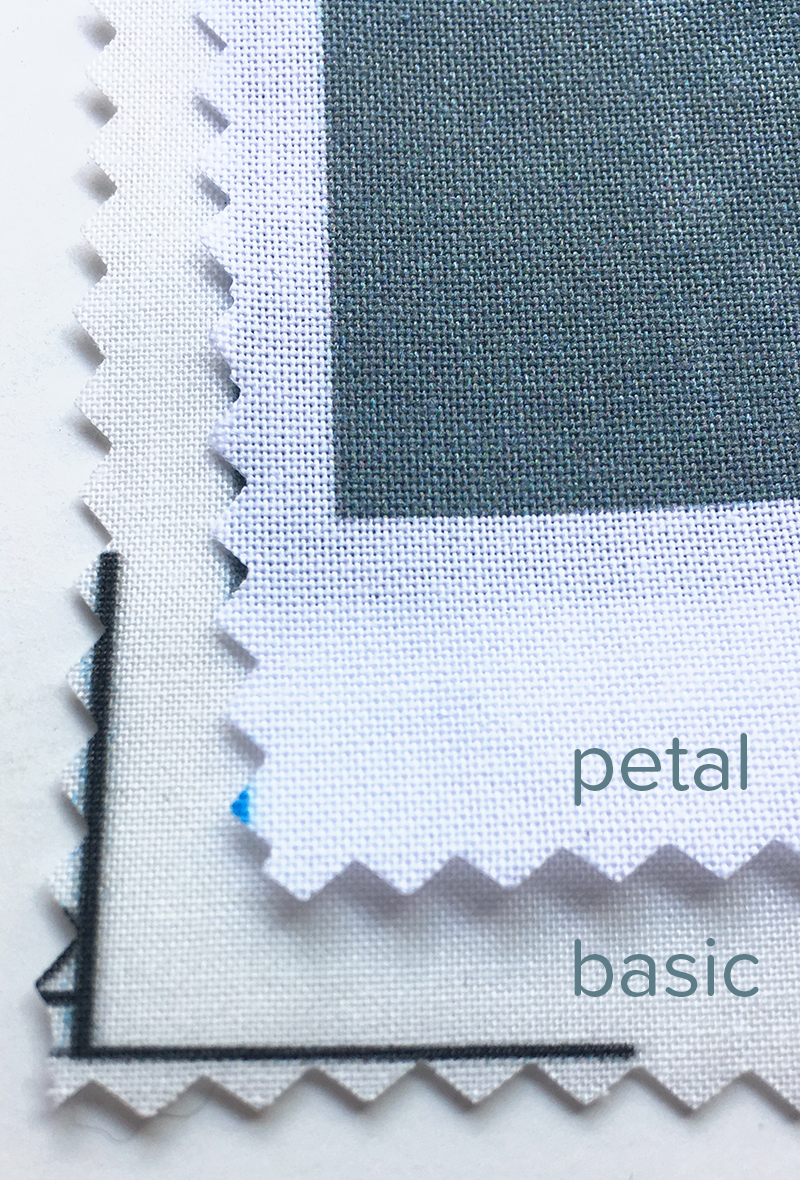
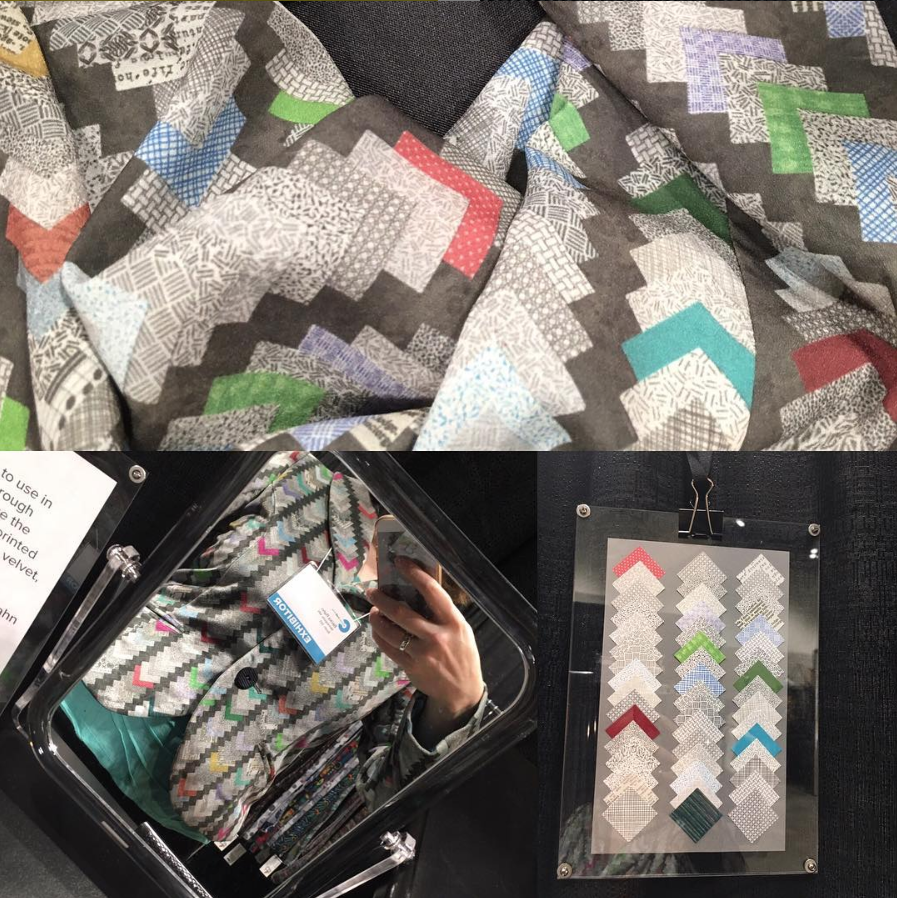
I started with their Hip Pop emerging artists program. That’s an image of my 2017 booth in its cardboard glory. (I actually think the cardboard popups are awesome and I think my work really popped against that kraft paper color.) Hip Pop is also a juried program but allows artists to share a booth with other emerging artists. The booth fees are lower (because of the limited space) and some of the display/lighting is included, so it is a way for new artists to try out the show and see if the audience is a good fit for their work before investing in a full both space. Once you have juried in as a Hip Pop artist, you can return to the shared booth for 3 years and then “graduate” to a full sized booth for the next two. I just completed my fifth year, so next year I will need to re-jury into the regular artist pool.

This year’s show just finished on Sunday and I was talking to someone about how it went and did I make enough to cover my costs. This is something we talk about as artists a lot. Some rough math in my head said “yes! It was a great year” but then I got curious about what the numbers said. One of the cool things about Square (in addition to it making credit cards super easy to take at shows) is that there are all kinds of reports I can pull up from the last 5 years and I can look at all of my data.

Talking with my neighbors, we all felt like Friday was a little slower than normal this year. I felt like Friday was usually my best day of the show and I think that’s pretty true.

This shows the percentage of my sales for each day. Thursday night is basically a cocktail party for the Craft Council donors; it’s always a pretty slow night for the artists. For the last three years anyway, Friday sales have been over half of my total. I think this probably tells you something about the typical audience that comes to this show; I tend to see adults with more flexible time and perhaps more disposable income. Saturday is more families and friends coming in groups. Sunday this year was more when I saw kids and some more age and gender diversity coming through. I definitely sold different kinds of items on Friday vs on Sunday.

This shows my sales for each category of item. The big difference you see here is the jump between the Hip Pop booth (2015 – 2017) and the full sized booth (2018-19). My sales nearly doubled when I went to the larger booth size. I wasn’t sure that would happen and I was pretty nervous. But so far that has worked out for me.

Loop or infinity scarves are my signature piece and I have had those at every show of the five years. They are easily my bestseller. The rectangle scarves, larger wrap scarves and skirts I have had in various forms every year, but I haven’t always had space to display very many of them. You can see the skirts especially are really variable. I didn’t sell any in 2017 (even though I had them there) but lots more in 2015 and 2018.

Miscellaneous was my catch-all category for things that I didn’t have every year. It included bow ties in 2016-2018, neckties this year, and some dresses in 2017-2018. I tried out different things to see what would work. Ties are always pretty popular. I did new neckties for the first time this year, but decided not to bring the bow ties because I didn’t have very many and I just ran out of time to restock. Dresses are a challenge because there is no good way for people to try them on; my 10×10 booth just doesn’t have enough space for a changing area.

The size of the total bar represents my total income for the year. Last year was a pretty great one. This year felt like attendance was maybe a little low (I don’t yet have official numbers, so I am not sure.) and I was in a different part of the room than I have been before. I am not sure how much of a difference that makes.

Finally, I actually got to the question of: did I break even? did I make any profit? This chart represents my total income for the show year (blue) and then all of the expenses (other colors) for the show. Materials included everything I needed to make the things that I sold at each show, plus a little extra to cover things like business cards, tags, stickers etc. Show fees included the pipe and drape and electricity for my booth. Booth cost was the fee I paid to rent my booth. Card fees was for credit card processing. I should note that this is a pretty prestigious show and the booths are not inexpensive. It takes a lot up front to be able to even participate and I want to acknowledge that. I didn’t count materials for things I haven’t sold yet. I had a lot more inventory there than I sold; you need that. It’s a big leap of faith that you will even sell enough to cover any of that.

I am pretty happy to know that every year my income exceeded my expenses. Not by a *lot* but by enough; those blue bars are all more than half. That difference is the amount I can pay myself for my time. As we were packing up, my husband asked if I thought I had made enough this year to pay for my time and I wasn’t sure. Wait, I can hear someone say. Aren’t you a business person? Shouldn’t you know all of this? Doing shows like this is only one of my sources of income, so I don’t usually break it down show-by-show but I look for balance among all of the things that I do. Sometimes I make more, sometimes I make less. It all comes out in the wash, as they say. But I was curious about this show specifically.

So I did the math. I always time myself when I am making a thing that I intend to sell. I know that zipper bags take me 7 minutes from start to finish. That’s the way I calculate my prices and it lets me know for sure whether I can accept a large order of something. I know exactly how long it’s going to take me to make 5 or 50 of them. So I figured out how long it took me to make all of the inventory I sold, plus about 8 hours of prep time getting other things ready for the show (ironing, printing tags, social media, washing tablecloths, running to get change), plus all of the hours I worked the show from load in to tear down. And I made $10.95 per hour.

To be honest, that’s actually more than I thought it would be. I am pretty excited about that. No, I am not going to retire on that kind of income, but even a smallish success is success! I know it’s more than I made from my first summer job.

There’s also the potential things that always come out of spending a weekend surrounded by my work and talking to people about it. I was asked to teach at a new venue. I had a possible wholesale order. I gained a handful of social media followers. And when I say handful, I mean less than a dozen, seriously. For every 300 people you talk to, 3 will actually sign up for your stuff. (I get it. I don’t sign up for everyone’s mailing lists either.) But those were people who were interested enough to find me and follow. That might mean that I will see them again at the show next year.

It’s also fascinating to me to talk to people about my work. Last year I had a lot of less than encouraging comments about how I used computers and if that meant that my work “wasn’t real art” (an actual quote from a visitor) and some negative reactions to the fact that I print on a lot of polyester (for many reasons, but those are for another post). It was almost exactly the opposite this year. I had really positive comments about how I was using a computer in really cool ways and many people appreciated that poly was so much easier than silk to care for/wash/pack for travel.

I sold out of infinity scarves in this brand new “Fair Isle” design (it was a Spoonflower design challenge entry from 2018), and two perennial favorites (Waterlily Mosaic and Tweed). For the larger rectangle scarves, I sold out of “Decadent” (another recent design challenge entry), which I thought might be too bold, but it was a big hit and Tweed again in that larger size.

I was a mentor this year to a couple of Hip Pop (emerging) artists. I wanted to continue to share some of my experiences from the show by writing this post because I feel like when I was brand new and thinking about applying I had no really helpful information. I didn’t know that Thursdays were slow or that no one would sign up for my mailing list and I wasn’t sure if it was just me. I didn’t know if I could sell enough at my $40-$60 price points to even make up that booth fee. I only sold 31 items that first year. That’s not very many when you think about it, but it was enough for me.

Overall I love this show. I LOVE the artists involved. They are the most supportive, welcoming and generous group you could ever ask to be a part of. Your mileage may vary, of course, but I have had nothing but positive experiences. It is an honor to be among such talented and dedicated makers; their craftsmanship is phenomenal. It is inspiring to be in that room. I think the Hip Pop program is brilliant and I enjoyed being a part of its pilot years. I am nervous that I won’t get juried in next year. (Hip Pop graduates don’t have to re-jury their first 2 years in a full booth.) What if the jurors think that the computer makes my work “not real art”? I’ll be holding my breath waiting for that acceptance email.

14 February, 2019

Making art is pay to play; I wish it wasn’t.

2019-02-14T16:32:53-06:00Everything Else|5 Comments

I was reading a post on a friend’s Facebook page a few days ago. Her daughter is a dancer; she was a dancer in her youth. The post (which my friend didn’t write, but was commenting on) was an open letter to some dance-related organization about girls showing up to audition for something and having to pay a fee to audition. There were a lot of comments, mostly that expressed outrage that anyone should be expected to have to pay to participate in an audition. I didn’t comment because I am not part of that community, but I snorted and thought to myself “Welcome to the club!”

As an artist, I have to pay to audition all the time. Nearly everything I apply to has a “jury fee” associated with it. I was talking with friends about this several months ago and we were all surprised. They had never heard of a “jury fee” and I didn’t know that my non-artist friends didn’t know this was a thing. So that seemed like a great reason to write a post about it.

Most of the shows and exhibitions my work would be a good fit for have an application process. You submit an artist statement and maybe another statement about how your work fits the theme of the show. You upload an art resume. Then you choose images to represent your work or the specific pieces you think would belong in the show. The specs for these are always wildly different. You spend a LOT of time recropping and resizing your images so they fit whatever format that the spec says. Then you pay a fee. The last few shows I have applied for have been $15-$45, due when you submit your application. “Art sale” style shows have a similar set-up. You often jury in to the show for free, but the booth fee is due generally when you are accepted and those for me have ranged $75-$1100.

Those fees are non-refundable. You don’t get it back if you don’t get into the show or if your sales at the show are dismal. It’s what you pay to play.

A couple of years ago, I applied to a LOT of things. I wanted to get my work out there. I had some new pieces and new photos and I was fired up. And then at some point, as the “no thank you” letters started to come in, I realized that there were possibly a lot of better things I could be doing with those $250 worth of fees I had spent. I wrote about it a bit in this post. I thought about that post this week as I was waiting for the results of a jury selection; one of a very small handful of things I had paid a fee to apply to this past year. (I found out I didn’t get in to that one by seeing other artists post their “YAY! OMG I am so excited!” posts on Instagram two days before I got an official “sorry, no thanks.” email. But that’s another post.)

I currently sit on two boards of directors for cultural organizations and most of the big, important and sometimes contentious discussions we have been having recently have been about accessibility. How do we make sure that we are doing things in ways that are accessible to more people? What are barriers to participation and how can we address them? We don’t yet have all the answers, but we are working on it and trying to understand better who is not at the table. With that lens so often in my mind right now, I was thinking about this whole “pay to play” concept and how much it is a HUGE accessibility fail.

I am fortunate that I have the ability to pay for those jury fees. I have an active business selling my work and I can use some of those profits to help with these fees. There have been points in my life/career/business that I wouldn’t have been able to do that and it would have been choosing between jury fee or grocery money. And it’s not just the fees. I have a computer and internet access at my house. I can photograph my work and I have all of the equipment to do that. I know how to reformat .jpgs and .pdfs and jump through whatever technology hoops those applications require. Applying to anything also takes time. An exhibition might take an hour; a grant might take 8 or 10 to do all the preparation for the application. I don’t get paid for any of that time.

How many people do I know who can do all of those things and take on all of that expense? Not many. Talk about barriers to participation. So what can I do about that?

I don’t have the answer.

So I am throwing the question out there to all of you, too. Just one of the opportunities I applied to had a statement that said something like “if you can’t afford the application fee, just contact me and I will waive it because I don’t want anyone to not apply because of that”. I appreciate the effort, but I wonder if myself-in-a-past-life-who-would-have-had-a-hard-time-affording-that-fee would have stepped up and said “I can’t afford this” and taken advantage of that offer. I don’t know. I’m in a position with the organizations that I am involved with to have a voice in the accessibility of these kinds of opportunities, but it feels like not much. I have been passionate about teaching technology to artists for many years and I can continue to teach people about photographing their work and helping to demystify DPI and MBs. I realize that there are totally legitimate reasons that organizations charge fees for these things. I have worked in the non-profit arts field for 20 years. They need the money. But I have to wonder if the last one I applied to really can justify the $10,000 in fees that the jury process generated.

And this goes right along with my philosophy when I am teaching, too. I primarily teach fabric design, which has some technology that is required to be able to participate. I have always tried to offer levels of participation when I put together classes for hosting organizations to choose from: a “Photoshop version” and a “free and cheap online software” version. When I first started, there was definitely a bias towards “We must use Photoshop because that is what the professionals use”. But lately, the only version that organizations have been choosing for me to teach is “free and cheap”, which has huge advantages and disadvantages. Photoshop and its siblings are expensive. Absolutely. So using things like PicMonkey and RepperPatterns (two apps I use a lot) brings that cost down a lot for students and does make it more accessible in some ways. But the trade off is that PicMonkey is not Photoshop. I can *almost* do all of the same things in both programs; I’ve worked hard to figure that out. But only *almost*. The way you do it in PicMonkey might involve a few more steps and a little ear-nose-elbow kind of manipulation to get you there and there are some things you just can’t do. Which students find really frustrating and they let me know that.
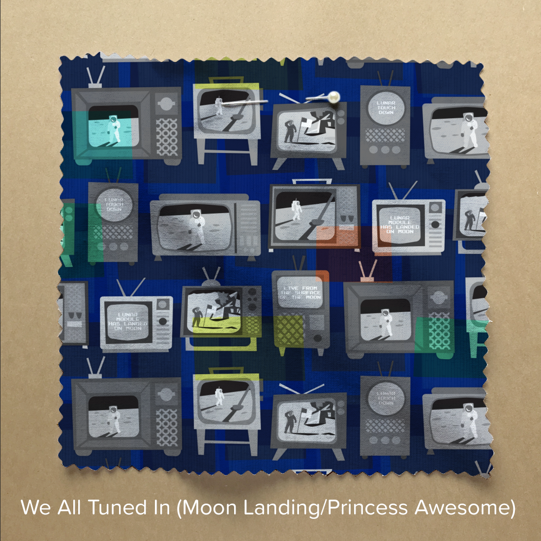
I’m trying to make a commitment this year to myself to get some online classes done, turning the Spoonflower Master Class that I have been teaching into an online version, so more people are able to participate. That’s really important to me. I want more of you to be making art right alongside me, not just the people who can afford to fly somewhere for a weekend. The online class will cost a lot less (because I can take out all of the travel/hosting/hospitality costs of doing the class in a physical space) but I go back and forth about how I teach it. Do I choose the “pro” version and make it so you have to have Photoshop/Illustrator? or the “free and cheap” version so maybe I can reduce that financial barrier. (And no I can’t put both in one class.) I can’t decide. And I know I will get criticism both ways. It’s something I need to think about some more. And talk to some more smart people.

What are your thoughts? How can we as artists (and aspiring artists) help organizations be more accessible with these kinds of opportunities and get away from the pay-to-play model? What can we do to help make that happen?

22 January, 2019

Spoonflower Design Challenge: Moon Landing

2019-01-22T10:47:52-06:00Everything Else|1 Comment

The design challenge theme this week was “Moon Landing”, celebrating the 50th anniversary of Neil Armstrong and Buzz Aldrin landing on the moon. It was a partnership with Princess Awesome, a company that designs science and technology themed clothes for girls. Many designers went with “girls in space” interpretations of the theme, but I wanted to celebrate the event itself.

I did some photo gathering online and looked at the way I would have experienced the moon landing: watching it on TV. I found lots of pictures of people gathered around television sets. I drew a collection of slightly wonky retro televisions from elements I saw in the photos and made illustrations of some of the iconic images from the broadcast with astronauts on the bright surface and deep shadows. On a few tv screens I put the captions that were on the broadcast. (This photo is from a friend of my mom’s who took a photo of his tv screen while he was watching.)

I wanted my televisions to be black-and-white, so I added a vibrant blue background to the design and then some transparent pops of color on top.

It was fun to work on and especially fun to do the photo research. You can see more moon landing designs at the contest page.

Go to Top