7 August, 2023

Pattern Review: Itch to Stitch Santorini Tank

2023-08-07T12:47:53-05:00Fabric Reviews, Sewing & Design|1 Comment

It’s been about 5 years since I have sewed something just for myself, just for fun. That seems crazy to me, but I think the last one was a dress for my sister’s wedding. I do a lot of sewing for my business, so the machine has put in the miles, but the only things I have made have been basically business related.

I realized that I wanted to just spend a day sewing for me. So I went on a search for some fabric that was not something I had designed and was something a little special. I have had great luck ordering some Indian cotton fabrics on Etsy. I ordered several yards of block printed cotton from this shop. It’s lovely. Smooth, soft, washed beautifully. Exactly what I wanted for a blouse.

I was going to make a favorite tank pattern (Gemma by Made by Rae) which I have made several dozen of over the years, but I needed to do an adjustment to the pattern because my body just isn’t the same shape it was 10 years ago and I was just feeling like I wanted to sew and not do math. So I was doing a little searching and this pattern popped up in my feed and I had to try it.

The Santorini Tank by Itch to Stitch. So much to love: the interesting seam lines, the button detail on the side. The fact that this pattern comes in sizes 00-40 and 4 different cup sizes! I’ve made one other pattern by Itch to Stitch before and I loved it, so I was pretty sure it was going to be great.

It took me about 4 1/2 hours to tape the pattern pieces together, cut out and sew my first one. I chose a size 12, C cup based on measurements but I have decided that it has more ease than I prefer, so I will go down at least a size in the future. (I made two; you’ll see that later.) I found vintage shell buttons in my stash, which were perfect.

What I love:

  • It has a great way of stitching the armhole facings “burrito style” and a link to a blog post about how to do it if the instructions are confusing to you.
  • The finishing details were really thoughtful. No weird raw edges on the inside.
  • Great instructions with lots of links to extra help.
  • The fit/shape is awesome.

My adaptations:

  • The pattern calls for 5 – 1/2 inch buttons which felt like not enough to me. I did 7 and they were slightly larger.
  • My sewing machine had issues stitching the two buttonholes right at the top because of the extra/varying thickness of fabric there. Not the fault of the pattern, but I might think about how I could tweak that construction a little bit so I don’t need to seam rip buttonholes out. (Argh!)
  • Eleventy-one pins really does make all the difference in making a curved hem lay nice and flat. I used the hemming method from the Gemma Tank which I mentioned up above, because I have had success with that before.

And then I made another one!

I also had a piece of Atelier Brunette Viscose Crepe which I got from Wyldwood Creative. She “unboxed” it live on Instagram and I ordered it that day. I love this vintage style print and texture. See a photo below. The one I chose is Lucie Cedar (green); she also has it in a blue and a gold/peach color. I had never seen this fabric in person before so I felt like this was a little leap of faith and I was absolutely rewarded! It is so gorgeous.

I decided to take another chance and I threw the fabric in the washer and dryer when it got here. Spoiler alert: that is not what the washing instructions tell you to do. But if I am making a garment, I will need to wash it and it’s going to end up in the laundry at some point no matter how carefully I try to remember to pull it out for special treatment. That’s just how it works at my house. I lucked out. It came out great with my not-following-the-instructions treatment.

For this one, I didn’t have enough fabric to do the button band and I decided with this very drapey fabric and busy print that it wouldn’t be a good match anyway. But I loved the way this pattern went together, so I just decided to make up another one and sew up the side seam, skipping the buttons. I could slip the other version on over my head without unbuttoning, so I didn’t need to invent another kind of closure.

The first version I made was too large in the bust for me and so I took it in as I was fitting/stitching. Instead of doing that again for this one, I reprinted the pattern and went down a size, so this is a size 10 C cup. I took about an inch in on either side on the previous version, so I just looked for a new size combo that was that much smaller. I loved how I could look at the chart of all of the combos of garment size measurements and find exactly what I needed. Ultimately, I chose to size down overall vs changing to a B vs a C cup (which also could have worked).

This one is close to a perfect fit. The bust still feels like it gapes a little at the underarms so if I do another, I might just swap out the B cup pieces but stick with this size and see if that makes it just right for me. Otherwise it’s just a little pattern tweak.

This is my favorite kind of top with some skinny jeans and a light cardigan when the weather gets cooler. So I can see myself making many more in this style and using some of my Spoonflower fabrics. With the button detail I think I would choose lawn or sateen. Without the buttons, poly crepe de chine would be very similar to this viscose crepe.

18 April, 2023

Review: Spoonflower’s Fleece vs Polartec Fleece

2023-04-24T17:18:29-05:00Everything Else, Fabric Reviews, Spoonflower & Fabric Design|Comments Off on Review: Spoonflower’s Fleece vs Polartec Fleece

Spoonflower recently launched a new fleece fabric made by Polartec. Polartec is the company known for “inventing” fleece fabric and I remember hearing that their fabrics were the “best” back in the 90s. So I was super curious to see a swatch when Spoonflower recently launched their new Polartec fleece fabric.

Spoonflower now has two fleece fabrics: fleece and Polartec Fleece. I am going to refer to the regular fleece as “classic” just for clarity as I talk about them. I have made several projects with Spoonflower’s classic fleece and I have been a little disappointed with it. The Polartec fleece is a slightly higher cost per yard than the classic, but in many other ways they are nearly indistinguishable. And I mean that pretty literally. Both are a bright white, made from 100% polyester, super soft on both sides. The print quality looks the same as far as color saturation and sharpness. I had to keep referring to the labels on my swatches to make sure I was looking at the right fabric as I was thinking about this review.

Differences I can see

The Polartec Fleece (bottom) is heavier/thicker than the classic fleece (top), but the difference is pretty slight when you feel the two fabrics. The classic fleece is 56″ printable width, Polartec is 60″.

There is an almost unnoticeable color difference between the two fabrics. I only mention it because I was really looking for differences I could talk about. Some of the colors look very slightly warmer on the classic fleece vs Polartec fleece. I really can only see it in the brown/tan shades and not the other colors.

The thing I was most interested in looking at was the amount of pilling. I have made myself two hoodies from the classic fleece and I hardly ever wear them anymore because they look really pilled. This is definitely more noticeable on a darker colored design. This adorable polar bear is this design by Scrummy and you can see the pilling really clearly here.

I washed both of these swatches several times before writing this review so I could try to see how they held up. I put them through regular wash and dry cycles with my everyday laundry. The results are not very clear. In the photo below, the Polartec fleece is on the left, classic fleece on the right. You can definitely see some texture/pilling on the classic fleece, but I can also see some on the Polartec. As of writing this, Spoonflower has the classic fleece fabric detail page with a pilling rating of 1.5 (with 1 being severe), but that detail is missing from the Polartec fleece detail page. Maybe it’s too new to have that information yet.

I think I would definitely order a swatch of a design in darker colors and wash it a bunch of times before I decided to invest the time making another project from the either fleece. In general it’s everything you expect fleece to be in how it sews and keeps its softness, but I am turned off with how it looks after a few washings. This is true of MANY other fleece fabrics for me, so this isn’t a knock against Spoonflower’s fleece choices specifically.

If you want to read more about Spoonflower fabrics and my experiences with them, be sure to check out my other fabric review posts.

9 June, 2021

Fabric Review: Spoonflower’s Minky, Celosia Velvet and Performance Velvet

2021-06-09T15:02:49-05:00Everything Else, Fabric Reviews, Sewing & Design, Spoonflower & Fabric Design|2 Comments

Spoonflower just introduced their new Performance Velvet fabric and I thought that it was a great time to do a fabric review of the Three Plush Fabrics of Spoonflower. As always with my other reviews of Spoonflower fabrics, I just want to say that these are my own opinions and experiences with these fabrics. I don’t get any kind of promotional, incentive, or other kickbacks; I just like to be able to share some in-depth info with students in my classes and all of you out there trying to get started designing your own fabrics.

Spoonflower has three great fabrics with a napped or plush finish: Minky, Celosia Velvet, and Performance Velvet. You can click through any of those links to see the detailed specs on each of those fabrics.

What they have in common.

All three of the fabrics have several things in common. All three are 100% polyester and 54″ printable width. All three have a plush or napped surface, which vary in pile length from .5mm (celosia) to 2mm (minky). All three are heavier or thicker weight fabrics compared to quilting cotton.

All of the printed designs are technically sharp, because the plush fabrics move around as you brush your hand over the surface, that can make fine details disappear and edges look softer than if you print on a smooth fabric like Sateen or Poplin.

Key Differences.

Here are some of the key differences I noticed that might help you choose which fabric is best for your project.

Fabric Base Color

Minky and Performance Velvet are bright white, where Celosia has a little more cream undertone. I don’t think it effects the print colors substantially, but you would notice if your design had a lot of white space or lighter colors in it. You can see in the photo above that the pale blue on the bottom of the design is slightly greener on the Celosia Velvet because of the warm base color underneath.

Look and Feel of the Fabrics

All three are very soft to the touch, but I think the Performance Velvet has the nicest hand feel with a very soft surface and a thick plush feeling fabric. Although Minky is very soft on the surface, it is also the thinnest of the fabrics, so it doesn’t feel as substantial. Celosia Velvet has a plush that feels slightly stiffer, more of what I think of as “upholstery velvet”.

Each fabric also has a distinct finish. Celosia Velvet has a subtle shine that is my personal favorite. I think that little bit of reflection gives it a more luxe look than the others. Performance Velvet has a matte finish. It reminds me of a vintage cotton velvet that you occasionally find in a thrift store. Minky looks “furry” to me and I think you see the nap or the fact that it’s a plush much more obviously than the others.

Drape

I think this is one of the most distinct differences between the three fabrics. In the photo above I tried to demonstrate so you can see how each fabric behaves. On the left, I pinched the fabric and picked it up, so you can see how the folds fall naturally. On the right, the fabric is laid flat, pinched and twisted.

Celosia Velvet is the stiffest, even though it’s about 2oz lighter per yard than the Performance Velvet. It has a more structural feel and no stretch. You can see it falls in very stiff folds.

Performance Velvet is the next softer drape. Although it is technically a thicker/heavier fabric, it falls in softer folds when you pick it up and it moves a little more freely.

Minky has the most drape of the three, with a more liquid sort of movement. It is only 6 oz per yard compared to Performance Velvet’s 11 oz, so even though it reads as “thick” it is really lighter weight. You can see the “furry” surface of Minky most when it is bent or rippled. Minky is also the only one of the three fabrics with a little stretch on the widthwise or cross grain.

The Back

One thing I think is always missing is a little info about what the reverse side of these fabrics look and feel like, which really is important for some projects.

Celosia Velvet is the most “upholstery” like with a plain woven back. Although Spoonflower’s site says it is a knit, it’s definitely not, as you can see the structure and it frays exactly as you’d expect a woven to do. It’s not exactly rough on the back, but it feels sturdy rather than soft.

Performance Velvet has a backing that feels and looks a lot like craft felt. It’s soft and has a slightly brushed look. The Performance Velvet is much creamier white on the back than it is on the front.

Minky has a smooth knit on the reverse.

What can you make with them?

I’ve used all three of these fabrics for different projects: Sara Coat (left), Filter Other Offset Jacket (middle), SeaSerpent Pillow (right). (you can click on any of those titles to read more and see larger photos)

Before Spoonflower had introduced either of the velvet options, I decided to try making a coat out of Minky. Because the Minky is so relatively light weight and stretchy, I actually backed all of the fabric with an inner lining of a lightweight twill before I sewed this coat so it looks much less drapey than it really is. That was a good choice for this project. It has a great texture, almost like a faux fur and the cuffs were made with velvet ribbon stitched in stripes. It was easy to sew, although I think my choice to line it also helped with that. If I were going to make a throw or a cuddly quilt, I would go for Minky with something else as a backing because it is so drapey; the others would make very stiff blankets.

The Filter Other Offset jacket is made from Celosia Velvet and I think the photo almost captures some of the sheen. Because velvet has a nap that wants to “push” the pieces out of alignment with each other as you sew, this took a lot of pinning and I really appreciated the walking foot on my sewing machine. I have also made a number of tote bags and other project bags from Celosia and everyone always comments on how nice it feels. I think Celosia makes a project look lush. I don’t think Celosia would be really great for clothing other than outerwear type uses. It really doesn’t have much drape so it’s good for structured or tailored shapes. I have also done a little upholstery with the Celosia Velvet.

The pillow was made from a sample fat quarter I ordered of the Performance Velvet. It’s a great pillow fabric! It was easier to sew than the Celosia (with much less slipping) and I really like the way it felt substantial and it went together so fast. I would really like to make a jacket from the Performance Velvet next. I think because it is a little softer/drapier than Celosia that it might make a great casual jacket or a winterweight skirt. I also think Performance Velvet would make great stuffed toys.

The fabric design featured in this post is called Wildflowers. It is made from a cut paper illustration made from handpainted paper and is available in my Spoonflower shop.

5 June, 2020

Fabric Review Friday: Spoonflower’s Dogwood Denim

2020-06-05T14:37:01-05:00Fabric Reviews, Spoonflower & Fabric Design|Comments Off on Fabric Review Friday: Spoonflower’s Dogwood Denim

I skipped a week of fabric reviews due to the unsettled situation here in Minneapolis, but I am continuing my fabric review posts today talking about Spoonflower’s Dogwood Denim. In this series of fabric review posts I am going to tell you everything I know about these fabrics from having worked with them and give you my best tips and tricks.

ABOUT DOGWOOD DENIM

Dogwood Denim is a heavyweight twill fabric. Twill is a kind of weave structure that has a somewhat prominent diagonal line because instead of the threads just going over one-under one, twill has threads that go over and under 2 or more threads. The threads are much thicker than the ones used to make Petal Cotton or Sateen, which I talked about in my last post. Unlike the jeans you might have in your closet, this denim has no spandex/lycra and no stretch. This is something to keep in mind when you are thinking about sewing clothing.

Dogwood Denim is 100% cotton and is a nice bright white. It is 11.7 oz per yard, which means that it’s almost 3 times as heavy as Petal Cotton and is the heaviest and probably the most durable fabric in the Spoonflower collection. It doesn’t tear easily and it is 100% opaque. It has a 56 inch printable width. The shrinkage is marked as 1-2% in width and 7-8% in length. That’s 2.5 inches over a yard of fabric (lengthwise) so I would really make sure I washed this before I made anything from it and keep that in mind if you are trying to economize on fabric and use every bit of the length. It also softens up a lot when you wash it; when you get the freshly printed fabric it is very stiff.

I just this afternoon finished this denim jacket made from one of my designs printed on Dogwood Denim. I made it at least a month ago, but waited until today to put in the buttonholes because I had a problem finding matching thread (due to the epidemic). This is unlined and because this fabric is so thick, I used some scraps of quilting cotton to do the inside facing on the cuffs and hem of the jacket to cut down on some bulk. Definitely use a heavier weight sewing needle in your machine when you are working with this fabric. It’s not hard to sew, but if you have 3-4 layers of fabric in a seam, it does get very thick. Although it is stiff and thick, the hand/surface is very soft as you would expect a denim to be. It doesn’t fray too badly while you are working with it, but it definitely frays when washed, so I made sure to serge all of the edges as I made this jacket. (Jacket pattern is Burda #7018.)

PRINT QUALITY AND APPEARANCE ON DOGWOOD DENIM

Because of the textured nature of the fabric, you will see that when you print your design. The colors on Dogwood Denim are vibrant and have nice saturation. Above is an example of the same design printed on both Dogwood Denim and Performance Pique. You can see the ridges in the denim may make the edges of shapes look a little less crisp and may obscure some subtle detail. That isn’t anything about the print quality, but the fact that the fabric has so much texture already.

This “Number 2 Pencils” design has very fine lines that still print pretty well. Note that this design has a spatter texture that does break up the lines slightly, but you can still see the detail.

WHAT IS THIS FABRIC GOOD FOR?

I’ve already made two denim jackets, so you can guess what my favorite project to make with this fabric is! I’ve also made a pencil skirt, using that pencil fabric. Pun absolutely intended. I think it would be great for pillows or a sturdy tote bag. I have also covered a kitchen chair seat with it. Like all digitally printed fabrics, because the ink is on the surface of the fabric, anything like upholstery that gets a lot of abrasion by contact will fade at the corners and edges as the surface of the fabric gets worn. On lighter colored prints you will notice this less.

22 May, 2020

Friday Fabric Review: Spoonflower Organic Cotton Sateen and Cotton Poplin

2020-05-22T12:54:59-05:00Fabric Reviews, Spoonflower & Fabric Design|Comments Off on Friday Fabric Review: Spoonflower Organic Cotton Sateen and Cotton Poplin

I’m starting a new series talking about the different kinds of fabric bases you can print on at Spoonflower. I get an email from someone on a pretty regular basis asking for advice about different kinds of fabric and trying to decide what will work best for a project. I have worked with nearly every fabric base at Spoonflower for some project or another. I’ve printed my designs, sewed with them, washed them, and worn them. I wrote up a post about the Petal Signature Cotton and comparing it to the other cotton bases a while back. Starting with this post, on Fridays I am going to pick another fabric or two and tell you everything I know about them and tell you about what I like and don’t like about each one. I will also use Petal Cotton as a comparison for all of these since this is the lowest cost option and might be the one that more people have ordered a sample of.

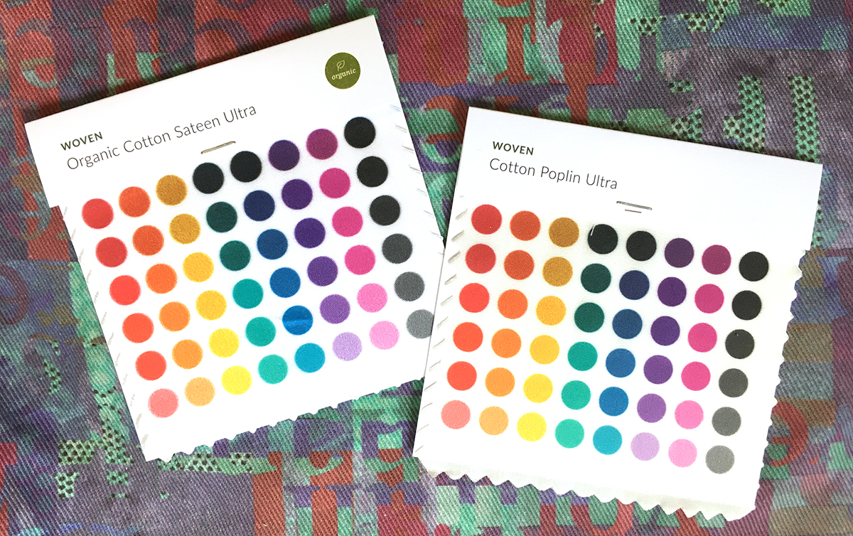
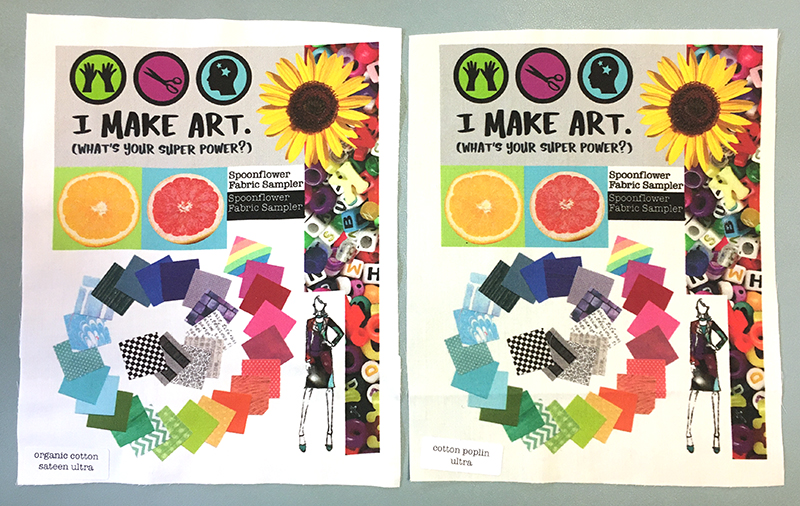
I’m going to start today talking about Organic Cotton Sateen and Cotton Poplin.

About Sateen

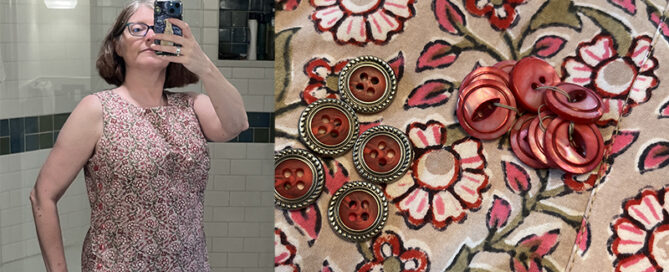
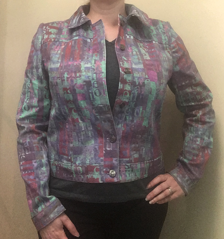
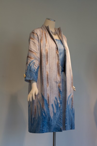
I have definitely used the sateen for more projects than poplin and it is one of my favorite fabrics. This dress and coat (made for an exhibition in 2015) is made all with Sateen and the coat is lined with Satin. This is not a “coat weight” fabric by any means; I interlined this with a cotton twill to give it the body and weight for a coat. It is 3.8 oz per yard, which makes it slightly lighter weight than the Petal Cotton and it feels slightly thinner in your hand.

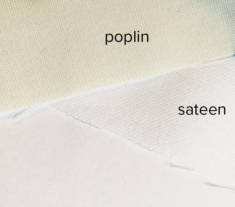
The Sateen has a very silky, smooth feel. It is a matte finish and is not shiny but it does have a little sheen. Instead of an “over-under-over-under” pattern that you think of when you think of a woven fabric, the way a sateen weave is made, it has very fine threads that “float” over several threads which gives it that smoothness.

The Sateen is a nice bright white, similar to the Petal Cotton. One of the parts I like best about it is that it has a 56″ printable width, which is much wider than your typical quilting cotton. That’s almost 30% more fabric in a yard than Petal Cotton, which has 42″ printable width. Spoonflower says that the shrinkage rate for Sateen is 3-4%. I did a test of some scraps and swatches a while back, where I measured before and after washing and I found the Spoonflower estimates to be really accurate. What does 3% shrinkage mean? That’s about 2 inches both directions on a yard of fabric. So that is definitely something to be aware of and a reason to always wash your fabric before you make something with it. (Moda Fabrics states that their fabrics are expected to shrink 3-5% when washed, so this is not just a Spoonflower thing.) The Sateen is also an organic cotton option.

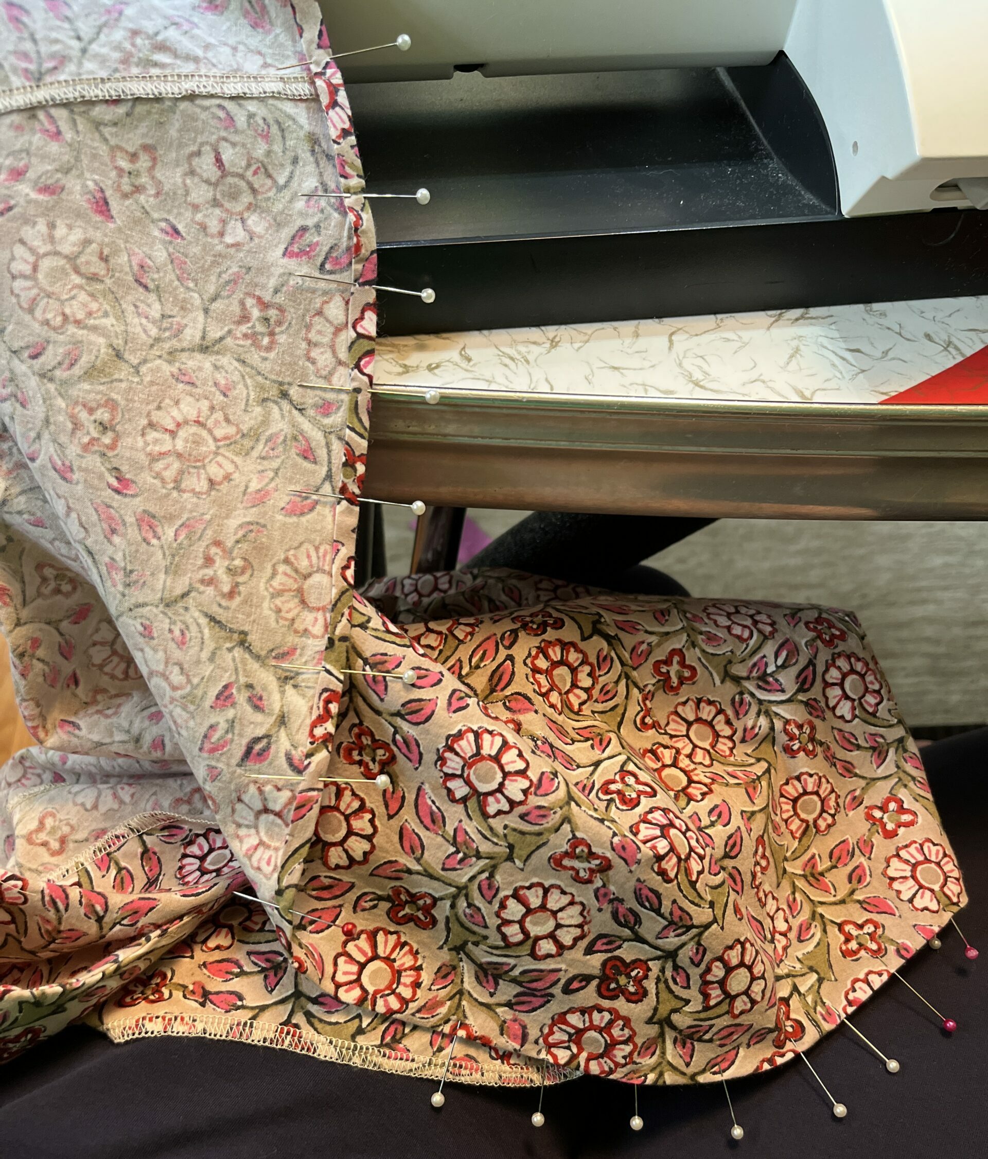
Sateen frays somewhat easily and so I always serge or finish the edges when I am working on projects using it. It’s really easy to sew and I think it takes pressed creases and lines easily. I have made lots of dresses out of it and although they come out of the washer and dryer with a few wrinkles, they are easy to press or steam out. One time (and really only once) I had a little trouble with some color transfer of the pigment from sateen coming off onto my iron, so I am careful not to turn the heat up excessively high and it hasn’t been a problem. (This probably has nothing to do with it being the sateen, it’s just the fabric I have used the most.) A question that someone asked was “how does it tear vs cutting?” It tears somewhat easily, but it does distort the edge (because of the way the weave is constructed) so I would recommend cutting vs tearing.

About Poplin

Poplin is the lightest of the Spoonflower cotton fabrics. It’s marked as 3.3 oz per yard and it’s 42″ printable width. It feels much lighter or thinner in your hand than Petal Cotton. It is also very smooth because it is woven with fine threads. Here you can see it compared to Petal Cotton and it is easy to see the difference in the fineness of the weave. It’s not as fine as a lawn, but it is the closest you will find in the Spoonflower line-up.

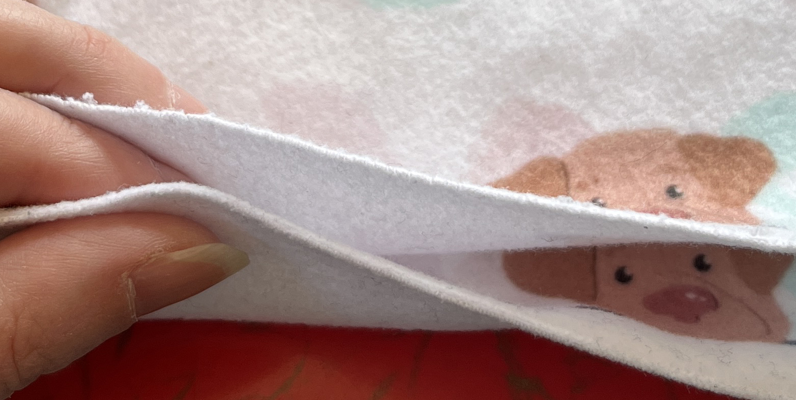
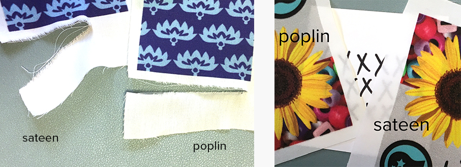
Poplin has a slight creaminess to the color, it isn’t quite as bright a white as the Sateen or Petal cotton. It is slightly translucent, shown above with some Xs marked in sharpie on a card underneath. Because it is so finely woven it doesn’t fray as easily as Petal or Sateen and it tears very easily with the grain and does not distort. Shrinkage is marked as 5-6% in length and 3-4% in width. I haven’t made nearly as many projects with poplin as I have with many other fabrics. There’s no real reason for that other than it just hasn’t been the right fabric for the project I was doing. I did make several ties and bow ties with it and I did find it wrinkles fairly easily and can be difficult to get a really smooth pressed look. Lots of steam seemed to help. Also, because it is so tightly woven, I did want a smaller sewing machine needle than I typically use in my machine. I tend to sew a lot heavier weight fabrics and the larger needle used for that left a more obvious stitching line (bigger holes) and it just looked nicer with a finer needle.

Print Quality and Appearance on Sateen and Poplin

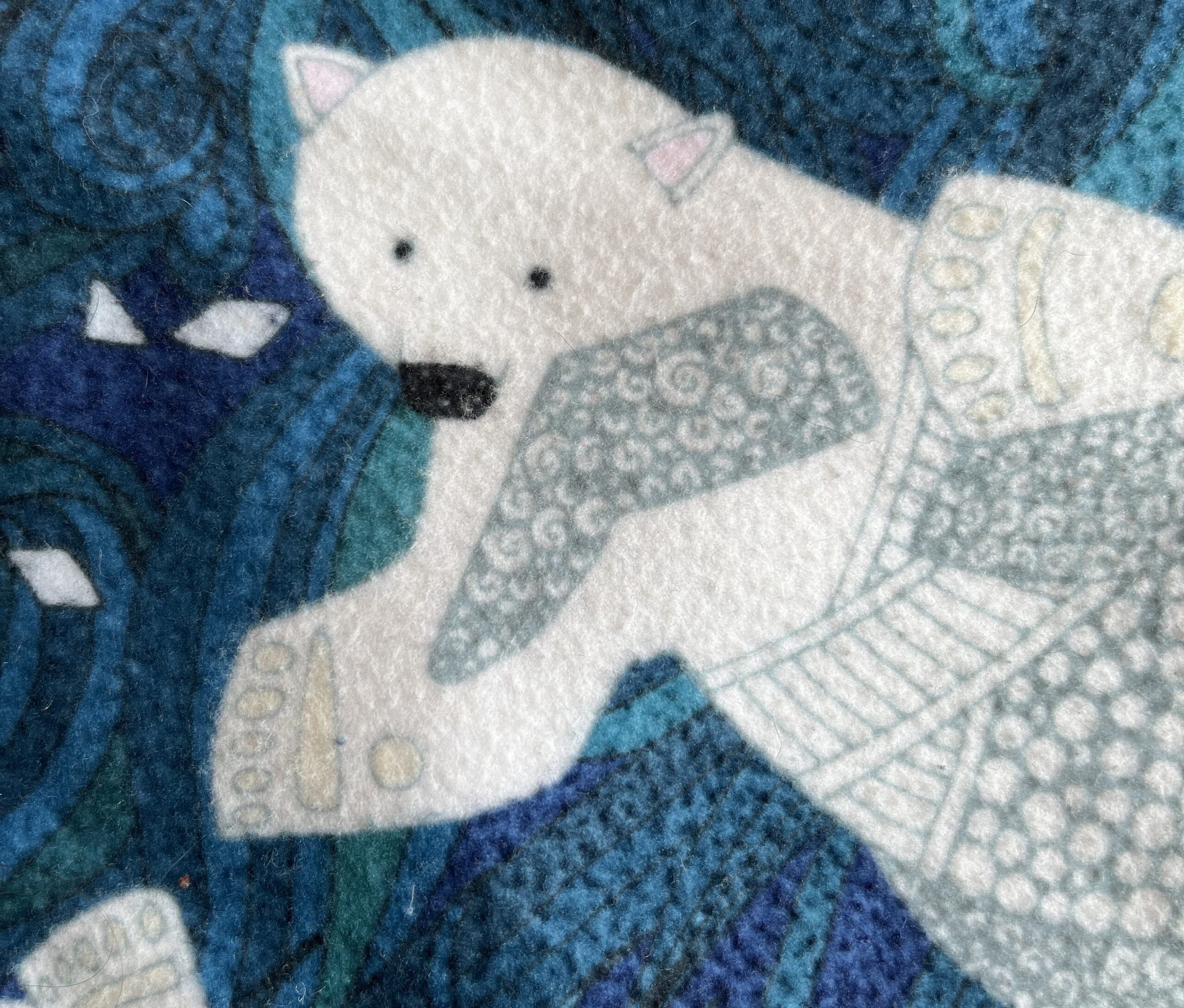
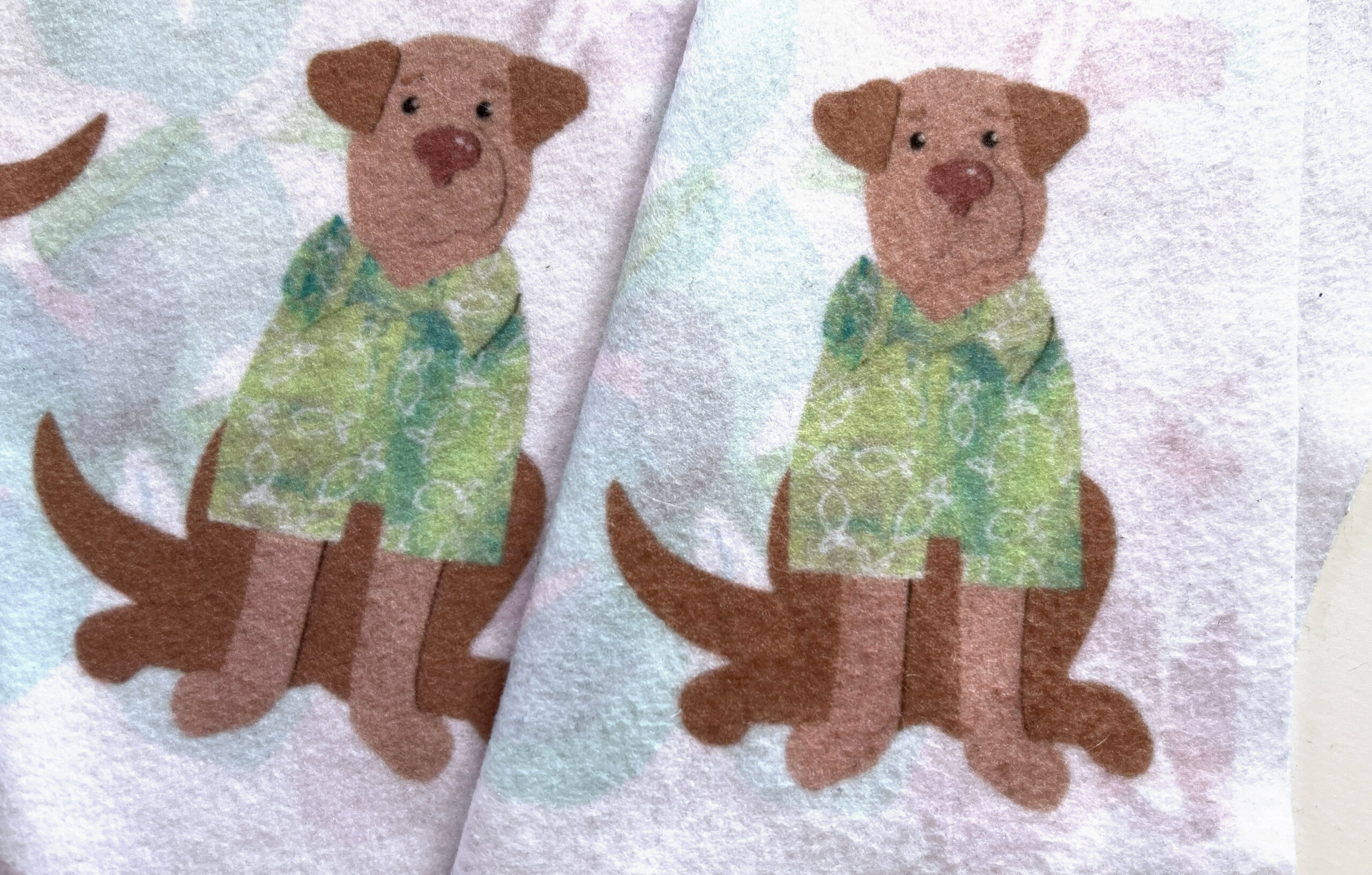
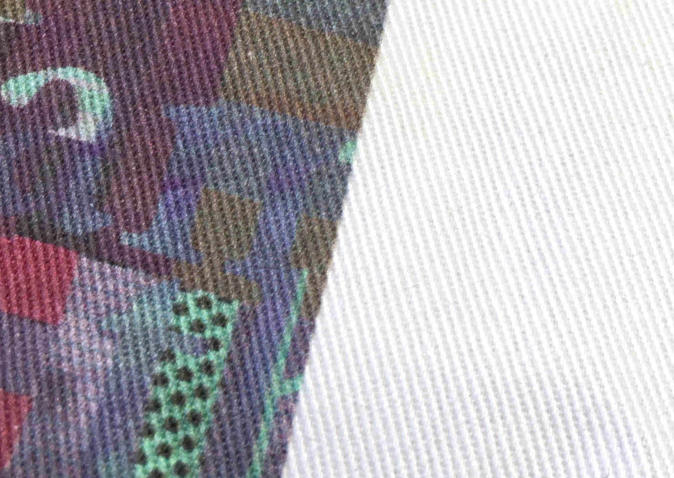
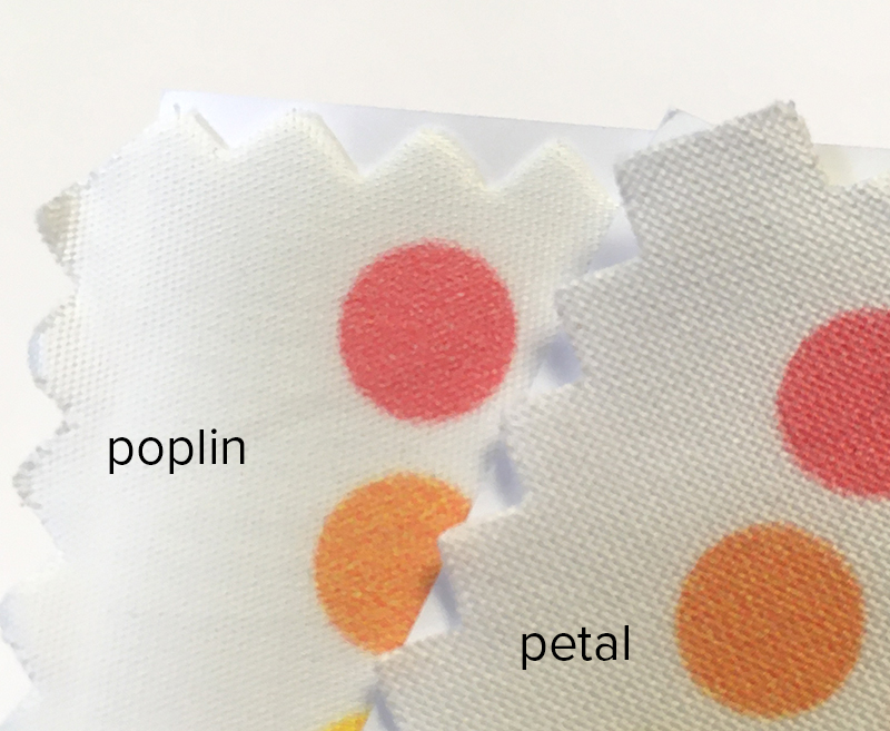
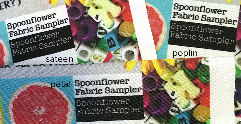
Of all of the cotton fabric options, Sateen and Poplin are probably going to be the best options for designs with really fine details. The fineness of the threads in both fabrics just makes the printing look a little crisper and sharper. This is probably the most noticeable in this example in places like the text. In the close up example below, you can see the same thing printed on Petal, Sateen and Poplin and there is some difference in the fuzziness or softness of the edges of the letters. It’s also really hard to capture in a photo, but when I look carefully in the areas of this sample that are photos (sunflower, beads) you can see a difference in the sharpness especially at the edges and shadows. If I were to pick a winner for the crispness and detail when printing a photo, I would go with the Poplin.

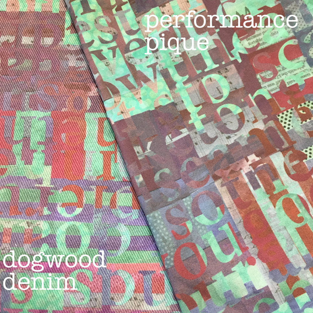
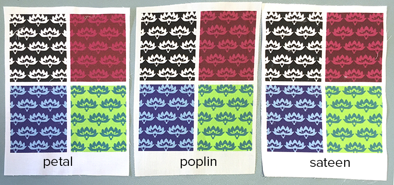
In this example of four colorways of the same design, you can see some of the crispness of the Sateen and Poplin compared to the Petal, but I can also see that the Sateen (far right) has a little contrast boost. I notice it most in the red/pink version where the lighter pink seems just a little brighter compared to the background. It’s subtle, but something I noticed.

What are these fabrics good for? That is a hard one to answer. Like I talked about with the coat I showed up above, I tend to figure out how to make a fabric work for me instead of worrying about what it is “supposed” to be good for. I think if I were making clothing, I would pick the Sateen over Poplin (or Petal) because I really like the feel of it. For wearables, the tendency to wrinkles would make me nuts with using Poplin because I don’t like to iron. (I don’t ever buy linen clothing; I just can’t stand how it always looks rumply.) If I were picking a fabric for something like an art quilt, especially one with photographic or really textured designs, I might pick Poplin just because of the detail in the print quality.

7 June, 2019

Fabric Review Part 2: Spoonflower’s Petal Cotton vs Sateen

2020-05-22T12:55:40-05:00Everything Else, Fabric Reviews, Spoonflower & Fabric Design|4 Comments

After I posted my initial comparison with Petal Cotton, Basic Cotton and Kona Cotton from Spoonflower, I had several people ask me about Cotton Sateen. Sateen is my favorite of the lightweight cotton fabrics and has been for a long time. Sateen has a different kind of weave structure. Instead of the warp and the weft threads being evenly distributed, a sateen weave lets the warp threads “float” across the surface of the fabric. I’ve always found Spoonflower’s sateen to be the best for printing fine details; designs always print very crisply. (It’s also 56″ inches wide, which means you get a lot more fabric when you order a yard of sateen.)

Holding the Sateen and the Petal cotton swatches in my hand, the Petal feels a little heavier/thicker, but when I weigh them on my postal scale, they show the same weight, so the difference is subtle.

As far as printing, Sateen still is the best for crisp sharp details. Petal is great (and a big step up), but Sateen is just a little sharper yet. On this design you can see it best in the grey-on-grey sections. The edges of the shapes are just a little more precise and sharp. The colors/saturation between the Petal Cotton and Sateen are very very similar. I can see a little difference in contrast. In this design, the greys have a little more contrast on the sateen – the darker shade is darker on the Sateen vs Petal and the yellows are a tiny bit brighter.

Overall, I think the Sateen and Petal are very similar print wise; the biggest difference is the fabric itself. I have used the Sateen to make a number of dresses and I think it is lovely to sew with. It presses nicely and it has a nice drape. I have ordered some Petal to make a couple of summer tank tops and I am curious to see if the thicker-feeling fabric feels too bulky as a clothing fabric.

Go to Top