

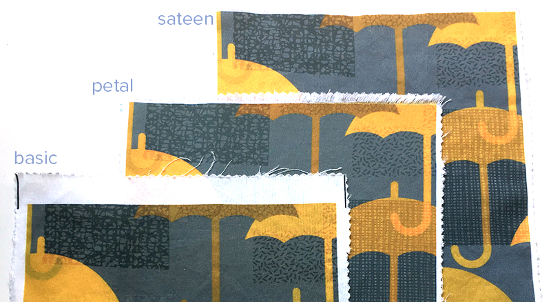
After I posted my initial comparison with Petal Cotton, Basic Cotton and Kona Cotton from Spoonflower, I had several people ask me about Cotton Sateen. Sateen is my favorite of the lightweight cotton fabrics and has been for a long time. Sateen has a different kind of weave structure. Instead of the warp and the weft threads being evenly distributed, a sateen weave lets the warp threads “float” across the surface of the fabric. I’ve always found Spoonflower’s sateen to be the best for printing fine details; designs always print very crisply. (It’s also 56″ inches wide, which means you get a lot more fabric when you order a yard of sateen.)
Holding the Sateen and the Petal cotton swatches in my hand, the Petal feels a little heavier/thicker, but when I weigh them on my postal scale, they show the same weight, so the difference is subtle.
As far as printing, Sateen still is the best for crisp sharp details. Petal is great (and a big step up), but Sateen is just a little sharper yet. On this design you can see it best in the grey-on-grey sections. The edges of the shapes are just a little more precise and sharp. The colors/saturation between the Petal Cotton and Sateen are very very similar. I can see a little difference in contrast. In this design, the greys have a little more contrast on the sateen – the darker shade is darker on the Sateen vs Petal and the yellows are a tiny bit brighter.
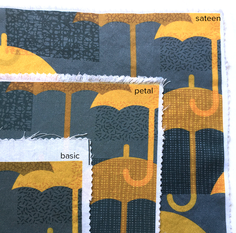
Overall, I think the Sateen and Petal are very similar print wise; the biggest difference is the fabric itself. I have used the Sateen to make a number of dresses and I think it is lovely to sew with. It presses nicely and it has a nice drape. I have ordered some Petal to make a couple of summer tank tops and I am curious to see if the thicker-feeling fabric feels too bulky as a clothing fabric.
Do they both need ironing after washing?
I think that really depends on your preference. With small swatches like this they came out of the washer & dryer with just a little crinkle not major wrinkles. I did iron these before I photographed them. With larger pieces of sateen I usually iron before I start working with it because I like my fabrics to be really smooth to cut things out. But that’s a personal preference. The dresses I have made from sateen always depend a little on how I launder them. If I pull them out of the dryer right away, I can often get away with just a little touch up ironing.
Thanks Becka. Both these articles were extremely helpful!
Hi Becka and thanks for the great in depth reviews. As you know, I use these fabrics for bow ties so bought a fat quarter of the petal cotton to do some testing. Even after pre-washing, it is very “grabby” to the point where I can barely turn a tie made of the petal cotton unless I make it on the bias. The sateen is better but still hard to turn for those narrow parts. The colors are better and brighter in the sateen for sure, but I do find there are issues with color transference when I press the bow ties. I use a press cloth but every design in the sateen transfers with a moderately hot steam iron. Once you know this it’s easy not to get caught out but I wish the colors were truly colorfast. Thanks for the helpful reviews!