

This design always makes me shake my head. It continues to be the most popular design in my Spoonflower shop and it was entirely inspired by snark.
I created it when I was working on the Spoonflower Handbook. One of the projects we wanted to do was a shower curtain and my co-authors and I had managed to convince our editors that the print should be something a little off the wall. We wanted something that wasn’t just Pinterest-worthy, but had a little of the amazing weirdness that can be found among Spoonflower designs. So we settled on octopi, which were a big trend at that time. (They are still pretty popular.)
But we couldn’t find a design that we all agreed on that would fit in to the curriculum in the book. We had a plan for the projects in the book to help you build different skills and teach techniques as you progressed through the book. We needed this design to help teach a particular skill. The trick was to find something that both taught what we needed it to teach and passed the thumbs up of the people in charge of the “look” of the book. (That wasn’t me.)
We tried something made with clip art, but that didn’t fit the design lesson (and licensing was tricky). We tried hand-drawing something inspired by that.

We tried using a vintage illustration from a 1918 encyclopedia.

I cut it out and repeated it, I made many different colorways, we scaled it to different sizes. I made and printed 27 versions of the “octopus design” and nothing could get the thumbs up from everyone who needed to approve it. It was too creepy, too grungy, too dark, too macabre, the wrong color, too weird.
I was frustrated.
So in a fit of snark, I decided I just needed to design something that was as trendy as I could make it. I put in every trend I could think of.
- Two colors, to make it as modern and clean as I could.
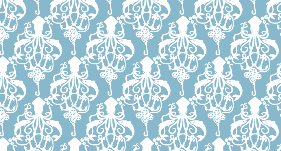
- A “cute” octopus, almost kawaii style.
- Damask designs were a huge trend on Spoonflower right then because of a design contest theme. Everything was damask. So I decided to do a damask-like pattern. This was also intended for a home dec project, so damask seemed apropos.
- Steampunk was also having a little trendy moment and octopi featured prominently in that.
So I drew a Steampunk Squid Damask. The original artwork is not pretty; I cut it out like a paper doll and then traced it with a purple marker on a piece of card stock and then scanned it to trace a vector design. (They asked to feature that original artwork in the book and I said you really don’t want to do that. I made a fake “pretty” original, but I don’t think we ended up using it anywhere.) Because I was feeling snarky, the “steampunk” part of the design was just the addition of some gears to the fishing line. Barely a nod to the theme.
To my complete shock, the whole team loved it at first glance. My original was navy and cream, but we ended up going with a pale blue and white for the finished project. I can’t look at the design without thinking of its 27 predecessors and the convoluted path it took to get to this one. It’s trending again right now on Spoonflower. I just did a couple of new colors and a smaller scale based on requests of some customers and that kicked off its own little trend again. Sometimes inspiration really does strike in the most unexpected of places.
