Want to listen instead of reading?
In 2022, I applied for a Minnesota State Arts board grant. I wrote a little bit about applying for it here, just after I was awarded the stipend.
For this grant I decided to focus on reaching new audiences. Because of the work I do, which is primarily textiles and clothing related, the people who come to my community workshops and online classes are predominantly women. My social media audience is primarily women interested in crafts or sewing. I really wanted a project that would help me reach a more diverse audience. So I decided to do something a little outside of my normal work. This is a book about music and musicians, which is not my normal subject matter. I’ve been incorporating more and more paper into my work because paper is very accessible. You can always find some recycled paper to make something from. So this felt like a way to help engage with a different audience as well, in choosing a media that might feel a little more approachable. You don’t have to know how to sew to understand what I do with this project.
What I didn’t appreciate about reaching new audiences is that it also might mean reaching out of your comfort zone artistically. And boy did this project make me do that! When I wrote about the project at the beginning of the grant I talked about two challenges: instruments and people.
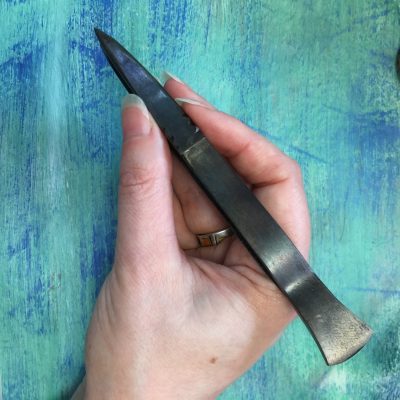
It turns out, I enjoyed making the instruments. They were tiny. The piccolo was only about 1 1/4 inches long and the triangle would fit on top of a nickel. That’s hard to do in bitsy pieces of cut paper. My fingers got very sticky with glue stick. I couldn’t have done the project without a pair of beautiful, pointy, handmade tweezers that my friend Jeff made.
I realized quickly that there is only so much tiny detail you can make without it looking clunky, so I decided a few things had to be created in Photoshop like violin strings and tuning pegs.
The part of the project which was maybe even harder than I thought it would be was to make people. In fact not just people, but people I know.
I knew what I was getting in to with this story. We had been talking about it for years before I ever thought about doing illustrations. There was a group of artistic friends that brainstormed how we could make the story come to life visually; whether it should be animated or paper puppets or stop motion or live drawings. Eventually a book seemed the most versatile and accessible idea. But I also had many chats with my friend Cy, an artist with decades of experience cartooning and painting, about the way to create simple portraits of people. Because I had no idea where to start.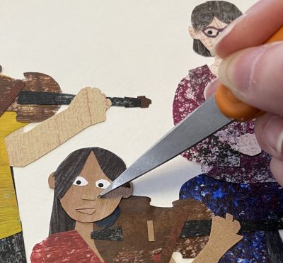
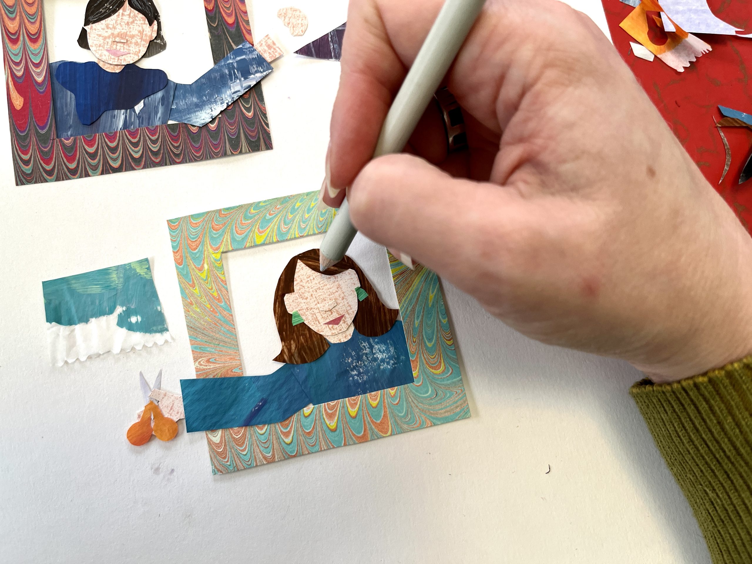
As artists, we all have the styles and subjects we love to make. I love rich textures, bright colors, and quirky animals and objects. I do not like to draw people. And in cut paper, the shapes have to be inherently simple. I had to make tiny rectangles for noses because I couldn’t cut anything more detailed than that. So I started first thinking about what were the minimal shapes I could use to make a face: Ovals for eyes, a rectangle for a nose, a triangle or two for a mouth. You can see how tiny they are there next to the point of my scissors.
I didn’t start out thinking I would do a book in the style of Eric Carle, who was an illustrator famous for hand cut painted paper, but several people have said my work reminds them of him. A lovely compliment. I looked at a lot of Eric Carle illustrations to see how he made people. I think maybe he liked animals better too, because many of his faces are painted on instead of cut paper. I also thought a lot about Ed Emberley, who wrote a series of drawing books for kids that were all about constructing animals from simple geometric shapes. So that’s how I started to think about bodies; what rectangles and ovals and curves could I make and connect together. I left the images of the audience and the orchestra until the very last because they were intimidating. That’s 49 different people on those two pages alone and the pages each took more than a week to finish.
I’ve used painted paper in a lot of fabric designs before I started this book because I love the texture the paint gives to the paper. I think it really adds some life and dimension to otherwise flat colors. I like the imperfection. Painting the paper turned out to be really necessary for these illustrations because I was super frustrated with the colors available to work from, especially skin tones. So some of the first days I worked on the book were just about making materials: skin tones, colors of wood for all of the instruments, hair colors. I assigned each “main” character a color that follows them through the book. Ada always wears turquoise. Her mom, Carrie the oboist, wears a red-violet shade. I painted some paper in every color you see in the book. In a few places I used hand-marbled paper that I made in a class. I don’t have the setup to marble paper in my studio but I have a stash that I created in classes at the MN Center for Book Arts and I love to add in little bits. In a few places in the audience you can also see the transparent deli paper layered with security envelopes, which are my favorite recycled paper. Security envelopes are the ones that things like your bank statement come in and the insides are printed with tiny black and white patterns.
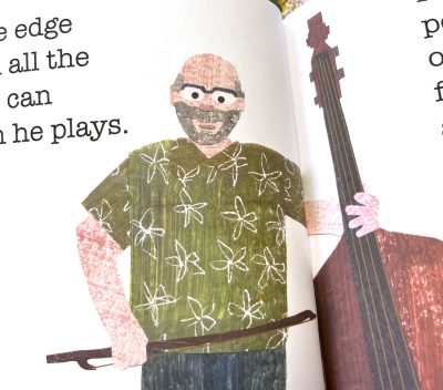 Some of the people in the book are people I know, which made it easier in some ways to think about how Rolf always wears green, so naturally he has to have a green Hawaiian shirt on page 6. But it was also simultaneously intimidating because what if they don’t like the way I made their paper alter ego look? What if I emphasize something that they don’t like about themselves? What if I made them feel self conscious or disappointed?
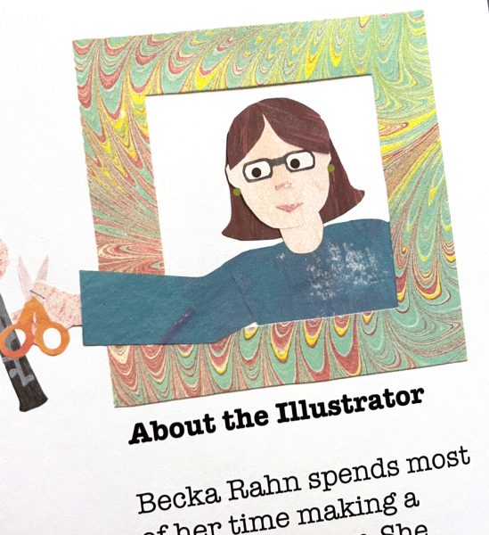
Although I probably should have started with it, one of the very last images I made was the self portrait of myself that’s on the “About the Illustrator” section. The one you see was actually my second try, designed for a different page on the book. Although I liked the first one ok, the second one ended up somehow looking more like me, so I decided to swap them out.
By the time I did the last couple of pages, I had a little more confidence. I put many people I know into the audience page. Sometimes I didn’t even know I was doing it until I got done with a person and said to myself, “Oh that looks like Fred.” Am I confident enough to do another project illustrating people? Absolutely not. But I surprised myself at how proud I was when I got it done. It was a big artistic hurdle to push myself through.
(A note: Books aren’t available yet; there are a couple of tweaks that need to happen, but they will be soon.)


Wow…what an awesome project Becka! It sounds very challenging but rewarding too. Love your cut paper work!