


A quiet leap: Transitioning to new media in my art practice
At a dinner party with friends a few nights ago, someone suggested that we go around the table and share something we did in the past year that the group might not know about or might be surprised to learn. One friend had joined a new musical group and another started teaching Spanish to elementary school kids. For a moment, I blanked on what to talk about because I really feel like I didn’t do anything new this year. I’ve been teaching, keeping up with my Etsy shop, doing shows. The same things I do every day.
But then I remembered that the thing that has been quietly changing this year is the kind of art that I make. For more than I decade I have been designing fabric, and I still love doing that a lot. But I really took a break from that this past year because fabric projects were not really calling to me. I didn’t feel motivated to tackle a big sewing project. I didn’t have the need to create those pieces.
Many years ago now, I stepped away from the fabric art center that was my entire life. There were lots of factors that came in to play there, but when I called it quits, I not only stepped away from my job, but I removed myself from that community as well. I needed a break; not just a rest, but a separation.
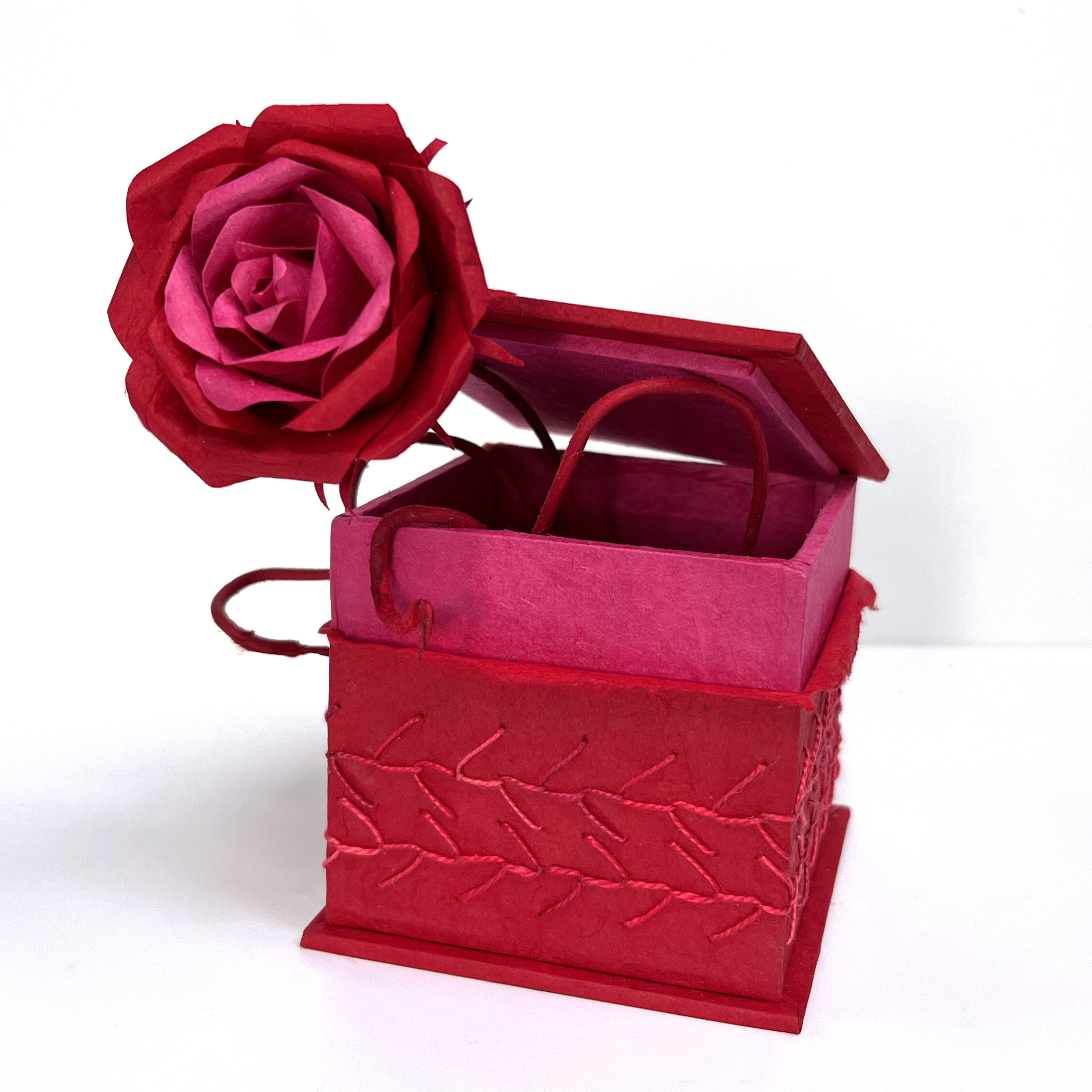
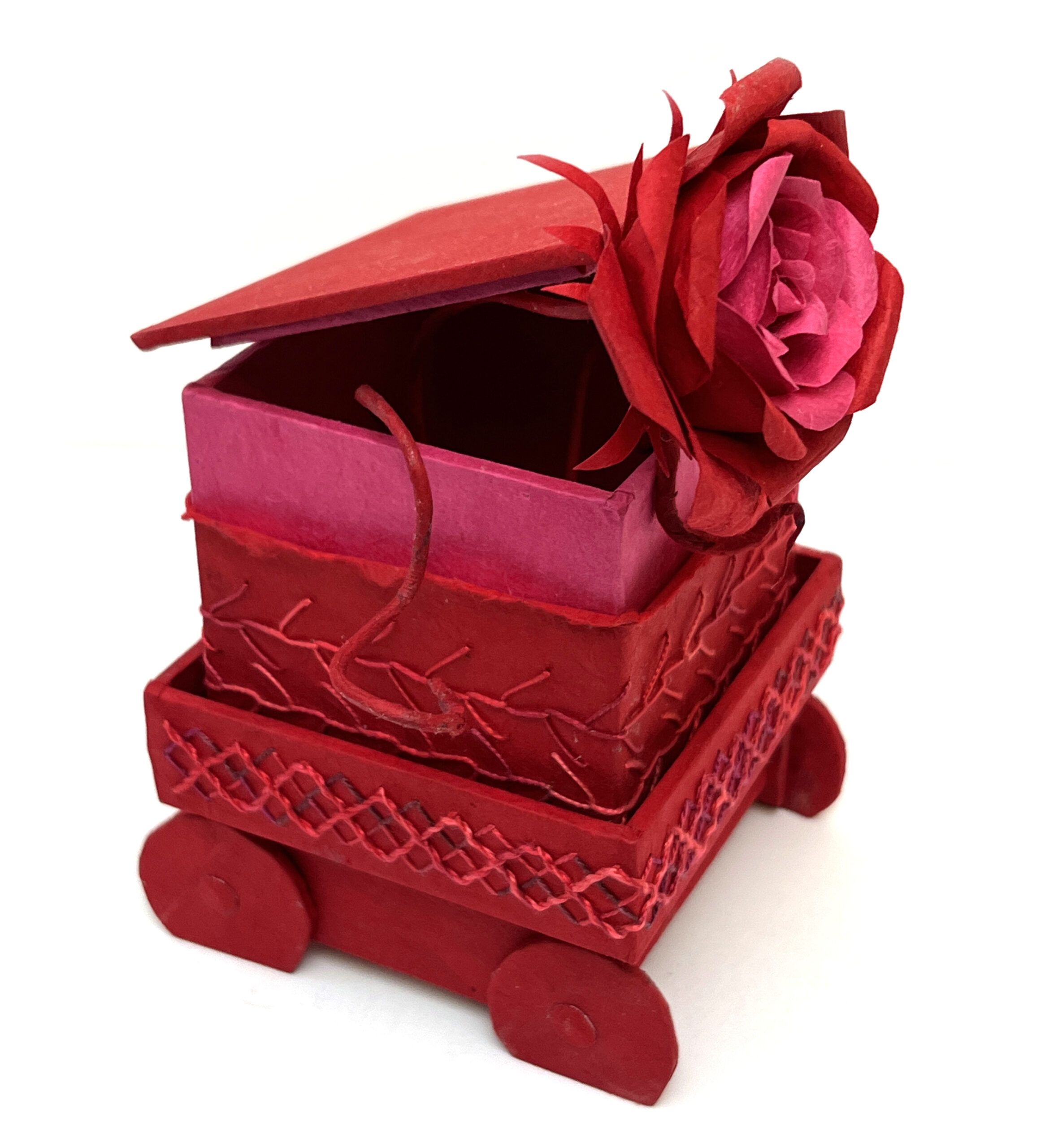
 In August, after 3+ years of taking classes, I finished my Book Arts Certificate from the MN Center for Book Arts. It’s a program that they administer to “certify” artists in a study of book arts techniques. I think of it like a mini Masters Degree. I took classes which I loved (boxmaking, marbling) and ones that I did not love (letterpress).
I found that I wasn’t as interested in making art as I was in the experience of being a beginner again. I needed to ask questions and make things that were ugly and didn’t work and just to try new things.
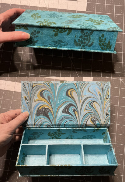
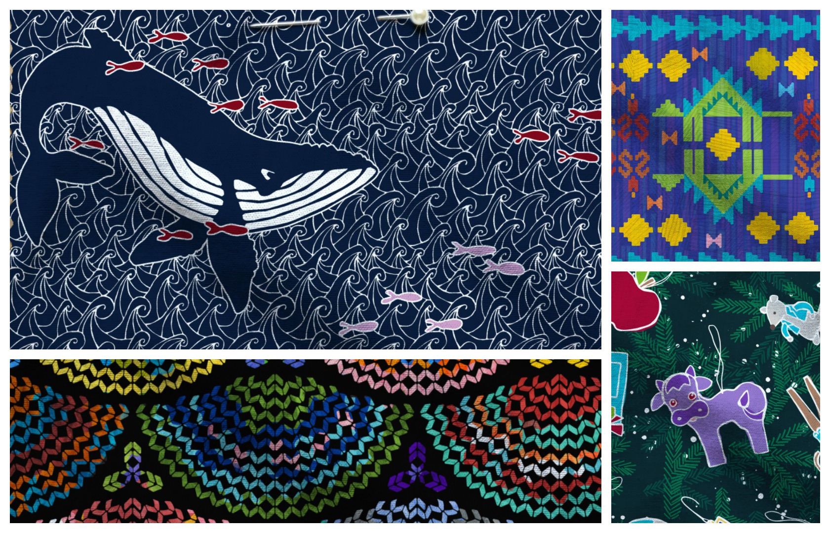
I gradually learned enough skills in book arts that I could start to incorporate some of the fabric techniques that I love. I marbled paper and carved stamps to hand print in repeating patterns like the sea turtles (left).
My weekly embroidery class students got me thinking about what kinds of embroidery stitches I could do on paper instead of fabric. I explored and sampled all kinds of stitches to see how the thickness of the threads in each stitch and the threads traveling across the back of the paper would influence the stitched pattern on the front.
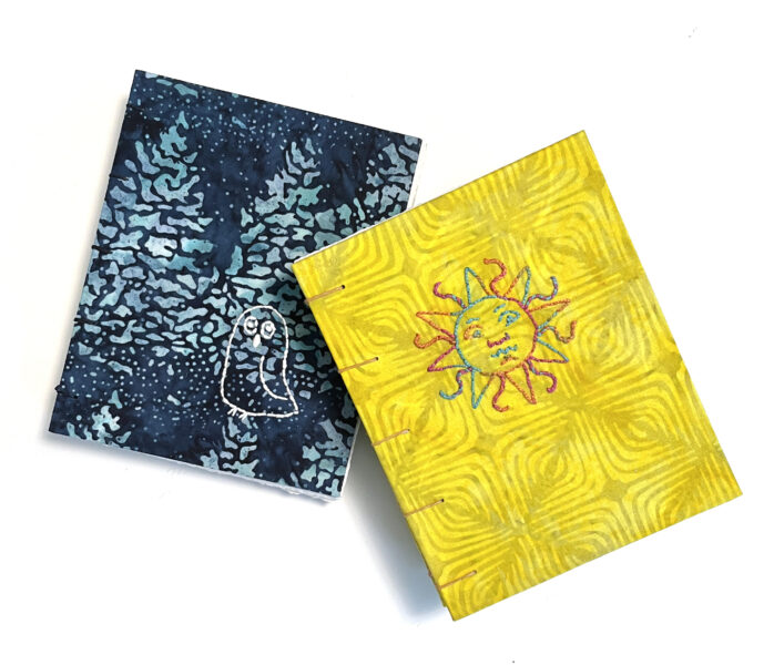
I learned to make my own bookcloth. I’d used bookcloth in several classes to cover both books and boxes, but being a person with a love of fabrics, I was immediately discouraged by the lack of fabric options. I could only find a handful of solid colors. So I printed my own Spoonflower designs on cotton lawn and peel and stick wallpaper and used that to cover books and boxes. Then I tried embroidery on bookcloth made from some batik fabrics to make small journals that were really a fusion of fabric and paper techniques.
And finally I put some of this new work out in the world. It’s one thing to share photos of all of these experiments on social media, but it’s another leap to take the photos and enter something new in a juried exhibition at a gallery. That’s what I did. And that felt brave.
When I tried to describe to my friends how it felt, I said to imagine that you have played the clarinet all of your life and then decided that you wanted to learn the trombone and you just played your very first trombone solo at a concert. (There were a lot of musicians in the room.) To someone looking from the outside, it might just look like art is art. But to me it felt very new and unsure.
The three pieces at the top of this post are all ones I exhibited this year. I did so a little bit quietly. I talked about them a little in my newsletter and I posted a little on social media, but I didn’t really talk about the intention of taking my work in a completely different direction: a fusion of fabric and paper techniques. Saying that goal out loud seemed a little too much of an “announcement”. So I just sat back and waited to see how people reacted and how it felt to watch people interact with these pieces.
One of them won an award. Another was dismissed as being “too fine art”.
It’s January and my business task for today is to work on setting goals for the upcoming year. I am procrastinating a little bit by writing this post, but reflecting is an important part of setting goals and I basically gave myself a year off from design challenges, fabric designs and garment making to try something else. I think the experiment is a success. I have another embroidered paper piece that has been accepted into an exhibition in January. I’m teaching a class making coptic bound sketchbooks in February. A college student reached out to me over the holiday break wanting to connect with other paper embroidery artists. And I am thinking about more classes combining hand embroidery with paper components. That sounds like the start of something interesting.


 There is a style that always makes the top 10 in the design challenges and I just am not in love with it. It’s not my aesthetic. But it is very popular and I totally can see why it is. So I had to keep reminding myself that I was designing things that made me feel good and that felt like they were true to my style, not things that were popular. The top 10 is about popular designs. And I don’t design to that popular aesthetic. It’s easy to feel discouraged when there is a “contest” involved and scores published. I think I could totally make my designs match that popular aesthetic and maybe boost my rankings, but do I really want to do that? Not really.
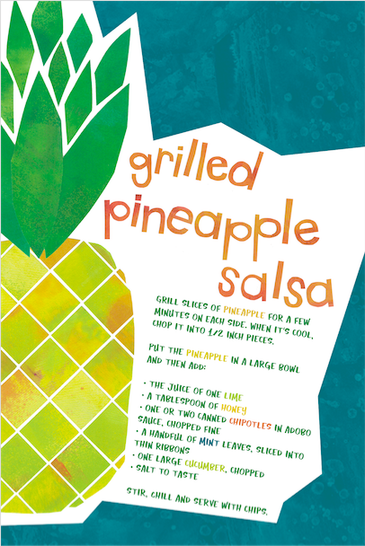 My pineapple salsa entry for the “Recipe Tea Towel” challenge was a total surprise for me. Honestly, I felt like I phoned it in on that design. I didn’t have an inspiration that was really calling to me. I had a busy and kind of stressed out week that week it was due. So I designed the whole thing at very nightowlish hours in about 45 minutes. It was a very quick cut paper design, scanned and assembled, and a recipe I knew off the top of my head. Instead of doing something clever with repeats, I just made one large pineapple to fill one whole side of the tea towel. It ended up being my number 6 finisher and is in the top 10 of my “most favorited” designs for all time at Spoonflower. Who knew?