26 November, 2018

No Bah-Humbugs here.

2018-11-26T11:00:46-06:00An Artist's Life, Gallery Exhibitions|Comments Off on No Bah-Humbugs here.

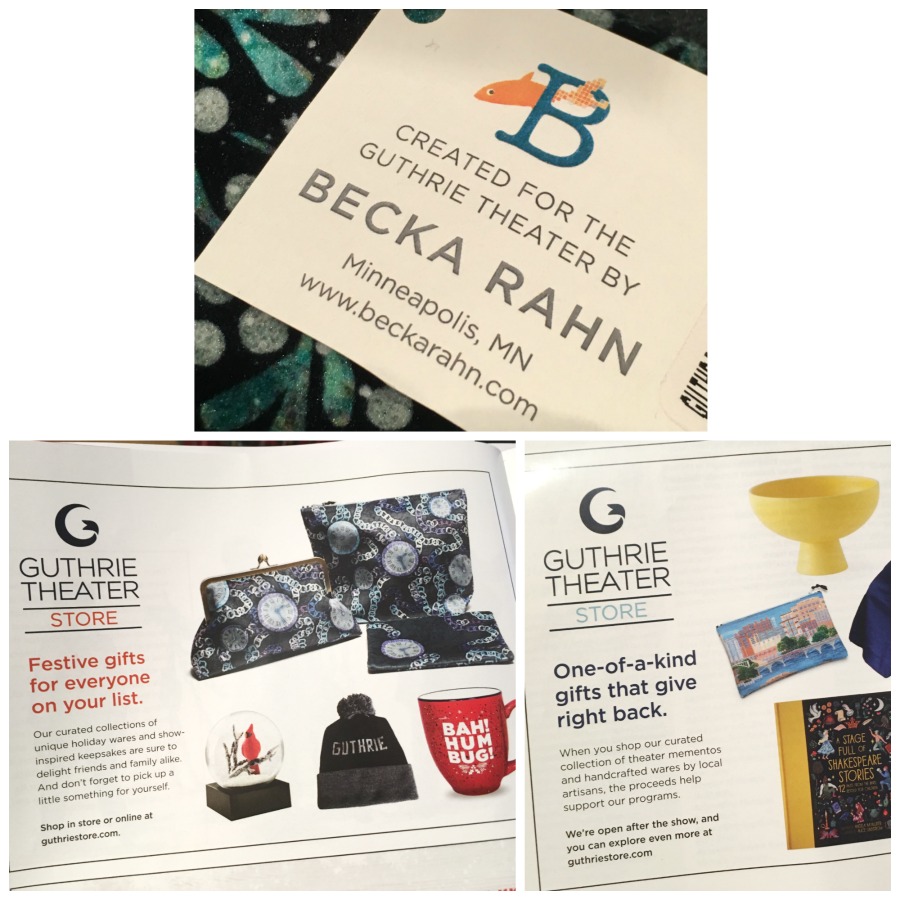
One of the most fun partnerships I work on is designing pieces for the Guthrie Theater Store. Last year I did a whole series inspired by Sunday in the Park with George. I have made designs inspired by the Guthrie itself. The photo above shows one of those Guthrie-inspired designs in an ad in the program and one featuring some new designs in another program.

This year they asked me to do designs for their annual production of A Christmas Carol. I know the story, but I hadn’t seen their production, so they sent me photos from last year’s production. Such fun to study all of the details and colors! Several themes or scenes jumped out at me right away:

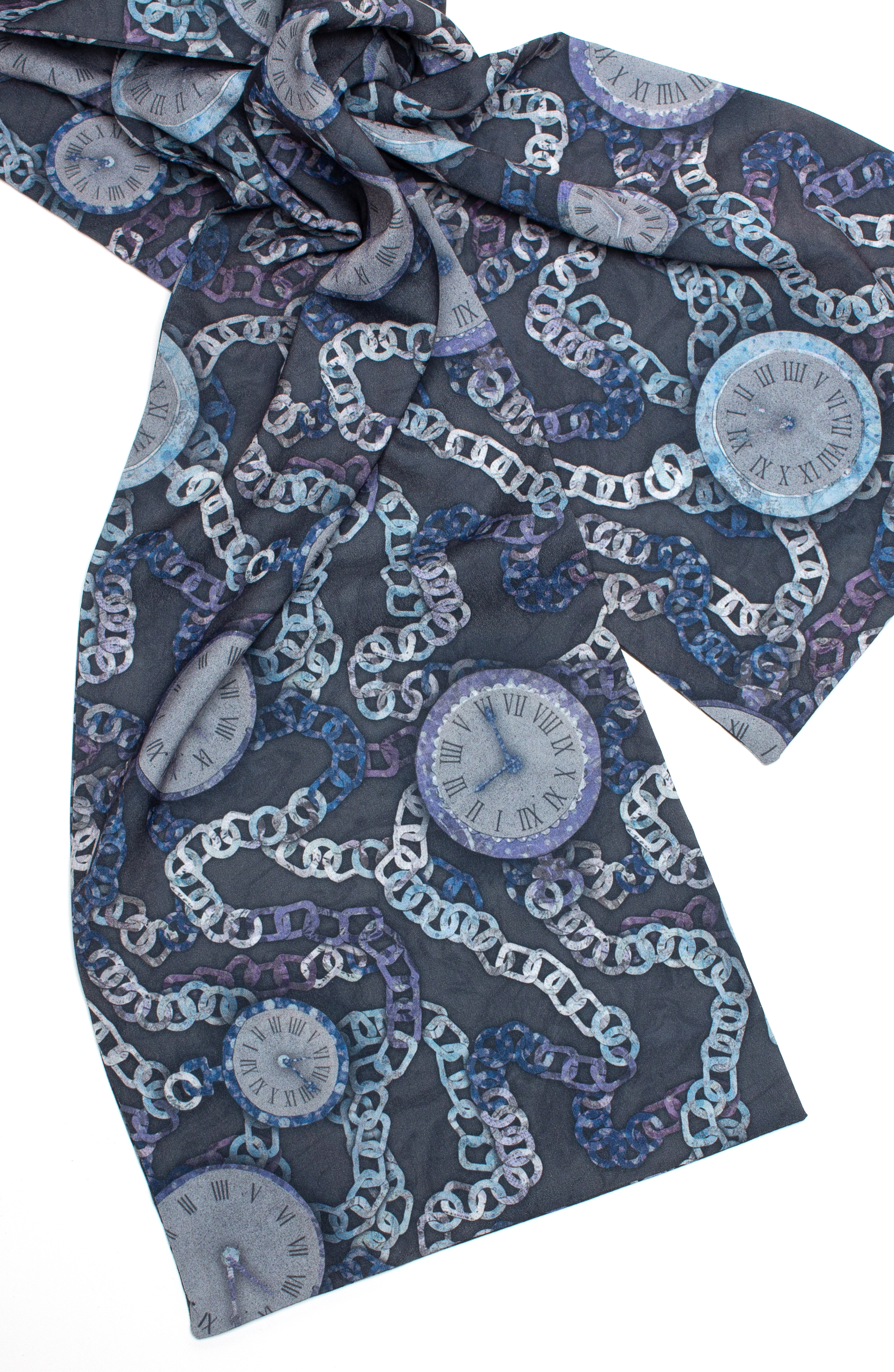
  • Time is a big element in the story and there are clocks prominent in several of the scenes.
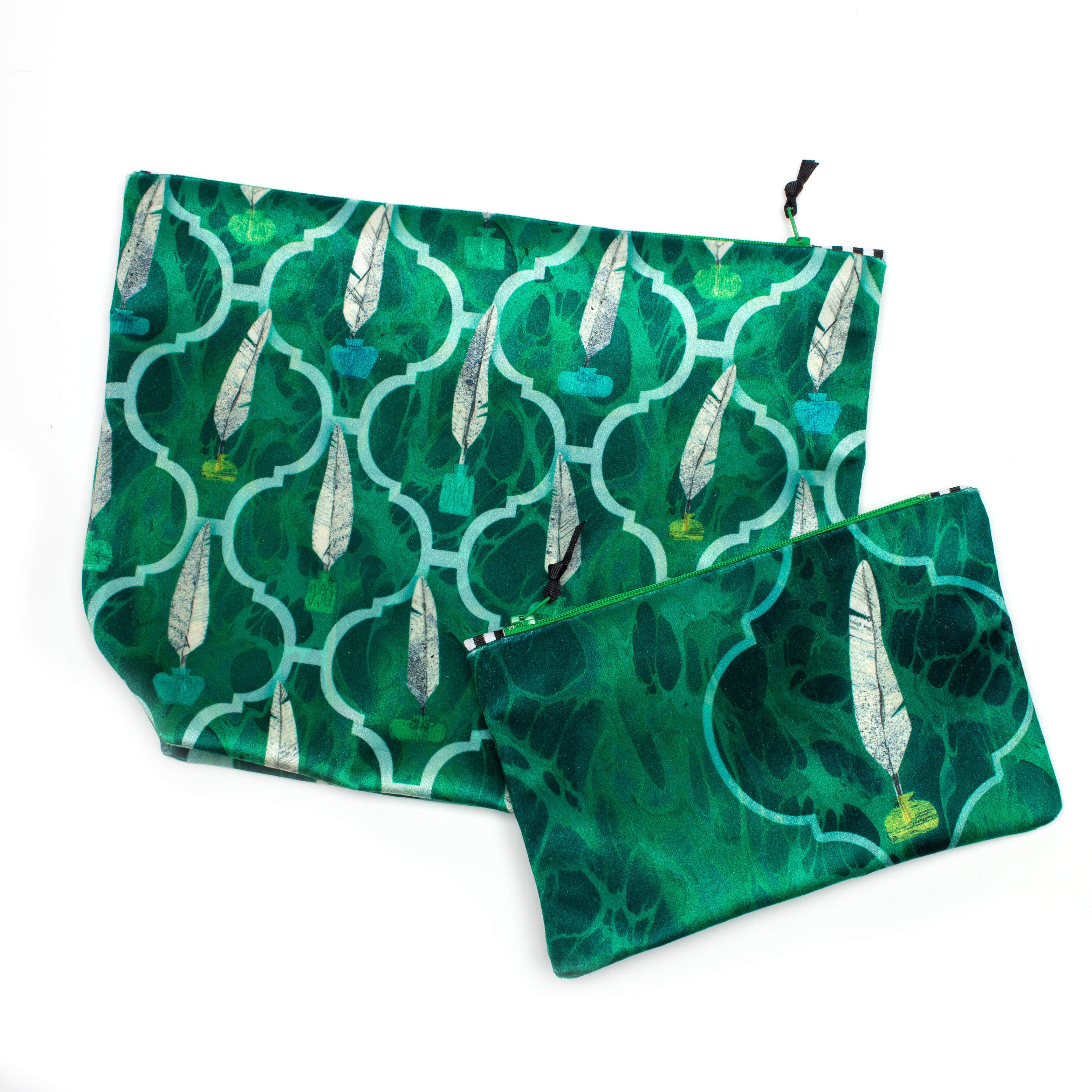
  • In a number of scenes I noticed actors writing with white feather pens.
  • In one scene of people singing carols around a piano I noticed the wine glasses lined up on the piano.
  • Bright streetlamps and a tiny bit of snow.

We decided to go for something that was “seasonal” without being holiday specific, so I chose rich vintage-inspired colors and bigger ideas from the story. All of the designs are made from cut paper illustrations using recycled paper.

I started with a design I called Timeless. It is made up of pocketwatches and watch chains. The colors are all soft twilight shades. The chains are also an echo of the chains on the “Ghost of Christmas Past” from the show. The papers I used for this illustration were primarily colored art paper, but “grunged up” with some alcohol ink spray to give them a more weathered texture. The background of the design is a scanned piece of hand-marbled paper, which is also a visual theme I used throughout.

Next, I designed Quills. Quills refers to the feather quill pens you see throughout the show, but is also a little nod to Charles Dickens, the author. The pens and inkwells are all made from recycled paper from vintage issues of Hennepin History Magazine. Hennepin History Museum last year gave away copies from the 50s-80s that were excess in their collection. I also gave these some texture with alcohol ink spatters and a little wash of paint to obscure the text a little bit. I cut the feathers on the diagonal, so the lines of the text on the pages gave the texture to the feathers. The background of this design is a piece of marbled fabric I made and scanned. I chose marbling because that is very often used as the endpapers in old books and I felt like it was a nice fit with my writing theme.

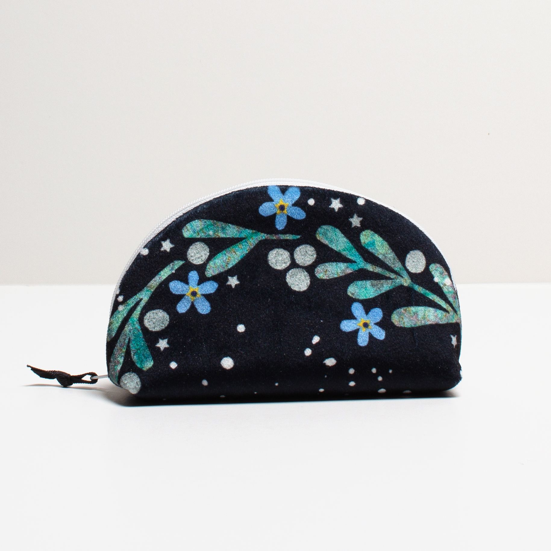
Mistletoe and Forget-Me-Nots started as just a little zipper bag. But Kay (the shop manager) and I decided that we liked it so well that I went back and reworked it into a repeating pattern at two different scales, so that I could make bow ties and larger zipper bags as well. In the Victorian “language of flowers” mistletoe and forget-me-nots symbolize fond memories and a connection that lasts through time, which are strong themes in the story. This illustration is all cut paper overlaid with snow made from spattered paint.

We also wanted a couple of tea towels because those make great gifts, so I pulled two quotes from A Christmas Carol that I thought were great messages for gifts you might want to give. Singing Carols and Lamplight are the two tea towel designs.

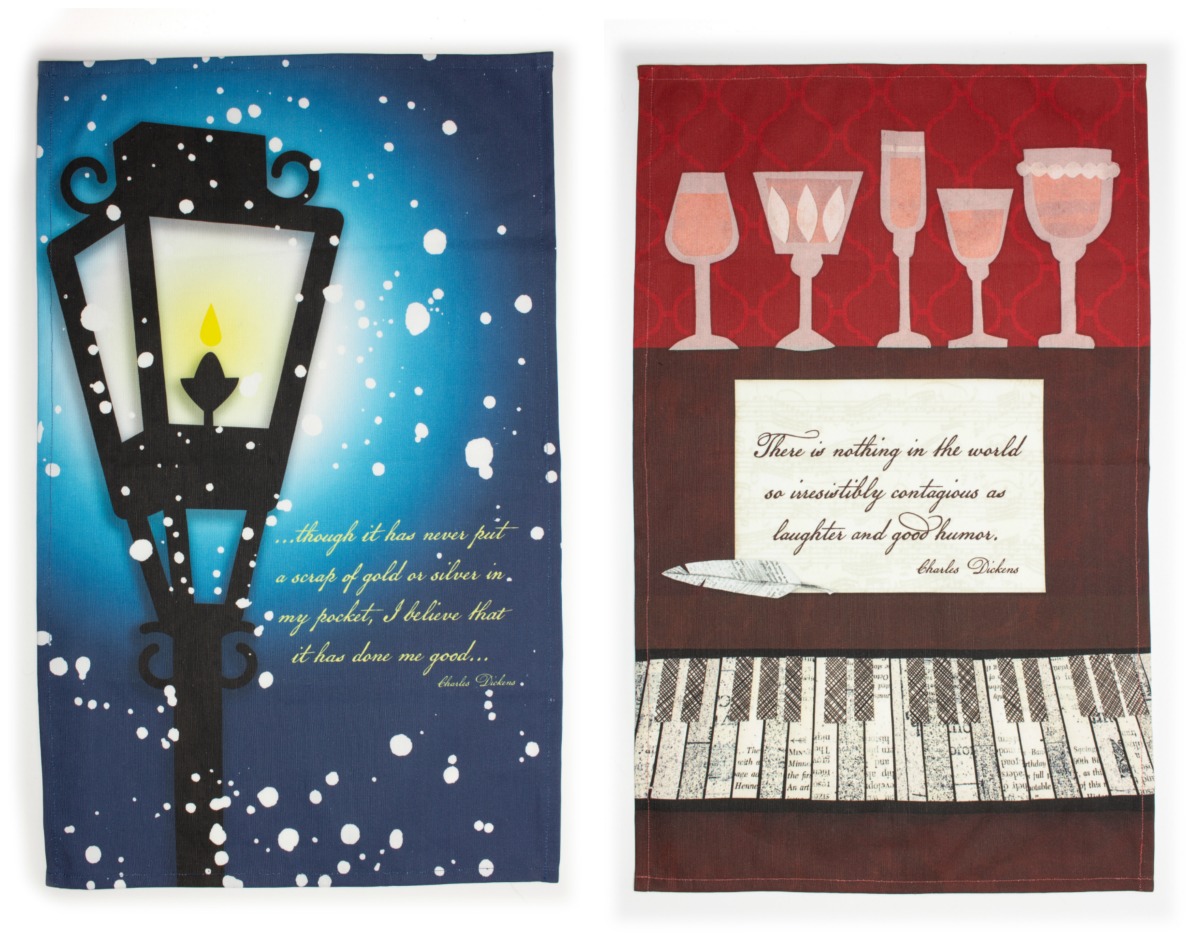
The piano keyboard is all made from more history museum magazines and the pattern from the inside of a security envelope (like the kind you get bank statements in). The wine glasses are made from tracing paper, so they had some translucency. The snow is more paint spatter. The woodgrain on the piano is more marbled paper.

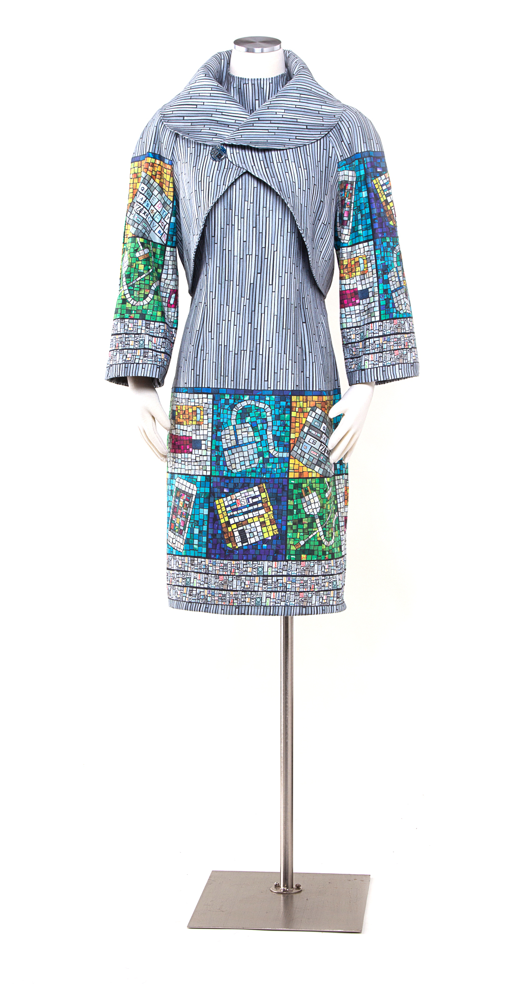
It is really fun and exciting to put together a collection like this based on a theme, especially when you have such a rich story to draw from. All of these designs are available exclusively at the Guthrie Shop for the holiday season, both in the theater shop and in their online shop. The collection includes three sizes of zipper bags (velvet), clutch purses (velvet), neckties and bow ties (twill and crepe), and tea towels (linen-cotton).

4 October, 2018

Faking It.

2018-10-07T22:36:03-05:00An Artist's Life, Gallery Exhibitions, Out & About, Spoonflower & Fabric Design|4 Comments

I was invited to show three pieces in an exhibition called Fiber Art in the Digital Age at the WI Museum of Quilts and Fiber Arts. The theme of the show is fiber art that incorporates innovations of the “digital age”. I created three pieces that include digitally printed fabrics and laser cut wood and acrylic. This is the first in a series of posts talking about those pieces.

Faking It
Sometimes a comment about your work sticks with you for years. One of the first digitally printed fabric garments I made was a dress that I wore to an art gallery opening. Two visitors came up to me and struck up a conversation about the dress, asking if the fabric was made using batik. When I explained with excitement that it was actually digitally printed photographs of ice, they looked at me and said “Digitally printed? That’s cheating!”

I have discovered that the relationship between fiber art and computers is often misunderstood. There is an assumption that if you use a computer, that it does all of the work; you just press a key and Photoshop magically creates art. Because I used a computer to create part of my piece these commenters, and several others throughout the years, decided that it wasn’t real art.

So, I decided to make Faking It a celebration of “fake” art made by computers. I started by creating imitation mosaics from recycled magazine paper with images of computers and technology: an iPhone, charging cables and even a vintage floppy disk signed with my initials. I surrounded the mosaic tiles with a border of ransom note style words that all are synonyms for fake: false, swindle, hoax, hokum, spoof, flim flam, bogus and so on. The background is made from tiny strips of paint chips in colors titled “pixel white” and “high speed access”. I scanned all of this paper art and the design was then printed on to polyester faux suede fabric. The button on the coat is a costume jewel made from a recycled circuit board embedded in resin. And finally, the dress and coat were made using a commercial knock-off pattern of a couture designer dress worn by Melania Trump at the 2018 presidential inauguration.

Digitally printed faux suede.


Here are some detail shots of the fabric design. Each one is made from pages of magazines and catalogues. You can see a video about how I made one of the mosaics for this piece in this post.

Many thanks to my friends and fans on Facebook who helped me come up with the “fake” word list that makes one of the borders on this print. I posted something asking for help thinking of alternate words for “fake” and they came up with awesome suggestions.

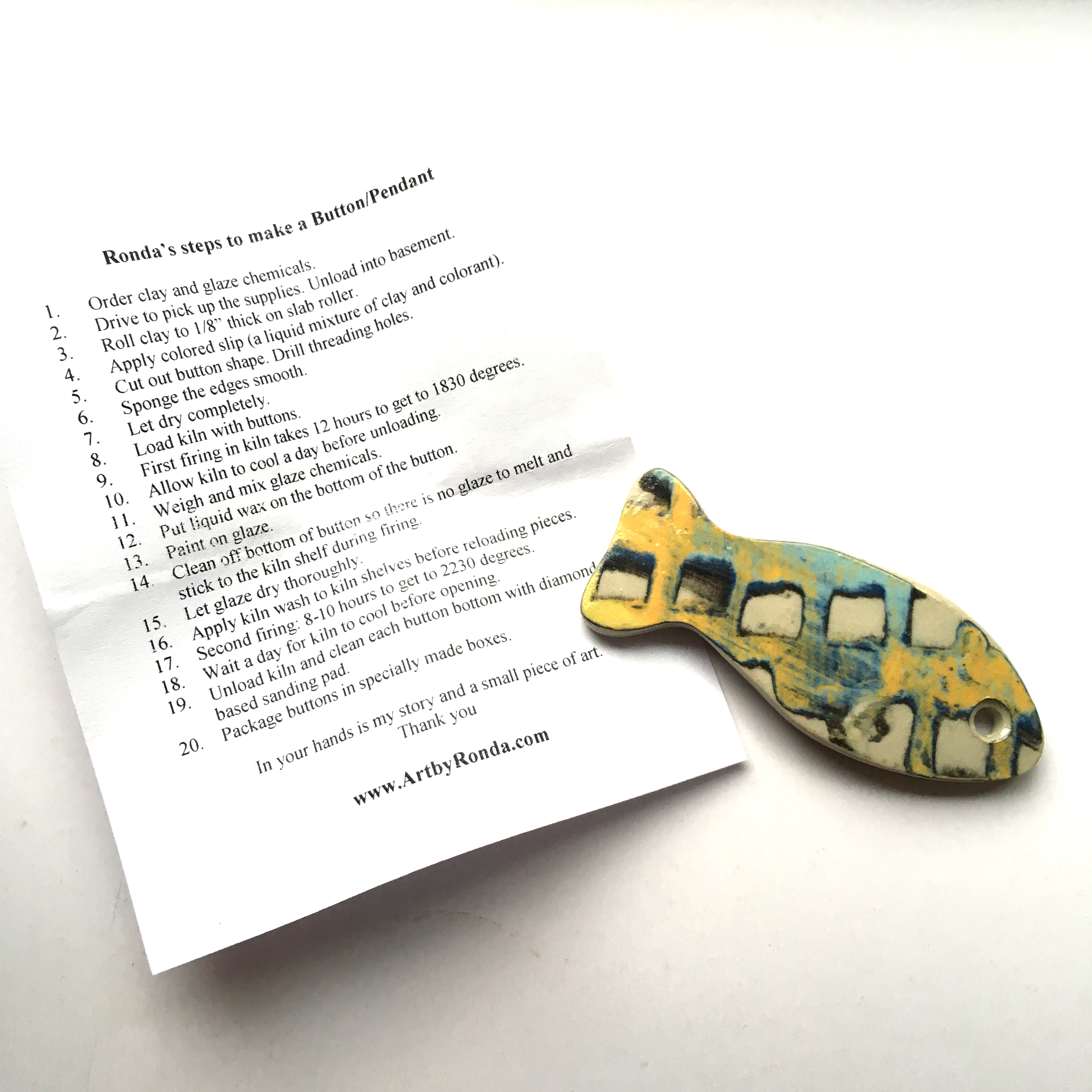
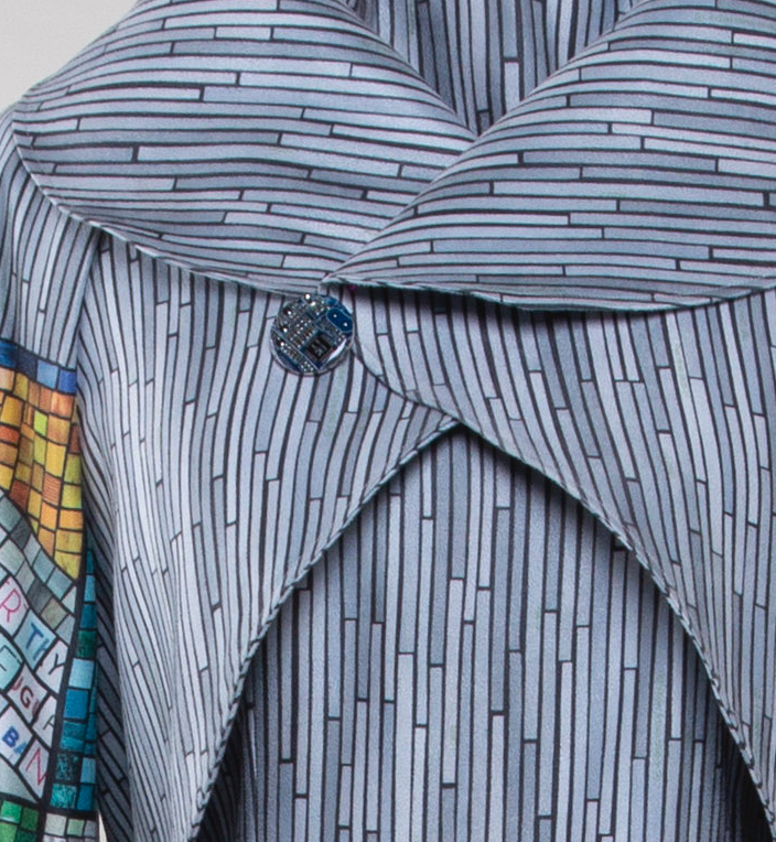
The button on the coat was made for me by Amanda at Circuit Breaker Labs. This isn’t a super sharp picture of it because I forgot to take detail shots before I shipped this piece off for the exhibition, but check out her Etsy shop to see how cool these are. (She made this one for me as a custom request, usually she offers them as pendants, earrings, keychains and more.) It was the perfect addition to this piece.

A little secret that you can’t tell by looking at this piece. There is actually an extra seam on the back of the jacket because I ran out of fabric. Spoonflower discontinued this faux suede just days after I ordered the fabric for this dress. When I realized that I needed a little more, I went back and they were sold out. Even though I knew it was going to be discontinued soon, I really wanted to use the faux suede in keeping with my fake theme, so this dress really is one of a kind and almost zero waste. I used every scrap I could.

I love this piece. I worked on it for months and I really enjoyed every bit of it. All three of the pieces I made for this exhibition have good stories – things I wanted to talk about, things I had been thinking about and conversations that I wanted to have with people. It felt really good to make pieces that weren’t just about pretty or fun or design challenges, but pieces that were talking about something.

Do you have a comment about your work that has stuck with you? Something that people often misunderstand about what you do? Have you ever been accused of “cheating”? Tell me your stories!

2 July, 2018

An unexpected delight: Origami in the Garden at MN Landscape Arboretum

2018-07-01T23:25:06-05:00Everything Else, Gallery Exhibitions, Out & About|1 Comment

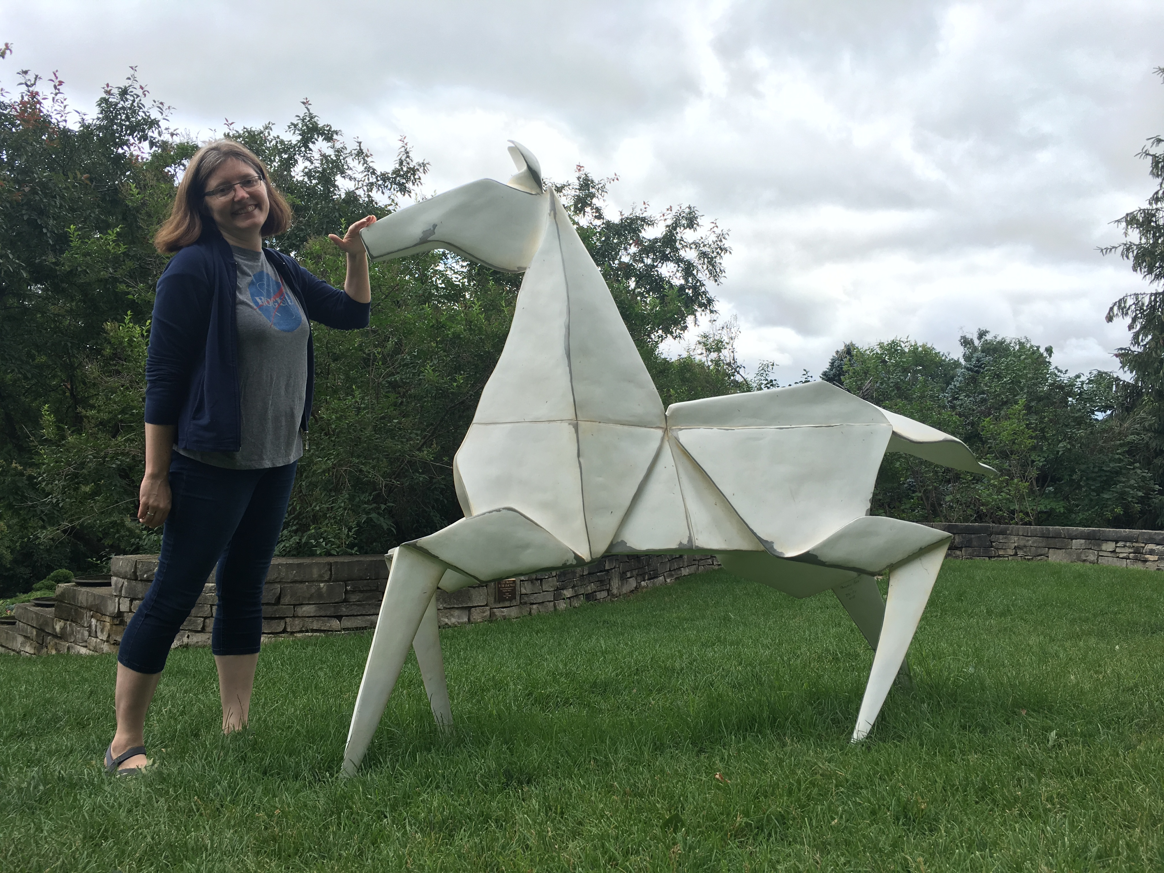
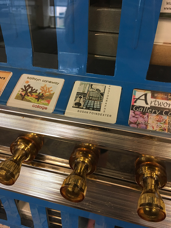
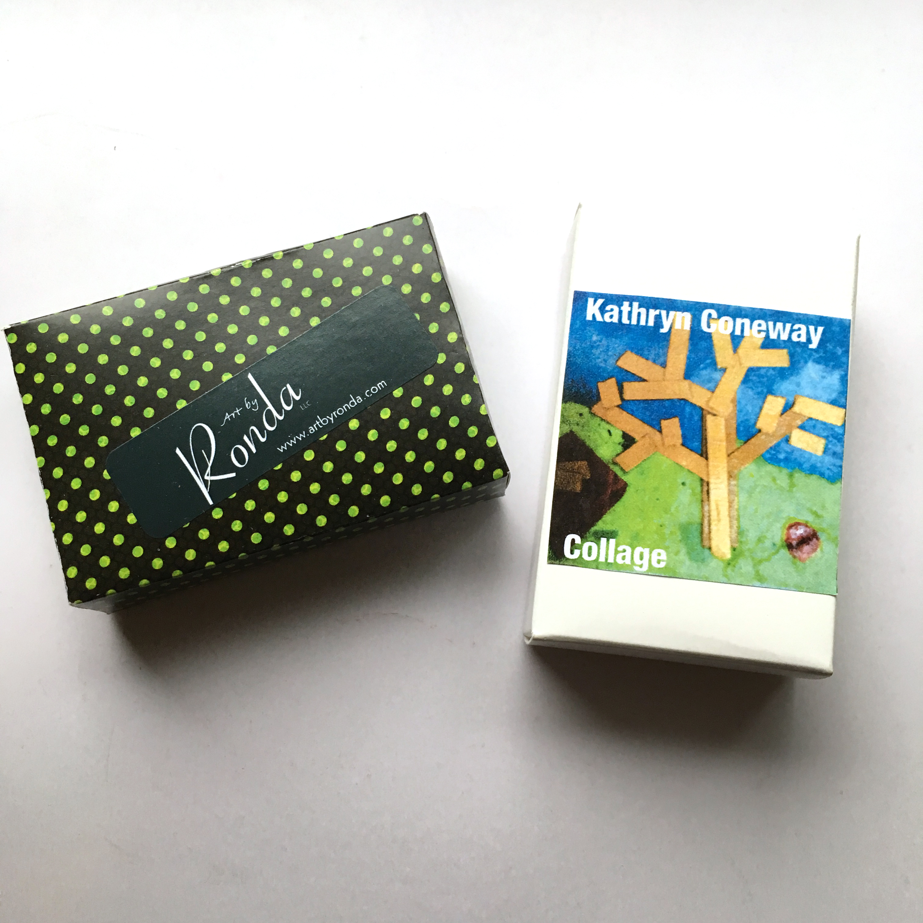
A few weeks ago I spent an evening at the Bakken Museum as a guest artist. The theme was “art in the garden” and it was held on their rooftop patio. For a project, I suggested that I teach people to fold origami butterflies to go with the garden theme. By happy chance, Minneapolis St Paul Magazine was a sponsor of the event and sent along a case of magazines for us to recycle and make art with. It was a perfect match for my project.

I brought some of my fabrics along that feature origami and recycled paper so I could talk about how I use origami in my art.

At least three different people at the event asked me if I had seen the “giant origami” at the MN Landscape Arboretum. I hadn’t heard anything about giant origami, nobody could really tell me anything more about it, and after that night I sort of forgot about it. The Arboretum is about 45 minutes from my house and mostly off my radar. By chance, yesterday afternoon the concert band that my husband plays with had scheduled to play a concert at the Landscape Arboretum. I almost always go along to listen to his concerts and I remembered the “giant origami” conversations. I thought it might be a little something to look at while the band was warming up.

All I can say is WOW. I am so glad I got there and got to see this exhibition. It was stunning. It is called Origami in the Garden and is a collaboration between Jennifer and Kevin Box, a husband and wife artist team, and several other master origami artists. The pieces are actual folded models cast in aluminum, bronze and steel. There are more than 40 pieces throughout the gardens. It was so fun to walk around and see the glimpse of white “paper” peeking out through the leaves. Lots of things were blooming, the day was lovely, and the pieces were installed in ways that made them look like the garden was designed just to showcase each piece.

Accompanying the outdoor sculptures was an indoor display of some of the models folded and unfolded, miniature versions of some of the large sculptures, paper models and more. Which was also fascinating.

Robert Lang, one of the master artists from the show (who folded this amazing crane; see dorky selfie below) is teaching a class in a few weeks and I signed up. It seemed like an opportunity not to be missed. I am a very beginner folder, but I learn quickly and I know the basics, so I am hoping I can keep up. I am excited! I never get the chance to take classes.

If I didn’t convince you already that you need to go and see this exhibition, maybe dorky selfie number two will help you decide:

15 June, 2018

Art-O-Mat Love

2018-06-15T15:39:57-05:00Everything Else, Gallery Exhibitions|1 Comment

When I was teaching this week at the conference center in St Cloud, MN, I was delighted to run across an Art-O-Mat. I had read about them and my friend Cedar had sent me photos of one she saw on her travels. You may remember my love for tiny museums from previous posts.

What is an Art-O-Mat? A repurposed cigarette vending machine that now vends ART! How cool is that?

Each slot is now filled with boxes that each contain an original piece of art from an artist. This one had all kinds of media including paintings, photos, ceramics, zentangle, and wax seals. You get a little hint at what is inside the box by a 2 inch label by each pull knob.

I decided that I needed to get two Art-O-Mat boxes, so I picked a collage artist and one that was labeled porcelain buttons.

I opened the porcelain buttons first from Art by Rhonda. I am sad to say that it looks like Art by Rhonda no longer has an active website. But I love the porcelain piece that was in the box. A fish!

From Kathryn Coneway, I got a paper collage of trees. There is a tiny bit of information about this artist at the link, but I can’t figure out where she is located. (The website is lacking in some basic information.)

A couple of mysteries, for sure. I love that my two pieces of art color coordinate so beautifully: black, yellow and turquoise. A great color combination!

I love the concept and I ordered a prototype kit so I can think about applying to be an art-o-mat artist. How fun would that be?


25 May, 2018

Making Paper Mosaics: A video demo

2018-05-25T10:14:07-05:00Everything Else, Gallery Exhibitions, Spoonflower & Fabric Design, Tutorials|2 Comments

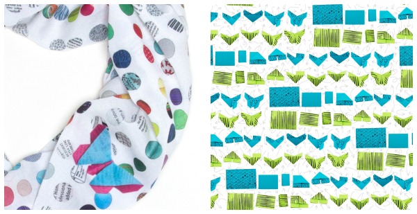
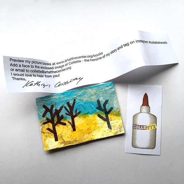
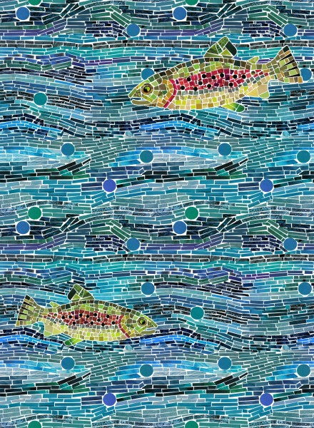
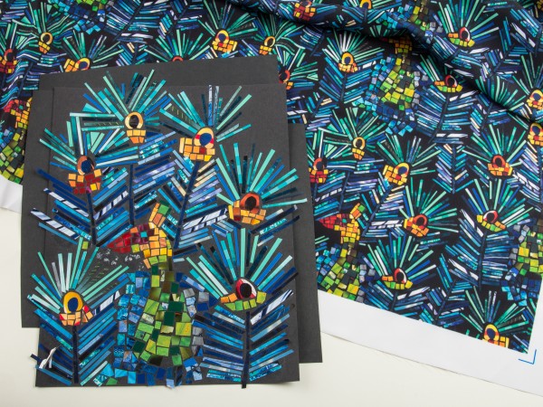
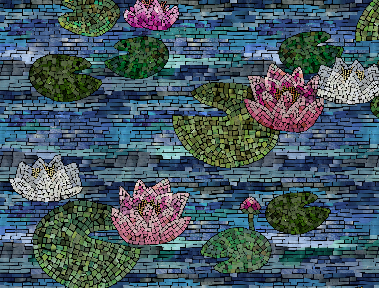
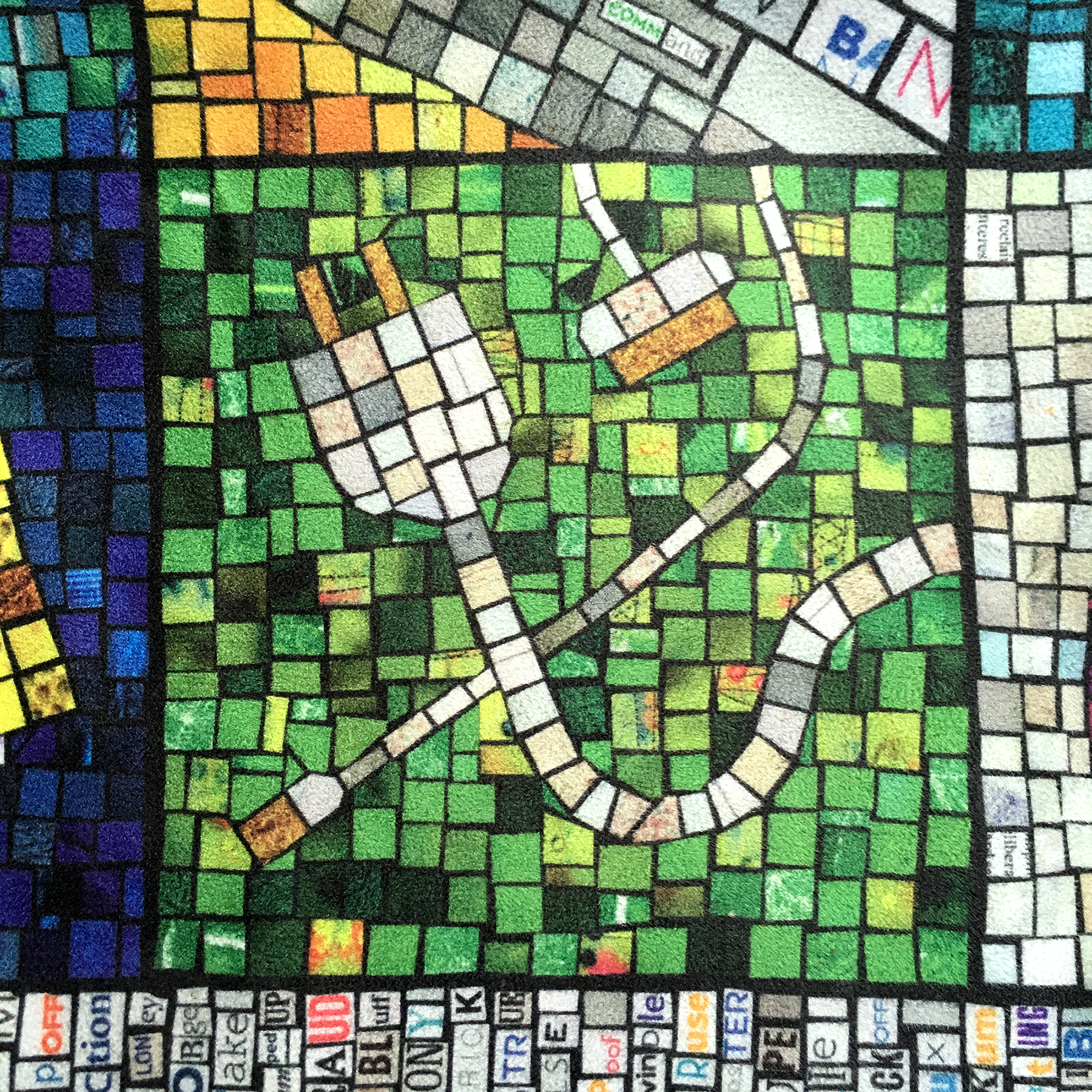
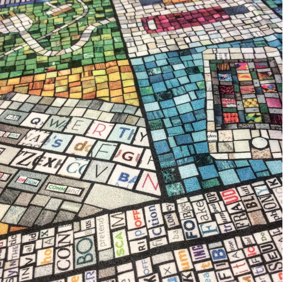
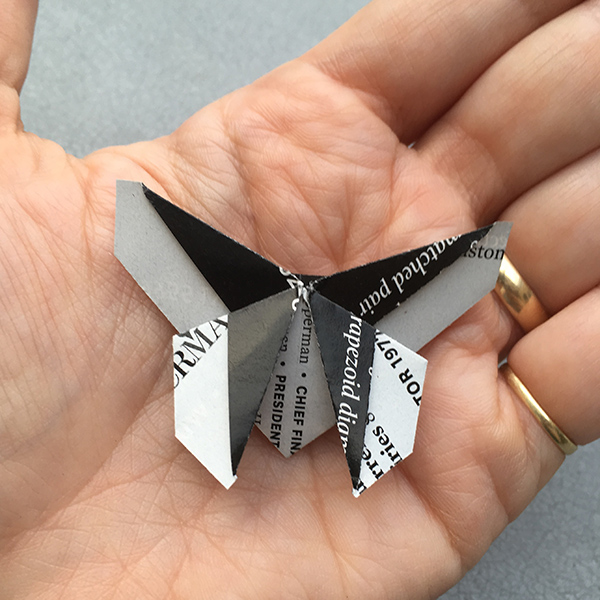
At my last fabric design class, I chatted with my students about how I make paper mosaic designs. I like to design fabrics using original art like paper collage or drawings or paintings. They were very curious to see the originals that my fabrics had started out as, so I thought it would be fun to make a video demo to show the process from paper to fabric.


Here are a few other mosaic designs I have done. All are made from recycled magazines or other patterned papers.


25 April, 2018

Thank you Fiber Art Now

2018-04-25T13:25:55-05:00An Artist's Life, Gallery Exhibitions|3 Comments

I was very honored to have been selected as one of Fiber Art Now magazine‘s inaugural Emerging Artist Awards. The awards were announced in the latest issue and I am joined by Andra Stanton, Bonnie Kuhr, Hanna Vogel and Xander Griffith.

I am excited to get back to work on the piece that I mentioned in my application. I have started preparing the materials and I should be able to get started putting the design together in a couple of weeks, not only making the art but trying to capture as much video/photo record as I can of the whole process. I am looking forward to it!


Go to Top