10 January, 2018

Out of step with the trend

2018-01-16T08:37:14-06:00An Artist's Life, Gallery Exhibitions|6 Comments

Last year I applied to a bucketload of exhibitions. It’s a thing you do when you are an artist. When you get well-known enough, you start to get invited to things, but when you are still “emerging”, you apply to juried shows so that you can get your work in front of people. I applied to a variety of things: exhibitions with themes, ones limited to specific media, ones showcasing “craft” instead of focused on fine art. I applied to two that were specifically about the crossroads of technology and art (which I think my art is a great example of). I applied to some that friends told me were “made for my work”. I never know quite where my work will fit, so I applied to a lot of different things.

I didn’t get in to a single one.

This isn’t terribly surprising. You get a lot of rejections in this business. I don’t take it too personally. But these applications take a lot of time and money. Each one has a form to fill out, a statement to write and images that always have to be edited to be a specific format (and no two are ever the same). It takes a couple of hours to apply, even if you are super prepared and have your resume and artist statement up to date. And they always have a cost. Each show has an associated fee of $25-$50 to apply. I have been on the administrative side of juried shows and I totally understand why they do this. There are costs involved to putting a show together and this is an easy way to offset it. But on the artist side, those fees add up, with no good way for me to recoup those costs. IF I get into the show, I might sell a piece and defray it somewhat, but one sale isn’t going to probably add up to $300 worth of application fees. And not every venue encourages sales.

So I decided before I applied to anything else, that maybe I would take a look at what WAS getting in to these shows and see if I could get a feel for what the trend is. So I went back and looked at some of the websites and announcements for some of the things I applied to. Several organizations that are considered to be leaders in the fiber art/craft field have also recently published posts about “10 exhibitions to not miss in 2018” and the like. So, I looked at the images that were being used to talk about these exhibitions too.

I absolutely see a trend.

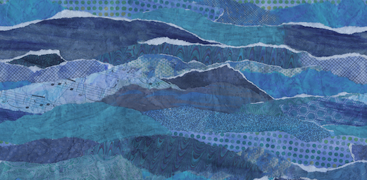
I pixellated this image on purpose, so it’s not just a lousy internet connection making it blurry. I took screenshots of the images that were being used as the promo for a big variety of those “don’t miss” shows and things I had applied to. I pixellated them because I don’t want to call out or disrespect any specific artist, juror or show, because it isn’t about the specifics, but I think you can see the trend I am talking about.

There is a whole lot of neutral there.

If I were to also give you some adjectives to describe the common elements I see from this group of images, I would choose: eroded, aged, uncomfortable, sparse. At least two shows had pieces that were almost creepy with altered baby doll faces. Many objects were distressed, grungy, earthy feeling things. And I am not saying any of these adjectives are bad or negative, just that these were very common elements from show to show.

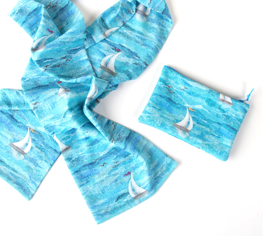
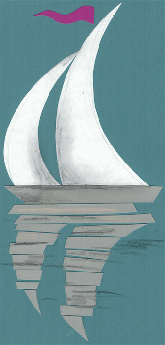
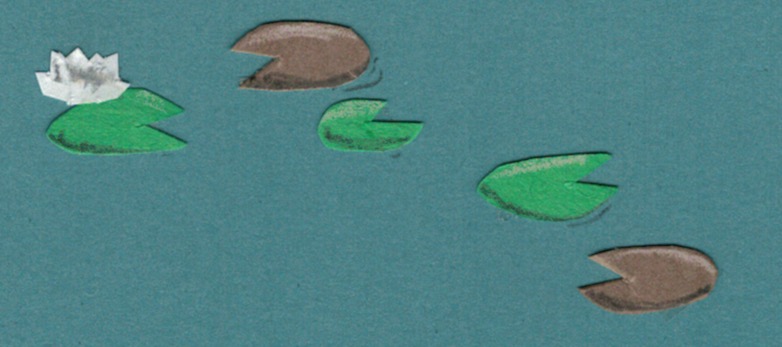
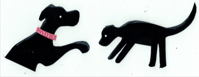
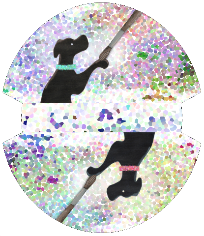
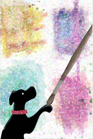
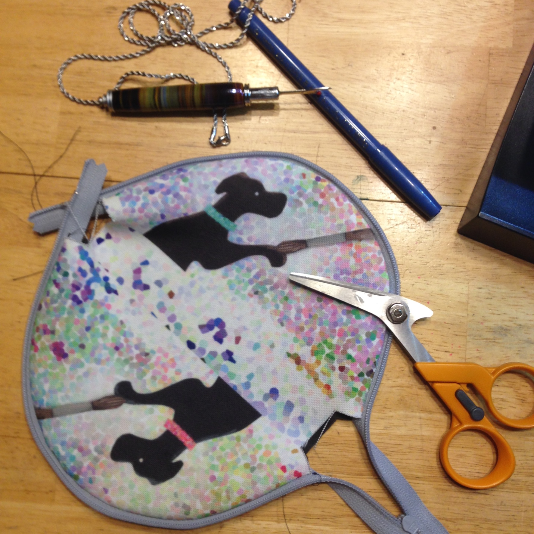
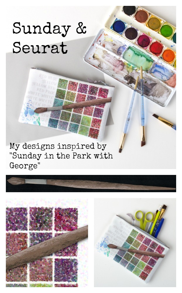
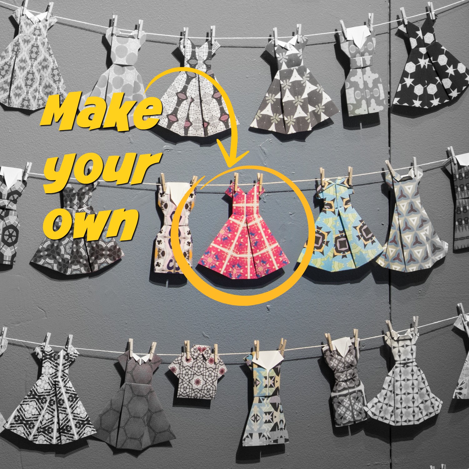
My work matches none of those adjectives. It is colorful, retro, graphic, quirky.

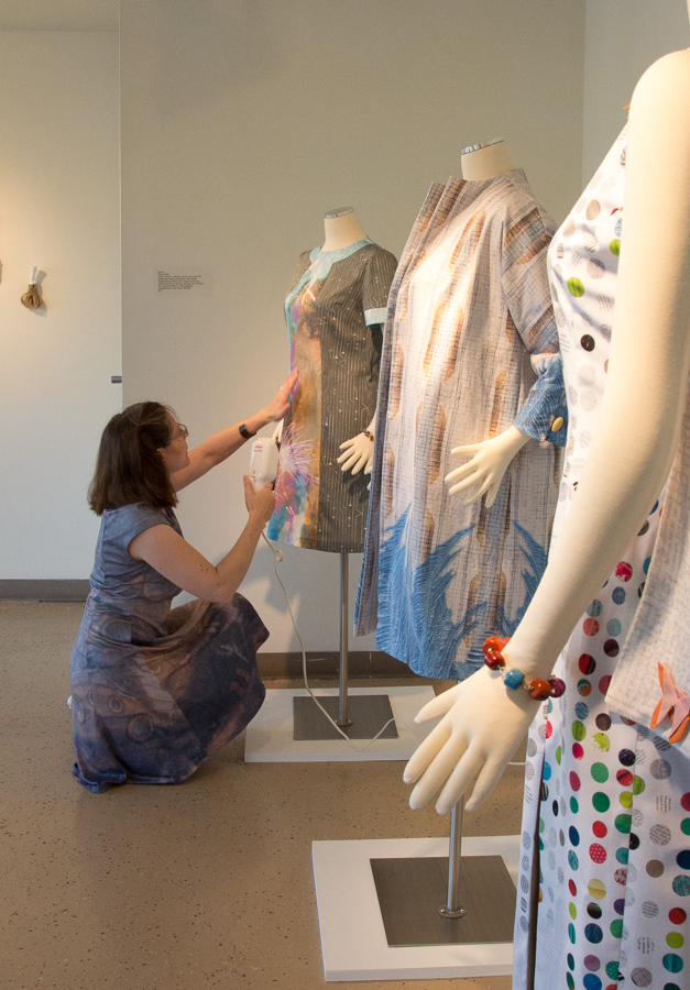
With one exception, I also didn’t see a single wearable garment as a featured image for any exhibition. There was a little bit of jewelry and some sculptural pieces that were garment-like. (The exception was a “don’t miss” show of Native American weavings from a museum of folk art.)

It’s actually difficult to find exhibitions that will even take wearable pieces. They are often ineligible, with no reason given. I expect it has something to do with not wanting to bother with dress forms.

So, it seems that I am out of step with the trend.

That leads me to wonder. If I took one of my garments and gave it the Cinderella-after-the-ball treatment, would it get a different response? Desaturate my colors and distress and deconstruct the piece. Would that make it more appealing to the trend? Does that make it more “art”? Do I want to do that? Is that even my work?

The answer is that I think I am not going to bother with juried shows for a while. Maybe they just think my work is terrible. Fair enough. You never get any feedback from this process, so it’s hard to tell what they are thinking. But juror after juror seem to be choosing the same kinds of other things, which are not what I do. So maybe that just means it’s time to take a break and put that time and money to different use.

I also wonder: Where exactly does my work fit? Maybe I am looking in the wrong places and I need to think about that some more too.

The “fiber art” people tell me that I am cheating because I use computers and technology in my work. (I have had other fiber artists tell me this to my face, so I know this is a real thing.). The “fine art” people don’t consider fibers a fine art form; they think I belong in craft. The “craft” people aren’t sure what to do with my focus on surface pattern; it’s too much like art. The “wearable art” people tend to favor more sculptural or conceptual. The “digital surface design” people are all about pattern and licensing and not about using your own patterns to make art. Again, I am not disrespecting or complaining about any of these groups, just looking at trends I’ve noticed and feedback I have gotten. I am not sure where I fit.

A friend of mine was recently passed over for an art-related opportunity and the feedback she got was she didn’t have enough “fine art” teaching experience, despite the fact that she is a skilled and much experienced teacher of fiber and paper arts. Let’s just say, neither of us agree with that particular piece of feedback. She’s struggling to find a fit as well.

I’m curious. What trends are you seeing in the shows you have attended, viewed, applied to or participated in? Do you love the trend? Tired of it? What do you wish you saw more of?

(Edited: also check out the comments at Facebook. some great discussion)


11 July, 2017

Sunday & Seurat: Sailing the Seine

2017-07-11T21:42:22-05:00Gallery Exhibitions|4 Comments

This is part of a series of “behind the scenes” posts about my Sunday & Seurat designs for the Guthrie Store. Click here to see all of the posts in this series or see a gallery of the collection.


Another detail I noticed in the Sunday on the Isle painting was the sailboats in the distance. Since Minnesota is nicknamed the “Land of 10,000 Lakes”, I knew that a print with boats would probably be something people here would love.

I started this print by creating the water. I collected about 15 different patterned and colored papers, everything from newsprint to sheet music to scrapbooking paper. I laid them all out on my table and gave them all a wash of blue paint. I wanted to obscure some of the patterns a little bit, but I also wanted to give it a cohesive color palette. By giving everything a wash of the same blue, they suddenly all become variations on a theme, rather than 15 separate colors.

I tore the papers into long strips and started layering them together to look like waves. I deliberately tore them a little unevenly to get the “foam” of white paper showing on the tops of some. I glued this all together as a paper collage. My scanner can only scan a piece 9×12, so I needed to carefully adjust and mask the edges of that rectangle so that I could make a seamlessly repeating pattern that could fill any amount of fabric. There is no magic formula to making something like this appear seamless, just lots of time zoomed in and manipulating pixels one by one to disguise the edges of the tile. Totally tedious; totally worth it. Many hours later, I had made a seamless water pattern out of it, which I saved as is, because I reuse patterns like this all the time once I have the hard work done.

Next I created a cut paper illustration of the sailboats and scanned it. One of the things I loved about the sailboats in the painting was the reflection in the water. I thought that was such a lovely detail. So my illustration had a reflection as well.

I made several different sailboats and added those in a layer on top of the water. I was careful to place them on the waves so they looked like they were sailing along and not just plopped down. Finally, I added a flock of birds. I originally had made a set of water lilies as well (my favorite flower) to go in among the boats, but the scale just didn’t work out. If they were small enough to make sense with the sailboats, you couldn’t tell what they were. So those got scrapped.

You’ll notice that the color of my water and the color that it is on the finished fabric aren’t the same thing. When I looked at my finished design, I realized that it looked a little somber. Although the colors matched the painting pretty well, it didn’t have that summer sailing kind of feeling that I wanted. So I went back in and brightened up the water and shifted it to look a little more turquoise, a color that made me think more of sunshine on the water. I also tweaked the tiny flag at the top of the mast so there were pink and yellow flags just for a little sparkle of color.

The final layer, of course, was my Seurat-inspired pointillism texture added in layers. You can still see a tiny bit of the polkadots in some of the patterned papers, but I love the complexity that gives to the design. I love this one and I hope lots of you love it too.

23 June, 2017

Sunday & Seurat: Gone to the dogs

2017-06-29T11:54:01-05:00An Artist's Life, Gallery Exhibitions|4 Comments

This is part of a series of “behind the scenes” posts about my Sunday & Seurat designs for the Guthrie. Click here to see all of the posts in this series.


If you look closely at the Sunday on the Isle painting, you will find a black dog whuffling in the grass. Those of you that know me know that I have a fondness for black dogs.

This is Chester and Leo. They are my black lab mutts. Brothers from the same litter. 3 yrs old.

So, I had to use the black dog as the inspiration for a design. When we were talking about what kinds of pieces we wanted for this collection, I felt like there should be something that wasn’t necessarily a kids item, but something that would appeal to kids. And there are a lot of people who love dogs. So this one seemed like it would be pretty popular. (Turns out we were right, but more about that in a minute.)

I made two versions of the dog from cut paper and I added a little colored pencil shading to them. I scanned the cut paper designs and layered together with a painted background that was just a swirl of different colors. And I added the paintbrush from the Red Yellow Blue design as if the dog is holding up his paw to be painted.

That turned in to this, which I call Brush to Paw. I printed it on eco-canvas. The hidden “easter egg” in this print is that the dogs have a different colored collar on each side of the bag, which match my dogs (red for Chester and turquoise for Leo).

And when you sew it together, it makes a little bag that looks like this. I use these as travel bags and keep my phone charger, jewelry, bandaids and those kinds of odds & ends.


We quickly realized that this little guy was going to be a hit, so we added a piece to the collection and I gave him a place on a tea towel as well. I just got this fabric yesterday and I am going to spend the rest of the afternoon hemming and making some linen/cotton tea towels which should be in the Guthrie shop very soon.

It always catches me off-guard but one question I get asked all the time is “Who does your sewing? Or where do you get them made?” The answer is: Me at my dining room table.

That part is just as important to me as the design is. I have no interest in designing things to send off and have mass produced overseas.

The fabric for all of these is printed by my friends at Spoonflower in Durham NC. They are friends and I have been to Spoonflower HQ and have seen my fabric coming off of their printers. I can’t own the kinds of machines that they have (They cost more than my first house did.) so I am thrilled I am able to work with them to make my designs happen.

Part of the cost of making these is paying myself a fair wage for the time spent sewing them. I work hard to make that part as efficient as I can because I don’t want to spend 24 hours a day sewing, but I can be confident that they are the quality that I want and that the person sewing them isn’t working in a sweatshop. This week I have been drinking tea and watching the Great British Baking Show as I sew. I can’t complain about my job this week.

19 June, 2017

Sunday & Seurat: A Collaboration

2017-06-29T12:03:10-05:00Gallery Exhibitions, Spoonflower & Fabric Design|Comments Off on Sunday & Seurat: A Collaboration

I am so excited to finally be able to talk about my collaboration with the Guthrie Theater Store. In February, I was approached by the manager of the gift shop for the Guthrie Theater. Their summer musical was Sunday in the Park with George and she wondered if I would like to work with them to make some exclusive pieces for the shop that were inspired by the show.

Sunday in the Park with George is loosely based on the life of Georges Seurat and his painting Sunday on the Isle of la Grande Jatte. I first saw the show about 15 years ago and soon after that we visited the Art Institute in Chicago and were able to see the painting. It was the first time that I can remember seeing a painting and literally gasping. I came around a corner and there it was. Part of the beautiful visual story of the show is that the actors recreate the painting on stage and the characters move in and out of that scene.

Image courtesy of Art Institute of Chicago

The show is a love note to artists. Seurat struggles with getting the image that he sees in his head on to the page and the struggle filling up the blank canvas. He is famous for the pointillist style, where the image is made up of dots of colors that your eye blends together. When I thought about what to design, I thought of the song “Color and Light” from the show, where Georges repeats the names of colors in a rhythmic pattern like his dots on the page. So that was one of the first designs I created.

Red Yellow Blue

Making the design Red Yellow Blue

I started many of the designs in this collection from paper. The grid (representing a paint palette) and the paint brush are both illustrations made from cut paper; the paint splatters were watercolor. The paintbrush was shaded with colored pencils to add some texture. I scanned all of those pieces so that I could manipulate them digitally but preserve the texture and hand-cut or hand-painted quality of them.

There is a filter in Photoshop called “pointillism”, which seemed like a logical choice to make the design look Seurat-like, but it didn’t give me the effect I wanted at all. So I read a little more about Seurat’s painting and that gave me some ideas.

The artist worked on the painting in several campaigns, beginning in 1884 with a layer of small horizontal brushstrokes of complementary colors. He later added small dots, also in complementary colors, that appear as solid and luminous forms when seen from a distance.

I built up my design the same way with transparent and opaque layers, some with dots and some without and I digitally played with the luminosity in different ways. It took a lot of experimenting to get something that felt just right. It ended up being about four or five layers in total.

This design was intended to be a zipper bag, so I created the design to scale and not as a repeating pattern, which is more typical for fabric designs. It is printed on eco-canvas, which is made from 45% recycled polyester. The finished bag is about 5×8″, which is just the right size for your favorite pencils and art supplies.

Red Yellow Blue.


This is the first in a series of posts about the making of these Sunday & Seurat designs. I wanted to have the chance to talk a little more about the inspiration and process of making each one. They can be found for sale at the Guthrie Theater Store and you can see the whole collection in this virtual gallery.

22 February, 2017

Make art with me: March 2

2017-02-22T11:27:46-06:00An Artist's Life, Gallery Exhibitions, UpcomingClasses|Comments Off on Make art with me: March 2

Thursday March 2 • 6-8 pm • free admission
Hennepin History Museum

I will be in the gallery talking about my work, answering questions and teaching YOU how to make awesome origami dresses like these from the exhibition. It is really fun to do and I have printed patterned wrapping paper so that every one can be different.

I was talking to someone recently about origami as a theme in my work. I never start out saying I am going to have something that’s origami, but it always shows up. Origami is a Japanese art form of folding paper. The designs are made without cutting or tearing the paper and almost always start off as a perfect square. When I was a kid, my dad had an origami book. It has been his since *he* was a little kid; a gift from a very favorite great uncle. Uncle Lester was a magician who specialized in paper tricks. I have written about him before. We were only allowed to look at the origami book with supervision, but my dad would sit with us for hours and help us figure out animals and flowers. There is one design from the book that I have had memorized since I was a kid. I remember folding it in elementary school from pieces of lined paper; it’s an unusual one that starts with a rectangle. My original engagement ring was an origami butterfly ring. I found the book it came from and tracked down an out-of-print copy for my husband for our 20th anniversary. I think origami was one of the first art forms I really connected with and said “I love this”. (In contrast, I hate painting. I really don’t enjoy it at all. It took a long time for me to embrace that. It’s ok to be an artist and hate painting.) So I hope you can come and learn to fold something. Maybe it will click with you too.

Go to Top