20 July, 2016

Fabric Design Tutorial: Photo Collage Bonus Mashup

2016-07-19T22:56:06-05:00Spoonflower & Fabric Design, Tutorials|Comments Off on Fabric Design Tutorial: Photo Collage Bonus Mashup

I posted a tutorial just a few days ago showing how to create a “scrapbook style” fabric design from a collection of photos. You can think of this post a variation on that theme. It’s a different way of using the same tutorial.

Screen Shot 2016-07-19 at 10.11.07 PM

In my last artist newsletter, the free download I sent to subscribers was a photo of a sunflower on a transparent background. It went along with the Prospect Park utility boxes project that I did recently; in fact, you can see that sunflower in the cafe scene and on the bicycle headlight on one of the boxes.

Maybe a fabric design with photos of your dogs or friends and family isn’t something you are interested in. What about flowers? This fabric design is a mashup; it uses that sunflower photo (and several other flowers) plus exactly the technique I described in the scrapbook style tutorial to make something totally new. I used the “color cell” option in the Background tool set (paint palette icon) to add the blocks of solid color to this design.

Screen Shot 2016-07-19 at 10.40.04 PM

What other variations on this theme can you come up with?

14 July, 2016

Fabric Design Tutorial: Create a “Mini Photo Scrapbook” Fabric Design

2016-07-19T09:53:53-05:00Everything Else, Spoonflower & Fabric Design, Tutorials|Comments Off on Fabric Design Tutorial: Create a “Mini Photo Scrapbook” Fabric Design

Screen Shot 2016-07-13 at 11.48.36 AMI am going to call this tutorial the first in what I hope will be a series of “Suggestion Box Tutorials“.

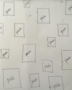
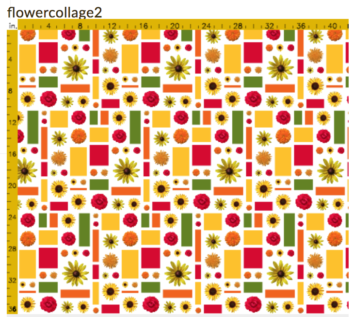
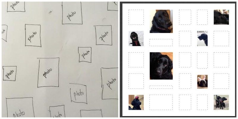
I got an email from a woman this morning asking for help designing a fabric to make a keepsake zipper bag. She and a collection of friends are meeting up this summer and she wanted a little something to give each of them to commemorate the occasion. She had a great idea for what she wanted the fabric to look like: a collection of photos and little graphics that were all significant to this group of friends. The photos should be scattered like postage stamps on a white background. She even sent me a sketch.

Her question was: did I know of anywhere there was a tutorial that could show her how to do this and how could she make sure that it was just the scale and size she wanted?

Could I think of anything? No. So, this seemed like the perfect tutorial for me to write.

What does your intention tell you about your design?

If you have had the chance to take a class from me, you know that one of my tips for creating really successful fabric designs is to design with intention. The intended use for your fabric can give you so many hints about how you need to set up your design files.

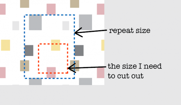
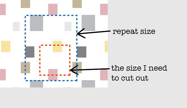
This fabric is intended to be a lining for a small zipper bag. So we know that will use pieces of fabric that are maybe 10-12″ square. If I create a repeating tile that is larger than 12″, I won’t see all of the photos that will be in the design because I will be just cutting out a piece. Maybe that’s ok. Or maybe you want to make sure that each bag has every photo visible. That’s a choice for you to make.

I also know that if my zipper bag is 10-12 inches, I probably need the photos to be pretty small in relation to that so that the scale makes sense. If the photos are each 6 inches, I will only be able to see a couple of them once I cut it out.

Screen Shot 2016-07-13 at 12.12.30 PM

Do the math.

So for this project, I am going to use that information to set up my design file (aka do the math). Why do I need to do that now? Can’t I just do the fun part (designing it) and worry about that math stuff later?

The number one thing I hear from new fabric designers is:

I uploaded my thing to Spoonflower and it was so awesome, but it was totally the wrong size! I thought it would be small but when I uploaded it, it was huge! I don’t know what happened. I was so surprised.

This is the step where you can make it turn out exactly the size you want it to be. It just involves a tiny bit of math.

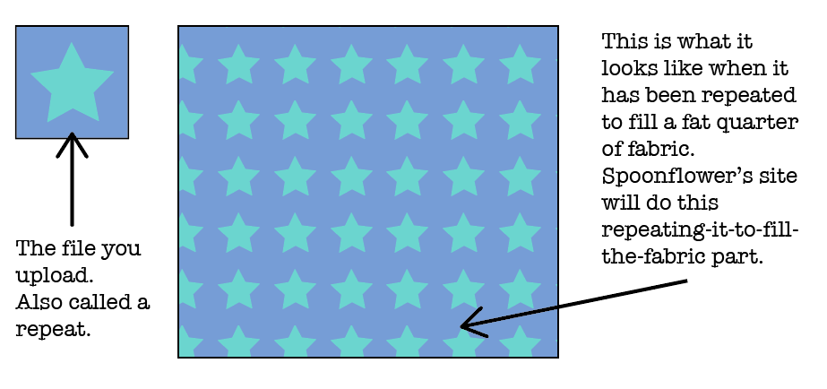
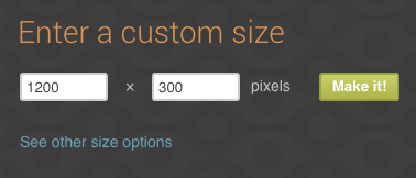
  1. Decide what size you want your repeat to be. By “repeat” I mean the file that you will upload to Spoonflower. Spoonflower computers will repeat that file it to fill as much fabric as you want to print. Yes, you repeat your repeat. English is weird.

Screen Shot 2016-07-13 at 12.25.24 PM

I decided that for this zipper bag lining, I want my repeat to be 12″ because I want to be able to see the whole thing with all of the little photos when I cut out my lining piece. That’s my design choice. You make your choice.

2. The magic number is 150.

The only thing you need to remember about resolution for this project is 150. Resolution is the number of dots (or pixels) per inch that the file needs in order to print at the size you want. Dots per inch = DPI.

Spoonflower’s printers use a resolution of 150 DPI. That’s why 150 is our magic number. That means if you set your file to 150 DPI, you will get exactly what you expect to get. That’s a rule. 150 uploaded = 150 printed. In otherwords, if I make a file that is 12 inches at 150DPI, I will get a printed design that is 12 inches. No more, no less. So how do I set up the file?

3. Figure out how many pixels that is.

Resolution is the number of pixels per inch. Since we know how many inches we need (12″) and we know how many pixels per inch (150 DPI) we can figure out how many total pixels that is. And we need to know the total number of pixels because that’s the number our graphics program will ask for.

inches x resolution = pixels

12 inches x 150 pixels per inch = 1800 pixels

That means if I want a file that will print exactly 12 inches wide, I need to make a file in my graphics program that is 1800 pixels wide.

Remember that number. 1800 pixels. Write it down on a scrap of paper.

Create a new blank file.

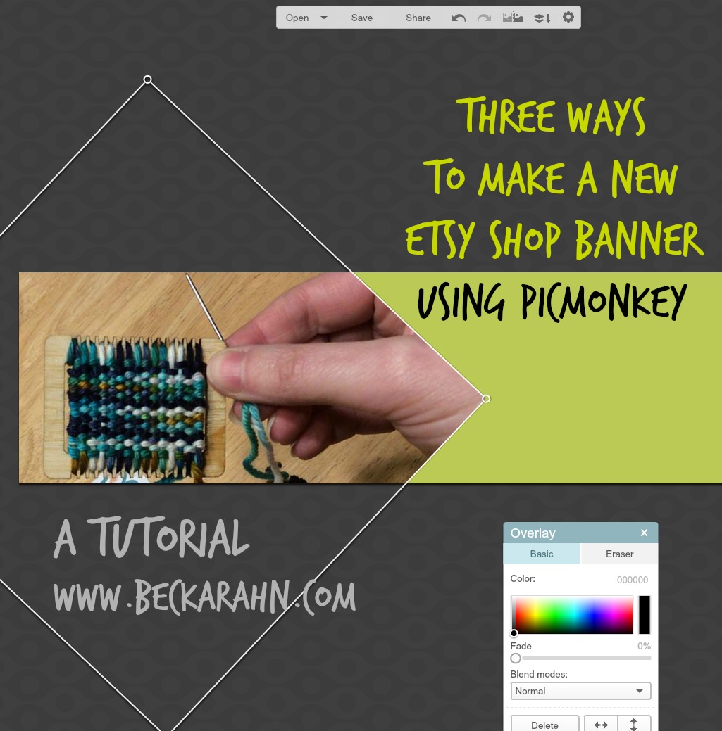
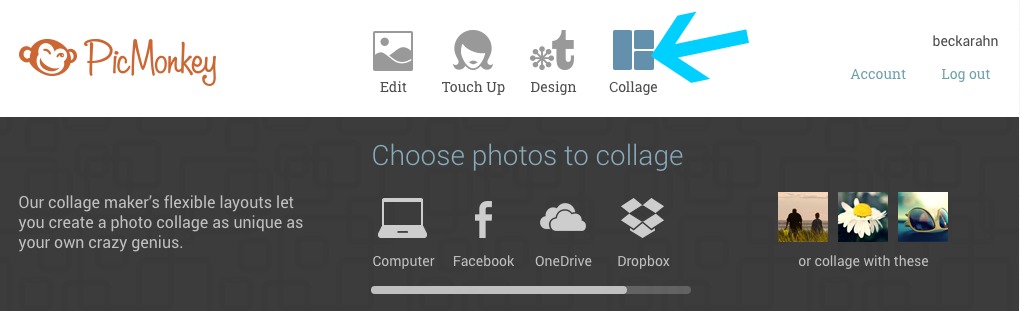
For this design, I am going to use a program called PicMonkey because I think it is the ideal tool for this design. It’s going to make it easy. You can use any program you want to to make your designs, but PicMonkey has some built in tools that I know will work really well for this. That’s why I picked it. It’s a free online graphics software that works right in your web browser. You don’t need to download anything.

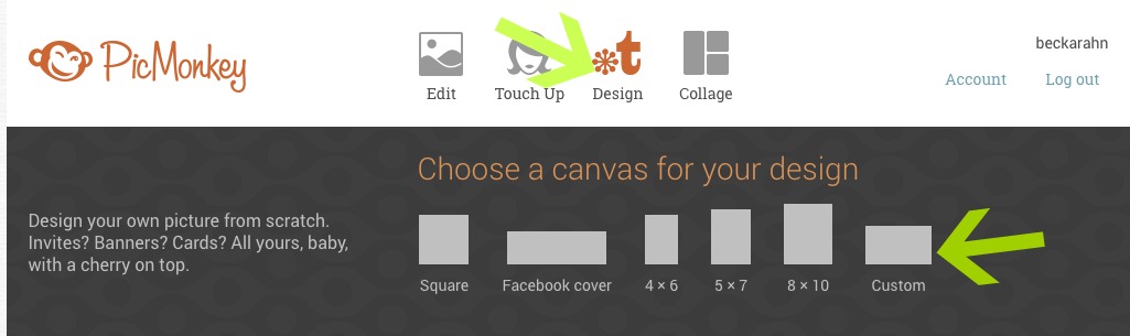
Go to PicMonkey.com. At the top of the screen you will see a menu bar.

Screen Shot 2016-07-13 at 12.44.02 PM

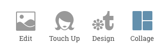
Click on the option on the right that says Collage.

Set up the Layout.

Screen Shot 2016-07-13 at 1.22.09 PM
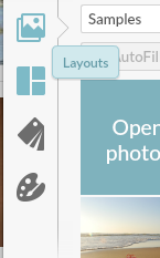
The reason that PicMonkey is such a great tool for this project is because of this collage tool. Look at the left sidebar on your screen for the icon that looks like a grid. If you hover your mouse over it, it will say “Layouts”. Click the Layouts button.

Feel free to explore the options in this panel! These are all of the different ways that PicMonkey can layout a collage for you.

(There are some options that are marked with a crown – those are part of the upgraded “Royale” package that PicMonkey offers, which is an annual fee of $40/year. We will use a free layout option for this project but that $40 per year membership is totally worth it. Note: I don’t get anything from PicMonkey for telling you that; it’s just my personal opinion. I just love PicMonkey.)

Screen Shot 2016-07-13 at 1.24.22 PM
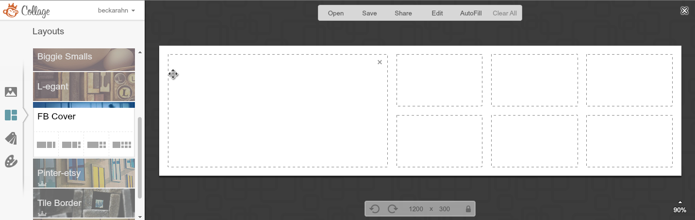
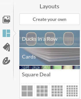
Click on the option called “Square Deal” out of that list and then pick the little icon at the very far right (a grid of 25 squares.)


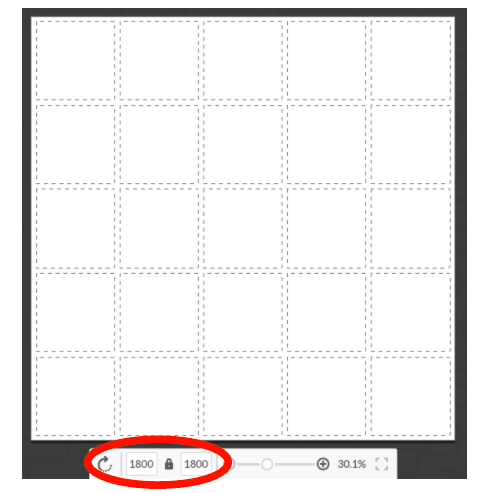
Remember when I told you to write down “1800 pixels”. The very next thing you want to do is set this file to be 1800 pixels. Look at the bottom center of the screen and you will see where to type that in. I put in 1800 for both the width and the height, so I will have a 12 x 12 inch square as my file size. (See how easy that was!) Hint, if you click the Lock Icon after you do this, it will keep it at this size while you are doing the next steps and rearranging things.

Screen Shot 2016-07-13 at 1.32.25 PM

Add your photos.

The dotted lines in this layout represent the places I can drop in my photos and graphics to make up this design. But first I need to load them into Picmonkey.

Screen Shot 2016-07-13 at 1.35.43 PM
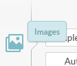
Look back again at the left sidebar. Choose the top icon that looks like a picture of mountains and is labeled “Images”. The very first thing in the panel of thumbnails will be a button (top left) that says “Open Photos”. Click that and it will pop up a window for you to find the files on your hard drive.Screen Shot 2016-07-13 at 1.36.58 PM

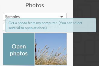
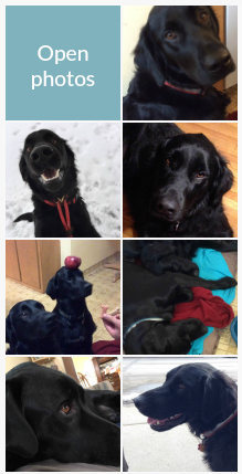
A hint: It’s super helpful if you collect everything you want to use for this design and put it all together in a folder on your Desktop (or somewhere else handy). Then you can select and upload them all at once instead of needing to hunt and peck all over your computer to find what you need. Load all of the photos you want to use right now. You can click that “Open Photos” button more than once to keep adding photos.

Screen Shot 2016-07-13 at 1.44.14 PMYou will see all of your photos pop up in the thumbnails along the left side of the screen. They don’t have to be photos. Anything in a .jpg format will work, like little graphics or screenshots. Just make sure you have permission to use them.

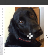
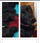
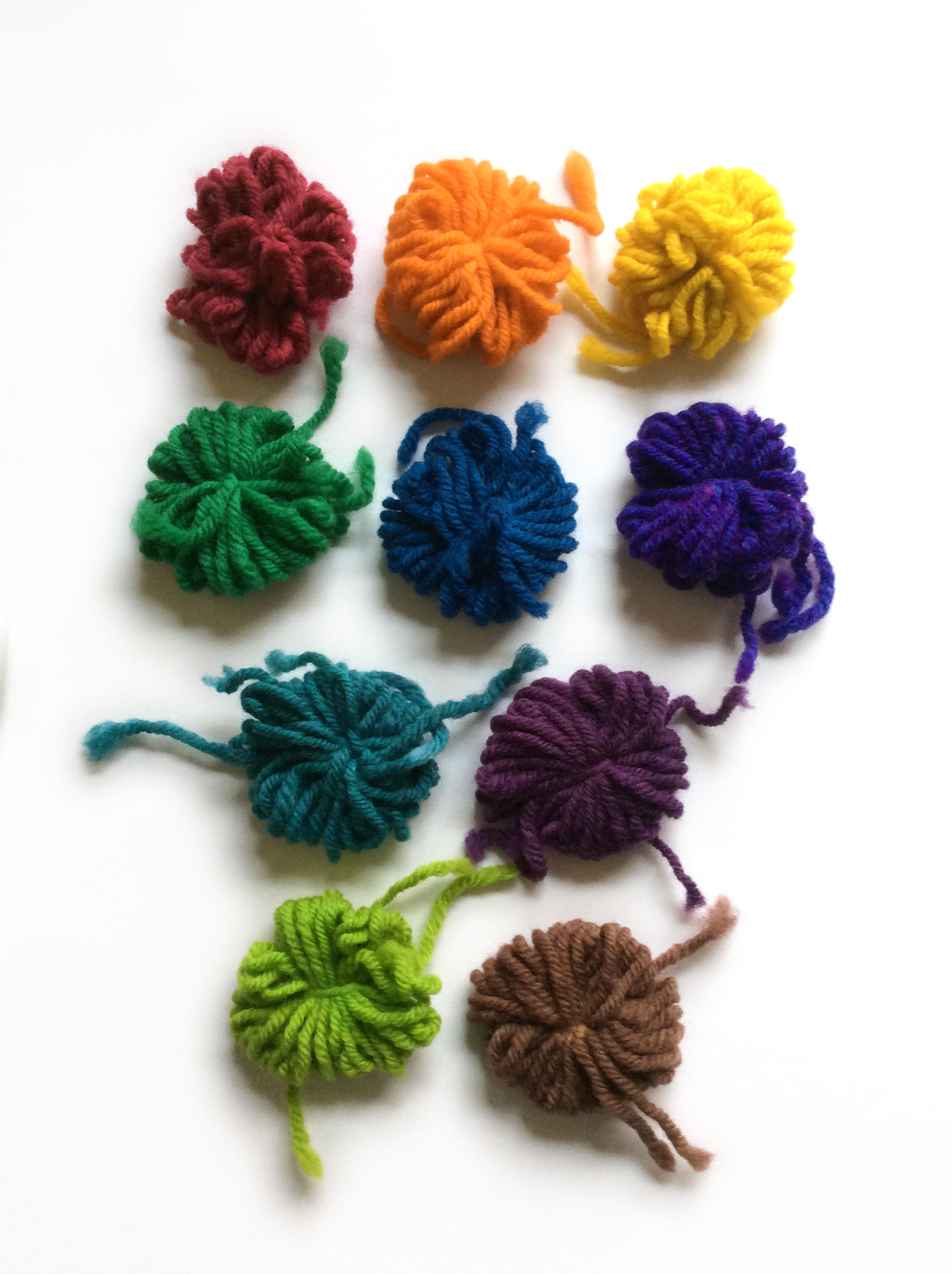
Now the photos are ready to use. I chose a bunch of photos of my dogs for this example.


Fill in the blanks.

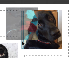
You can now click and drag the photos from the left sidebar and drop them in the boxes in the template on the right. If I look back to the sketch my friend made, she has photos scattered all around the design, so I am not going to fill in every box in the template, but I will leave some spaces.

Screen Shot 2016-07-13 at 3.05.41 PM
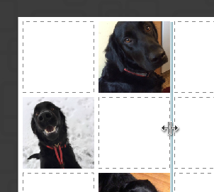
Want to vary the sizes of the boxes a little? You can click and drag to change the size and shape of the rows and columns. Hover with your mouse between a couple of boxes and you will see a double arrow pop up. You can drag with that double arrow to make the columns and rows bigger and smaller.

Screen Shot 2016-07-13 at 3.07.20 PM


Recenter a photos? Hover over a picture and wait for your cursor to change to a 4-pointed arrow. Now you can move the photo around within the box (to recenter it).

Want to add another photo and insert an extra box into the template? Grab a photo from the thumbnails, drag it over to where you want to add it and wait for a blue outlined box to pop up. When you drop the photo it will add a new box where that blue outline was. Now there are two photos in that space.

Screen Shot 2016-07-13 at 3.11.02 PMScreen Shot 2016-07-13 at 3.11.10 PM


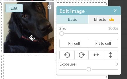
Zoom? Click any photo in the collage to see an Edit button (top left) or an “X” (top right). Click the “Edit” button and a menu will pop up that will let you zoom and rotate that photo you have selected. Click the “X” to remove the photo.

Screen Shot 2016-07-13 at 4.08.10 PM

How do you know if the photos you are using are going to work and not look pixellated? Pretty much it is what-you-see-is-what-you-get. I could help you do the math to check that you have enough pixels in each of these photos and so on, but honestly, if it looks blurry, or pixellated, or in any way yucky when you look at it in this step, it’s going to look that way when you print it. It’s pretty simple. Your best bet is: if it looks yucky, choose a different picture. You can’t fix blurry or pixellated.

(more…)

31 May, 2016

Tutorial: Color schemes from photos & using Creative Cloud Libraries

2016-05-31T11:30:43-05:00Spoonflower & Fabric Design, Tutorials|Comments Off on Tutorial: Color schemes from photos & using Creative Cloud Libraries

Screen Shot 2016-05-31 at 10.10.31 AMI write a newsletter for the MN chapter of the Surface Design Association and each month I include a color scheme for inspiration. I know color is a hard thing for a lot of people. I work very intuitively with color and I personally don’t put a lot of thought into color theory or color wheels; I just go with what feels right to me. But not everyone can work that way. So I like to provide a little jumping off point by pulling a set of colors from a photograph to use as color inspiration. Maybe you can use it as a jumping off point for a new design. Maybe it makes you look deeper at a photo to see the way colors work together. Maybe it makes you think about how there are unexpected colors in shadows. I think there is something for anyone to relate to.

As a dyer or surface designer that works with paints, dyes or pigments you can look at the palette and mix up your colors to work from there. As a digital designer, I can import these colors directly in to my graphics program. It doesn’t really matter if I am working with the exact colors from the photo for a single design, but where that is handy is when I want to make a set of coordinating designs where matching colors is important.

I start by pulling colors from the photo using a program called Adobe Color, which is also part of the Adobe Capture app, so you can use it in your web browser (Color) or on your phone/tablet (Capture).

Screen Shot 2016-05-31 at 10.14.35 AM

Go to Adobe Color and look for the camera icon that says Create from image (green circle) or click in the center of the screen. Choose the image you would like to use.

Screen Shot 2016-05-31 at 10.15.00 AM

When it pops up the photo, it will automatically choose 5 colors, shown by little bubbles on the photo. You can click and move those bubbles around to adjust the colors. On the top left, there is also a palette marked Color Mood, which gives you options for “colorful”, “bright”, “muted” etc.

You’ll need to have an Adobe ID to save this color scheme. If you already have a subscription to Photoshop or any of the other Adobe software, you should use the same ID. Once you have a set of colors you are happy with, click the Save button.

A little note: No Adobe account? If you don’t want to have one more account name and password to remember, I totally get that. If that’s the case, just take a screenshot of this screen instead of saving. You can work from a screenshot almost as easily.

Screen Shot 2016-05-31 at 10.17.15 AMGive your color theme a name and choose where you want to save it. Creative Cloud is the subscription service that you get your Photoshop subscription from. (Because this is always a question I get asked when I talk about this in a class, it doesn’t have anything to do with “The Cloud” or saving things to “The Cloud”, Creative Cloud is your Adobe account. It’s just badly named.) By default, you have a Library named “My Library” but you can create a new one and give it a different name. You have the option of making this color scheme part of the public gallery if you choose “Publish this theme to Explore”. That’s up to you.

Why save it this way and not just on my hard drive? This is the cool part. Anything I save to My Library is available to me in any other Adobe program. So once I have captured this color scheme, I can switch over to Photoshop.

Screen Shot 2016-05-31 at 10.19.26 AM

When I open the Libraries panel in Photoshop, there is my Dandelion color theme right at the top. I can click on those colors and use them just like the regular color palette. (If Libraries isn’t open look in the top menubar for Window -> Libraries and that will open it up.)

It works exactly the same way in Illustrator. If you mouse over one of those color chips, you will also get two more pieces of information. The top number (example above #D8923A) is the hex code for that color. The bottom number is the RGB values. You can type those numbers into any other graphics program and get the same color. Here’s what that looks like in PicMonkey.

Screen Shot 2016-05-31 at 11.00.12 AM

If that hexcode looks familiar to you, it’s because that system is also what is used on Spoonflower’s ColorMap.

If you didn’t save to Creative Cloud and are working from a screenshot, you can open the screenshot and use the eyedropper tool to get the same hexcode and RGB information.

Want to see it in use? Here’s a very quick and simple example of patterns of chevrons and polkadots drawn in Illustrator, which use colors pulled from the photo. This could be the front and back of a pillow. Or the outside and lining of a totebag. Or some coordinating quilt prints.

Screen Shot 2016-05-31 at 11.11.41 AM

13 April, 2016

How do I repost in Instagram? A tutorial

2016-04-14T08:44:01-05:00Tutorials|2 Comments

I have had an Instagram account for a while, but I just wasn’t using it.  One of my goals for this spring was to dust off that account and start finding ways to use it and see if Instagram was a good social media match for me. I have been trying to post from art shows that I am at and take more behind the scenes photos while I am working on pieces. (And I post photos of my cute dogs, naturally.)

I realized that there were also some cool things I wanted to be able to “re-gram” or share from other Instagram friends, but I couldn’t figure out how to do that, so I asked my friend Google. It turns out that sharing is a little bit complicated. There isn’t a “share” button in Instagram. I read a bunch of articles and help docs and this is what I decided is my favorite solution. Keep in mind that Instagram is basically only for phone and tablets, so all of these screenshots in the tutorial are from my iPhone.

I downloaded an app called Repost. It’s a free app and my favorite part about it is that it adds a sticker to the photo you are reposting, so it is really apparent that you are sharing something from another person. That’s important to me.

Screen Shot 2016-04-13 at 12.43.02 PM

Connect Repost to your Instagram account and you are ready to go. Choose the photo you want to repost from your Instagram feed.  You can also choose to repost things from your likes or favorites by choosing those tabs at the top.  Choose the photo and tap “Repost”.

Screen Shot 2016-04-13 at 12.46.38 PM

The next screen lets you set where Repost puts that photo credit. The buttons at the bottom of the screen let you place the credit on different sides of the photo and give it a light or dark background. Then tap Repost again.Screen Shot 2016-04-13 at 12.48.01 PM

A pop up will let you know that it has copied the original caption from the photo to your clipboard. (I don’t need to remember the caption – that’s pretty great too!) Just tap OK. Next it will ask you where you want to Repost this photo. Tap the Instagram icon.

Screen Shot 2016-04-13 at 1.45.27 PM

Finally, you now have the photo moved over to Instagram. When you first pop in to Instagram, the caption is blank. Tap and hold inside the caption text box. When you release your tap, a bubble will pop up that says “Paste”. Remember when we said OK to copying the caption? This is how you get to it. Tap “Paste” in the bubble and it will add the original caption and a little extra text which says: #Repost @username with @repostapp.  This tags the person who posted the original photo, so they will know you reposted it, and your followers can see whose photo you are sharing. You can also add your own text and tags to the caption.

Screen Shot 2016-04-13 at 12.57.05 PM

Then go ahead and post it. Here’s what a repost looks like in my feed. Screen Shot 2016-04-13 at 12.58.34 PM
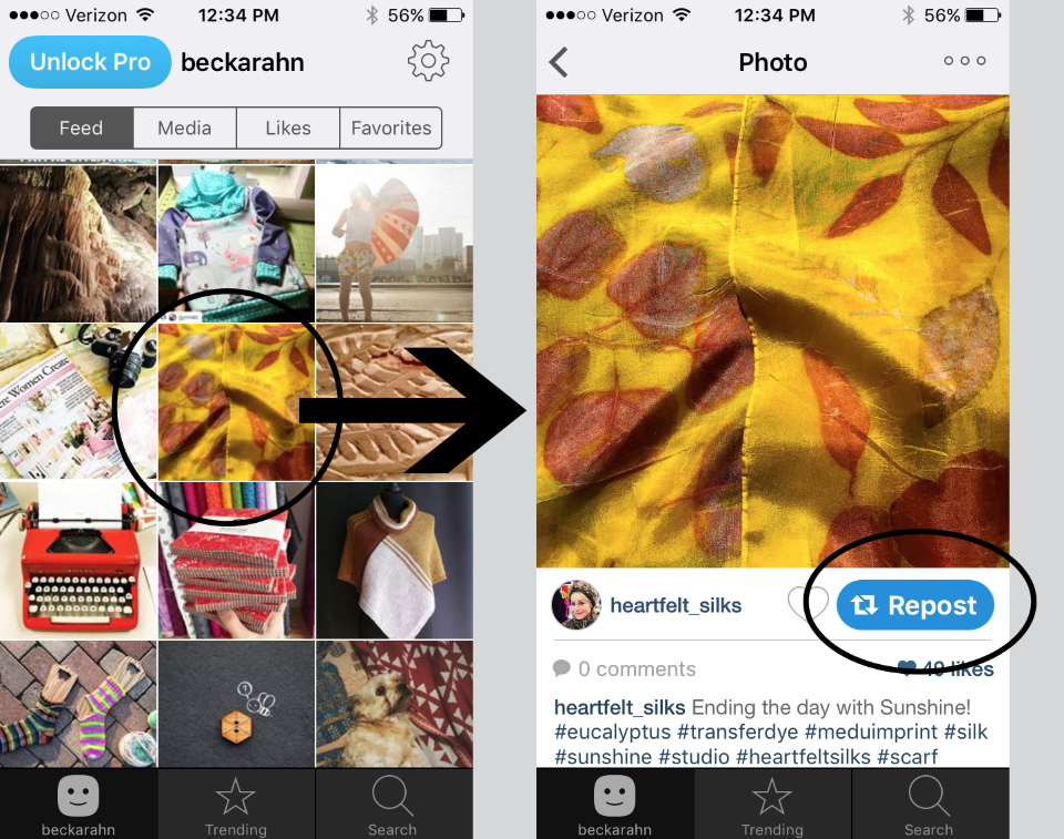
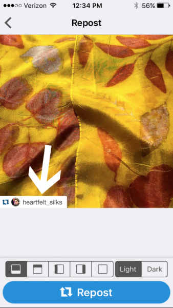
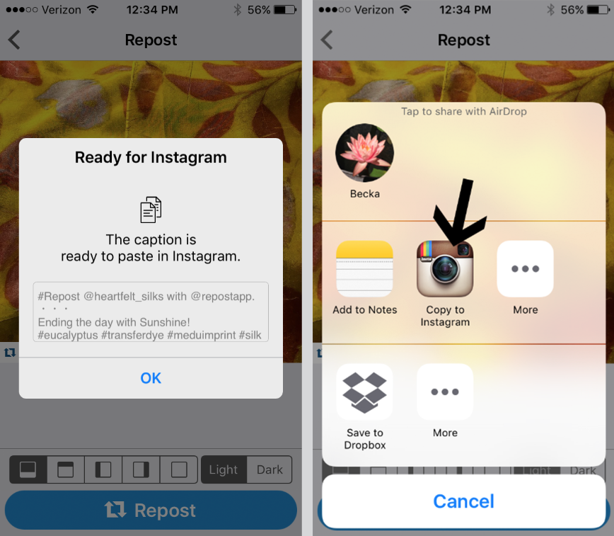
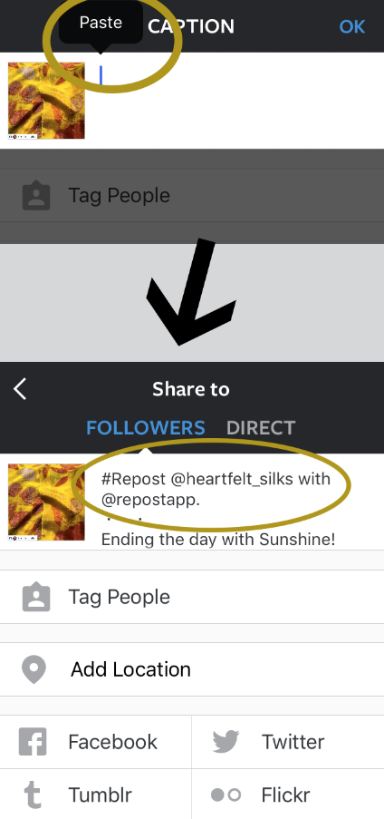
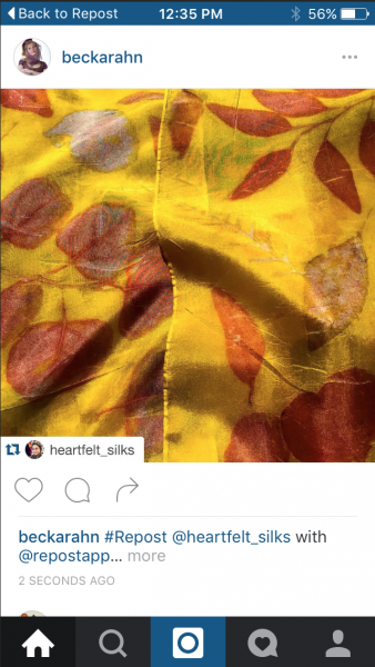
There are lots of other ways to do this, but like I said, this was my favorite solution.  I like the way that I can easily re-post the caption as well as the photo and I like the “sticker” on the photo that identifies the original author. Thanks to my friend Robbin for having such a lovely photo for me to share.

Do you have a different app or method that you use to repost? I’d love to know what’s your favorite.

28 March, 2016

Dyeing Wool Yarn with Easter Egg Dye (A tutorial)

2016-03-28T10:30:40-05:00Tutorials|1 Comment

EasterEgg3
When you are an artist, nearly everything has the potential to be an art material. We dyed some easter eggs on Saturday and there was some leftover dye. Which was obviously a great excuse to dye some yarn.

These are 100% wool yarn, dyed using a basic set of PAAS easter egg tablets made up according to instructions: 1/2 c warm water and a tablespoon of vinegar. You can use them following the same basic formula as dyeing with koolaid or food coloring: color + acid + heat.  After we finished dyeing a dozen eggs, I dropped these mini skeins into the coffee cups full of dye and microwaved each one for 2 minutes. I know that wool needs more heat than eggs would be happy with in order to make that dye permanent.

After you microwave it, let them sit on the counter until the liquid is room temperature and the dye is exhausted (ie the water is clear). Don’t skip the heat step, or these colors will be much more likely to fade and bleed. No stirring or playing with the fibers when they are hot, if you don’t want it to felt. And this will only work with yarn that is wool or another protein fiber: silk, alpaca, llama etc.

These are super saturated colors because I had a lot of dye and not very much yarn. I estimate that you could dye up to .5 oz of yarn with 1 tablet and get colors this intense. The more yarn you add, the more pastel the color will be.

For a few, I mixed the colors just to see what else I could get. The top 6 colors are the plain tablet, the bottom four are a 50/50 mix of two colors, which I poured into an extra coffee cup. Interestingly, the green was an aqua turquoise color on my eggs, but true emerald green on the yarn.

EasterEgg2

I am sure the PAAS tablets are on clearance at the grocery store today, so I am planning a walk over there to stock up on a few more boxes.  Just because this is fun.  The same thing goes for yarn dyed this way as I said in my yarn dye/food coloring tutorial: Your colorfastness may vary. I wouldn’t make an heirloom knit with yarn dyed this way, but it is super fun for a hat or mittens that will get you through a few winter seasons.

PinterestEaster

23 March, 2016

Three Ways to make a NEW Etsy Banner using PicMonkey (A tutorial)

2016-03-23T18:50:57-05:00Etsy, Everything Else, Tutorials|Comments Off on Three Ways to make a NEW Etsy Banner using PicMonkey (A tutorial)

Etsy is rolling out a whole new look for your shop in a couple of weeks. I will admit to some initial grumbling myself and thinking “now I have to redesign everything”, but I actually like the new design quite a bit.  I think it was time for a refresh and I think it will make it more appealing to buyers in the long run.  I know Etsy has put together some templates with Canva to help you create a new shop banner, but I have never used it and the idea of learning another new platform/software wasn’t really appealing.  I also, to be quite honest, hate something that makes you log in and give them information before you ever even see what it’s about.  Sorry, Canva.

So I thought I would put together a tutorial in PicMonkey, which I use here a lot, requires no logging in and I think is also really simple to use.  If you want just a single photo as a banner, you can upload it right to Etsy and reposition it live in the browser. For these three banner ideas, I have taken the photos and ideas just a little step further so you need to do a little design before you upload it.

Etsy Banner Version One: Just a Photo (with a little branding)

Go to PicMonkey.com and choose Design -> Custom from the menu at the top.

tutorial1

A set of boxes will pop up and ask you for the size.  The new Etsy banner has a minimum size of 1200 x 300 pixels.

Screen Shot 2016-03-23 at 10.39.51 AM

Now you have a blank canvas that is the right size.

I started by adding a canvas color to this blank canvas. PicMonkey has sets of tools you can choose from that appear down the left side of the screen.  Choose the Basic Edits tool set (it’s the top one that looks like a crop box) and then choose Canvas Color just to the right.  Don’t forget to hit apply.

tutorial2

I chose one of the colors that is in my “brand” color palette. This banner is an opportunity for me to personalize my Etsy shop, so I want to tie it in to my branding.  I’m going to add a photograph on top of this, because I think that this new banner style really lends itself to photos.  To add a photo, choose the Overlays Tool Set from the left sidebar, which has an icon that looks like a butterfly.  And then pick Your Own from that dropdown menu at the very top.  I chose the photo I wanted and PicMonkey placed it on my canvas. I used the corner toggles on the photo to make it a little larger and the rotate tool (a knob on the top center of the photo) to turn it 45 degrees, which makes an interesting chevron shape against my background.

Screen Shot 2016-03-23 at 9.52.30 AM

Screen Shot 2016-03-23 at 10.53.25 AM

I saved this file and uploaded it to my Etsy shop.  Here’s what that simple banner looks like in my new shop homepage.

Screen Shot 2016-03-23 at 11.27.18 AM

Etsy Banner Version Two: Not a Photo

Maybe you don’t have a photo that you think really represents your shop very well and you would rather have something a little more graphic. Here’s an idea for that.  Start the same way by choosing Design -> Custom and sizing it to 1200 x 300.

Instead of adding a canvas color, we will add a textured background.  Choose the Textures Tool Set from the left sidebar.  The icon looks like a diagonal grid.  For this example, I picked the Boards textures from the list and added a chalkboard texture to my canvas.  Be sure to click Apply.

Screen Shot 2016-03-23 at 10.02.25 AM

For this version, I thought I might want to add some text to this design that talks about what’s in my shop.  First I went to the Overlays Tool Set and picked an arrow from the Dashed & Lined options.  Then I added Text with the Text Tool (Tt icon) in the left sidebar.

Screen Shot 2016-03-23 at 11.47.21 AM

Save and upload to Etsy and here’s what this version would look like.

Screen Shot 2016-03-23 at 11.50.34 AM

Or a little bit silly version with just a few more overlays and text.  (I haven’t actually designed my own new banner and I am really liking the idea of this one.)

Screen Shot 2016-03-23 at 12.01.07 PM

Etsy Banner Version Three: A Collage

PicMonkey also has a really simple collage tool that would make a great banner.  Go back to the main PicMonkey menu and choose Collage.  It will immediately pop up a window asking you to choose some photos for the collage.  Find some photos and click open.  (You can add more later.)

tutorial4

Before you start adding photos to the design, choose a collage arrangement under the Layouts Tool set (the icon looks like a collection of rectangles).  The preset for a Facebook Cover works great for this, but you can choose any layout you like.

Screen Shot 2016-03-23 at 10.17.30 AM

At the bottom of the screen there is a box which shows the dimensions of your collage.  Click the lock icon on the right to unlock it and then change it to 1200 x 300 pixels.

Screen Shot 2016-03-23 at 12.09.24 PM

Now you can add your photos by clicking the Photos Tool Set (mountains icon) and dragging the thumbnails of the photos to the empty boxes in the collage. Clicking on a photo in the collage will bring up a tool to resize it.  Drag them to move them within the collage box.  You can also adjust the background color of the collage and the spacing of your boxes by using the Background Tool Set (icon looks like a paint palette).  PicMonkey has a great collage tutorial that shows you a few more things like how to add more boxes and resize them.

Here’s a collage style banner that has been uploaded to my shop.

Screen Shot 2016-03-23 at 12.15.15 PM

I hope this has given you a great starting point and some ideas that might make this update little more fun and less of a chore.  I’d love to see what you come up with!  Share a screenshot with me on instagram or twitter @beckarahn.

pinterestTutorial

Go to Top