17 November, 2015

Adventure, 8×8 inches

2015-11-17T12:45:25-06:00Gallery Exhibitions|1 Comment

adventure

Adventure

digitally printed polyester with hand beading

8×8 inches

This piece was my donation to a fundraiser held at the art center in the town where I grew up.  The event is called The Goods and it is a silent auction for 8×8 inch pieces of original art.  The twist is that all of the art is anonymous until the evening of the event.  So I had to wait until after the event to show you this piece.  I make wall pieces very rarely, but I do like this 8×8 inch format.  This was actually a test print for one of the pieces that was in my Jerome grant show this fall.  It is a photograph of a paper origami butterfly.  That is layered over a collage of text from newspaper and the pages of a “Choose your own Adventure Book” from the thrift store.  This image was digitally printed on fabric.  Then I stitched 4 wavy lines of clear sequins to represent the path that this butterfly is flying, so it shimmers from certain angles.

22 October, 2015

Digital Fabric Design: Cheater Art Quilt

2015-10-22T17:51:46-05:00|Comments Off on Digital Fabric Design: Cheater Art Quilt

Another opportunity to go beyond The Spoonflower Handbook by creating an art quilt with digitally printed fabric. In the first class we will create a small art collage from textured and patterned paper; a hands-on way to add depth and complexity to your design with minimal computer skills needed. The second night we will scan to transform that art into a digital format and enlarge it to fit on a yard of fabric. Finish with some simple “photoshopping” to add details or adjust colors and get tips for creating coordinating prints to accompany your design. Your finished design can be printed to make a quilt or wall hanging, finishing/sewing to be completed on your own time. Materials fee $7, payable to the instructor. See supply list at registration for more details on technology and materials.

This class is 2 sessions: December 7 & 14

8 October, 2015

Class projects & collaborating

2015-10-08T17:27:17-05:00An Artist's Life, Classes & Teaching|Comments Off on Class projects & collaborating

I taught a really great class last night which was an intro to digital fabric design.  We talked resolution, we talked pixels, we talked formats & file sizes.  It’s basically a class to make you brave enough to go dabble and try something on your own.  My goal is to empower and inspire: to give you enough information that you feel confident enough to try and to give you some idea that is exciting enough to make you take the step and do it.  I hope that’s what happened for my students last night.  (It felt like a pretty inspiring and empowering night to me.)

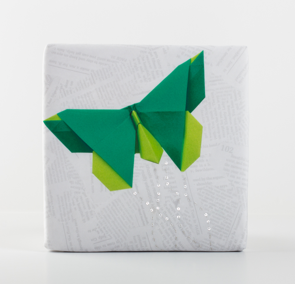
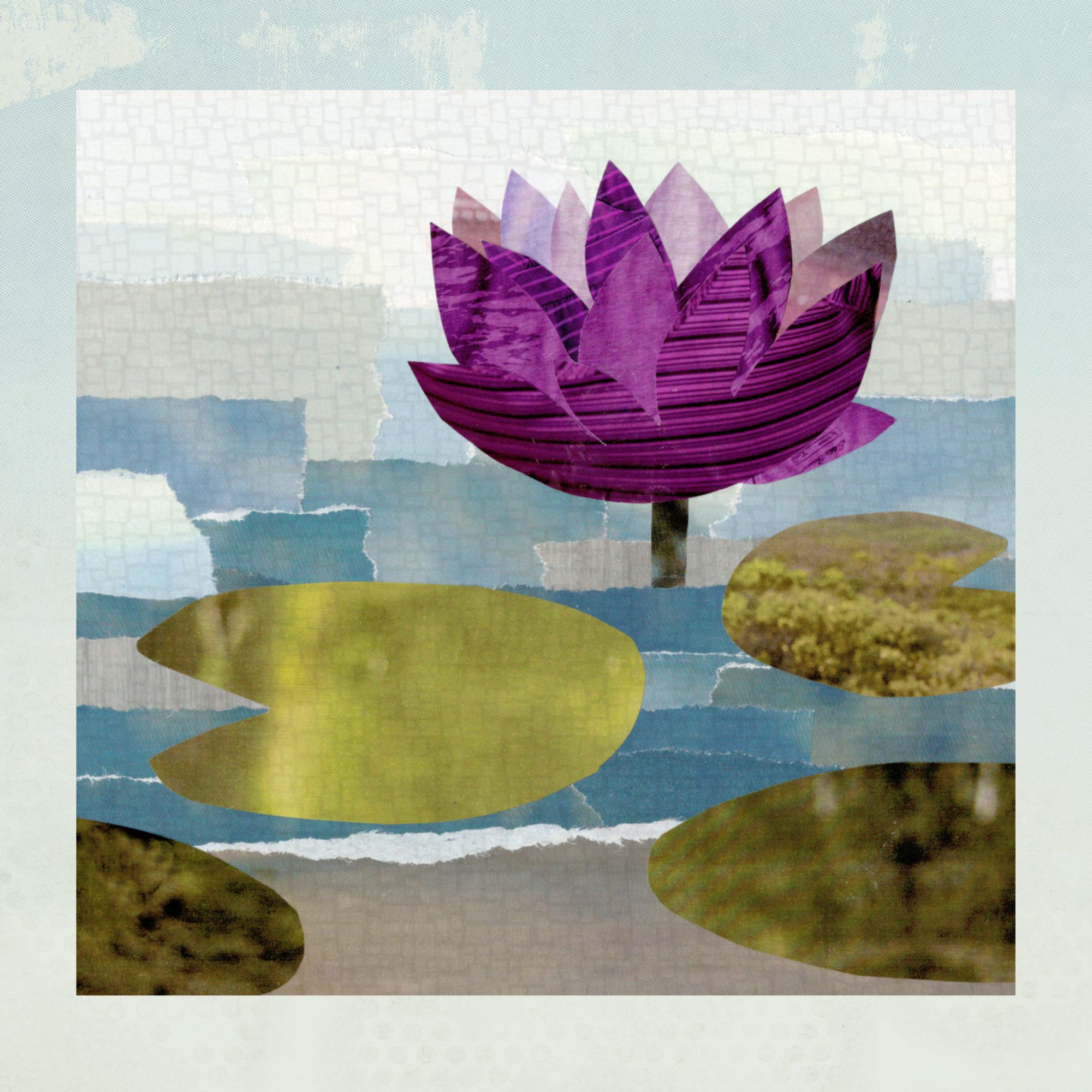
Once we got through all of the vocabulary, we did a couple of hands on projects.  In this class, I like to do a collaborative fabric design where everyone contributes a piece and then we put it together, create a design, I order a yard and I mail everyone a swatch after class.  So you get a piece of fabric you worked on.  Sometimes I do a grid where everyone draws in a square.

lovegrid

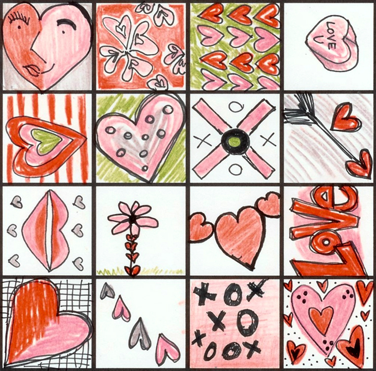
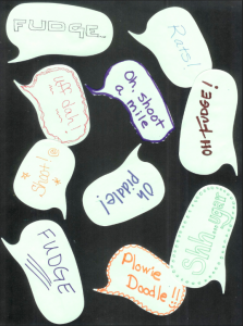
Sometimes we do a collage like this one with speech bubble shaped sticky notes and our favorite “clean” swear words.

Screen Shot 2015-02-05 at 9.47.06 AM

This time I decided to play with the Spoonflower weekly contest theme: microorganisms.  My class was skeptical.  I prepped a little ahead of time: I cut vellum paper to be microscope slides, we drew organisms, we added a sticker label to our “samples”.  I like to keep it small and simple so we don’t take up a lot of class time or trigger any “i can’t draw” anxiety.  Someone suggested a herringbone arrangement, which I thought was really fun.

Screen Shot 2015-10-08 at 2.23.23 PM

Screen Shot 2015-10-08 at 2.24.09 PM

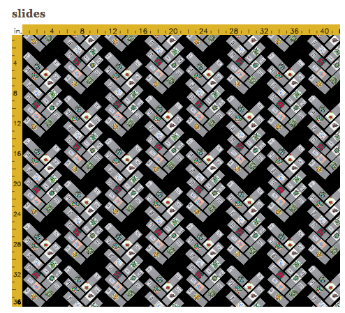
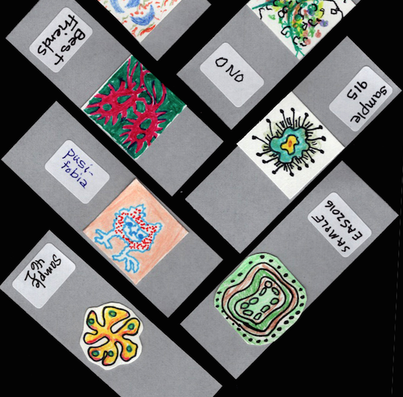
I think it’s adorable.  And funny.  And it got us many great lessons – how to scan, how to touch up & crop, how to upload and so on.  We did all the steps in class, looked at different repeats, discussed negative space and made a great cohesive design.  Score!

But one thing that made me think.  One student said: Do I have to?  What if I don’t want to make a microorganism on a slide?

I get it.

I totally get it.  Part of the joy of making things is that you get to do it your way.  That’s the bonus of making it through so many elementary school art classes (at least the ones I was exposed to). If you learn the skills of working with a paintbrush or using the scissors by making all of the “cookie cutter” projects, then you can take those skills and run with it.

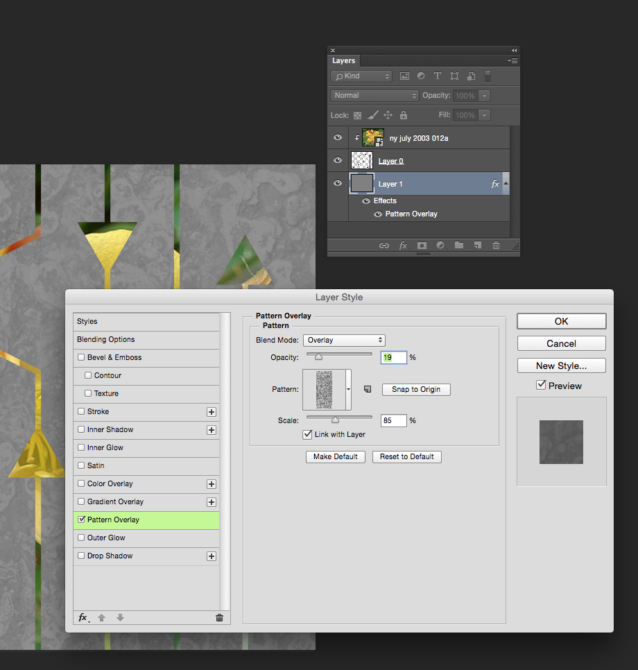
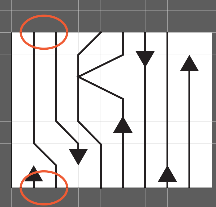
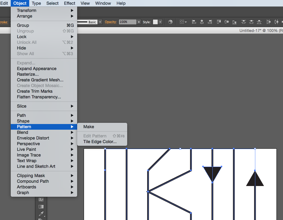
I told her she had to make a microscope slide along with the rest of us.  And not because I needed everyone to be doing the same thing, but my goal was different.  I encouraged everyone to try things that they were interested in seeing the results of: use colored pencil if you want to see how that texture looks as you print it on fabric; outline in pen (or not) if you want to see what ink lines look like; try shading.  You have 1 inch to do your experiment.  We talked about ways to make a design cohesive.  Sometimes I limit the colored pencil colors so we have a specific colorway (the hearts design above), sometimes we have a theme like the post it notes.  These design elements all had the “slide” and the sticker shapes to tie them together, so we let that be the cohesive element.  We talked about how to arrange them (and the drawbacks to the pattern we chose), we looked at all of the repeat styles and the pros and cons of those as well.

On a personal level, I loathe group projects. (Who doesn’t?  Have you ever met anyone who says:  I sure love working on group projects?)  But as a teacher, we got to have a deeper discussion because we were all working on the same design and not 10 different designs.  We didn’t compare whose was better or more clever because it was ours, together and we were all equal contributors.

I once sat in on a seminar with awesome feltmaker Lisa Klakulak.  She was teaching a really basic wet felting technique and we each started a 3 inch square of felt, laying it out and getting the first steps done.  A few minutes in to the process, she had us pick up the piece and pass it to the person on our left.  The clamour!  No one wanted to hand over their precious piece and she made us do it anyway.  By giving away the ownership, we could focus on the technique.  The new piece that was handed to you was different.  You had to look and feel and analyze and think about what it needed next and think about what she had taught us.  After a few minutes, we picked them up and passed them again. Once that first shock had passed, the grumbling got much less.  At the end, we all ended up with a random swatch, made by many hands, but I learned so much.  I saw so many different versions and variations, successes and challenges. And there was no talk of “I’m not good at this” or “Mine looks dumb” or “Look at how pretty Lucy’s is”.  The discussion was instead about the process: “Look at how much smaller this one was, I wonder if it started with less fiber or those were just aggressive felters.”  The discussion moved away from “me” and on to the art technique.  I haven’t been brave enough to pull Lisa’s kind of a “trick” on a class, but I still think about it and how effective it was.


15 September, 2015

“Bonus Becka”

2015-09-15T17:56:26-05:00An Artist's Life, Gallery Exhibitions|3 Comments

Screen Shot 2015-09-15 at 4.58.53 PM

My blog software shows me all kinds of statistics about how many people visit the site each day (hi everybody!) and what pages you are looking at.  One of my favorite things is to see the search terms that got you here.  I know a lot of you look for sewing machine reviews.  (Glad I posted those.) You are often looking for weaving advice.  (I am not very helpful with that, sorry.)  My favorite one today was the search “bonus Becka”.  I am not sure what you were looking for with that search but I am glad it brought you here and it made me smile.  I will see if I can provide some bonus Becka.

It has been a hard week.  Not a feel-sorry-for-me-because-my-life-is-so-rough week, but it was the week after a huge week of important projects wrapping up.  And I won’t pretend that isn’t a big let down. Let’s be real. That’s part of being an artist of any kind. I remember doing theater all through college and the week after a show everyone got sick.  You spend the whole time leading up to the show running on caffeine and adrenaline and then when it’s over, you feel like you’ve been hit by a truck.  I am happy with how everything turned out with my exhibition, I’m pretty proud of my work and I love the response the book is getting so far, so please don’t think I am not appreciative!  But this week I am regrouping and resting and letting everything do its thing without me a for a few days. Because I can.

The question I have been asked a lot lately is “what’s next?”  The answer is, I don’t know.  I am not too worried about that because that’s part of my plan.  It’s been just over a year since I left my full time job as an arts admin and I said, when I did that, I was going to take some time to explore and try things.  In the last year, I have done 4 new-to-me art shows in a variety of venues both large and small.  I have applied for several exhibitions (I didn’t get in.)  I won a Jerome grant.  I didn’t get a state arts board grant.  I finished the book and it felt surreal to finally have it in my hands.  I have applied for some awesome teaching gigs; one I’ve got (ARROWMONT!) and several I am waiting on.  I am waiting to hear about 2 other grant applications.  (There’s lots of waiting going on right now.)  I got a grant to do a school residency in November.  (I am great at teaching kids, but is that even my “thing” anymore?  I don’t know.)  There’s a whole list of things that I didn’t get done in this year that I thought for sure I would have time for. I said no to a few things and yes to some things I probably shouldn’t have.   I also had things fall through or experiences that just did not live up to my expectations at all. (And that’s really hard for me because I set a very high standard for myself and I assume others to do the same.)  I have learned a lot about myself and the ways I do my best work.  All-in-all, I had a fantastic year, I got to do some amazing things and I LOVE being my own boss.

Screen Shot 2015-09-15 at 5.38.17 PM

Some bonus Becka?  I can show off one other piece of unofficial art.  This is the dress I made to wear to the opening reception for my show.  The pattern is Davie by Sewaholic (with a tiny modification that I added the “knot” at the keyhole neckline.)  I screwed it up with a rookie mistake (seam allowance!), although it ends up that I fixed it just fine. (Don’t ask why I am catawampus or being silly posing like one of my dress forms.)

sunset


This design was made using these 3 photos.  The sunset (thanks Mom!) is the background, adding a beautiful gradient and those peachy colors.  The butterfly is cut out and transparently layered many many times over that at very large scale.  Then I put it at actual size on the shoulder, as if it was a pair of butterfly brooches.  They each have a few translucent sequins stitched on them for a tiny sparkle.  Finally the last layer is a greyscale version of that asphalt, just to add an organic bubbly texture to the whole thing.  I very carefully laid this out like a border print to be able cut the dress and have the print exactly how I wanted it.

Screen Shot 2015-09-15 at 5.48.43 PMThis one doesn’t have a title yet.  Got any great suggestions?  I would love to hear them.


1 September, 2015

Tutorial: Seamless Arrow Repeat Part 3

2016-03-16T10:03:14-05:00Spoonflower & Fabric Design, Tutorials|Comments Off on Tutorial: Seamless Arrow Repeat Part 3

(This is part three of a tutorial for making a seamless arrow pattern.  Find Part One and Part Two here.)

For Part Three, I am going to move over and work with the design in Photoshop now.  Why?  I could easily add color in Illustrator, but the effect I want is to cut those arrowheads out of another photo, which will give it a very organic color wash instead of a solid color.

Open the file in Photoshop.

So first I open that file we just saved in Photoshop. I first double click the Layer marked Background to unlock it (making it Layer 0).  Then I use the Magic Wand tool and delete to remove the white background and just leave the pattern of black lines.  (Make sure the option marked contiguous at the top center is clicked off and you will select all of the white in the image and not just the parts touching where you click.)

Screen Shot 2015-08-27 at 10.11.41 AM

Screen Shot 2015-08-27 at 10.15.30 AM

That will leave a checkerboard pattern in the background.  That is Photoshop’s way of telling you that is now transparent.

Add the photo layer.

Next I will add something to create that colored layer.  For my grant project design, I used one of the layers from the photo created by my design partner, so that her print and mine would coordinate.  But really anything will work, as long as it has the colors you want.  So for this example, I used a photograph of a columbine.  Choose File -> Place Embedded and pick your image.  Size/resolution is not really important.  Once you have placed it, click and drag it to resize and fill the space.  Make sure the photo layer is on top and your arrows on the bottom.

You can add filters or adjust colors or edit this layer if you want to.  For example, I might blur it to make it look more watercolored and less photo sharp.  In my grant project design, I added a few pops of magenta with a paint brush to bring out that color in the coordinating fabric.

Screen Shot 2015-08-27 at 10.14.23 AM


Create a clipping mask.

Select the Layer with your image and right-click it to bring up a pop up menu or choose Layer -> Create Clipping Mask from the top menu.  This will cut from the photo in the shape of the layer underneath.

Screen Shot 2015-08-28 at 11.54.48 AM


Add a background.

I will add a new layer to give the design a background color. You can click the new layer button in the palette (looks like a page with a bent corner) or choose Layer -> New from the menu.  I can choose Edit -> Fill from the menu to fill this layer with color and then drag it in the Layers palette to be on the bottom of the stack.

Screen Shot 2015-08-28 at 12.00.47 PM


The last thing I did was to add a little texture to that flat grey layer.  When I double click the layer in the Layer Palette, I will get a menu of Layer Style options.  I chose an asphalt texture that I had saved previously and set it to be only 19% opaque.

Screen Shot 2015-08-27 at 10.20.08 AM


In Part Four, I will show you how to proof your design and touch up any little flaws in the repeat and then it is finished and ready to go.

More in this series: Part OnePart TwoPart ThreePart Four

arrowsPin

31 August, 2015

Tutorial: Seamless Arrows Print – Part Two

2016-03-16T10:02:27-05:00Spoonflower & Fabric Design, Tutorials|Comments Off on Tutorial: Seamless Arrows Print – Part Two

(This is Part Two of a tutorial for creating a seamless arrows print.  See Part 1 here.)

Screen Shot 2015-08-27 at 10.06.48 AM

Part two of the tutorial is all about making the design seamless.  What does that mean?  I want these arrows to look like they are traveling all over the fabric without having a a start and stop.  Even though I only made a small section of the design, I want it to look like I designed something bigger and disguise the edges of the repeating element.

Check and adjust your lines.

With this design, one way to make it look seamless is to make sure that any line that extends off the edge of the drawing, joins up with the design again.  In orange I circled two lines, which go off the edge at the top of the repeat, and then show up again at the bottom.  When I make this tile repeat and put two identical tiles next to each other, those lines will match up and look like they are one continuous line.  I should also say, you don’t have to always work in a repeat, in fact I don’t make repeats very often, but for this particular project I just needed some yardage and not a specific shape.  So a repeat was the easy way to go.  Make sense?

Try the Pattern Tool.

Illustrator also has a Pattern Tool which you can use to get a preview of what that repeating element will look like.  Select all of the elements in your design and then go to Object -> Pattern -> Make.

Screen Shot 2015-08-27 at 10.09.17 AM


repeattoolThe pattern tool has lots of options for the kind of repeat style and the spacing, which you can play with.  I am using the tool in this screenshot to just show me what it looks like if I were to see 3×3 tiles.  And I can see when I have everything repeated that there are a couple of edits that I would make.

What do I look for?  Think about how your eye travels around the design.  My eye keeps going to and stopping at two arrowheads that are lined up side by side.  I think I need to move one of those around and break that up.  I also look for negative space – is there somewhere that is blank or has a gap that looks out of place?  Then look for things that are unique – there is only one line that stops (it’s between those 2 parallel arrowheads).  That might be a quirk that I want to leave in, or it might be distracting.

So my next step is to make all of those adjustments and then save this tile.

Screen Shot 2015-08-27 at 10.08.21 AM

I am going to save it as a .jpg and check the box that says “Use Artboards” which will crop it to fit the tile (in case I have anything that hangs over the edge.)

In Part Three, we move to Photoshop to add color and texture to the design.

More in this series: Part OnePart TwoPart ThreePart Four

arrowsPin

Go to Top