19 April, 2017

A Taste of Digital Fabric Design

2017-04-19T10:02:03-05:00|Comments Off on A Taste of Digital Fabric Design

Designing  and printing your own custom fabrics is a new innovation in the craft world.  Services like Spoonflower.com allow you to design and digitally print small amounts of yardage with your own custom designs. Learn the basics to set up a file and manage color; get tips for file resolution and formatting and see samples of fabrics you can create. Students will create a collaborative design in class and get a sample to keep.
9 March, 2016

Classes on the Road: Digital Fabric Design at Arrowmont

2016-03-23T09:06:15-05:00UpcomingClasses|Comments Off on Classes on the Road: Digital Fabric Design at Arrowmont

Screen Shot 2015-07-15 at 12.38.04 PMIn June, I will be spending a week at Arrowmont School of Arts & Crafts in Gatlinburg TN.  I haven’t ever been to Arrowmont, but I have heard all kinds of amazing things about the experience there, so I am excited to have been invited.

Our class at Arrowmont will be intense.  We have 37 hours to explore all kinds of techniques for designing your own fabric.  For the class in April at Spoonflower, we are going to focus on Adobe Illustrator, but for this one at Arrowmont, it is all about Photoshop and layers and texture.  I have had several potential students email with questions about the class (which is awesome) and so I thought I should talk a little more about what we will be doing, since the description in the Arrowmont catalog is necessarily brief.

waterlilyquiltMy theme for this class will be exploring the different paths you can take to design fabric. Everyone knows the feeling of staring at a blank page with an equally blank mind.  Where do you start?

We are going to start this class by building a common vocabulary.  We will talk about pixels and resolution and color.  We will learn about different design tools that are common to Photoshop and other graphics programs (select, layer, opacity, offsets).  Then we will start building a toolbox of techniques.  Each day in this class we will take a different path to start a fabric design.  One day we will work with scanned found objects; one day we will start with photos; one day we will doodle with paint.  We will learn ways to layer and manipulate textures borrowed from other objects.

Are you ready for this class? You don’t need to know anything about Photoshop or designing fabric.  It is helpful if you are comfortable working with computers and you have maybe explored Photoshop (or other graphics programs) a little on your own.  You should be able to pull a photo off of your camera, save it and find it again.  You should be able to connect to wifi and navigate webpages.  You should be brave enough to try things and not worry that you are going to “break something”.

Screen Shot 2014-10-06 at 6.37.11 PMWe will be creating a faux batik, similar to this tutorial I put together.  Why faux batik?  Because it is a fantastic way of practicing a set of design techniques you can use for many other things: scanning your original artwork and manipulating the colors, digitally coloring a design, layering with a photographic textures.  It’s a great model that will teach you many skills that you will be able to use for future designs.

We will all go crosseyed if we have to spend 7 hours a day looking at computer screens, so I have a lot of design ideas and exercises that we will do offline as well to help break things up.  These will be things like learning how to make seamlessly repeating designs or creating balance in a repeating pattern. We will take a photo walk looking for textures.

Screen Shot 2015-09-15 at 5.48.43 PM

You will also have time in class to explore something independently.  I want you to be able to work on your own, but with the ability to ask questions and screw things up with help right there.  So we will set aside time for me to work with each student one-on-one to explore your own design goal.

These are some of my goals for class.  I hope that by the end of class, students will have learned:

  • digital vocabulary for fabric design (pixels, resolution, repeats, seamless, layers, colorway etc)
  • scanning and manipulating your own artwork and found objects
  • creating a design using original art (painted paper) and layers
  • creating a colorway from a photograph
  • using photographs in fabric designs
  • basic Photoshop skills and tools
  • other tools for digital design: RepperPatterns, Adobe Color
  • independent projects with instructor guidance
  • tour of Spoonflower site and tools, show and tell of printed fabrics, examples

You can see all of the details at Arrowmont’s website.  If you want to know more about any part of class, feel free to email me!

9 September, 2015

Tutorial: Seamless Arrows Pattern, Part Four

2016-03-16T10:04:02-05:00Spoonflower & Fabric Design, Tutorials|Comments Off on Tutorial: Seamless Arrows Pattern, Part Four

(This is part four of a tutorial for making a seamless arrow pattern.  Find Part One and Part Two and Part Three here.)

Proofing and touching up the pattern is the finishing step to create the seamless arrow design and I am going to do that with the Photoshop pattern tool.  The first thing I do is select the whole design (Edit -> Select All) and create a pattern tile by choosing Edit -> Define Pattern and click OK.

Screen Shot 2015-09-09 at 10.46.34 AMIt will look like nothing has happened.  That’s ok!  The tile that you selected has been saved in the patterns palette, which is kind of hidden.

To proof the design, I create a new blank file that is the size of a yard of fabric. That’s an arbitrary size – I just think it’s nice to look at a large number of repeats.

Screen Shot 2015-09-09 at 10.46.58 AM

Then I choose Edit -> Fill from the menu.  From the pop-up Fill menu, choose Pattern from the contents drop down menu.  Just below that in Options there is another drop down and in it, you should find that pattern you just saved.  (See what I mean about a little hidden.)

Screen Shot 2015-09-09 at 10.47.25 AM


Now you can see what it looks like when the tile is repeating across a whole yard of fabric.  And right away a couple of things jump out at me.

arrow

Oops.  I didn’t think about the edges and I have a blank space where there aren’t any arrows.  I can fix that by cropping out some of the blank space.  The other thing that jumps out is a seam where the color changes. The color change is kind of abrupt and it makes a dark line.  I can fix that pretty easily by going back a step to my original file.  I select the photo layer of that flower because that is where the color is coming from.  The easiest way for me to make that contrasting line to go away is to just use a paintbrush to just touch it up. I choose a green color from the bottom of the image and paint some at the top where that really deep green was, hiding that seam line and blending the two together.

arrows2

After I do those two little edits…

Screen Shot 2015-09-09 at 11.23.29 AM


I have a pretty good finished design.  I save that tile and that is the repeat that I can upload to Spoonflower and print my fabric.  This is the version that I used for my grant project exhibition, which I will post photos of very soon.

Screen Shot 2015-08-07 at 11.26.11 AM

More in this series: Part OnePart TwoPart ThreePart Four

arrowsPin


31 August, 2015

Tutorial: Seamless Arrows Print – Part Two

2016-03-16T10:02:27-05:00Spoonflower & Fabric Design, Tutorials|Comments Off on Tutorial: Seamless Arrows Print – Part Two

(This is Part Two of a tutorial for creating a seamless arrows print.  See Part 1 here.)

Screen Shot 2015-08-27 at 10.06.48 AM

Part two of the tutorial is all about making the design seamless.  What does that mean?  I want these arrows to look like they are traveling all over the fabric without having a a start and stop.  Even though I only made a small section of the design, I want it to look like I designed something bigger and disguise the edges of the repeating element.

Check and adjust your lines.

With this design, one way to make it look seamless is to make sure that any line that extends off the edge of the drawing, joins up with the design again.  In orange I circled two lines, which go off the edge at the top of the repeat, and then show up again at the bottom.  When I make this tile repeat and put two identical tiles next to each other, those lines will match up and look like they are one continuous line.  I should also say, you don’t have to always work in a repeat, in fact I don’t make repeats very often, but for this particular project I just needed some yardage and not a specific shape.  So a repeat was the easy way to go.  Make sense?

Try the Pattern Tool.

Illustrator also has a Pattern Tool which you can use to get a preview of what that repeating element will look like.  Select all of the elements in your design and then go to Object -> Pattern -> Make.

Screen Shot 2015-08-27 at 10.09.17 AM


repeattoolThe pattern tool has lots of options for the kind of repeat style and the spacing, which you can play with.  I am using the tool in this screenshot to just show me what it looks like if I were to see 3×3 tiles.  And I can see when I have everything repeated that there are a couple of edits that I would make.

What do I look for?  Think about how your eye travels around the design.  My eye keeps going to and stopping at two arrowheads that are lined up side by side.  I think I need to move one of those around and break that up.  I also look for negative space – is there somewhere that is blank or has a gap that looks out of place?  Then look for things that are unique – there is only one line that stops (it’s between those 2 parallel arrowheads).  That might be a quirk that I want to leave in, or it might be distracting.

So my next step is to make all of those adjustments and then save this tile.

Screen Shot 2015-08-27 at 10.08.21 AM

I am going to save it as a .jpg and check the box that says “Use Artboards” which will crop it to fit the tile (in case I have anything that hangs over the edge.)

In Part Three, we move to Photoshop to add color and texture to the design.

More in this series: Part OnePart TwoPart ThreePart Four

arrowsPin

26 August, 2015

Jerome Grant Projects: Duet #2

2015-08-26T16:41:27-05:00An Artist's Life, Everything Else, Gallery Exhibitions|Comments Off on Jerome Grant Projects: Duet #2

My second project for my Jerome Grant is all about the story.  My partner Dawn and I have been friends since the 7th grade.  Dawn is now a professor, teaching art at a community college.  She isn’t a digital or fabric person at all; she gravitates towards printmaking and book arts.  I thought it would be fun to go “offline” with Dawn and write a series of postcards to one another.  I bought several packages of blank cards and a bunch of stamps and we mailed our conversation back and forth with one side of the card for words and one side for a sketch of something. She block printed, I water colored with tea and we talked about art.  Why do I hate working with the color red?  Do you have a “go to” doodle that you always draw when you don’t know what to draw?

Dawn really inspired me to do something hands on and get away from the computer a little bit.  So I started a series of designs based on cut paper collages made from found paper and junk mail.  I now have about 6 designs based on that idea and I am really loving that whole set of work.  We talked a little at the beginning of the project about making a garment that told a story. Could a dress be a book?

dots 2


This design is the base I started from.  Two sizes of circle punches and a stack of catalogs and envelopes.  I made 4 like this that became the final fabric design.  They alternate between bright colors with no text and grey/black/white with text on them.  I wanted to incorporate text into the design to refer to that book idea, but I didn’t want it to be a literal story that you would read.  So I used text as a design element throughout.

What kind of a story would a dress tell you?  It would have to be a “choose your own adventure”, where something you would do would be like turning the pages of the story.  So I created a text design from a torn up choose your own adventure book from the thrift store.  More text, but used in a textural way.  That is what makes the texture on the hem of the dress, which is shown here.  This is a screenshot of the actual dress panels as I was working on them.

Screen Shot 2015-07-15 at 12.23.23 PM


The origami butterflies came next.  I had made some fabric butterflies as a way of using up some pretty scraps for a show early in the spring.  And I loved that this design was evolving entirely from paper, so I made two kinds of butterflies.  These above were folded from origami paper and photographed to be layered into the design. And then I made 3-D fabric origami butterflies that embellish the dress.  (I have an affinity for origami butterflies.  My engagement ring was an origami butterfly folded from shiny silver paper.)

Finally I wanted to get our postcards incorporated into the design, so I scanned the text from several and created a final text design that is our handwriting with a color gradient over top.

Screen Shot 2015-08-26 at 4.31.11 PMScreen Shot 2015-08-26 at 4.31.48 PM

This design was printed on 2 yards of silk crepe to make a “scarf”.

Where does the “choose your own adventure” come in?  The dress is designed to be rearranged by the wearer.  Like a magnetic nametag, the fabric butterflies have neodymium magnets stitched to the back and another stitched to a felt backing.  The magnets let you put butterflies anywhere you like.  Up over the shoulder, all along the hem.  They also hold the scarf piece in place, so you can add a cowl back or an extra strap or a hood or a piece draped grecian style.

This one is called “Choose Your Own Adventure”.  (And I will post finished photos also after the show has opened.)

5 February, 2015

Design Tutorial: Creating a layered design

2015-02-05T10:46:57-06:00Classes & Teaching, Spoonflower & Fabric Design, Tutorials|2 Comments

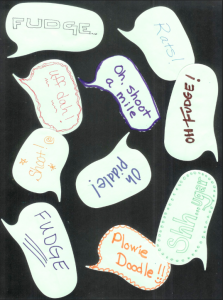
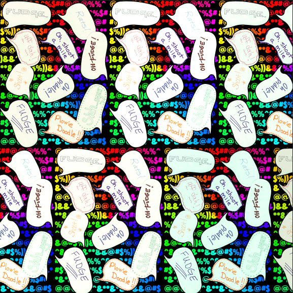
Often when I teach an intro fabric design class, the students and I create a collaborative fabric design during class, which I have printed and mail to them after class.  This most recent class played along with me and made this design using speech bubble shaped post-it-notes and wrote their favorite “clean” swear word.  I thought it would make a funny fabric, especially given the day I had before I got to class.  So I scanned our design and got ready to put it into a repeat and it just seemed sort of blah.  We needed a much more colorful fabric to match our colorful language.  So I added some color and after I sent the swatches, I told my class I would post a tutorial about how I did it so they could check back.  My screenshots for this are in Photoshop, but many other design programs have the same tools you can use.

We started with a scanned image of post-it-notes on black paper.  I scanned this at 150 dpi because I wanted to print it at the same size and that is the resolution I need for fabric.

Screen Shot 2015-02-05 at 9.47.06 AM
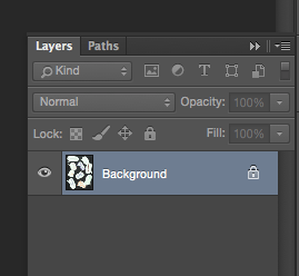
The first thing I wanted to do was to move the speech bubbles to a layer all by themselves.  This way I could insert something into the background and have them float over top.  When I open the image in Photoshop, it automatically makes it a locked background layer. (See the lock icon?)  When I go to the Layers palette and double click the layer that says Background, it will unlock it and convert it to a regular layer (Layer 0), which is what we need.

Screen Shot 2015-02-05 at 9.50.26 AM
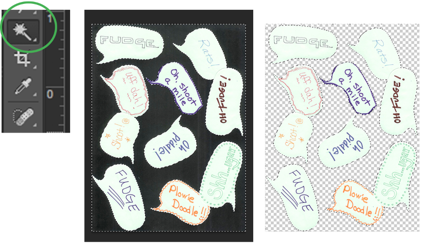
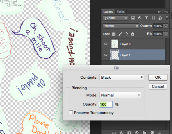
Next I want to remove the black background and leave just the speech bubbles by themselves on this layer.  Choose the Magic Wand tool and click anywhere in that black background.  You can see what’s selected because Photoshop traces around it with dashed lines.  Once you have it selected, hit the delete key.  Your black background will disappear.  The checkered pattern you now see indicates that this part of the design is transparent.  (It won’t show on your finished design.)

Screen Shot 2015-02-05 at 10.15.39 AM

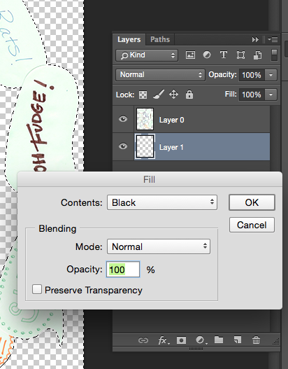
Next I will add a new background layer back in, by choosing the new layer icon (looks like a page with a bent corner) to make Layer 1. Then choose Edit -> Fill from the menu to fill it with black.  You will probably also have to put your layers in the right order by clicking and dragging them in the palette to make sure the bubbles are on top and the black layer on the bottom.

Screen Shot 2015-02-05 at 9.52.10 AM
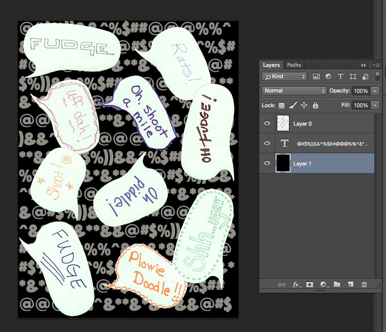
So it doesn’t actually look like we have done much at this point, but what we have done is split the design into two layers so that we can now insert something in between them.  Next, I am going to add a Text layer, by clicking the text tool and dragging a text box to fill the design space.  Now I can type text into this layer.  I filled it with cartoon style swear words (*&%$!!@) to match our theme.  It doesn’t matter what color they are, we will change that next.  Drag the text layer so it is sandwiched between Layers 0 and 1.

Screen Shot 2015-02-05 at 9.53.05 AM

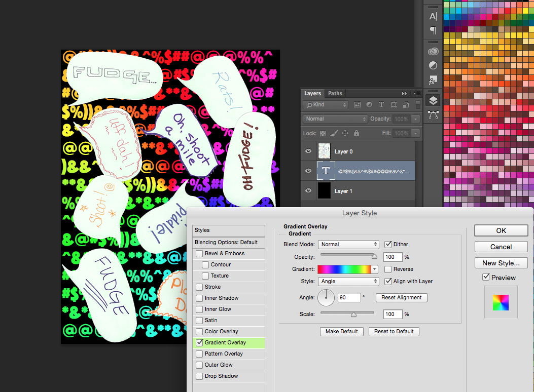
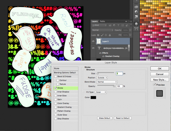
Now the color!  If you double click the Text layer in the Layers Palette, a window will pop up giving you options for Layer Styles.  We are going to use a Gradient Overlay to add a rainbow to this text.

Screen Shot 2015-02-05 at 9.53.47 AM

The last little tweak I made to the design was to add a black outline to our speech bubbles to help make them pop out from the background a little more.  That is easy to do with the same Layer Styles tool.  Double click Layer 0 with the speech bubbles and choose Stroke from the style options.  I added a 3 px border of black.

Screen Shot 2015-02-05 at 9.56.48 AM

And this is the finished design.

Screen Shot 2015-02-05 at 9.57.24 AM
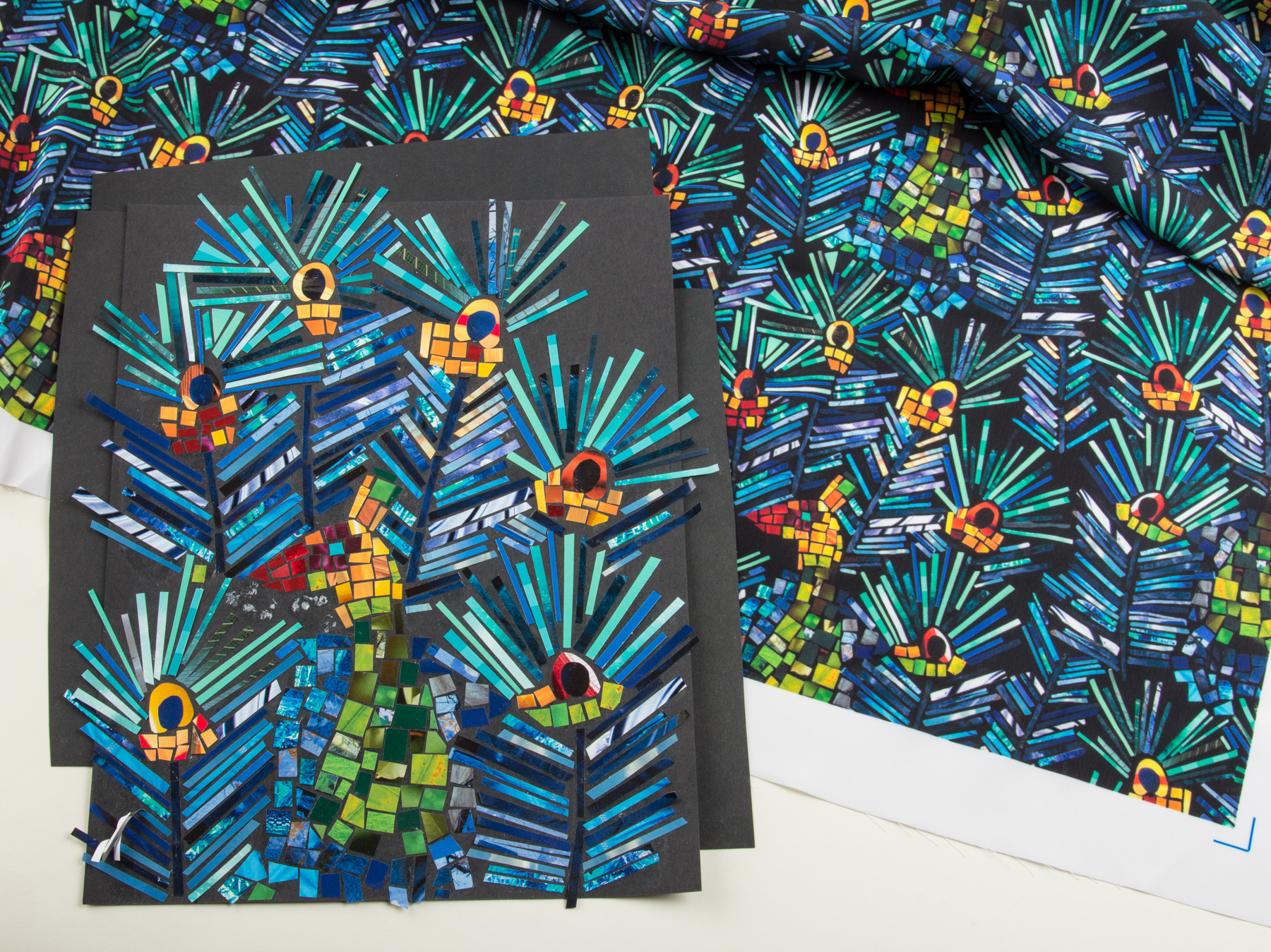
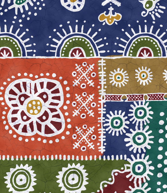
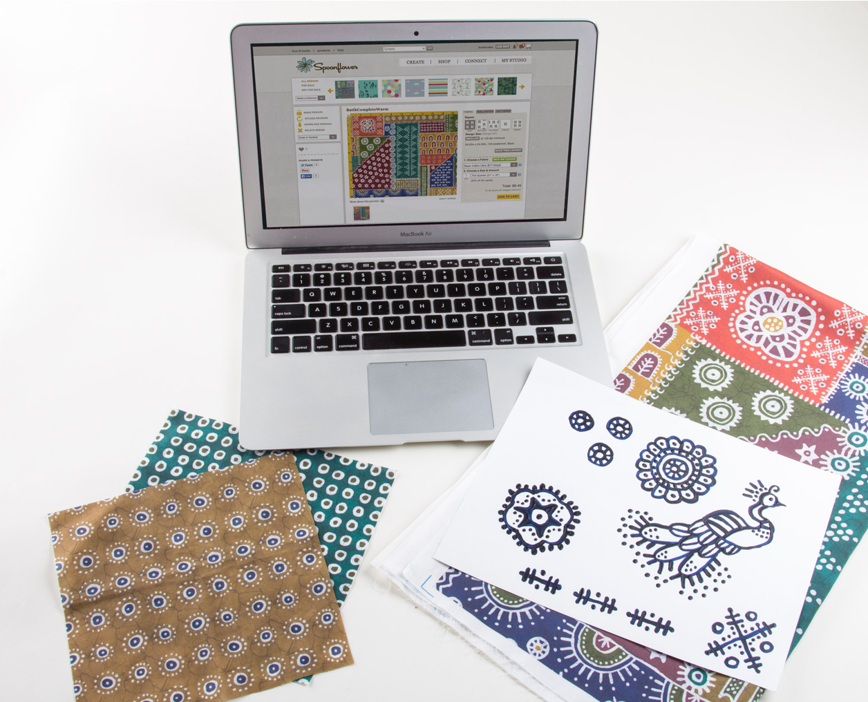
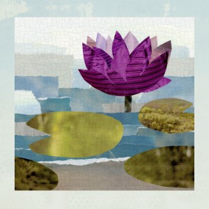
Now I understand that this is a pretty silly fabric and you aren’t probably going to run right out and order yards of it.  But by using the same steps you learned here, you can create fabrics like these:

Screen Shot 2015-02-05 at 10.32.00 AM

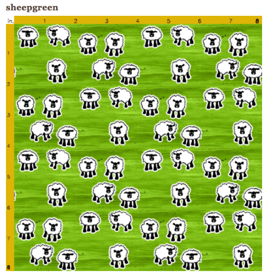
These sheep are drawn with a fine tip sharpie and scanned.  I cut them out from the background the same way and added a white Stroke to the layer so they have that white outline.  The background for this design instead of text, is a piece of painted paper that I scanned and added a Color Overlay (from the Layer Styles Palette) in green.

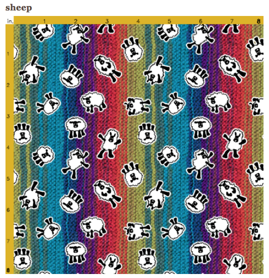
Or dancing sheep on a knitted background.

Screen Shot 2015-02-05 at 10.36.59 AM

Go to Top