26 September, 2014

Digital Design Tutorial: Faux Batik Part Three

2016-03-16T09:46:27-05:00Spoonflower & Fabric Design, Tutorials|Comments Off on Digital Design Tutorial: Faux Batik Part Three

Part Three of my faux batik tutorial is all about making your scanned paintings into vector shapes.  For this we are going to switch over and open the files in Adobe Illustrator instead of Photoshop.  As I said about Photoshop, there are certainly other vector based programs that you can use as well, but I am not as sure that they have some of the specialized tools that Illustrator includes.  Way back when I was first learning Illustrator, I hated it.  It did not make any sense to me at all.  I think it might now be my favorite tool, but it is a heck of a learning curve.

Making simple vector shapes.

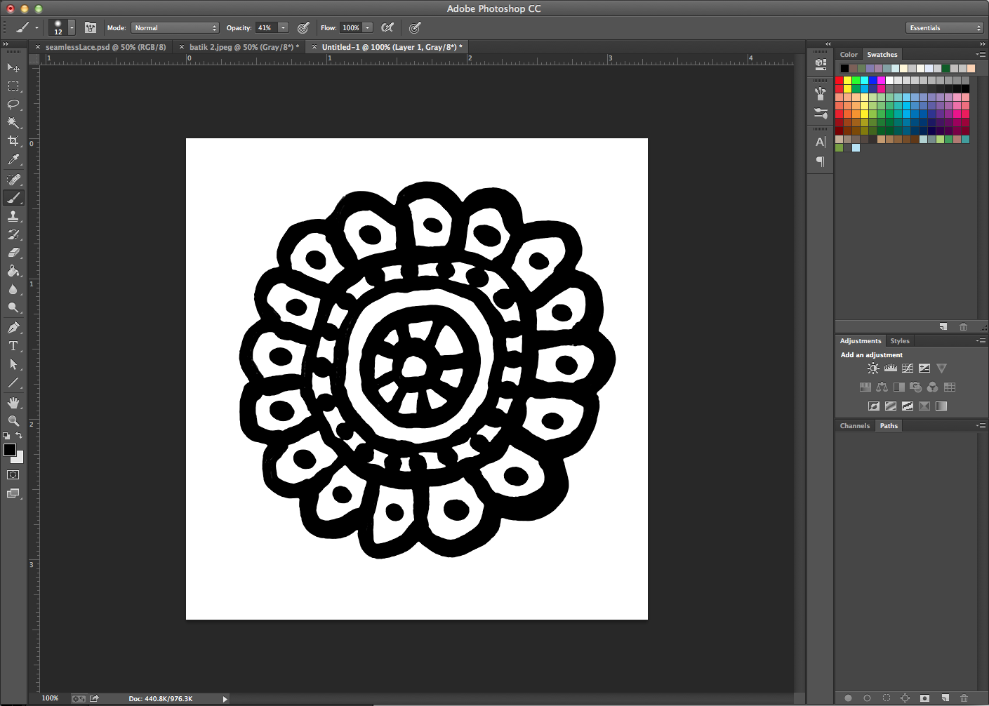
I opened a new blank file in Illustrator and then placed one of my painted elements into the document.  (Place a file by going to the File menu and choosing Place.) Select your image by clicking on it using the black arrow or select tool.  You can tell it is selected because Illustrator draws a box around it.

Screen Shot 2014-09-24 at 5.01.48 PM
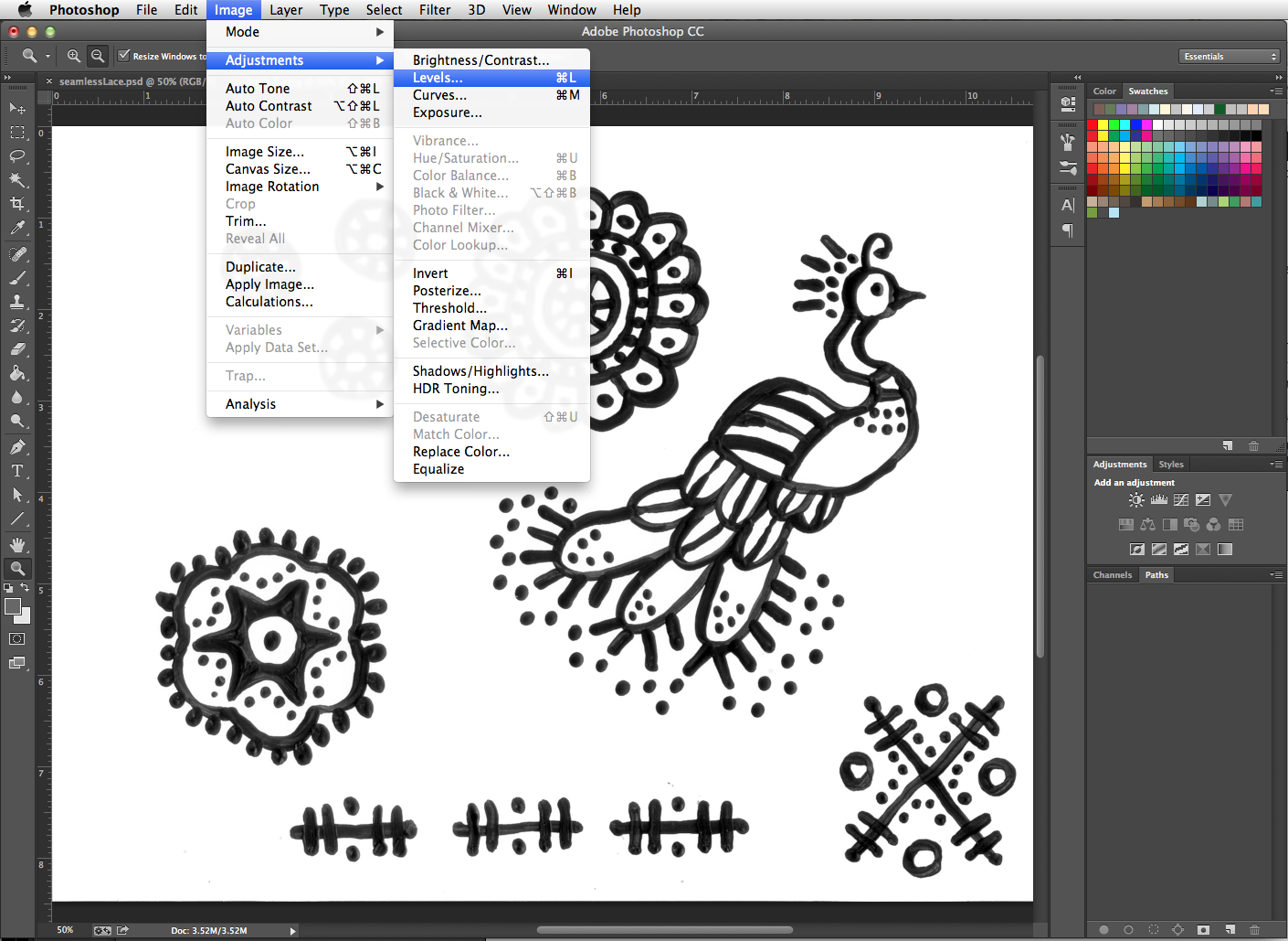
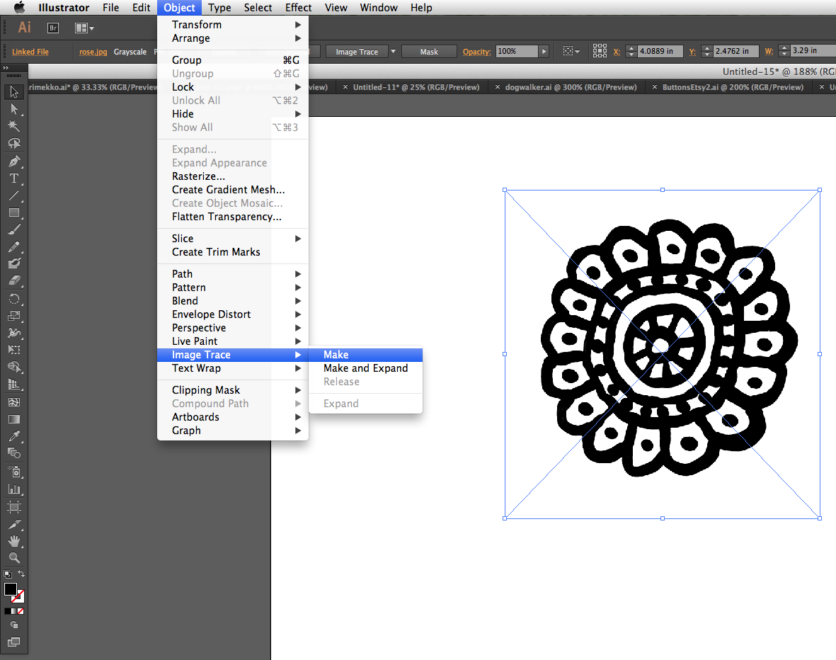
To convert this element into a vector shape, go to the Object menu and choose Image Trace -> Make and Expand.  This Image Trace tool has lots of settings you can tweak but I just went with the built in defaults for these designs and that worked great. When it traces your image, it looks for the contrasting edges and it draws new vector lines to match them.  Here’s what it looks like after it has been traced.

Screen Shot 2014-09-24 at 5.02.05 PM

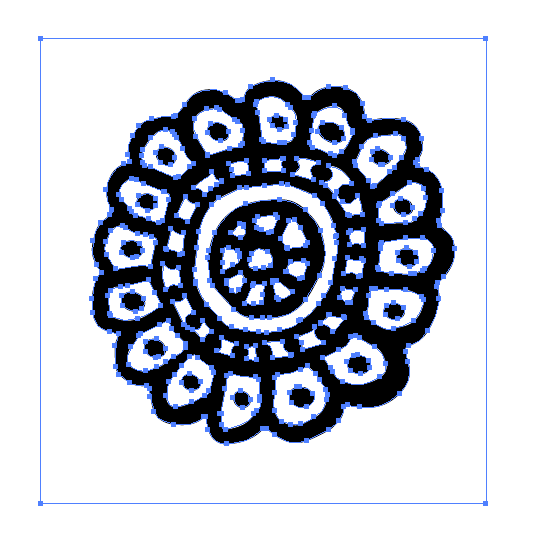
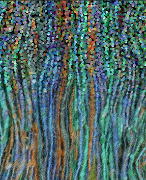
The little blue dots and outlines are showing me the new points and lines it has drawn to make these shapes.  When you look at the shape, you really aren’t going to see a difference.  So what did it do?  The best way to show you is to zoom in to the design very closely.

eyes
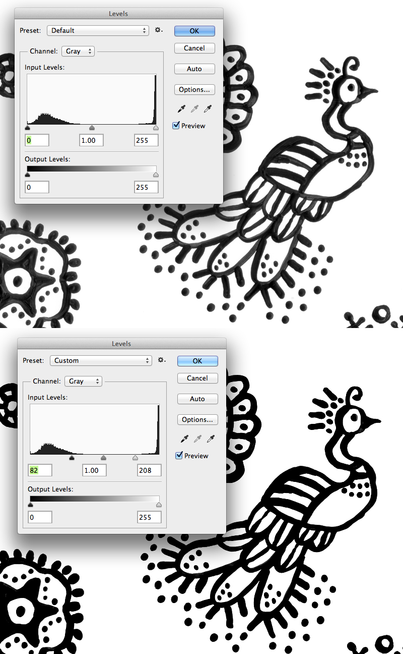
On the left is the rosette in Photoshop and the right is in Illustrator after we have traced it.  In Photoshop, you can see the shape is made of an exact number of pixels and you can see all of the jagged or pixellated edges when you look at it very closely. If I wanted to use this design and make it bigger, you would see this jagged edge.  The pixellated edge also makes it difficult to color it in a different color because you can see the edge isn’t pure black but is many different shades of grey. To make a smooth looking curve when it is smaller/zoomed out, it needs to approximate to smooth out the edges.  In Illustrator, the trace tool converts the shape into vectors or “pins and lines” instead.  So now if I make this shape very large, the computer says, “I know there is a pin here and a pin here and a line in between them” and it redraws the shape at whatever size I need it.  It always has a smooth edge because vectors can adapt. Because it is a smooth edge, it’s also easy to switch colors and get something very clean.  Why don’t we always use vectors then?  Some things can’t be made into simple shapes.  Think about a photograph and how many millions of shades and tints and subtle color things are going on.  Neither format is better, it just depends on what you need to achieve.

The last thing I want to do is get rid of the extra white space around my shape.  When the trace tool traced the shape, it included the white background from my Photoshop file.  To get rid of that extra white paper, I first selected the shape. By default, traced images are always “grouped” together so all the pieces stay as one unit.  To ungroup the shape, choose the menu item Object -> Ungroup.

Screen Shot 2014-09-25 at 10.33.53 PM
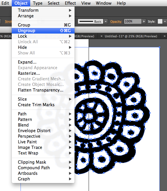
Now click away from your element in an empty space (to deselect it) and click back on the white box to select just that part.  Then hit delete.  Finally, I want to group all of the bits of this rosette back together again so I can move them around as one piece.  To regroup it, I click outside of the rosette somewhere and drag so that I draw a box around the entire rosette.  This tells the computer to select everything that’s inside the box that I just drew.  Then I go back to the menu and choose Object -> Group.  Now it is grouped back together and the pieces will stay where they belong.

To get ready for the next part of my design, I will go ahead and convert all of my elements into vector shapes.  I will place them, trace and keep them all together in this same file, which I call my “toolbox”.  We will work with the toolbox more when we get to Part Four.

Lost?  Confused?  Please feel free to chime in with questions in the comments.

More in this series: Part One • Part TwoPart ThreePart FourPart FivePart Six

batikPin

25 September, 2014

Digital Design Tutorial: Faux Batik Part Two

2016-03-16T09:45:41-05:00Everything Else|Comments Off on Digital Design Tutorial: Faux Batik Part Two

This is the second post in a series: a digital fabric design tutorial making a faux batik print.  Yesterday I painted some batik-inspired designs on paper and today I am going to show how to scan and clean up the designs.
Screen Shot 2014-09-24 at 4.55.55 PM

Part Two:  Scanning and preparing your paintings

This (above) is the program I use with my scanner.  It’s called Image Capture and is built in to the Mac.  You can use whatever scanner software you have – they are really pretty much the same.  I scanned each page of my paintings.  I chose to scan them as black and white at 200 dpi.  (This scanner software has a drop down menu with defaults set, so I couldn’t scan to 150 dpi exactly as I mentioned in the previous post.)  I scanned the whole page and then saved it.

Next I opened up the scanned painting in Photoshop to do a little touchup.  I am going to adjust the Levels in my design, which basically makes the blacks blacker and the whites whiter.  It will help smooth out anywhere where the paint was uneven or lighter and get rid of a few smudges on the paper.  In Photoshop I choose the Image menu, then Adjustments, then Levels.  You don’t have to do this in Photoshop.  There are a number of really great (and somewhat more affordable) graphics programs out there that have tools that do the same things.  The tools are sometimes labeled slightly differently, but if you are willing to experiment, you can usually find a tool to do what you need.  (Photoshop is 100% worth the price, but I get that not everyone can make that work for them.)

Screen Shot 2014-09-24 at 4.58.38 PMHere’s a side-by-side comparison before and after I adjusted Levels.  You can see in the tool box that I dragged the triangle sliders under Input Levels from the outside edges towards the middle until it looked right and then clicked OK. Here’s the simple techie explanation for what’s going on.  Look at the Levels tool box. The left side of the controls (black arrow) adjusts the blacks and the right side (white arrow) adjusts the whites.  All of the colors in the image fall somewhere between black and white and that’s what the spiky mountains in the diagram are showing you.  There is a lump of blacks – they are spread out because there are a lot of variations in black in our painting.  There is tall spike of all the whites, which are all very similar.  When I drag the arrows, I tell Photoshop that anything to the outside of those arrows should be all the same.  In otherwords, I tell Photoshop to make all of the blacks to the outside of the black arrow just be pure black.  That gets rid of any cloudy/grey/faded parts of the design and makes it pure black and white.  Now that you know what the tool is doing, don’t be afraid to slide the arrows around and see what happens.

levels


I wanted to work with just one element at a time instead of the whole page, so I cut out one of the elements using the Lasso Tool to draw a loop around it and select it.  Then I used Cut & Paste to paste it into a new blank document.  I saved that rosette as a .jpg all by itself.  I repeated the select, cut and paste steps for all of the design bits on this page and saved them all in a folder together.

Screen Shot 2014-09-24 at 5.00.56 PMIn the next post, I will show you how to convert these designs to vector shapes, but I wanted to talk a little first about why I am going to do that.  Just adjusting levels is enough to make these look pretty great and I could just go on cutting and pasting to make a whole design with new big canvas in Photoshop using these exactly as they are.  That is a great way to do it.  But, I want to bring everything over to use as vectors for a couple of different reasons and those are things that are really hard to do in Photoshop.  First, I want to make repeating patterns with some of these elements.  Illustrator has a killer pattern tool. Next, I want to be able to play with the colors on these a whole bunch – I don’t want to make a black and white design and I think that is going to be easier to work with in Illustrator.  Finally I want to combine a lot of these smaller elements into bigger ones, and I think copying and manipulating them will be easier in Illustrator.  Stay tuned for more.

More in this series: Part One • Part TwoPart ThreePart FourPart FivePart Six

batikPin


24 September, 2014

Digital Design Tutorial: Making a Faux Batik, Part One

2016-03-16T09:44:17-05:00Spoonflower & Fabric Design, Tutorials|1 Comment

IMG_0028.JPG

I made this bag last week. The fabric was a curtain panel that I bought at a garage sale. Pretty wild for a curtain but great for a small tote. I am in love with this fabric – the colors and the design are very me and I would love a tshirt that looked something like this (and this is not clothing fabric). So I am going to show you the “behind the scenes” process of how to make a faux batik like this that I can print on any fabric I want to. I am going to make a seamless repeat inspired by this design and show you how I do it.

I get asked in classes very often “do you use Photoshop or Illustrator for your designs?” The answer is yes. I often use both on a single design. Sometimes I throw in some PicMonkey too. It all depends on the effect I am trying to achieve. Hopefully as I show you the process I use you will be able to see a little bit of how that works.

Faux Batik: Step One
Even though I am going to design this fabric digitally, Step One doesn’t involve Photoshop or Illustrator. When you look at the inspiration print, there are a lot of organic lines and shapes. They are blobby and irregular. The designs might repeat, but each one is a little different than the one next to it. This is because real batiks are made by drawing designs with wax, which doesn’t lend itself to a lot of precision. Irregular lines like the ones drawn with wax are really hard to make digitally, so I wanted to start with something that would give me the line quality without having to do a lot of digital manipulation. My solution: Paint.

IMG_0029.JPG

This morning I painted 6 sheets of card stock with batik motifs. I didn’t worry about making specific designs but just made elements that I will be able to cut out, shrink, duplicate and put together to make my repeat tile. I did a few shapes that could be borders and tried to think about small, medium and large shapes that I could use. I used the bag fabric as inspiration for some and others (like the peacock) I made up myself. These were done with some acrylic craft paint and a small tapered brush on white card stock. Acrylic paint has some nice body to it so it was easy to change the pressure on the brush and get some great line variations. I know many people like to do this kind of work in a sketch book but that never works for me because it is so much easier and cleaner to scan separate sheets of paper than a big bulky book. Personal preference.

Once they are dry, I will scan them. I painted these designs at a pretty large scale based on the line weight my brush could do, so I plan to scan them at about 150 dpi because I know I won’t need to make them any bigger than this for my finished fabric.

More in this series: Part One • Part TwoPart ThreePart FourPart FivePart Six

batikPin

28 August, 2014

Three Musketeers: New digital prints on exhibit

2014-09-24T18:29:13-05:00Gallery Exhibitions, Spoonflower & Fabric Design|5 Comments

musketeersAs of today, I have three works in three different exhibitions, which are all open at the same time.  Pretty dang cool!

On the left is “Rain Storm” which was selected to be a part of Textile Center’s MN State Fair exhibition. These were selected works from the show which was originally held in January 2013.  I blogged about it here.  It is made from digitally printed and hand-silkscreened fabric with some hand embroidery.

The center piece is called “Concert” part of the 20 for 20 exhibition that opens tonight at Textile Center.  This is collaborative fabric that was made by attendees of Textile Center’s birthday party.  I guided an activity where everyone was invited to draw an image celebrating fiber art in a square of a 1 inch grid.  I combined all of the 50+ images and made a repeat.  The dress is inspired by some I saw in the collection at Kensington Palace and the draped sash is there to represent membership in an organization (a fun fact I found while looking up trivia about formal dress.)

The third is “Permafrost“, which I blogged just recently.

Here are some close-ups of the fabric designs, so you can see some of the details:

Screen Shot 2014-08-28 at 2.13.14 PM Screen Shot 2014-08-28 at 2.14.55 PM Screen Shot 2014-08-28 at 2.15.30 PM


28 July, 2014

On exhibit: Permafrost

2014-09-24T18:29:33-05:00Sewing & Design, Spoonflower & Fabric Design|Comments Off on On exhibit: Permafrost

flyer

I am absolutely delighted to be one of the artists featured in this regional Surface Design Association show which opens in just a few days.  When I got the announcement of the exhibition call for entry, I thought the concept was intriguing.

The intention of this exhibit is to illustrate things that are transparent, translucent, and/or transformed in this world, OR, things that should be (i.e. government, politics, fundraising, banking, corporate power, policy decisions, healthcare, etc.). You can go for the literal meaning of the words transparent, translucent, transformed… or, you can go with a more conceptual or abstract meaning of the words. We invite both the literal and wide view of this theme.

The piece I made for the show is called “Permafrost”.  We got a great photo (I think) and they must have loved it too because it is there on the flyer.

Rahn_Becka_ttt_Permafrost

To me, the word translucent can be described by layers; something you can see through, but what you look at changes based on the layer you are looking through. This design was created using layers of images: fern frost on a window and a chain link screen. Separately, the two don’t have an obvious relationship, but combined they become a new idea and allow you to see one as it is influenced by the other. “Permafrost” is a geologic term for soil that remains frozen for consecutive years, bound or locked up as ice, and as the title of this piece, describes the connection I see between these two images. The lines of the dress give the feeling of emerging from this image of everlasting winter. The sleeveless style and broken neckline suggest the wearer is cracking and shedding away the ice.

Rahn_Becka_ttt_PermafrostDetailThe fabric is digitally printed, naturally.  It’s a lovely drapey silky faille from Spoonflower. This fabric has a nice weight to it so it hangs well.  A little challenging to sew as it is a bit slippery and tends to shift off grain if you let it.  Hand beaded with vintage flat sequins from Etsy.  Both photos for the design were taken on trips to my hometown.  The frost (which is actually 6 images put together) was on the windows at my mother-in-law’s house.  The chainlink was in a public art space called “Art Alley” and although I faded a lot of the color out for this piece, the fence is painted bright blues and pinks.

21 April, 2014

Tweed: Spoonflower Performance Knit & Renfrew Mod

2014-09-24T18:29:50-05:00Sewing & Design, Spoonflower & Fabric Design|2 Comments

yarndress

This is affectionately known as the “yarn dress” at my house and I have worn it for about a half a dozen official type functions this winter.  I realized at some point that all of the dresses and things I have made from my Spoonflower fabrics have been very summery – sleeveless tops, summer dresses – and I live in MN, where there was a ridiculous amount of winter this year.  So I wanted a dress that was something I could wear with tights and a cardigan.  Then Spoonflower introduced “performance knit”, which is a stable but drapey kind of polyester knit.  Seemed like a perfect fit.  I LOVE this dress.

The fabric:  The design started from a photo of my friend Jen’s handspun yarn.  The original colors were a little too much for me, so I toned the whole thing down a little bit and made it seamlessly repeat.  Then when I set up the 2 yards of fabric to print, I added a photoshop effect to the edge of each yard, creating a kind of border print where the edge dissolves into polkadots.  I could just barely squeeze the dress on to 2 yards (it’s good that I am short).

yarnbefore

Screen Shot 2014-04-21 at 4.36.14 PMThe pattern:  The pattern is my favorite t-shirt  – Renfrew from Sewaholic – just lengthened to add a skirt.  I have another short sleeved one I did this to and I wear that one a lot too. When I do another from this fabric, because it doesn’t stretch much, I would add just a tiny bit over the shoulders/bust width, maybe just going a size up.


Go to Top