10 July, 2018

Video Tutorial: Fill-A-Yard Projects with Spoonflower

2020-04-21T21:17:12-05:00Spoonflower & Fabric Design, Tutorials, Videos|Comments Off on Video Tutorial: Fill-A-Yard Projects with Spoonflower

A quick video tutorial of how to use Spoonflower’s Fill-A-Yard feature. Thanks to a student from my online class for the question.

If you need a little more help working with collections, be sure to check out my online classes. I go through collections in the Spoonflower Step One class.

25 May, 2018

Making Paper Mosaics: A video demo

2018-05-25T10:14:07-05:00Everything Else, Gallery Exhibitions, Spoonflower & Fabric Design, Tutorials|2 Comments

At my last fabric design class, I chatted with my students about how I make paper mosaic designs. I like to design fabrics using original art like paper collage or drawings or paintings. They were very curious to see the originals that my fabrics had started out as, so I thought it would be fun to make a video demo to show the process from paper to fabric.


Here are a few other mosaic designs I have done. All are made from recycled magazines or other patterned papers.


7 March, 2018

Sisterhood of Knitters

2018-03-08T11:55:34-06:00An Artist's Life, Spoonflower & Fabric Design|3 Comments

It’s International Women’s Day (and my birthday) this week and in honor of that, Spoonflower’s Design Challenge was “Sisterhood Around the World”. I thought this one was really hard and I nearly skipped the week. I really struggled to come up with something that fit the theme and was interesting. I really like to make sure that my designs have a life that is beyond the theme of the challenge because I look at design challenges as a way to help build up my body of work. Having a deadline is great motivation and sometimes having a topic (like Kilim) or colors that I would never choose is a great creative challenge.

So I tried to think about “sisterhood” and I was just bored with the idea of a bunch of little girls in cultural costumes (which was the first thing that came to my mind.) I don’t like to draw people. I was tempted to do an abstract design to represent me and my two sisters and I thought about that for a while but it just wasn’t clicking. Then while in the car driving to a meeting, I had the idea of a sisterhood of knitters. (I absolutely get my best ideas while driving. Something about occupying the active part of your brain so the creative part can wander.)

I take knitting with me a lot when I am out in the world. I knit while waiting for meetings and at appointments. I knit during meetings sometimes. I knit in the evening after a stressful day. I meet friends for coffee and we knit together. I knit while waiting around for my husband’s band concerts to start. I make small projects like mittens and hats. I don’t like anything too complex but I do like beautiful yarn.

There is something about knitting in public that creates conversation. If I were to sit at all of these places and stare at my phone, no one would even make eye contact with me. But when I knit, it’s somehow like giving permission to interact. Someone will watch me knit and smile. Or sometimes they watch me knit and look at me like I am bonkers; it depends on the crowd. Someone will ask me what I am working on. Other knitters will ask me about the yarn or the stitch pattern. Little kids will stare and sometimes, if they are brave, will come over and feel how soft the yarn is. Someone within earshot will tell their friend that I am crocheting or will say “my mom does that”. At conferences, I have been the topic of a whole series of tweets: “Did u see that someone was sitting in that session and knitting?! She wasn’t even looking at it.” I had a delightful conversation with a guy at an airport once when I was making a pair of mittens with dpns. (If you’ve never seen someone working with dpns, it vaguely resembles wrestling a porcupine.) He’d seen little old ladies knitting sedately, but whatever I was doing with all of those spikes sticking out made it look pretty badass.

The best way to learn to knit (I think) is to have a friend show you, one-on-one. That’s how I learned. My first knitting lesson was with my friend Berit (a family friend) when I was about 11 years old. She told me that she was teaching me the Norwegian way to knit (continental) and that people might think it was odd, but it was much better than the American way. I didn’t understand what she meant until I was much older, but I thought it was something special. My first project was a tiny hoodie cardigan sweater for my tiny Steiff teddy bear, knit on size 3s or so with baby yarn. White with little rainbow tweed flecks. Then she taught me how to make cables. I didn’t know that I “shouldn’t be able to” do those things as a beginner, because no one told me it was hard.

I taught a beginning knitting class the last two weeks to some highschool students. Eight Somali girls who chattered through class half in English and half in Somali. I wish I had thought to ask them if there was a Somali word for knitting. One girl wanted to know why there were no boys in class and didn’t believe us when we said there were boys who knit, just maybe not as many of them as girls. I told her about the knitter that did a bunch of costume pieces for the Black Panther movie being a boy and although she was still skeptical, we had a great conversation about the costumes in that movie. That somehow made it cooler. By the end of class, everyone was making knit stitches. Some with needles, some with fingers. One of the girls asked at the end of class, “Can I say I am a knitter now?” Absolutely! She’s part of the sisterhood.

So my sisterhood design is knitters working side-by-side, celebrating that community of knitters. Their silhouettes have long hair and short hair, hijabs and ponytails. You might even see a certain Princess you recognize. There are straight needles, dpns and circulars. And lots of knitting.

The voting for this design challenge doesn’t open until tomorrow, but I was really excited about talking about this today. (If you want to give me a little present for my birthday, go vote for it tomorrow. That would be awesome.) Edited: Here is the link to vote. Open through March 13.

Are you a knitter? Has knitting in public ever been a fun conversation starter for you?

5 March, 2018

A whale of a design.

2018-03-05T18:32:04-06:00An Artist's Life, Spoonflower & Fabric Design|Comments Off on A whale of a design.

I think it’s fun once in a while to talk about a design and how I put it together. When I teach classes, this is an exercise that we often do: deconstructing a design so you can understand how it goes together.

One of the recent design challenges at Spoonflower was a limited color palette design. There was no theme, just a set of colors to use in your design: navy, orchid pink, maroon and black or white. I am not sure where my humpback whales inspiration came from, but when I posted the challenge on Facebook many of you also had watery/nautical suggestions: lighthouses, coral, semaphore flags. So we were all on a similar wavelength. I didn’t actually love this color combination. I am not a real fan of red and I do not like that orchid pink at all. So I knew I had to do a design that was primarily navy.

I decided to draw the whales by hand. I like to draw on plain cardstock and for this I used a black rollerball pen. I drew each of the whales on a separate sheet and didn’t worry about what the repeat was going to look like yet. I only drew the outline and filled in the solid black part of each one in Photoshop. (It was easier to do it that way than color it in with a sharpie.) For inspiration, I did a google image search of humpback whales. I like to bring up a bunch of pictures, spend some time studying them and then go draw without the photos in front of me. Details I noticed about humpbacks were the distinct stripes on their bellies, bumps on their “nose” and fins, and the fact that I think they always look like they are smiling. I scanned the whales after I drew them.

For the background I looked up a repeating “zentangle” pattern on Pinterest and sort of followed the directions. I wanted the background to also be handdrawn to match the style of the whales. I drew it originally in black on white, but realized as I put this together that I needed it to be white lines on a dark background, so I ended up using the invert filter in Photoshop once I had it all done.

The most time consuming part of this was making that background pattern seamless and matching up all of the lines so you couldn’t see breaks or gaps. If you have done any experiments with seamless patterns, you have probably seen tutorials about cutting a piece of paper and taping it back together again to make a seamless pattern. I just watched a Facebook Live post by Spoonflower doing this same technique. That’s exactly what I did with this one, but I realized after I did it that it is nowhere near as easy as those tutorials make it look. (Spoiler alert: I am planning to make that the focus of my next online class: how to finish a design done that way and why it sometimes still doesn’t look seamless.)

When I layered these elements together (waves, whales, fish) I realized that the fish and whales needed to pop out from the background just a tiny bit more, so I added a white stroke (outline) around all of them.

I didn’t worry about arranging all of the pieces until I had the colors and layers all figured out. There’s a lot of math/planning to do when you are figuring out how to make layers work together. My waves background was drawn on an 8×10 rectangle, so the rest of my design also had to fit proportionally in an 8×10 rectangle. (I wouldn’t be able to make it a square without distorting the design or cropping, which would make it no longer seamless). I did a lot of tests to check the repeat on a much larger canvas to make sure I liked the way it was repeating and about midway through I drew a few more fish because with the very large whales and very small fish it wasn’t feeling balanced.

Here is the 8×8 inch swatch of fabric that I got to check out the design. You can see only a bit of a whale chin. I made this a large repeat, which seemed appropriate for whales so you can only see a bit when you only print a swatch. I think it will make really cute tote bags with just a whale or two on each side. I am planning to order some of this design on canvas later this week to try that out.

5 February, 2018

Tutorial: Make a valentine cut-out design

2018-02-05T13:34:56-06:00Classes & Teaching, Freebies & Patterns, Spoonflower & Fabric Design, Tutorials|Comments Off on Tutorial: Make a valentine cut-out design

Since Valentines Day is just around the corner, I thought I would post a quick tutorial for making a heart shaped cut out design. You can use any image or pattern and “cut it out” to make it into a heart shape. (Or any other shape you want to use. The steps are the same.)

Make a heart

The first thing is to create your heart. I want a nice smooth shape that is basic black and white. You could use some clip art, but I really prefer to make my own “clip art”. (pun intended) With my own art, I never have to worry about using a copyrighted image or inadvertently stealing someone else’s design. I could draw something in Illustrator or use the vector tools in Photoshop, but I think it is so much easier to just start with a piece of paper. Seriously.

Why? I like the quality of the shape. Vector designs often look too perfect to me. It is really fast and easy to use the circle tool and the pen tool to create something that is symmetrical and has perfectly smooth lines, but I think that’s boring. It is also fast and easy to use scissors and a piece of dark colored paper to cut out a shape, and get all kinds of imperfections: little wobbles of the scissors, curves that are more irregular and so on. It looks less computer generated to me and I like that.

So I sketched a heart with an arrow design on a piece of black paper and cut it out. I used a paper punch to make the little dots. Then, I scanned it. I adjusted the scanner so it was scanning it black and white and I bumped up the contrast. The scanner DPI settings aren’t very important here, so I chose 150 dpi because that should be plenty of pixels to work with.

If you have Photoshop, you can use that do do this next step, but it is also really easy to do in PicMonkey and that’s what I will show you in this tutorial.

Use PicMonkey

Go to picmonkey.com and choose Design (t icon) from the menu at the top. Then create a custom canvas. I am going to make mine 600×600 pixels. That’s a great size for a blog post or email and by making it square, it will look great in my Instagram feed.

Go to the Overlays menu (butterfly icon at left) and choose Add your Own at the top of that column. Then find your scanned heart design.

Next choose the photo or image that you want to “cut out” with this heart. I will use a picture of my dogs as my example. Choose Add Your Own in Overlays again and find that image.

To make it “cut out” you just need to select a different blend mode for this new overlay layer. Look in the Overlay pop up palette that should have popped up somewhere in your editor. (It’s on the right side in my screen shot) Under the Blend Mode dropdown, choose Add.

I can adjust the size of the overlay by using the bubble toggles at the corners or rotating with the handle at the top until I have the image and the heart cutout aligned the way I like it.

You can also use another repeating design instead of a photo; in fact any .jpg image will work. How about a sushi valentine? For this one, I just took a screen shot of this sushi stripe design that I created and used it to make an overlay.

And here I took the same idea with a different design and then uploaded it to Spoonflower to make a repeating pattern for a fabric design. This one would be cute as wrapping paper!

If you want to learn more techniques like this for designing your own patterns and fabrics, be sure to check out my online classes. There is even a free one to get you started and it builds on some of the ideas in this tutorial. Or check out my events calendar for in-person classes.

2 February, 2018

Work in progress and origami design inspiration.

2018-02-02T14:58:47-06:00Spoonflower & Fabric Design|Comments Off on Work in progress and origami design inspiration.

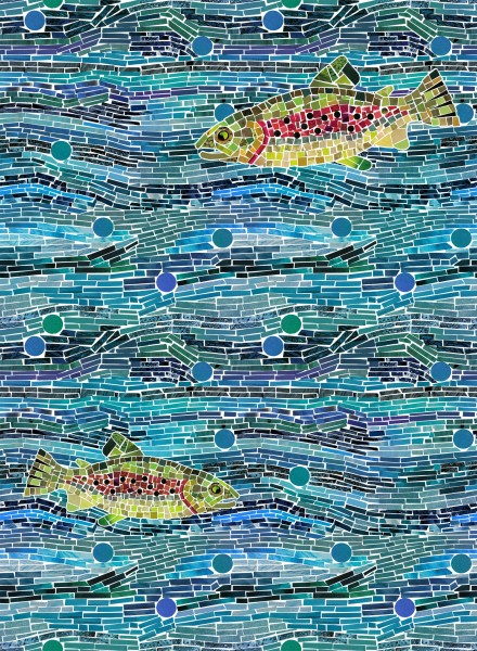
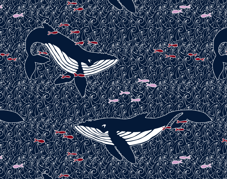
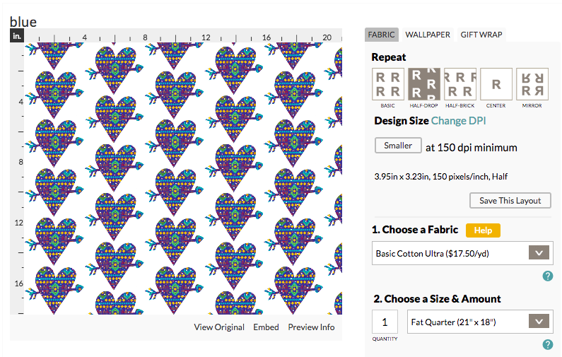
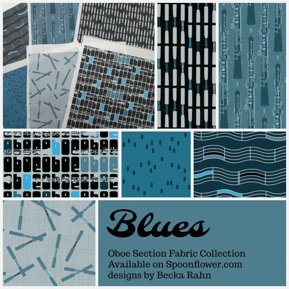
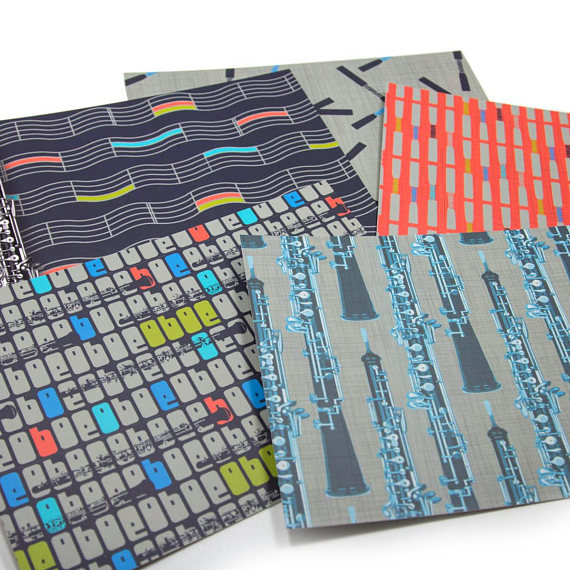
I talked a few posts back about goals for 2018 and one of those was to design more fabric. My goal was one new design a week and so far I am way ahead of schedule! First, I expanded my oboe fabrics line. It went from 1 print, which I originally designed in 2009 to 24 oboe and oboe-themed fabric prints available. I did six different designs in 4 different colorways. Because someone always asks the question when I use that term, a colorway means the group of colors that make up the designs. I use the same colors in all 6 fabrics so that the colorway all coordinates and you can mix and match. So my colorways are Tango (grey/red/pink/black), Duet (blue/green/purple), Salsa (orange, lime, turquoise, grey) and Blues (blue, grey, black). Those are all now printed, proofed, tweaked and available for sale in my Spoonflower shop.

And then I printed a slight variation on those same designs onto note cards so that I have sets of oboe postcards available now in my Etsy shop called Oboe d’Amore. It ends up that the repeating oboe instrument print is my favorite from the collection, although I am thinking about making a dress from the music staffs print with the wavy lines.

Then as another part of that “design more” goal, I have tackled the Spoonflower weekly design challenges. You can see my Spanish Tile, Greek art, and Kilim designs by clicking those links. Even though I loved my stegosaurus kilim design, it placed #328th, so I have a ways to go before I crack the top ten. I love the contests and I talk about them when I teach, but it isn’t something I ever made time to participate in. I am so glad I put that on my list for this year. I am really enjoying the challenge (and the deadline).

Something I have noticed about my Spoonflower Challenge entries is that I tend to design for the scale I would actually like the print to be printed at, but many contest entries seem to scale for what is going to look awesome in the fat quarter preview that is voted on, even though that would make somewhat exaggerated oversized prints on fabric. Maybe because I am such a fabric person/sewist that I am thinking always “what would this print be good for” and making my design with that scale in mind. So I am going to try a little experiment and for the next few entries, I am going to upload for the contest at a larger scale then I would normally design and then go back and revise them later to scale it down where I think the print belongs (or upload a second version).

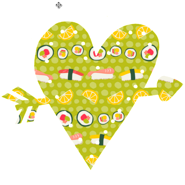
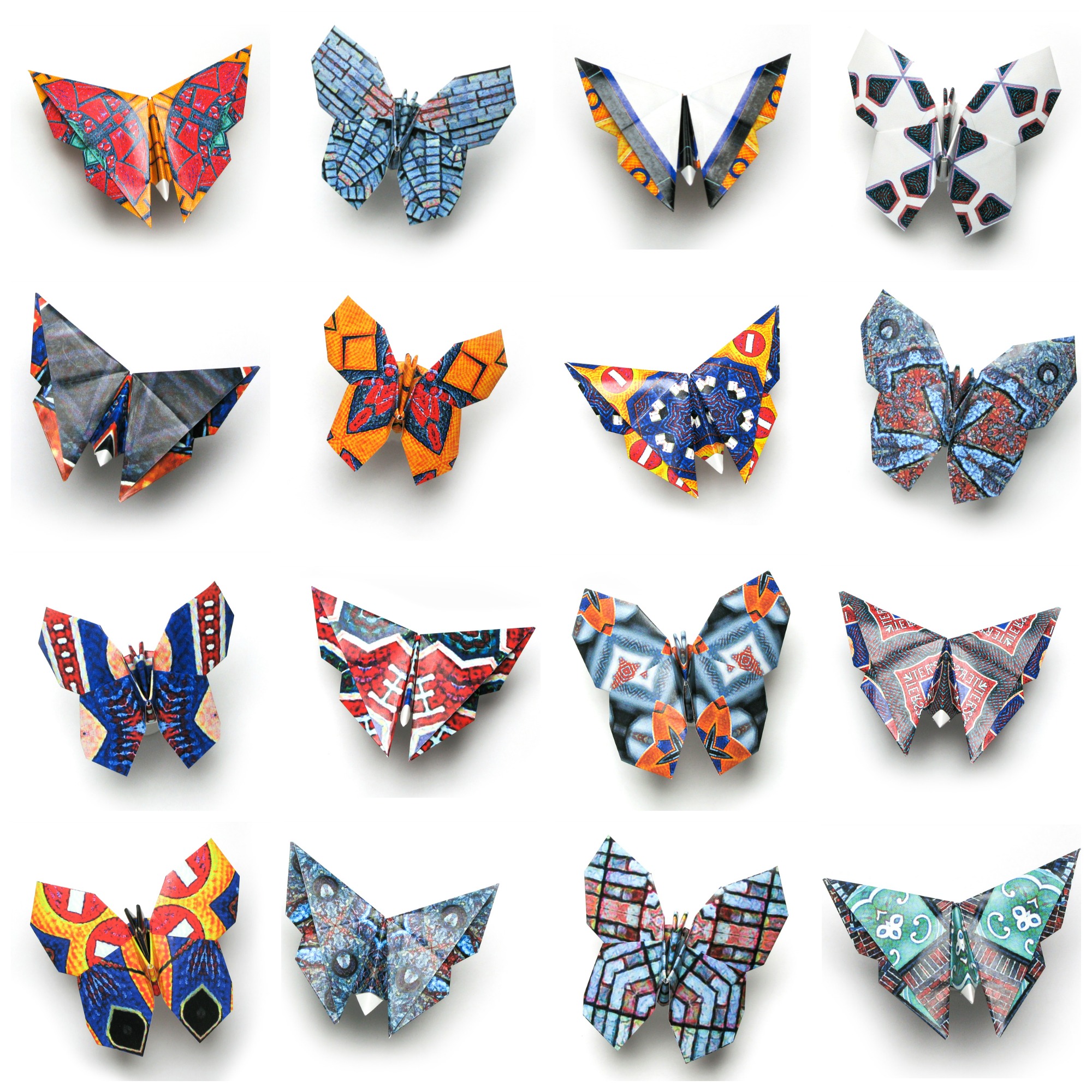
This week the contest theme is “Origami” and I thought I would tell you a little about my design, because I love to talk about the process. You know if you have read my blog for any amount of time, that I love origami. I have used it in several exhibitions and I have several fabric designs that incorporate origami.

So for this challenge entry I thought I would start by using the butterflies that I folded for an installation this fall. They are super pretty and I had already photographed them.

But as pretty as they are, I just couldn’t make them look like a cohesive design. I layered them with black and white patterns, dots, clouds. I overlaid them with another color to tie them all together that way. I spent several hours noodling around and just felt like nothing was really working. Bleh.

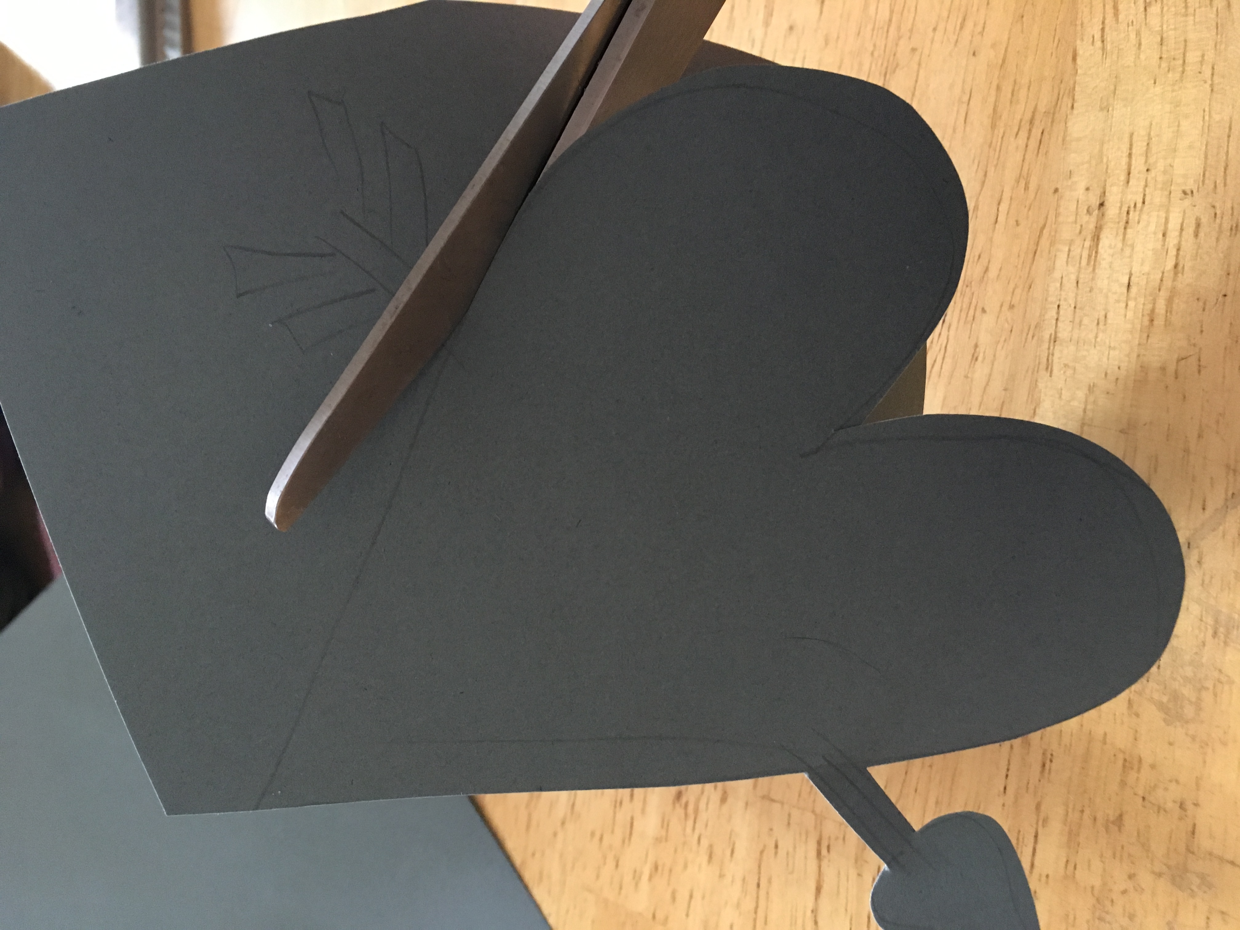
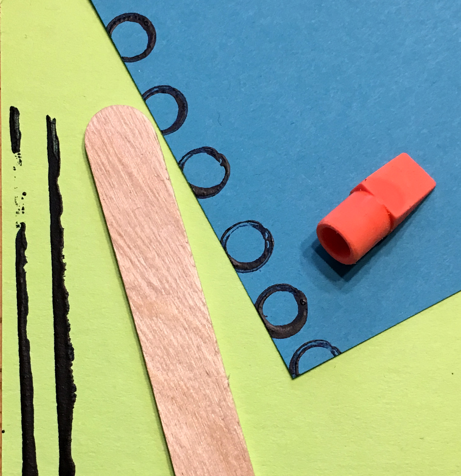
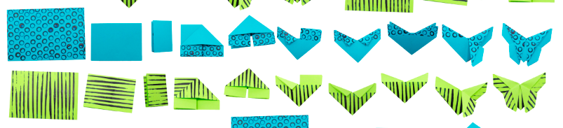
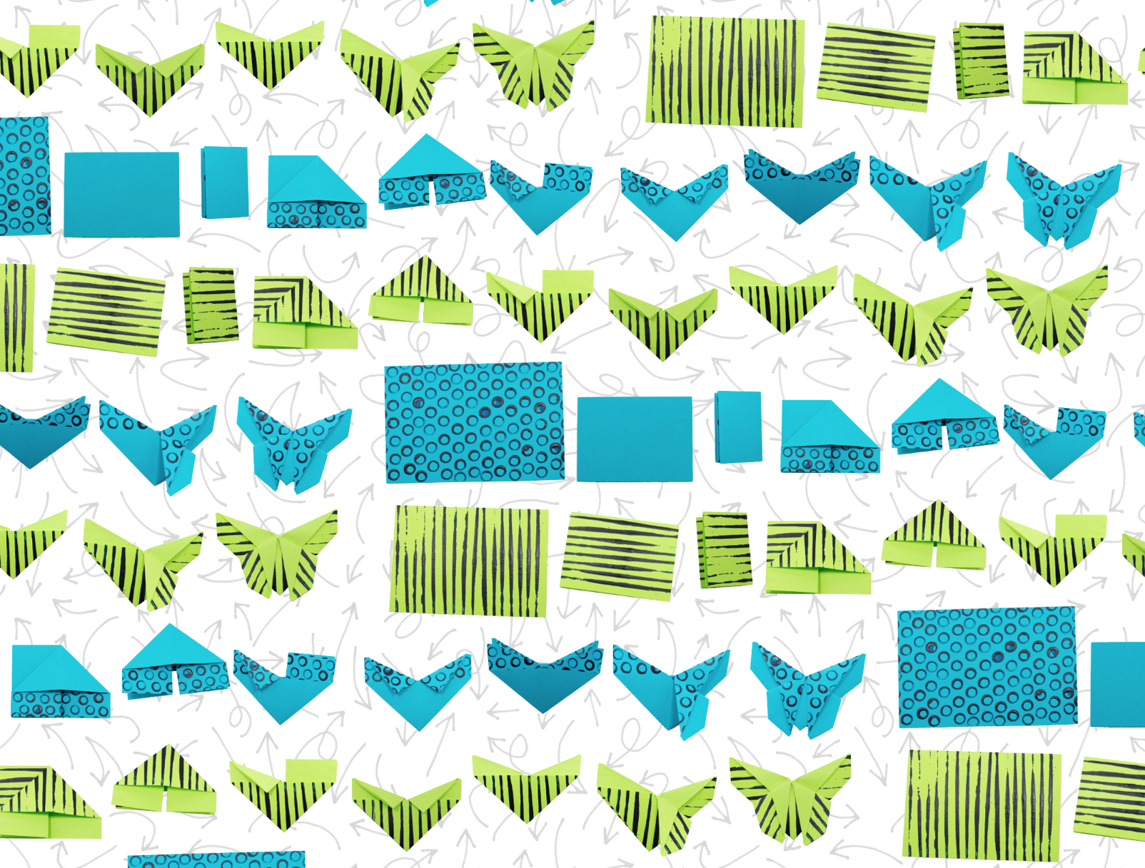
So, I bagged that idea and started something else. I posted a video about how to fold these butterflies, and I thought it might be interesting to photograph each step of that process and see if I could make a fabric design from that. I wanted to simplify the patterns on the paper, which I think was one of the problems with my previous idea, so I pulled out some construction paper and a little indigo colored craft paint, a pencil eraser and a popsicle stick.

Simple, bold patterns on one side, plain color on the other.

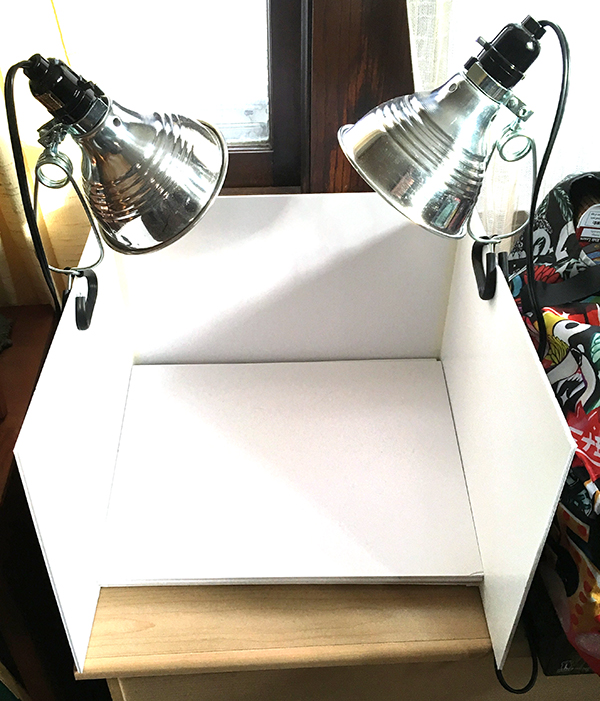
Then I set up my mini photo box and folded and took a photo at each step.

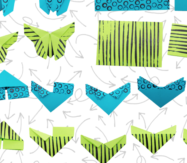
I thought it would be fun to line them up in order of steps, so that you could follow along and see the way it transforms. (Follow Along became the title of this design.)

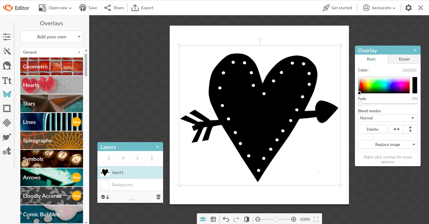
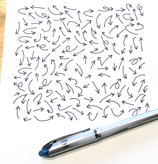
I felt like it needed one more thing to make it feel finished; some kind of texture in the background so it wasn’t just “things on a white piece of paper”. I love to add layers, so I drew a pattern of arrows. In origami diagrams there are often different kinds of arrows to help tell you what to do with a piece of paper. A zig-zag arrow says fold-and-unfold, a loopy arrow says flip-it-over and so on. So I drew origami-style arrows, scanned and made it into a repeating pattern for the background.

Here is the final finished design.

If you want to see all of the other origami designs (and if you’d like to vote for mine!) you can check out the Origami Challenge page. I think it is really inspiring to be able to see how hundreds of other artists choose to interpret the same themes. There is always something that makes me say “why didn’t I think of that?” and something that makes me say “I wouldn’t have made that choice.” and several new favorites. There’s a dog origami design in this batch that I particularly like.

The next challenge theme is “Significant Otters” and I can’t wait to show you that one!
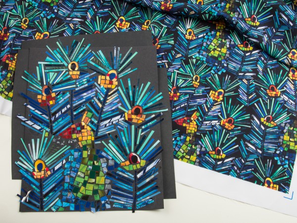
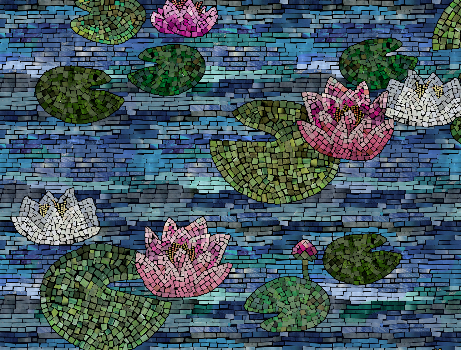
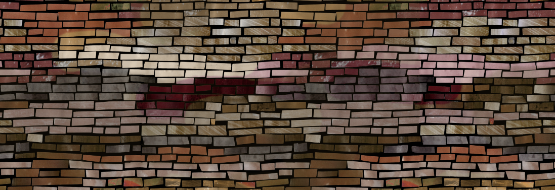
Go to Top