The unpredictability of running a small business
I was planning an afternoon of sewing up some special orders, but due to a package of materials being delayed, I found myself with an unscheduled afternoon. So I filled it with a whole lot of admin odds and ends: ordering supplies for some end-of-the-year classes, sending some invoices, delivering class kits for another class. I was looking at a pile of to-be-sewn zipper bag fabric on my table and feeling like I am unusually low on stock this year. I feel like my making “rhythm” is a little off. So in the spirit of procrastinating doing anything about that, I decided to do a little research. :)
It’s really hard as a small business to predict what’s going to happen with sales. As you grow, I am sure that gets easier in some ways. I certainly can predict big general things like November is going to be busier in the online shops and I always have a bunch of different in-person events in May. But this year, my Etsy stats say that overall my sales are down 42% this year. It’s been hovering around 38% for most of the year, so it’s even more discouraging to see it taking a dip right now for sure. I’m not sharing this as a sob story to get you to buy something, but I really think that its helpful for other small businesses to see that maybe they aren’t alone if they feel like this year has been a rough one in more ways than one. (And I know that you are out there reading this.)

You get a gut feeling when you have made things as long as I have for what are the “trends” in your items. I always order extra when I print anything in this waterlily fabric because it is always a bestseller. I keep only one or two of some zipper bag designs in stock, but others I always order 6 when I do a restock because I know they will sell.
Some years throw a wrench in your gut feelings for things and this year felt like one of them. I design fabric whenever the mood strikes me throughout the year, often participating in Spoonflower’s weekly design challenges. I usually make a plan to do 3-4 new designs leading into the fall because that’s when I do some of my biggest in-person shows of the year and I like to have new things to show people. But this year, my big fall show got cancelled somewhat unexpectedly (and too late to apply for another event). So I found myself with time blocked off to design and sew in preparation and nothing to prepare for. I made some new designs anyway but with a different audience and product in mind than I usually do.
Today I started to wonder, how much different things were this year. Even though my Etsy shop sales are down, there’s not much else different there. The things that usually sell well are still selling well, the entire volume is just lower. There are lots of reasons that could be contributing to this, but I don’t actually think there’s much useful to be gained by trying to deep dive into that because it’s been consistent all year. (I’m not interested in talking Etsy conspiracy theories.) So instead I decided to look at my in-person sales, which was completely fascinating.
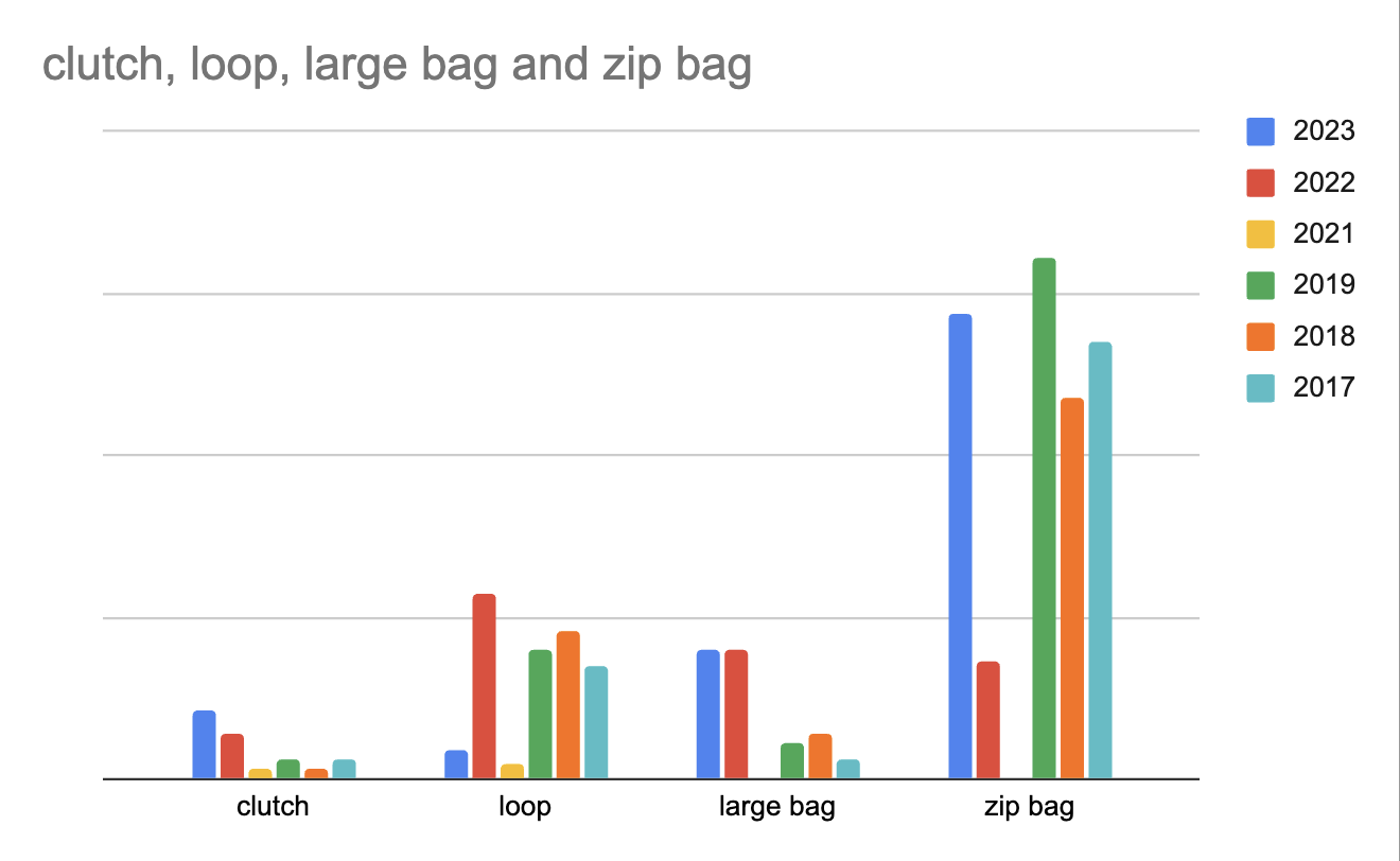
I decided to just look at my four kind of big selling item categories and the ones that I have been selling consistently for a long time. I looked back at my records just to see the number of items sold in these four categories: clutch bags, loop scarves, large project bags, and small zip notions bags. I didn’t even bother to include 2020, because all of my in-person events were cancelled. I only did one show at the very end of 2021.
The most interesting to me was to look at the blue and red bars on these charts. These represent this year 2023 and last year 2022. It’s no wonder that I feel a little like I don’t know what’s going on! The large project bags are almost exactly the same but in all of the other categories the bars are completely flip-flopped from one year to the next.
I have a few clues as to what’s happened. The loop scarves, like the one in the photo at the very top of this post are my absolute bestseller at the show that was cancelled. That design was one of my new fabrics for 2022. So it’s not surprising that the bar for loop scarves this year is so low. I did three new-to-me, in-person shows in 2023, where the zip bags were the stars. I kind of thought they would be, given the audience that would be at these events so it’s nice to know I guessed right on that. I tend to curate what I bring to different shows because I really try to pay attention to the kind of audience that will be there and what I think will be the right fit. I don’t bring scarves, for example, to the vendor market at the knitting conference.
My in-person sales total are up about 10% over last year with about the same number of show days. I don’t do a lot of in-person things but tend to do them very consistently, so people know to look for me there.
I’m not sure if I’ve learned anything that I can move ahead with, but it did feel very validating to know that I wasn’t crazy. This was an unpredictable year!
Want to listen instead of reading?


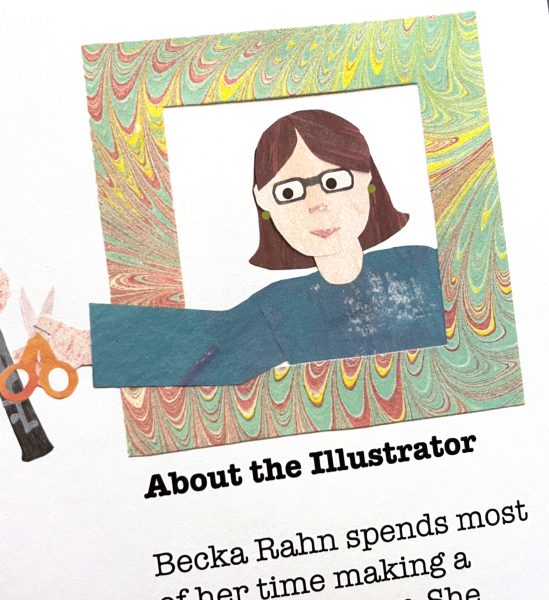
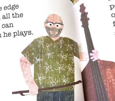 Some of the people in the book are people I know, which made it easier in some ways to think about how Rolf always wears green, so naturally he has to have a green Hawaiian shirt on page 6. But it was also simultaneously intimidating because what if they don’t like the way I made their paper alter ego look? What if I emphasize something that they don’t like about themselves? What if I made them feel self conscious or disappointed?