A few weeks ago, a colleague reached out to me and said “I’d love it if you wrote a blog post about how you price your classes and your art”. She was looking to change direction in her business and wanted some insights into making her art and classes more affordable. One thing she said really resonated with me: I want to create high priced art, but then that’s weird because I can’t afford that myself.
This is something I think about a lot. When I decided to make this art business of mine a full time adventure, I thought alot about how I wanted that to look. I come from many years of working in the non-profit arts sector and I could recite the mission statement of my organization from memory. Part of what you do in that non-profit world is always look at things as they relate to that mission. So I needed a mission statement. I decided that mine was really made up of a set of values.
Make more art.
The first value I settled on was the idea that my job meant I was making art. I define that idea of “art” pretty broadly so for me it means I am making things. That might be fabric designs or clothing or classes or websites. I am working with my hands and my brain and creating new things. The way my brain is wired, I need to be problem solving and innovating and creating to be happy.
Support the community.
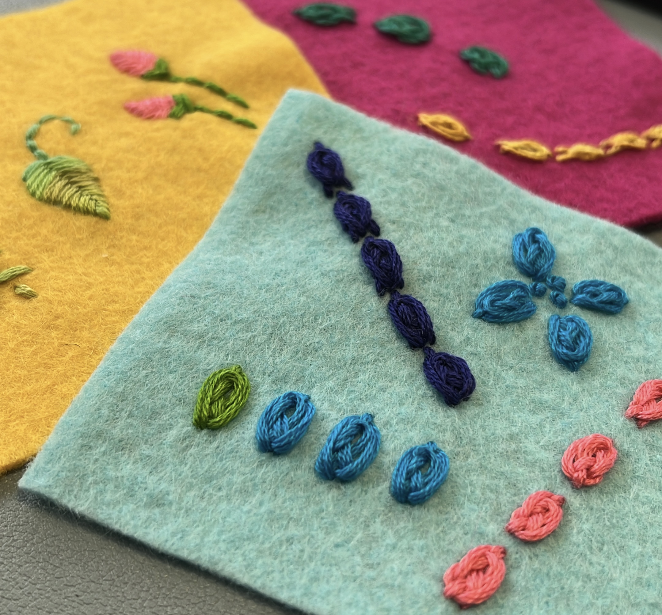
The next value I came up with was that I really wanted what I was doing to help support other artists and creators. That means when I source supplies to make my art or to teach a class I start with other small businesses as resources. About 90% of what I use for classes comes from Etsy sellers and other small businesses. I get zippers from a shop in WI and my favorite felt comes from a shop in IL. I’ve been ordering all of my fabric from Spoonflower since they were a single printer in a repurposed sock factory. I partner with local non-profit organizations like the county library system to teach classes. I want to know a person at the businesses where I do business.
The past few weeks I’ve been sitting on a grant review panel for the regional arts council. A group of about 12-14 arts professionals evaluate all of the grant applications. I wrote about that process for a grant I have going on right now. I have gotten several grants like this and other panelists have reviewed my applications, so this is my way of making sure that community thrives by taking my turn as a panelist.
That’s also why I write posts like this. When I was first getting started I didn’t know anyone else who was just getting started and it was scary and lonely. I didn’t know if I could make it work and I didn’t want to quit my day job and then fall flat on my face. If you can take something from this post and use it in your business or art practice then I am delighted and I am giving you a virtual high-five.
Make it accessible.
The last value I settled on was to make things accessible. If you’ve worked at all in non-profit orgs, that word might make you cringe a little bit. It’s been a huge focus of missions and programming for decades and it gets talked about a lot. Often in the simplest sense it gets broken down into ADA compliance and ASL interpreters. But accessibility can be addressed in so many different ways. For me, affordability was a big accessibility barrier that I wanted to work on; I’ll come back to that in a bit.
I used to teach at a venue where the class prices were on the high side. I don’t think that org is doing their pricing wrong; everyone has overhead and expenses and many other factors that go in to determining their prices. But because the prices were at the level they were, they attracted a certain kind of student. In a very broad general sense, the only people who took classes from me there were wealthy and retired. Other people told me that classes were too expensive and they felt out of place. This bothered me, so I started to try and look for other places that I could teach that might be more accessible to more different kinds of people.
I was approached by Skillshare to teach classes for them many years ago, but it bothered me that there was a membership paywall that made those classes unavailable to a lot of students. That wasn’t the only factor that made it seem inaccessible to me. Skillshare also has a video based “formula” that they want classes to follow. From a teaching standpoint, I didn’t want to be limited to only teaching in a lecture/video format, which isn’t the best match for all learners.
The pandemic era boom of online classes was, in a way, a complete revolution. At the beginning, none of us knew what we were doing and how to work with the technology. But as we all got more experience, I realized that online classes can open up accessibility in so many more ways. By using captions and other video tools like speed control and ability to pause and review, they can be adaptable to different or preferred learning styles, visual and auditory abilities, or language barriers. Allowing students to learn in their own space can help with transportation and childcare needs, physical needs and mental needs like social anxiety. Online classes absolutely have drawbacks and inherent barriers as well, but I love that there is a more available and widely acceptable option for a lot of students. I love teaching online. There was no support for me to do that before 2020.
I also look at the materials and tools I am using in classes. I love to teach Adobe Illustrator for example, but time-after-time guilds and small fiber groups asked me if I could teach them how to design with Spoonflower but not using Photoshop or Illustrator because their members couldn’t afford it. Could I teach them using free software so more people could participate? So I did that and I learned a whole bunch of free and low cost apps that I could teach with. I’ll be honest and say that I struggled with that for a while. There’s a perception that the “experts” or “professionals” use Photoshop or Illustrator or Procreate and they charge $$$$ for it. I didn’t want to be seen as less expert or less professional by teaching using free apps and recycled materials, but this was what people were asking for and it’s something I’m good at. It took me a long time to really identify and embrace that as a niche I love.
So accessibility is a value that I try to think about in all of the things I do in my business and I look at many different ways I can define accessibility and try to make things more accessible so I can work with more different kinds of people. I can’t do everything and there’s always more to do, but I am always looking for ways that I can try to pay attention and try new things.
How do values equal action?
So it’s great to talk about what you aspire to do by stating business values, but how does that actually turn into something concrete? Here’s where I want to talk about pricing and affordability as one example of that. This is how I put that value into practice.
How do I set prices?
The easiest example I can think of to tell you about prices is to talk about my Etsy shop. I make all kinds of things from zipper bags to scarves and sell them both online and occasionally in-person. I have a very specific way that I set prices. First I have to design and figure out exactly what I am making. This prototype phase is about just working out the specifics: how much of what things do I need. I look at everything I can think of from fabric and zippers to copies of instructions and packaging bags for kits. After I have the design figured out then I move on to pricing and the details of making it.
For example,
- Let’s say a yard of fabric to make zipper bags costs $30. I can make 18 zipper bags from that yard of fabric. That’s $1.67 each. Then I add on the cost of the rest of the materials I need to make that bag (lining, zipper, tag etc) and it comes out to about $2.50.
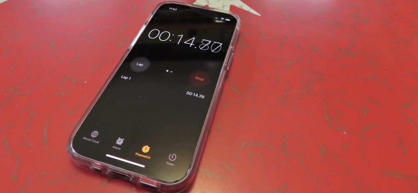
- Then I literally get out a stopwatch and make a dozen of them. I time myself making them per piece from cutting out the fabric to trimming the threads at the end. I can make a zipper bag in under 7 minutes. It took me a while to get to that rate, but I have all kinds of systems and patterns I do now that speed up the process. Not only does it help me figure out a fair price, but I know exactly how long it will take me to get ready for a big show or do a special order for someone.
- Then I multiply that time per piece by the hourly rate I want to get paid. It depends on what I am doing what rate I pay myself for the time. My “just basic sewing” rate is lower than my “designing a custom fabric” rate. So let’s say for this example that’s $3 per bag or about $20/hour. Before anyone says $20 per hour is too low, let’s keep in mind that it’s more than I was paid hourly at my last “office job” and more than my mom was paid for her 20+ years of experience as a highschool special ed teacher. I consider it a fair rate.
- So we are now at around $5.50 for materials and time. I usually double that to account for overhead & profit. Overhead is everything from the amount I will have to pay the IRS to the time it took me to design the thing to the Etsy listing fees.
- I look at all the math and then round up or down to come up with what looks like a sensible price (ie, not $9.47). For those zipper bags, that’s $10. I am paid for time and materials, I have covered overhead expenses and I have profit I can invest back in my business and save for retirement. I don’t make a lot of profit but I do make something on every piece.
Pricing classes works in much the same way. I look at hours invested in preparing and face-to-face teaching time. I add in overhead like my Zoom subscription and time it takes me to promote classes. I total up materials and postage if I am mailing kits to students. For a class where I take individual registrations, I divide that up on a per student basis. For a class I teach for a larger guild or group I have a flat rate. I am simplifying here naturally, but if you want to dig into that deeper, I have a class all about it. I don’t charge more for a class with more students because for me it’s the same to teach a room of 3 or 20. I am still giving you 100% of my preparation, effort and experience.
Are my class and product prices accessible for everyone? No, probably not. But I have tried to make them as fair and transparent and authentic as I can. That’s not a very retail or corporate approach, but it is aligned with my brand values.
“You should charge more.”
I get this comment a lot and I don’t think it’s true. I talked at the beginning of this essay about my friend who said “I want to create high priced art, but then that’s weird because I can’t afford that myself.” I occasionally help artists and small non-profits set up their websites and Etsy shops. If I charge a high rate for designing a website, for example, then I price myself out of working with exactly the people I want to help make their website. Just because the “designers” at Joe’s Website Shack charge $200 per hour to set up a website doesn’t mean I need to charge that much or that that’s the value of website set up. I am my own target customer (ie an artist who needs a website) and I couldn’t afford to have Joe’s do my website.
One of the ways I can make my prices less than Joe’s Website Shack is to keep my overhead down. I don’t have to pay for overseas call centers. But I also don’t have to pay for every monthly fee for every marketing or business service out there. I’ve watched a lot of seminars and classes about running a small business and almost without exception, someone recommends a monthly service: something that schedules posts for you, brainstorms your SEO, provides links to your Instagram posts or templates for your graphics or the premium Etsy shop template. If I subscribed to even half of those, I would be spending hundreds of dollars a month in overhead. I kind of feel the same way about single purpose kitchen gadgets. As much as I think a Millenium Falcon waffle maker would be cool, I really don’t need that taking up space in my tiny kitchen cupboards.
I think really carefully about the tools that are important to me. My email newsletter software is essential. My newsletter list is like gold. They are the people who really engage with what I do and I am grateful for them everyday. Do I upgrade that software to include all of the “trickle campaign” and automation emails services? Nope. Because those things make me nuts. I hate automated emails. I bet you hate them too. I was asked to participate in a study that my e-newsletter software company did and after the interview I felt a little weird about it, like I was small potatoes compared to the interview questions they were asking me. I didn’t use half of their stuff. I told a friend about this and she very wisely said, “Well sure you are small potatoes, but you have an open rate that’s like 5 times what the big potatoes do. That’s why they wanted to talk to you.” Luring people into signing up for the newsletter with free stuff and “onboarding” might be the marketing wisdom of the day, but the additional cost would raise my overhead.
I added a plugin to my website a few months ago that automatically delivers the Zoom link to students who sign up for my classes, so I don’t need to remember to email them and send it before class. This was an investment for me not only as a time saver, but after I nearly forgot to send the links out to a class, I decided it was also an accessibility upgrade in making sure that students had the information they needed to participate in a timely manner and a format that was easy to find. I need to try to recruit a few more people in to signing up for some classes to cover that additional cost, but I decided that it was a great investment. My Adobe subscription is another great example of this. I subscribe to the Adobe Suite and I use it for everything: creating art, marketing, website, graphic design, video etc. It’s one tool that can help me with many aspects of my business activities so it’s a great value for me.
Finally, I also look at all of the different things that I do and I look for synthesis. I am not just a retail business or a teacher or a website designer or an artist. I do ALL of those. The grant project I am working on right now has a big part of it that is paying me for my time to make the art. I will use it to complete the grant project, but that art is going to go on and be 15 more things once I get done. I’m illustrating a book, but those cut paper illustrations can also become fabric designs and postcards. I will have the books to sell in my shop. I will teach some classes about the art and the book. I love finding ways to “reuse” my art. That grant is going to subsidize a big body of other work so those future projects have less overhead. My Etsy sales have been really great in the last couple of years, which has allowed me to invest in time to make some new designs. When I make a kit for my shop, writing the instructions is the same as the majority of my class prep for teaching. So making a kit and a class at the same time is more economical than doing one or the other.
What about the free stuff?
Now you might be saying to yourself: “But Becka, there’s a lot of FREE stuff on your website. How does that work? How are you covering your costs if it’s free?” I don’t teach for free. But you can take a lot of my classes for free and it’s because of that synthesis I was just talking about. A couple of my classes are free because I put them in my marketing budget. Instead of buying an ad somewhere, I made a free class about Spoonflower so you can take a class from me and see if you like it and maybe come back for another class another time. That felt like a better investment than an ad in a magazine. The “free” classes I teach for the county library system are free for students, but I get paid to teach them from the library’s programming budget, funded by a state sales tax amendment. They are a win for everybody. Another set of free classes were something I was paid to do and “licensed” to a group for a certain period of time and when that time was up, I could put them up on my website as a class. I was already paid for the time to teach and develop those, so I can offer them free to students now.
Will you be able to run your business the same way I do? I can’t answer that for you. We all have different things that we have to factor in to what makes our art practice “successful” and what that means for each of us. I do hope that this post has given you an idea or made you think about how you can bring more of your values into what you do. I’d love to hear about what works for you.


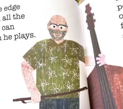 Some of the people in the book are people I know, which made it easier in some ways to think about how Rolf always wears green, so naturally he has to have a green Hawaiian shirt on page 6. But it was also simultaneously intimidating because what if they don’t like the way I made their paper alter ego look? What if I emphasize something that they don’t like about themselves? What if I made them feel self conscious or disappointed?