About beckarahn

This author has not yet filled in any details.
So far beckarahn has created 861 blog entries.
18 April, 2023

Review: Spoonflower’s Fleece vs Polartec Fleece

2023-04-24T17:18:29-05:00Everything Else, Fabric Reviews, Spoonflower & Fabric Design|Comments Off on Review: Spoonflower’s Fleece vs Polartec Fleece

Spoonflower recently launched a new fleece fabric made by Polartec. Polartec is the company known for “inventing” fleece fabric and I remember hearing that their fabrics were the “best” back in the 90s. So I was super curious to see a swatch when Spoonflower recently launched their new Polartec fleece fabric.

Spoonflower now has two fleece fabrics: fleece and Polartec Fleece. I am going to refer to the regular fleece as “classic” just for clarity as I talk about them. I have made several projects with Spoonflower’s classic fleece and I have been a little disappointed with it. The Polartec fleece is a slightly higher cost per yard than the classic, but in many other ways they are nearly indistinguishable. And I mean that pretty literally. Both are a bright white, made from 100% polyester, super soft on both sides. The print quality looks the same as far as color saturation and sharpness. I had to keep referring to the labels on my swatches to make sure I was looking at the right fabric as I was thinking about this review.

Differences I can see

The Polartec Fleece (bottom) is heavier/thicker than the classic fleece (top), but the difference is pretty slight when you feel the two fabrics. The classic fleece is 56″ printable width, Polartec is 60″.

There is an almost unnoticeable color difference between the two fabrics. I only mention it because I was really looking for differences I could talk about. Some of the colors look very slightly warmer on the classic fleece vs Polartec fleece. I really can only see it in the brown/tan shades and not the other colors.

The thing I was most interested in looking at was the amount of pilling. I have made myself two hoodies from the classic fleece and I hardly ever wear them anymore because they look really pilled. This is definitely more noticeable on a darker colored design. This adorable polar bear is this design by Scrummy and you can see the pilling really clearly here.

I washed both of these swatches several times before writing this review so I could try to see how they held up. I put them through regular wash and dry cycles with my everyday laundry. The results are not very clear. In the photo below, the Polartec fleece is on the left, classic fleece on the right. You can definitely see some texture/pilling on the classic fleece, but I can also see some on the Polartec. As of writing this, Spoonflower has the classic fleece fabric detail page with a pilling rating of 1.5 (with 1 being severe), but that detail is missing from the Polartec fleece detail page. Maybe it’s too new to have that information yet.

I think I would definitely order a swatch of a design in darker colors and wash it a bunch of times before I decided to invest the time making another project from the either fleece. In general it’s everything you expect fleece to be in how it sews and keeps its softness, but I am turned off with how it looks after a few washings. This is true of MANY other fleece fabrics for me, so this isn’t a knock against Spoonflower’s fleece choices specifically.

If you want to read more about Spoonflower fabrics and my experiences with them, be sure to check out my other fabric review posts.

7 March, 2023

Three teacher confessions: Why I love questions

2023-03-11T11:27:18-06:00An Artist's Life, Classes & Teaching|1 Comment

Imagine putting on a blindfold. Then adding some earplugs. And then stepping into a room to teach a two hour class.

I LOVE teaching virtual/Zoom classes. If there is one spot of sunshine that came out of the past few years for me, it’s the acceptance/accessibility of online teaching. I jumped in to learning the technology enthusiastically. And I now teach something via Zoom every week from my studio table. It’s awesome.

I remember one of the late-2020 classes I taught had a group of 18 or so students and every single person had their camera and microphone turned off. I’m not complaining even for a minute that everyone chose to do that. There are many reasons to NOT have your camera and microphone on and they are all good ones. I support that 100%. But what I didn’t expect was how hard it was to teach when there is no feedback at all from students. I felt a little like I had to relearn how to do it.

It takes a lot of energy.

Until I was faced with an entire screen full of black rectangles, I didn’t realize how much I relied on simple feedback like students nodding or looking up from their project to know when it was time to move to the next step. It’s a like a conversation. I share something and then students share something back with me. But when there’s no feedback, it’s like shoveling snow. You just keep scooping up the next bit and stepping forward until you get to the end and then you stand there panting.

“Students who vigorously nod: you are life itself.” This quote popped up today in my Instagram stories and I couldn’t agree more. Those nods and smiles and thumbs up are like little shots of espresso. More so than I ever imagined.

The more I thought about it, the more I wanted to write this post with a few “Teacher Confessions” or things that I suspect students don’t know but that make my job a thousand times easier and more fun.

1. Questions are never dumb.

I was thinking about a class I taught a few weeks ago. It was a small one and started out with everyone watching quietly from their black boxes for the first 45 minutes. But then someone unmuted and asked a question. And it was like that broke the ice. Soon there was another question and then a comment. And then a “me too” in the chat. And suddenly we were having a conversation.

I wanted to give that first question-asker a shiny gold star sticker! With an in-person class, I can watch and see if anyone looks puzzled or is struggling with a step and I can show a demonstration a different way or explain it differently or do it again. I watch for that. But virtually, I can’t see what anyone is doing so I don’t know when to repeat or move forward. Until you ask a question.

2. Sharing is even better than questions.

I am not one of those teachers who believes anything is “my way or the highway”. I’m there to show you the way I do a thing to get a specific result, but I know that there are always many ways of accomplishing that end result, sometimes more and less successfully. In another class we were working on something with a specific step that we did over and over. So we all had some time to practice this new skill. After a few repeats, someone asked a question and instead of just me answering, another student added “I moved my hand this way and tried this” and someone else said “It was easier for me when I tried it this way”. That, my friends, is like winning the lottery. Not only did I learn a new way of thinking about it, but everyone else now had three ideas for ways to do this thing instead of just one.

3. Questions + sharing = community experience.

There’s an invisible thing that I think happens when everyone is participating in the conversation too. When someone asks a question, you might think “Oh I wondered that too.” or “That makes so much sense now to me too.” If you try something another student suggested, you suddenly have something in common with that other person too. It’s a shared experience or something you did together. You had the same question, tried the same thing, had the same success or flop. Suddenly it becomes something “we” did, instead of something “I” did. It’s a little like that feeling of watching a movie in the theater and everyone lip synchs the line “My name is Inigo Montoya. You killed my father. Prepare to die.” It makes you a part of something special. You walk away with a smile.

As teachers we all say “Please ask questions” but the confession part is that I really do mean it. It helps me as much as it helps you (and probably everyone else too.)

22 February, 2023

Construction Update: Waiting on the Snowstorm

2023-02-24T16:23:13-06:00Construction, Everything Else|3 Comments

When last we checked in with our construction adventure, we had floors. We now have plumbing and electricity and paint and bookcases! The project is actually really close to being finished at this point. But then we had to wait for the snow.

So once we got all of the floors done, they immediately covered them all up with brown paper so they could continue to work without anything getting damaged. Then our carpenter came in and started doing the woodwork. The whole downstairs of the house has all of the original 1920s oak woodwork and we asked them to match downstairs with all of the new stuff. And it’s just gorgeous. They recreated the wide base mouldings and the trim around all of the windows. And the paint crew color matched the trim downstairs too. Even though it’s brand new construction, that little detail really makes it feel like it all belongs to the same house. I am never in to popular trends and I really don’t like the minimalist/modern/Scandinavian style that’s everywhere right now, so that meant creating custom mouldings and so on. We figure this is a once-in-a-lifetime project so we are doing it “right”.

This little nook is a fun detail. There was originally a hole in the wall here where the previous owners had a space heater. It didn’t pass inspection when we bought the house so they ripped it out and there was just always just a hole here where you could see the original chimney from the old furnace. Instead of just covering that up, we added this electronics nook. It will have a glass shelf inside and it’s got USB and regular outlets wired right into the side of the cabinet. So we can charge all of our phone/iPad/watch devices. It is right next to where the foot of our bed will be so it’s perfect to drop things off when you go to bed.

We also built in bookcases specifically for our board game collection. We have a lot of them and they need a deeper shelf than a standard bookcase. These took a little back and forth with our contractors because, not being big board game geeks themselves, I think they didn’t understand when we said they needed to be both extra deep and extra sturdy. We had them paint the inside of these a color called “Indigo Batik“, which so far is the one little pop of color upstairs. The shelves aren’t there in the photo because they are still working on them, but they will also be blue with a little oak strip across the front.

And finally the bathroom is finished except for a last little bit of grout and caulk. One of the treats that I wanted as part of this remodel was to get some tile from my friends at Clay Squared to do a detail in the bathroom. I love tile and as much as I would have loved to do the entire bathroom in one of their tile colors, that was a little out of our budget. So instead I got 5 boxes of their “seconds” tiles in two colors (Pesto and NorthShore) and two sizes and I worked with our tile guy to make a stripe pattern that goes all the way around the bathroom. You can see that in the photo up at the top.

We paired that up with some creamy white subway tiles on the walls and tiny hexagons on the floor. I couldn’t love it more. The last few tiles we added to the back of the shelf nook inside the shower. The electrician came back and finished the lights and the heat last week. We’ve had no heat at all in the space since October, so that has been really nice and cut down on the drafts downstairs. The plumber hooked up all of the plumbing so the bathroom is all ready to go. And both the plumbing and electrical got final inspections.

Today they were supposed to put in the rest of the windows but with 2 feet of snow on the way and lots of crazy wind we all decided that it would be better to wait for next week. So it’s been really quiet the last couple of days for a change.

8 February, 2023

Comparing Spoonflower’s Celosia Velvet vs Renaissance Ribbons Velvet Borders

2023-02-08T14:00:55-06:00Everything Else|Comments Off on Comparing Spoonflower’s Celosia Velvet vs Renaissance Ribbons Velvet Borders

Edith from Renaissance Ribbons reached out to me a little bit ago with a question. She had read my post comparing Spoonflower’s Celosia & Performance Velvets and wondered if I would share my thoughts about the digitally printed velvet borders that Renaissance Ribbons makes. I thought it sounded like a great follow up to that post, so I asked her if I could share my thoughts here. Edith sent me a couple of samples the next day. (In the interest of transparency, other than providing those samples, this post was not sponsored in any way.)

First impression is that the Renaissance velvet borders are beautiful. Which is exactly what I would expect because their entire shop makes me feel like a kid in a candy shop. The color is rich and vibrant and the print quality is outstanding. There are very fine details in the two designs I saw and those are crisp and precise. The one thing for me that was unexpected was that the pieces were unfinished on the edges. Coming from a shop with ribbons in the name, I assumed that they would be like ribbon with a finished edge, but they are actually just cut pieces of velvet with a built in selvedge of extra color at the edge. I don’t think there’s anything wrong with this at all, I was just surprised and this wasn’t mentioned in the descriptions of the velvets that I saw on their site.

How do they compare to Celosia Velvet from Spoonflower?

I started by laying out a piece of Renaissance Ribbons Border (top) next to a piece of Celosia velvet (bottom) that I had printed in one of my designs. The first thing I noticed was that the RR Border has a very matte finish compared to Celosia. At the bottom of this photo you can see a little of the sheen that my camera picks up in the Celosia. Other than that fabric finish, the colors are very comparable in the vibrance and saturation.

I flipped them over to take a peek at the back. They are both a woven fabric with a very similar look from the back side. The back of the RR Border is a deeper cream color, but the white parts of the design on the front are a nice crisp white. Unlike Spoonflower fabrics, which you can get in a variety of sizes, the Renaissance Ribbon borders come as a 5 inch strip, 1 meter long, which is ready for you to add into your project.

When I crumpled and played with the drape and hand of the fabrics, both were very soft. The RR Border has a little stiffer hand and has less drape than Celosia. I think this is a great feature in something designed to be a border. I would expect that to be pretty stable. Spoonflower says that the pile height on Celosia velvet is about .5mm and I would say that the RR Border is maybe half the thickness of that. I held the two up next to each other so you can see an edge on view. I also think a slightly thinner fabric is probably good for a border, which is designed to be sewn on to something else. Celosia is meant to be a little more like an upholstery weight fabric, so that makes sense that it needs a little more thickness.

Overall, I think these borders are a great idea and the two dozen or so designs they have on the site are all rich and decadent looking. You can’t design your own like you can on Spoonflower of course, but they have an impressive collection of guest designers (Kaffe Fasset, Tula Pink, Mary Engelbreit, Amy Butler) so there’s a lot to choose from in velvet or their other woven ribbons. It was fun for me to have an excuse to look at some digital prints from an entirely new source.

18 January, 2023

Stepping out of your comfort zone as an artist.

2023-01-20T08:54:42-06:00An Artist's Life|1 Comment

In 2022, I applied for a Minnesota State Arts board grant. I wrote a little bit about applying for it here, just after I was awarded the stipend.

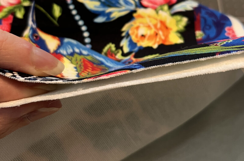
For this grant I decided to focus on reaching new audiences. Because of the work I do, which is primarily textiles and clothing related, the people who come to my community workshops and online classes are predominantly women. My social media audience is primarily women interested in crafts or sewing. I really wanted a project that would help me reach a more diverse audience. So I decided to do something a little outside of my normal work. This is a book about music and musicians, which is not my normal subject matter. I’ve been incorporating more and more paper into my work because paper is very accessible. You can always find some recycled paper to make something from. So this felt like a way to help engage with a different audience as well, in choosing a media that might feel a little more approachable. You don’t have to know how to sew to understand what I do with this project.

What I didn’t appreciate about reaching new audiences is that it also might mean reaching out of your comfort zone artistically. And boy did this project make me do that! When I wrote about the project at the beginning of the grant I talked about two challenges: instruments and people.

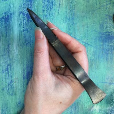
It turns out, I enjoyed making the instruments. They were tiny. The piccolo was only about 1 1/4 inches long and the triangle would fit on top of a nickel. That’s hard to do in bitsy pieces of cut paper. My fingers got very sticky with glue stick. I couldn’t have done the project without a pair of beautiful, pointy, handmade tweezers that my friend Jeff made.

I realized quickly that there is only so much tiny detail you can make without it looking clunky, so I decided a few things had to be created in Photoshop like violin strings and tuning pegs.

The part of the project which was maybe even harder than I thought it would be was to make people. In fact not just people, but people I know.

I knew what I was getting in to with this story. We had been talking about it for years before I ever thought about doing illustrations. There was a group of artistic friends that brainstormed how we could make the story come to life visually; whether it should be animated or paper puppets or stop motion or live drawings. Eventually a book seemed the most versatile and accessible idea. But I also had many chats with my friend Cy, an artist with decades of experience cartooning and painting, about the way to create simple portraits of people. Because I had no idea where to start.

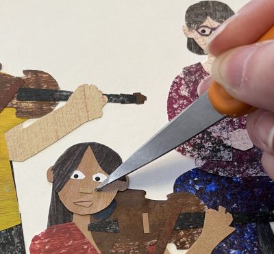
As artists, we all have the styles and subjects we love to make. I love rich textures, bright colors, and quirky animals and objects. I do not like to draw people. And in cut paper, the shapes have to be inherently simple. I had to make tiny rectangles for noses because I couldn’t cut anything more detailed than that. So I started first thinking about what were the minimal shapes I could use to make a face: Ovals for eyes, a rectangle for a nose, a triangle or two for a mouth. You can see how tiny they are there next to the point of my scissors.

I didn’t start out thinking I would do a book in the style of Eric Carle, who was an illustrator famous for hand cut painted paper, but several people have said my work reminds them of him. A lovely compliment. I looked at a lot of Eric Carle illustrations to see how he made people. I think maybe he liked animals better too, because many of his faces are painted on instead of cut paper. I also thought a lot about Ed Emberley, who wrote a series of drawing books for kids that were all about constructing animals from simple geometric shapes. So that’s how I started to think about bodies; what rectangles and ovals and curves could I make and connect together. I left the images of the audience and the orchestra until the very last because they were intimidating. That’s 49 different people on those two pages alone and the pages each took more than a week to finish.

I’ve used painted paper in a lot of fabric designs before I started this book because I love the texture the paint gives to the paper. I think it really adds some life and dimension to otherwise flat colors. I like the imperfection. Painting the paper turned out to be really necessary for these illustrations because I was super frustrated with the colors available to work from, especially skin tones. So some of the first days I worked on the book were just about making materials: skin tones, colors of wood for all of the instruments, hair colors. I assigned each “main” character a color that follows them through the book. Ada always wears turquoise. Her mom, Carrie the oboist, wears a red-violet shade. I painted some paper in every color you see in the book. In a few places I used hand-marbled paper that I made in a class. I don’t have the setup to marble paper in my studio but I have a stash that I created in classes at the MN Center for Book Arts and I love to add in little bits. In a few places in the audience you can also see the transparent deli paper layered with security envelopes, which are my favorite recycled paper. Security envelopes are the ones that things like your bank statement come in and the insides are printed with tiny black and white patterns.

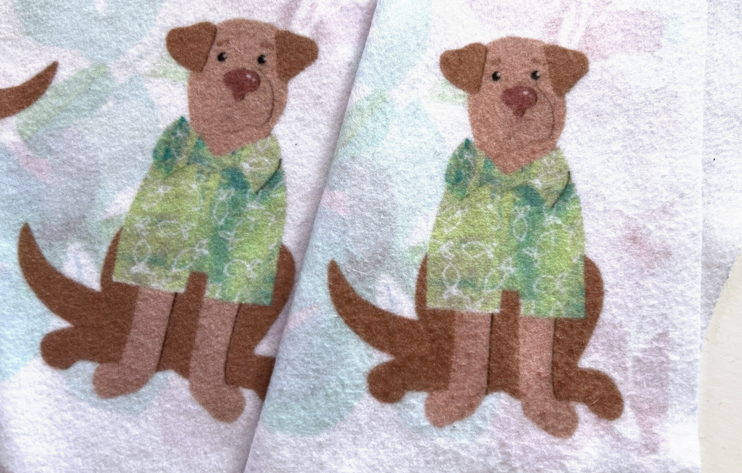
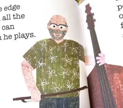
Some of the people in the book are people I know, which made it easier in some ways to think about how Rolf always wears green, so naturally he has to have a green Hawaiian shirt on page 6. But it was also simultaneously intimidating because what if they don’t like the way I made their paper alter ego look? What if I emphasize something that they don’t like about themselves? What if I made them feel self conscious or disappointed?

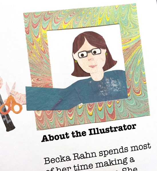
Although I probably should have started with it, one of the very last images I made was the self portrait of myself that’s on the “About the Illustrator” section. The one you see was actually my second try, designed for a different page on the book. Although I liked the first one ok, the second one ended up somehow looking more like me, so I decided to swap them out.

By the time I did the last couple of pages, I had a little more confidence. I put many people I know into the audience page. Sometimes I didn’t even know I was doing it until I got done with a person and said to myself, “Oh that looks like Fred.” Am I confident enough to do another project illustrating people? Absolutely not. But I surprised myself at how proud I was when I got it done. It was a big artistic hurdle to push myself through.

(A note: Books aren’t available yet; there are a couple of tweaks that need to happen, but they will be soon.)

12 January, 2023

Construction Week 11: Floors & Windows

2023-01-12T13:21:33-06:00Construction, Everything Else|Comments Off on Construction Week 11: Floors & Windows

This past week has been all about floors and windows! The bathroom floor tile is almost complete and when I talked to our tile guy yesterday, he was nearly as excited about the window as I was. It makes the room so much brighter. You can see that this isn’t finished yet. Everything takes lots of steps. But three of the new windows are in and they make such a huge difference. You can see we matched the style of the windows downstairs with the three dividers in the top pane. These will be painted to match the woodwork everywhere else upstairs which is dark stained red oak, copying the style from downstairs.

We only have some of the windows still. Two of them are still on order. Since May. And sadly, these aren’t exactly right. Some of these windows are supposed to have tempered glass in them to meet code requirements and they didn’t do that. (Not sure whether it was a mistake in the order or the manufacturing). Fortunately there’s a solution: a film you can add to the glass to which is acceptable instead of tempering. So that still has to happen. And they also forgot to make this window with frosted glass. Since it’s basically floor to ceiling, you would get a very good view of anyone stepping out of the shower. So that’s really not going to work. Fortunately they make the film in a frosted version too. So our contractor is working on tracking that down. It’s always something!

Another new thing I learned is that there is an inspection for everything. Yesterday’s was the shower pan/drain inspection. A guy in a safety yellow vest showed up and went right upstairs, ran some water down the drain to make sure that all worked correctly, signed off on something official and got back in his car and drove away. We’ve had two plumbing inspections, electrical, framing, structural. Honestly, probably a few more I don’t even know about. They are very efficient.

Right now you can’t see the beautiful floors in the rest of the room because as soon as they got them down, they quickly covered them up with heavy paper so they don’t get damaged while everything else is still happening. But I got a photo before that happened. We picked LVT or luxury vinyl tile that looks like wood. I picked one that was the closest match I could get to the original hardwood floors downstairs. Because I love the look of wood, but we really decided that real hardwood was probably not in our budget. We don’t have any carpet anywhere in our house. I just don’t like it and it’s impossible to keep clean when you also have a love for large labradors. I’ve started thinking about rugs, now that I have a better idea of what this new space looks like. If anyone has a place you love to get rugs, send me a link!

Go to Top